Color is one of the most important decisions in summer wedding linen design. Because linens cover some of the largest visual surfaces in the reception, the colors chosen for tablecloths, napkins, runners, and overlays can shape the entire mood of the event. They influence how florals appear, how place settings feel, how the venue photographs, and how guests experience the table throughout dinner.
For summer weddings, linen color selection should feel intentional rather than purely seasonal. Soft neutrals can create a romantic foundation, garden tones can connect the reception to natural surroundings, coastal shades can bring lightness and movement, and deeper evening colors can add formality and contrast. The strongest palettes are not necessarily the most colorful; they are the ones that support the wedding vision with balance and restraint.
Curated Linen Collection helps couples, planners, and designers create refined reception tablescapes through luxury table linens, napkins, runners, overlays, custom colors, and coordinated linen details. With the right palette, summer wedding linens can bring the entire event design into focus.
Why Linen Color Matters in Summer Wedding Design
Linen color should be one of the earliest tabletop decisions because it affects every other design choice. Florals, china, glassware, stationery, candles, and chairs all interact with the linen palette. When the linen color is chosen thoughtfully, the reception feels cohesive from the guest tables to the head table, bar, cake table, and escort display.
Linens Anchor the Reception Palette
Table linens act as the base layer for the reception color story. A tablecloth can establish the dominant tone, while napkins, runners, and overlays can introduce supporting shades or accent colors. This makes linens one of the most effective ways to bring the wedding palette into the guest experience.
For example, a soft ivory tablecloth can support almost any summer palette, while sage napkins can connect the table to greenery-heavy florals. A shell-toned base with coral accents can create a coastal direction, while navy linens with champagne details can give an evening reception more depth.
Summer Light Changes How Colors Appear
Summer weddings often include bright daylight, golden hour, candlelight, and evening lighting. Each lighting condition can change the way linen colors appear. A blush linen may look soft in daylight but warmer under candlelight. A mist blue napkin may feel fresh in a garden setting but cooler in a ballroom. A deep navy tablecloth may feel dramatic in the evening but more formal during the day.
This is why linen colors should be reviewed with the venue, event time, and lighting in mind. The right palette should work across the full reception, especially for weddings that begin outdoors and continue into an evening dinner.
Linen Color Shapes the Guest Experience
Color affects the mood of the table. Soft colors can make a reception feel romantic and airy. Neutral shades can create a timeless and polished foundation. Garden tones can feel organic and fresh. Deep colors can make the setting feel formal, intimate, or dramatic.
Guests may not describe the linen color directly, but they will feel the effect of it. A well-chosen linen palette makes the table feel composed, refined, and aligned with the larger wedding design.
How to Build a Linen Color Palette from the Wedding Vision
A linen palette should begin with the wedding vision, not with a single favorite color. The goal is to understand the reception’s mood, floral direction, venue setting, and tabletop details before deciding which colors should appear on the linens.
Start with the Primary Wedding Colors
The primary wedding colors should guide the linen direction, but linens do not always need to match them exactly. In many cases, exact matching can make the design feel flat. A more refined approach is to choose linens that support the palette while allowing florals, stationery, and tableware to add variation.
If the wedding palette includes blush and ivory, the linens might use champagne or soft rose to create warmth. If the palette includes blue and white, the linens might introduce shell, mist blue, or soft gray. If the palette includes bold coral, a neutral tablecloth with coral napkins may feel more balanced than using coral across every linen surface.
Add Secondary Accent Colors Carefully
Accent colors are best used with restraint. Napkins, runners, overlays, and specialty table linens are effective places to introduce secondary shades without overwhelming the reception.
For example, a wedding with mostly ivory and green florals may use butter yellow napkins for a soft summer accent. A coastal wedding may use aqua runners against shell-toned tablecloths. A formal evening wedding may use champagne overlays or gold napkins to add warmth to navy or charcoal linens.
A controlled accent color can make the table feel layered without making the palette feel busy.
Use Neutrals to Balance Stronger Design Elements
Neutrals are essential in luxury wedding linen design. Ivory, champagne, taupe, shell, soft gray, and white can calm a stronger palette and give the eye a place to rest. They are especially useful when the wedding includes bold florals, colorful glassware, patterned plates, or statement stationery.
Neutral linens do not have to feel basic. A textured neutral tablecloth, tonal runner, or refined napkin can add depth while keeping the overall palette elegant. In many summer weddings, the most sophisticated linen choice is a neutral foundation with a few deliberate color moments.
Refined Summer Linen Color Palettes to Consider
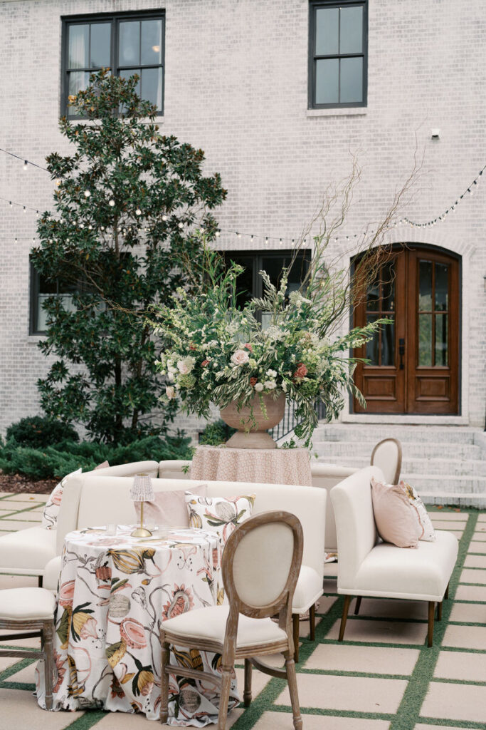
Summer wedding palettes can move in several directions depending on the venue, mood, and formality of the reception. These palette groups offer a useful starting point for selecting linen colors that feel seasonal, polished, and cohesive.
Soft Romantic Palette
A soft romantic palette is ideal for garden weddings, estate receptions, bridal-inspired designs, and elegant indoor dinners. This palette may include ivory, blush, champagne, soft rose, butter yellow, and pale peach.
These colors create warmth without feeling heavy. They pair well with roses, peonies, garden greenery, delicate china, and candlelight. For a refined look, use a champagne or ivory tablecloth as the base and bring in blush or soft rose through napkins or runners.
Garden-Inspired Palette
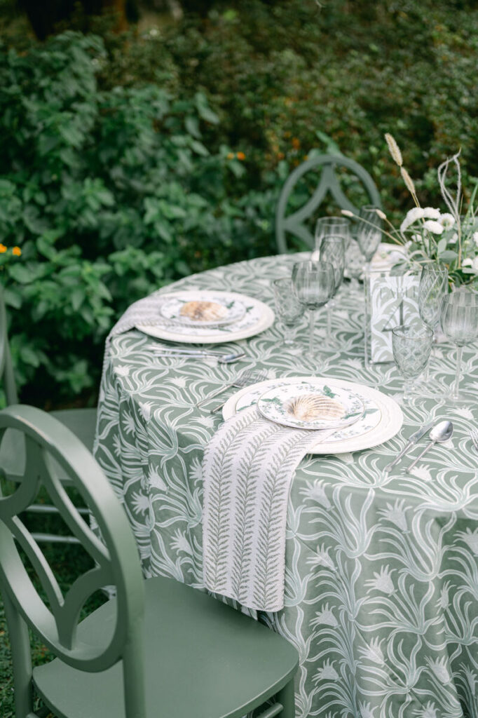
A garden-inspired palette works beautifully for outdoor receptions, tented weddings, and venues surrounded by greenery. This palette may include sage, mist blue, ivory, petal pink, botanical green, and soft lavender.
These shades feel fresh and natural without becoming overly rustic. Sage and botanical green can connect the table to the landscape, while mist blue and lavender add softness. A garden palette works especially well when paired with floral napkins, textured tablecloths, or subtle patterned runners.
Outdoor wedding palettes also change according to the specific venue surrounding them. Reviewing summer wedding linens by venue type can help couples and planners see how garden landscapes, coastal views, estate settings, terraces, and tented spaces influence the colors, textures, and overall linen direction that work best.
Coastal Summer Palette
A coastal summer palette should feel light and refined rather than themed. Strong options include shell, sand, aqua, ocean blue, coral, sea-glass green, and white.
The goal is to reference the coast through tone and texture, not literal beach motifs. A shell or sand tablecloth can create a polished foundation, while aqua or ocean-blue napkins add freshness. Coral can be used as a warm accent, especially when balanced with ivory florals or neutral tableware.
Formal Evening Palette
A formal evening palette brings depth to summer wedding design. This palette may include navy, emerald, charcoal, gold, copper, champagne, and deep botanical green.
These colors are effective for ballroom receptions, rooftop dinners, private club weddings, and evening tented events. Deeper tablecloths can create drama, while champagne, gold, or copper accents add warmth. For a refined result, balance dark linens with lighter florals, clear glassware, and intentional candlelight.
How to Use Color Across Different Linen Pieces
A strong linen palette is not only about which colors are chosen. It is also about where those colors are used. Tablecloths, napkins, runners, overlays, and specialty linens each play a different role in the reception design.
Tablecloths as the Foundation Color
The tablecloth usually carries the foundation color. Because it covers the largest surface, it has the strongest visual impact. A neutral tablecloth creates flexibility, while a statement color makes the table itself a focal point.
Neutral tablecloths work well when florals, tableware, or stationery already bring strong color. Statement tablecloths work best when the rest of the table is more restrained. The decision should depend on the full design, not the tablecloth alone.
Napkins as Accent Color Moments
Napkins are one of the most effective ways to add color to a wedding tablescape. They sit at every place setting, which means even a small color choice can have a strong visual impact across the room.
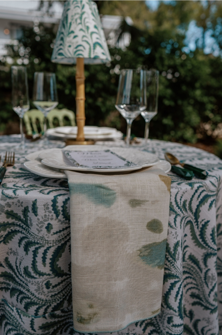
A blush napkin can soften a neutral table. A sage napkin can connect the place setting to greenery. A navy napkin can add contrast to a champagne tablecloth. A patterned napkin can introduce color without requiring a patterned tablecloth.
Runners and Overlays for Controlled Contrast
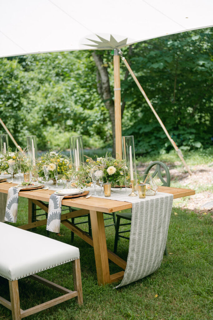
Runners and overlays are useful when the design needs contrast, pattern, or texture without changing the entire table foundation. A runner can bring color down the center of a long table, while an overlay can make a head table, cake table, or display table feel more distinctive.
This approach is especially helpful for couples who want color but do not want every guest table to feel bold. Accent linens allow color to appear in controlled, intentional ways.
Specialty Tables as Palette Extensions
Bars, dessert tables, escort displays, welcome tables, cocktail tables, and cake tables should support the same color story as the dining tables. These areas do not need to match exactly, but they should feel connected.
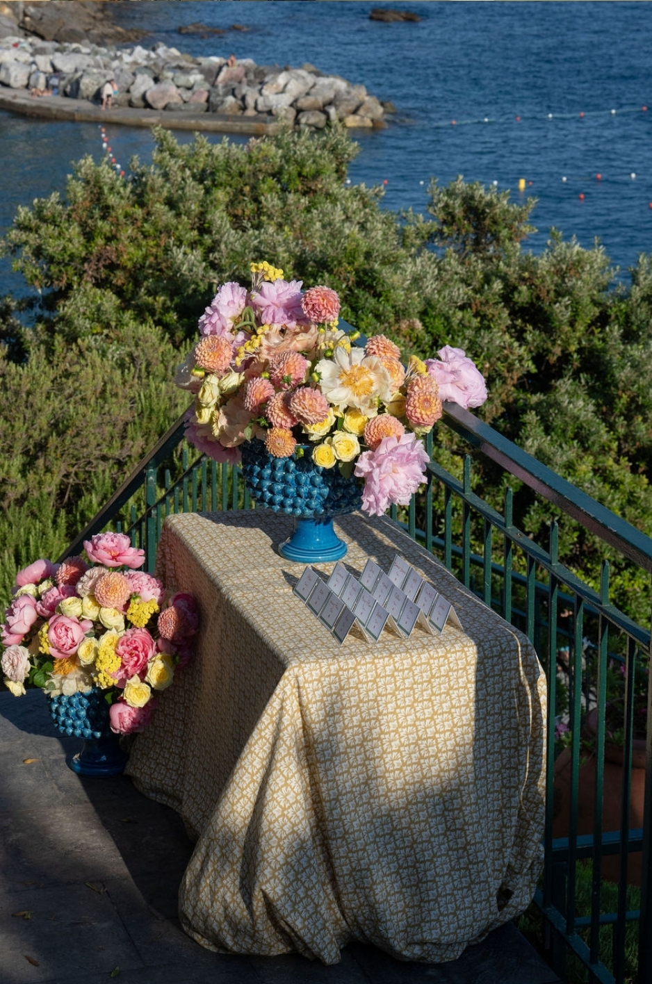
A cake table may use a lighter version of the guest table palette. A bar linen may repeat the napkin color. An escort display may use a patterned overlay that includes the main wedding colors. These smaller moments help carry the palette throughout the full reception.
Pairing Linen Colors with Florals and Tabletop Details
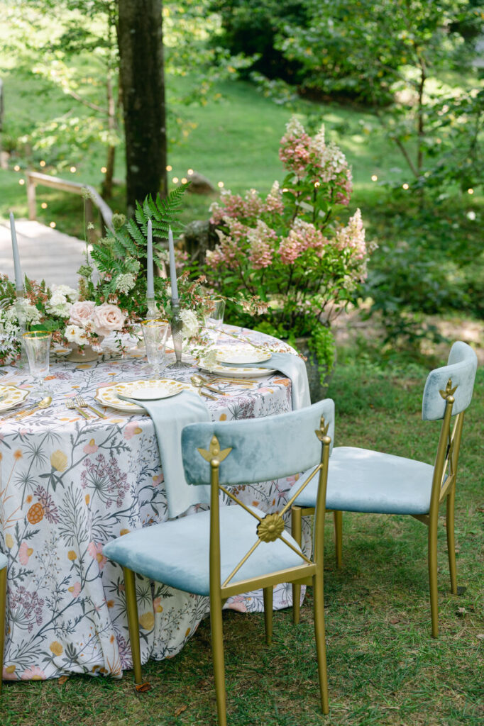
Linen colors should be selected with the full tabletop in mind. Florals, china, glassware, menus, candles, and flatware can all shift how a linen color feels. A refined reception palette considers how these details work together rather than treating each element separately.
Coordinate with Floral Undertones
Florals often have warm or cool undertones, and linens should be selected accordingly. Warm florals such as peach, coral, cream, and butter yellow often pair well with ivory, champagne, shell, taupe, and soft rose linens. Cooler florals such as white, lavender, blue, and green may pair better with mist blue, soft gray, sage, or crisp ivory.
Greenery-heavy arrangements can be balanced with neutral tablecloths or supported with sage and botanical tones. White florals can work with nearly any linen palette, but the final effect will depend on whether the linen creates softness, contrast, or formality.
Consider China, Glassware, and Menu Cards
Tabletop details can either intensify or soften the linen palette. Colorful glassware may call for a quieter tablecloth. Patterned china may work best with a solid linen base. A detailed menu card may be more effective against a neutral napkin or tablecloth.
When choosing linen colors, review the tableware and stationery together. A tablescape feels more refined when every detail has room to contribute without competing for attention.
Avoid Too Many Competing Colors
A luxury wedding table does not need every color in the wedding palette to appear equally. Too many competing colors can make the table feel fragmented. A stronger approach is to choose one dominant linen direction and one or two supporting accents.
For example, a reception might use ivory tablecloths, sage napkins, and a floral runner. Another might use navy tablecloths, champagne napkins, and white florals. The palette should feel layered but controlled.
When to Use Custom Linen Colors or Patterns
Custom linen colors and patterns are useful when the wedding vision requires a more specific design direction than standard rental options can provide. They can help refine a palette, create a signature moment, or connect the table design to the couple’s broader wedding concept.
Custom Colors for Specific Wedding Palettes
Custom colors are helpful when a couple has a very specific shade in mind. This may include a particular soft blue, a unique green, a warm neutral, or a shade that needs to coordinate closely with the invitation suite, florals, or bridal party attire.
Custom color details can be especially effective on napkins, runners, overlays, and specialty table linens. These pieces allow the custom shade to appear intentionally without overwhelming the full reception.
Custom Patterns for Signature Design Moments
Custom patterns can add personality to the wedding design. A floral print may reference the bouquet or garden setting. A subtle pattern may echo the invitation suite. A venue-inspired motif may connect the tabletop to the architecture or destination.
Custom patterns are often strongest when used in focused places, such as the head table, cake table, escort display, or napkins. This creates a signature design moment while keeping the overall reception balanced.
Best Places to Use Custom Color Details
Custom color details work well on napkins, runners, overlays, head table linens, cake table linens, bar linens, and escort display linens. These surfaces are visible but controlled, making them ideal for personalized color choices.
For guest tables, custom details may be used more selectively. A custom napkin across all place settings can create a refined and cohesive effect, while a custom runner may be most impactful on long tables or focal tables.
Frequently Asked Questions
What linen colors are best for summer weddings?
The best linen colors for summer weddings include soft neutrals, romantic pastels, garden tones, coastal shades, and deeper evening colors. Ivory, champagne, blush, sage, mist blue, shell, coral, aqua, navy, emerald, and gold can all work depending on the reception style.
A garden wedding may lean softer and more botanical, while a formal evening reception may use deeper or more dramatic tones.
Should wedding linens match the exact wedding palette?
No. Wedding linens do not need to match the exact wedding palette. They can complement, soften, or contrast the palette in a more refined way.
For example, if the wedding palette includes blush, the linens might use champagne or soft rose. If the palette includes blue, the linens might use mist blue, shell, or navy depending on the event mood.
Are neutral linens too simple for a luxury wedding?
Neutral linens are not too simple when they are selected with the right texture, drape, and supporting details. Ivory, champagne, taupe, shell, white, and soft gray can all feel luxurious when paired with refined florals, custom napkins, runners, overlays, or elegant tableware.
Neutral linens often create the strongest foundation for highly detailed wedding designs.
How can I add bold color without overwhelming the table?
Bold color can be added through napkins, runners, overlays, or specialty tables instead of every linen surface. This allows the color to feel intentional without dominating the full reception.
A bold napkin can add contrast to a neutral tablecloth, while a colorful runner can bring energy to a long table. A statement overlay can highlight the cake table, head table, or escort display.
Can linen colors be customized?
Yes. Linen colors can be customized through custom tablecloths, napkins, runners, overlays, prints, and specialty linen details. Custom options are especially useful when a couple wants a specific shade, a coordinated accent, or a signature design element.
Custom linen details can help connect the table design to the wedding palette, venue, invitation suite, or floral direction.
Conclusion
Summer wedding linen colors should be chosen with the full tablescape in mind. The right palette supports the venue, florals, tableware, lighting, and overall wedding mood while keeping the reception polished and cohesive.
A soft romantic palette can create warmth and intimacy. Garden tones can connect the table to the natural setting. Coastal shades can feel fresh and refined. Formal evening colors can bring depth and drama. Neutrals can balance the design and allow other details to shine.
Curated Linen Collection helps couples, planners, and designers build refined linen palettes through luxury tablecloths, napkins, runners, overlays, custom colors, and coordinated linen details for summer wedding receptions.
Explore Curated Linen Collection’s luxury wedding linen rentals or connect with the team to begin selecting tablecloths, napkins, runners, overlays, custom colors, and coordinated linen details for a refined summer wedding reception.