Color is one of the most powerful design decisions in a wedding tablescape. Before guests notice the menu cards, chargers, candles, or floral details, they often take in the overall atmosphere of the room. Table linens play a major role in that first impression because they cover one of the largest visible surfaces in the reception space.
Choosing wedding linen colors should not be treated as an isolated decision. The best color choice depends on the venue, season, lighting, floral palette, tabletop rentals, and overall wedding mood. A color that looks beautiful online may shift dramatically under warm ballroom lighting or outdoor daylight. A shade that works on a small swatch may feel too strong when used across twenty guest tables. That is why linen color selection should be both creative and strategic.
This guide walks through the most popular wedding table linen colors, how to match them to different wedding styles, how fabric texture changes color perception, and how custom or rental options can help couples create a polished, personal event design.
Popular Wedding Table Linen Colors for Today’s Events

Wedding color trends change over time, but the strongest linen colors tend to balance freshness with longevity. Couples want their wedding to feel current, but they also want the photos to remain beautiful years later. The most popular wedding table linen colors today include soft romantic shades, garden-inspired greens, warm neutrals, refined blues, earthy tones, and dramatic jewel colors.
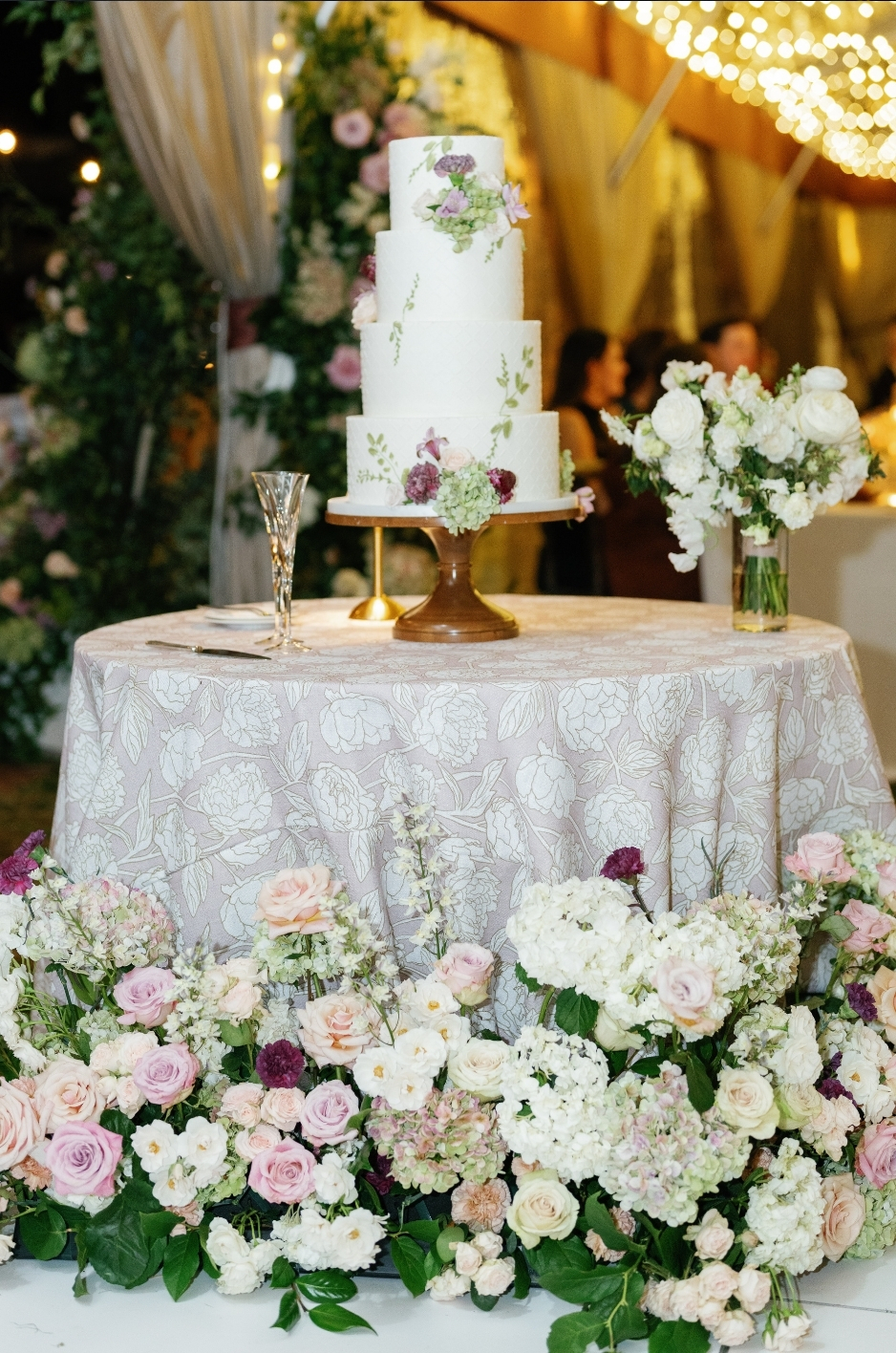
Blush and Dusty Rose for Romantic Tables
Blush has remained popular because it adds warmth without feeling too bold. It works well with ivory, cream, champagne, sage, mauve, and soft gold. For couples who want a more mature version of pink, dusty rose is often the better choice. It feels muted, refined, and less sweet than brighter pink tones.
Blush and dusty rose linens are ideal for romantic weddings, spring receptions, bridal showers, garden venues, and estate celebrations. They pair beautifully with roses, ranunculus, peonies, sweet peas, and delicate greenery.
To keep pink-toned linens sophisticated, avoid pairing them with too many sugary colors. Instead, use ivory, taupe, champagne, soft green, or muted mauve as supporting tones.
Sage and Olive for Garden-Inspired Weddings
Sage and olive are versatile green tones that work across many wedding styles. Sage feels soft, fresh, and romantic, while olive feels deeper, earthier, and more grounded. Both shades pair well with outdoor settings, natural florals, wood accents, stone venues, and garden-inspired decor.
Sage colored linens are especially effective for spring and summer weddings. They create a calm foundation and coordinate easily with white, blush, lavender, cream, and pale blue. Olive linens are stronger for autumn weddings, vineyard receptions, and rustic-luxury designs. They pair well with terracotta, gold, cream, rust, and deep floral tones.
Green linens also have the advantage of connecting naturally with floral design. Because greenery is already present in most wedding arrangements, sage and olive linens can make the full tablescape feel cohesive.
Champagne and Ivory for Classic Elegance
Champagne and ivory are among the safest and most elegant wedding linen colors. They work in almost any venue and adapt to a wide range of wedding styles. Ivory feels clean, timeless, and bridal. Champagne adds warmth and subtle luxury.
These colors are ideal for formal weddings, traditional receptions, ballroom settings, church weddings, and luxury celebrations. They also work well when the couple wants the florals, candles, or tabletop pieces to carry more of the visual interest.
Champagne linens pair beautifully with gold flatware, crystal glassware, white florals, and candlelight. Ivory linens work with almost every palette, from soft pastels to dramatic jewel tones. If the wedding design includes multiple colors, ivory or champagne can help keep everything grounded.
Navy and Powder Blue for Refined Color
Blue wedding linens can feel coastal, classic, formal, or romantic depending on the shade. Navy is strong, structured, and elegant. Powder blue is soft, airy, and refined. Together, they offer a flexible range for couples who want color without moving into overly bright territory.
Navy linens work well for evening receptions, formal weddings, estate venues, and coastal events. They pair beautifully with white florals, gold accents, silver accents, and soft blue details. Powder blue linens are ideal for spring weddings, seaside venues, garden receptions, and romantic tablescapes.
Blue also photographs well when coordinated with the right lighting and florals. For a clean look, pair blue linens with white and ivory. For a warmer look, add champagne, blush, or soft peach accents.
Terracotta, Taupe, and Sand for Earthy Warmth
Terracotta, taupe, and sand are ideal for couples who want warmth without using traditional bright colors. These shades create a natural, relaxed, and grounded look. They work especially well for autumn weddings, outdoor receptions, vineyard venues, desert-inspired events, and rustic-luxury celebrations.
Terracotta adds a warm clay tone that pairs beautifully with cream, olive, rust, copper, and muted pink. Taupe is more neutral and can support a wide range of palettes. Sand works well for coastal weddings, neutral receptions, and organic table designs.
These colors are most successful when layered with texture. Linen, woven chargers, ceramic plates, dried floral accents, and natural wood details all help enhance the warmth of earthy linen palettes.
Emerald, Burgundy, and Plum for Rich Statement Tables
For couples who want a bold and luxurious look, emerald, burgundy, and plum are strong choices. These jewel tones create drama and depth, especially in evening settings. They are well suited for black-tie weddings, winter receptions, ballroom events, and formal dinner celebrations.
Emerald feels elegant and lush, especially when paired with gold, ivory, black, or white florals. Burgundy adds warmth and romance, making it ideal for autumn and winter weddings. Plum offers a slightly softer but still dramatic alternative, pairing well with mauve, blush, champagne, and deeper floral tones.
Because these colors are strong, they can be used strategically. Couples may choose jewel-toned linens for every table, or they may reserve them for head tables, sweetheart tables, cake tables, or lounge areas. We cover this further in Sweetheart and Guest Table Linen Coordination Guide.
Wedding Linen Color Pairings That Always Look Polished
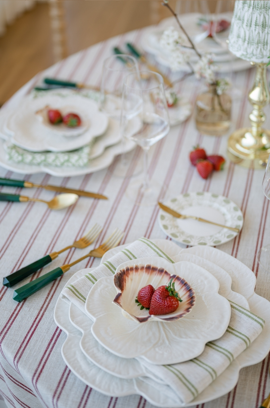
Some color pairings consistently work because they balance warmth, contrast, and elegance. These combinations can be used across table linens, napkins, runners, florals, candles, and stationery.
Ivory + Champagne + Soft Gold
This palette is ideal for classic luxury weddings. Ivory provides a clean foundation, champagne adds warmth, and soft gold brings a formal accent. Together, these colors create a timeless and elegant atmosphere.
This pairing works beautifully in ballrooms, historic venues, churches, and formal reception spaces. It pairs well with white florals, crystal glassware, gold flatware, and candlelight.
Blush + Sage + Ivory
Blush, sage, and ivory create a romantic garden-inspired palette. Blush adds warmth, sage brings freshness, and ivory keeps the overall look soft and balanced.
This combination is especially effective for spring weddings, estate venues, garden receptions, bridal showers, and outdoor celebrations. It pairs well with roses, peonies, greenery, and delicate place settings.
Navy + White + Soft Blue
Navy, white, and soft blue create a refined palette that can feel coastal, classic, or estate-inspired. Navy adds structure, white keeps the look crisp, and soft blue adds romance.
This palette works well for coastal venues, tented receptions, formal outdoor weddings, and blue-and-white design schemes. It pairs beautifully with white florals, blue stationery, silver accents, or gold details.
Terracotta + Taupe + Cream
Terracotta, taupe, and cream create a warm, earthy palette. Terracotta adds richness, taupe provides a neutral bridge, and cream softens the overall look.
This combination is ideal for autumn weddings, vineyard venues, rustic-luxury receptions, and outdoor celebrations. It pairs well with dried floral accents, warm candlelight, wood textures, and ceramic tableware.
Emerald + Black + Gold
Emerald, black, and gold create a dramatic and sophisticated palette. Emerald brings richness, black adds contrast, and gold introduces warmth and luxury.
This combination is strongest for evening weddings, winter receptions, formal ballrooms, and black-tie celebrations. It pairs well with structured florals, dramatic lighting, and polished tabletop details.
Lavender + Ivory + Dusty Rose
Lavender, ivory, and dusty rose create a soft, graceful palette with a romantic feel. Lavender adds a gentle cool tone, ivory keeps the palette refined, and dusty rose brings warmth.
This combination works well for spring weddings, garden receptions, bridal showers, and romantic estate celebrations. It pairs beautifully with delicate florals, vintage-inspired glassware, and light-toned candles.
When Custom Linen Colors Are Worth Considering
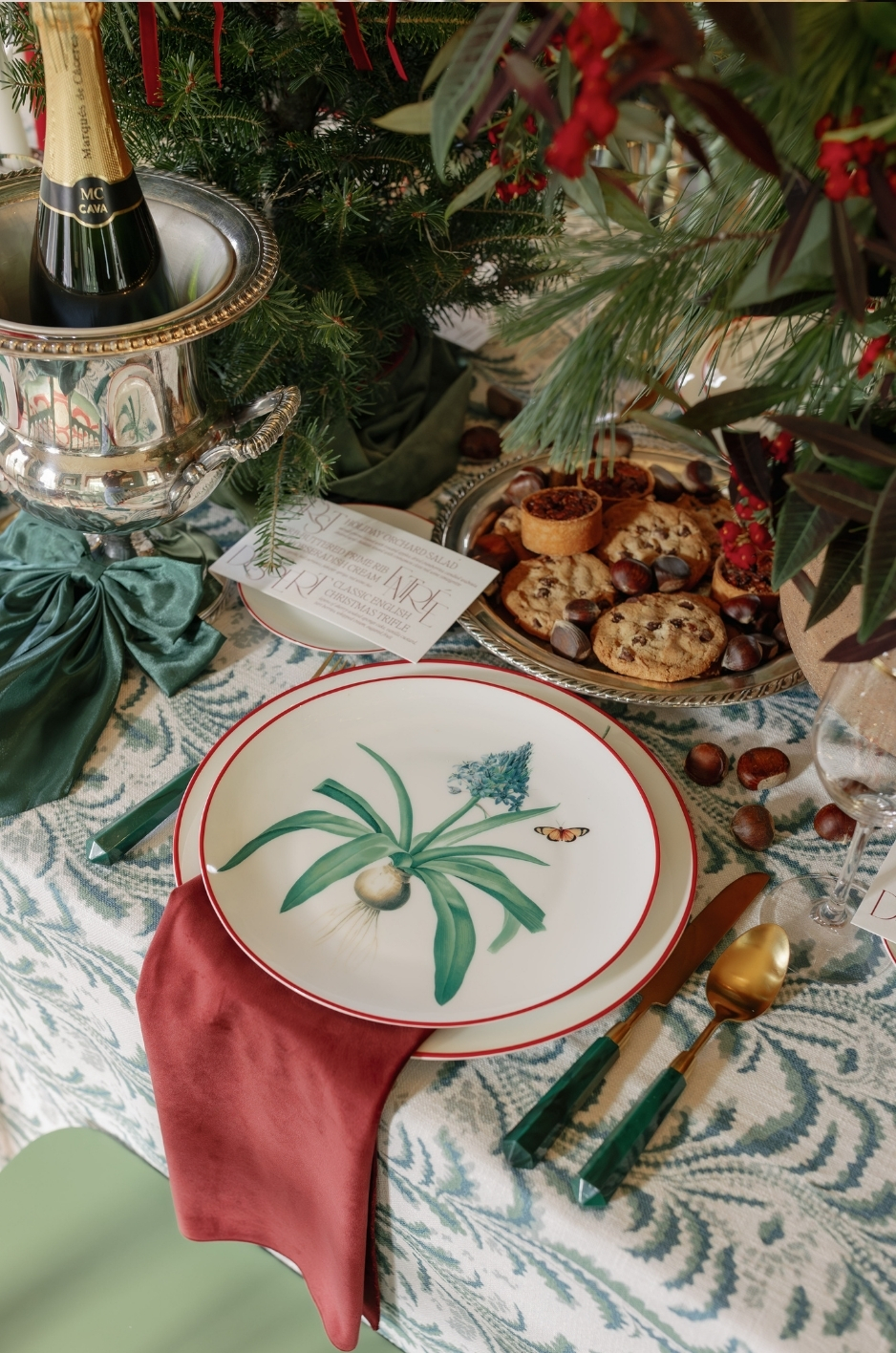
Standard rental colors work well for many weddings, but some events need a more specific approach. Custom linen colors are worth considering when the venue, floral palette, or wedding vision requires a more precise match.
When the Venue Has a Difficult Color Palette
Some venues have strong existing colors, including patterned carpet, bold wallpaper, painted trim, or distinctive stone and wood tones. When the venue guides the linen selection, planners can choose shades that balance these permanent features while still supporting the couple’s floral palette and overall wedding vision.
Custom linen colors can help bridge the gap between the couple’s desired palette and the venue’s fixed design elements. For example, a custom taupe may soften a room with warm wood, while a muted blue may balance a cool-toned interior.
When the Wedding Has a Very Specific Floral Palette
If the floral design includes specialty colors, the linens should be chosen carefully. A linen that is slightly too warm, too cool, too bright, or too muted can make the flowers appear disconnected from the rest of the tablescape.
Custom linen colors can help coordinate with unique blooms, bridesmaid dresses, stationery, or ceremony decor. This is especially useful for weddings with nuanced palettes such as mauve, dusty blue, clay, butter yellow, mushroom, or antique rose.
When Couples Want a Signature Color Story
Some couples want their wedding to feel highly personal and distinct. A custom linen color can help create a signature look that guests associate with the event. This may be inspired by a favorite flower, a meaningful location, a cultural detail, a family textile, or the wedding stationery. We cover this further in How to Create Linen Continuity Across Event Spaces.
A signature color does not need to be bold. Sometimes the most memorable palettes are subtle: a specific shade of cream, a muted garden green, a soft blue-gray, or a warm champagne tone that appears throughout the event.
When Standard Rental Colors Are Close but Not Quite Right
Sometimes a standard color is almost perfect but not precise enough. In that case, custom napkins, runners, overlays, or accent linens can solve the issue without requiring every tablecloth to be custom.
For example, if the base linen is a standard ivory, a custom sage napkin or dusty rose runner can help connect it to the floral palette. Accent pieces are often the easiest way to introduce custom color without overwhelming the room.
How to Choose Wedding Table Linen Colors Without Second-Guessing
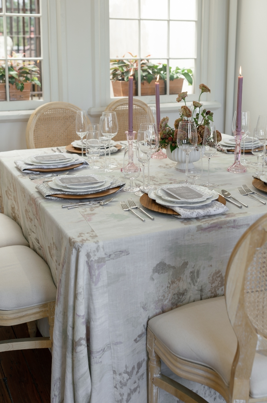
Choosing linen colors can feel overwhelming because each decision affects the next. The best way to avoid second-guessing is to follow a structured selection process.
Build a Mood Board Before Selecting Linens
A mood board helps keep the design focused. Include venue photos, floral inspiration, tableware, stationery, bridesmaid dress colors, lighting references, and any existing design details. This gives a clear visual direction before linen colors are selected.
Without a mood board, it is easy to choose colors individually that do not work together as a full event palette. A mood board shows whether the design feels cohesive.
Test Swatches in the Venue Lighting
Color changes under different lighting. Natural daylight, warm indoor lighting, candlelight, uplighting, and camera flash can all affect how linens appear. A color that looks soft in a showroom may look yellow, gray, or overly bright in the venue.
Whenever possible, test swatches in the actual reception space. If that is not possible, photograph the swatches in similar lighting conditions. This step is especially important for colors such as champagne, blush, sage, lavender, and blue, which can shift noticeably depending on light.
Compare Linens Beside Florals and Tabletop Rentals
Linens should be reviewed alongside the other table elements. A tablecloth may look beautiful on its own but clash with the charger, glassware, floral colors, or menu paper. Compare linen swatches with plates, flatware, candles, napkins, centerpieces, and stationery before finalizing the palette.
This process helps identify undertones. For example, one ivory may be warm and creamy, while another may be cool and crisp. One sage may lean gray, while another may lean yellow. These differences matter once all the details come together.
Choose One Main Linen Color and One or Two Accent Colors
A polished table design usually has one main linen color and one or two accent colors. Too many competing colors can make the tablescape feel disjointed.
The main linen color should support the overall room. Accent colors can appear through napkins, runners, overlays, menus, florals, candles, or glassware. This keeps the palette layered but controlled.
For example, the main tablecloth may be ivory, with sage napkins and blush florals. Or the main linen may be navy, with white flowers and soft gold accents.
Use Napkins, Runners, or Overlays for Accent Colors
Couples do not always need to use a bold color across every table. Accent pieces are often more effective. A colorful napkin, patterned runner, or textured overlay can introduce personality without overwhelming the reception space.
This is especially useful for couples who like bold colors but want a refined final design. Emerald napkins, terracotta runners, or dusty rose overlays can create impact while keeping the overall room balanced.
Common Linen Color Mistakes to Avoid
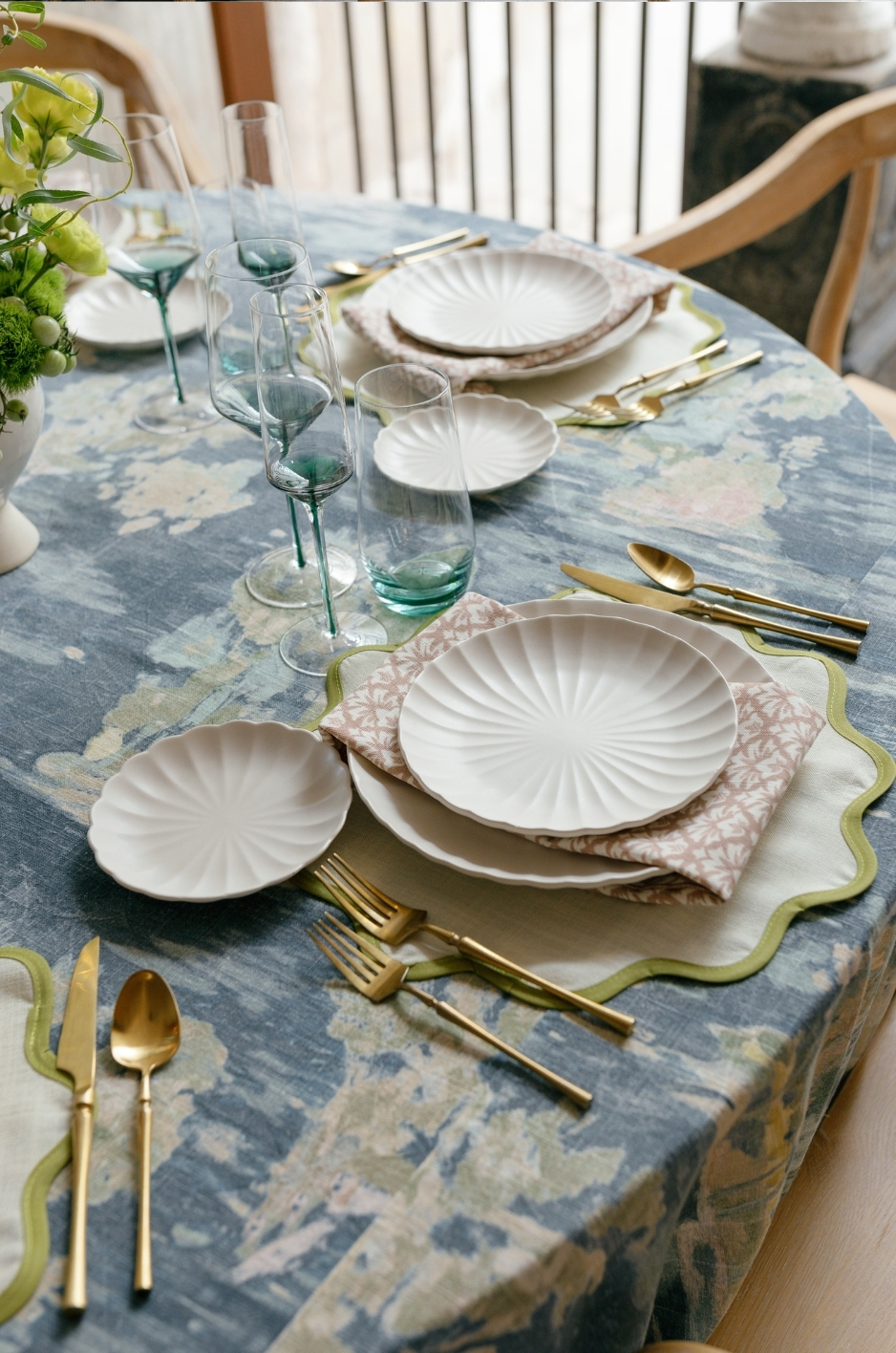
Linen color selection is easier when couples know which mistakes to watch for. Most issues happen when colors are chosen without considering the full event environment.
Choosing a Color Without Considering Venue Lighting
Lighting is one of the most common reasons a linen color does not look as expected. A color may appear perfect on a website or in a sample box but look completely different in the reception space.
Always test colors under similar lighting conditions before making a final decision. This is especially important for champagne, ivory, blush, sage, lavender, gray, and blue tones.
Matching Everything Too Literally
Wedding colors should coordinate, but they do not need to match exactly. In fact, overly literal matching can make the design feel flat. A bridesmaid dress, napkin, flower, and tablecloth in the exact same shade may look forced.
A more elevated approach is to use related tones. For example, blush can be paired with dusty rose, ivory, and mauve. Sage can be paired with olive, cream, and soft gold. This creates depth and makes the design feel more natural.
Ignoring Fabric Texture
The same color will look different across different fabrics. Satin may make a color look brighter. Velvet may make it look deeper. Linen may make it softer. Damask may make it more dimensional.
Do not choose color without choosing fabric. The two decisions should happen together.
Choosing Too Many Statement Colors
A wedding tablescape can quickly feel overwhelming if too many bold colors compete for attention. One dominant color and one or two supporting accents are usually enough.
If the couple loves several colors, assign each one a specific role. For example, use navy as the main linen color, blush in the florals, and gold in the tabletop accents. This keeps the palette organized.
Forgetting How Linens Will Photograph
Wedding linens appear in wide reception shots, detail photos, flat lays, guest table images, and candid dinner photos. A color that looks nice in person should also photograph well.
Highly reflective fabrics, very bright colors, or colors that clash with florals can create issues in photos. Testing swatches with other design elements can help prevent this.
Frequently Asked Questions
What is the most popular wedding table linen color?
Ivory, champagne, blush, sage, navy, and soft neutrals are among the most popular wedding table linen colors. Ivory and champagne are timeless choices, blush and sage work well for romantic or garden weddings, and navy is ideal for refined or formal events.
Should table linens match the wedding colors exactly?
No. Table linens should coordinate with the wedding palette, but they do not need to match every detail exactly. A layered palette usually looks more sophisticated than an exact match. Related tones, such as ivory, champagne, and soft gold, often create a more polished effect.
What linen colors work best for outdoor weddings?
Outdoor weddings often work well with sage, ivory, taupe, sand, blush, olive, cream, and soft blue. These colors coordinate naturally with greenery, sky, stone, wood, and floral elements.
What colors make a wedding reception look more luxurious?
Champagne, ivory, emerald, navy, black, burgundy, plum, and metallic-accented palettes can make a reception feel more luxurious. Fabric also matters. Velvet, satin, damask, and textured linens can elevate the same color and make it feel more refined.
Can I use bold linen colors without overwhelming the room?
Yes. Bold colors can be used successfully when balanced with neutrals. Couples can use bold linens on all tables for a dramatic effect, or they can use them more selectively on sweetheart tables, head tables, cake tables, runners, or napkins.
How do I know if a linen color will look good at my venue?
Request samples, test them in venue lighting, photograph them with the floral palette and tableware, and compare them against the venue’s existing colors. A consultation with a linen provider can also help identify which shades and textures will work best. Browse our luxury linen rentals to see these fabrics and colors in full.
Conclusion
Choosing the right wedding table linen color is one of the simplest ways to shape the mood, style, and overall elegance of your reception. From soft blush and sage to classic ivory, champagne, navy, and rich jewel tones, the best color should complement your venue, florals, lighting, and personal vision. With thoughtful color selection, layered textures, and guidance from Curated Linen Collection, your tablescape can feel polished, cohesive, and truly memorable. See how these ideas come together in our linen gallery.