
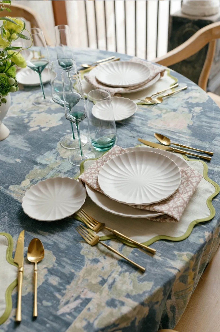
Fall wedding palettes do not have to rely on deep burgundy, dark green, or saturated rust to feel seasonal. A softer combination of oatmeal and terracotta brings autumn warmth to the table while preserving the lightness and refinement many couples, planners, and designers want for an elevated reception.
The appeal of warm neutral fall wedding linens lies in that balance. Oatmeal provides a quiet foundation with more warmth than crisp white, while terracotta introduces earthy color without dominating the room. Together, the two shades can support candlelit estate dinners, tented receptions, garden celebrations, vineyard-inspired settings, and formal indoor events without pushing the design toward an overly rustic theme.
The strongest version of this palette comes from treating oatmeal and terracotta as a starting point rather than two colors that must appear everywhere. Texture, undertones, floral choices, tableware, lighting, and the proportion of each shade determine whether the final tablescape feels soft, sophisticated, and connected.
Why Oatmeal and Terracotta Work for Fall Wedding Tables
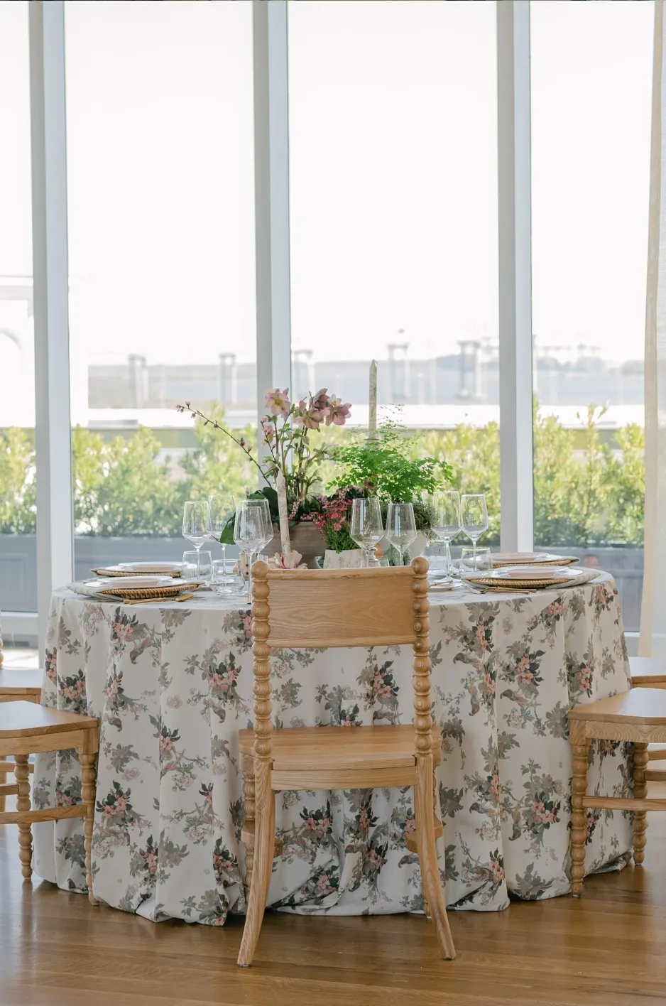
Oatmeal and terracotta occupy different positions within the same warm spectrum. One is quiet and grounding; the other is richer and more expressive. That natural difference makes it possible to create contrast without introducing a color that feels disconnected from the rest of the reception.
Oatmeal Creates a Softer Neutral Foundation
Oatmeal sits comfortably between ivory, beige, wheat, and light taupe. Compared with stark white, it introduces warmth before any flowers, candles, menus, or place settings are added.
That warmth is particularly useful in fall because it connects easily with wood tones, stone, dried grasses, warm metals, muted greenery, and the softer natural light associated with many autumn celebrations. It also leaves enough visual space for the other components of the table to carry personality.
An oatmeal-inspired tablecloth can therefore serve as the room’s anchor. Instead of demanding attention, it provides a consistent background against which terracotta napkins, patterned runners, floral arrangements, or specialty tables can become more noticeable.
Terracotta Adds Seasonal Color Without Becoming Literal
Terracotta brings the earthier side of fall into the palette. Depending on the exact shade, it can lean toward clay, brick, cinnamon, muted rust, or dusty orange.
The key is restraint. A softer clay or terracotta shade tends to integrate more easily with oatmeal than a highly saturated orange. Using the color in smaller areas also gives it greater definition. Napkins, runners, patterned textiles, pillows, or a feature table can carry enough terracotta to establish the autumn direction without covering every surface in the same hue.
For broader ways to work with earthy shades, wine tones, harvest neutrals, and layered seasonal textiles, fall and winter wedding linen ideas can provide additional direction. The current seasonal guidance specifically includes oatmeal among refined harvest neutrals and terracotta among useful fall accent tones.
Let One Color Lead
A balanced palette usually benefits from hierarchy. For most oatmeal-and-terracotta tables, oatmeal works well as the dominant shade and terracotta as the secondary color.
That could mean an oatmeal-inspired tablecloth at every guest table with terracotta appearing through napkins. On long tables, a warmer runner might provide the accent instead. At a sweetheart or cake table, the relationship could reverse, allowing the richer shade to become more visible in a controlled focal area.
The objective is consistency, not equal distribution. When both colors compete for the same amount of attention, the table can become heavier than intended.
Build the Palette Beyond Oatmeal and Terracotta
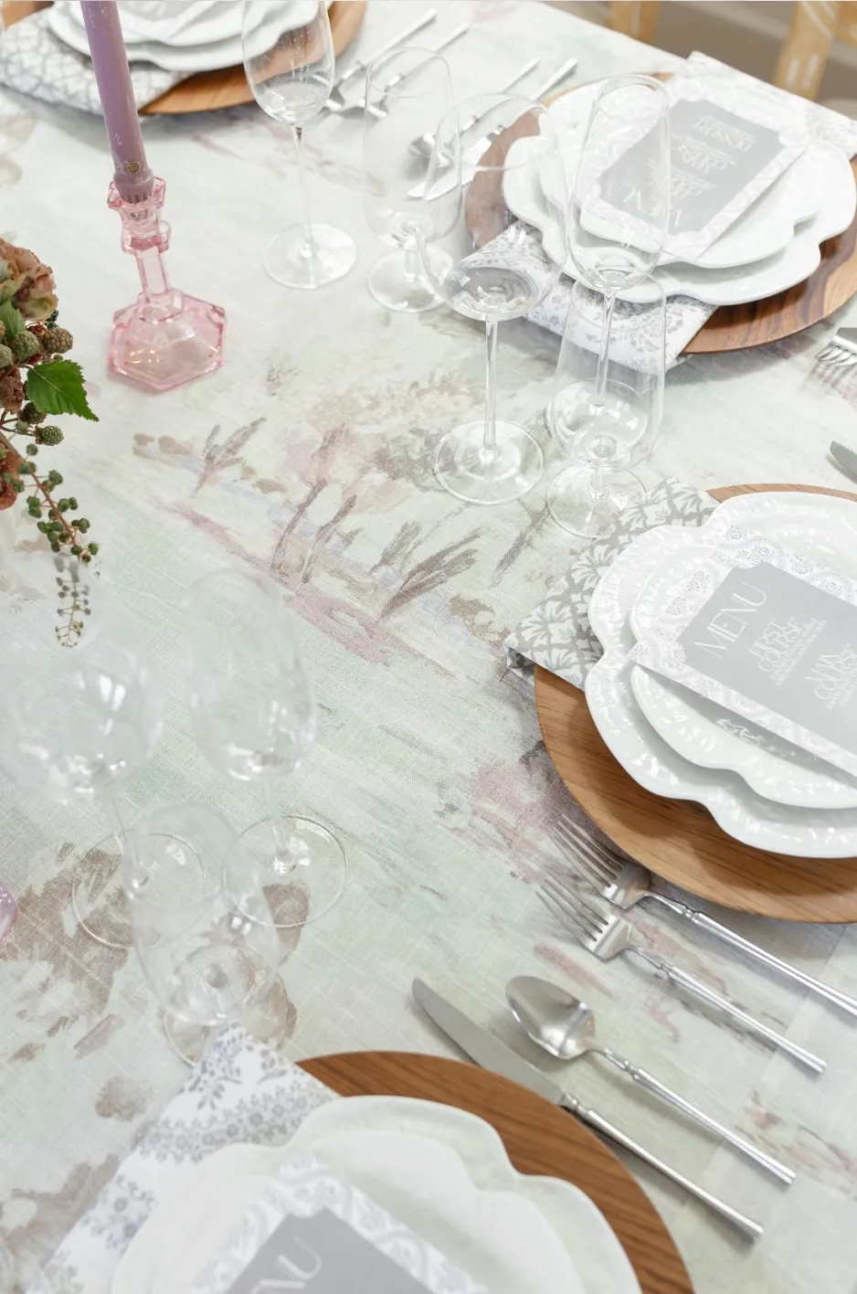
A two-color concept becomes more dimensional when supporting tones are introduced carefully. Rather than adding several unrelated fall shades, choose colors that either soften the palette, deepen it, or create a small amount of contrast.
Add Cream, Ivory, or Champagne for Lightness
Warm pale shades prevent oatmeal and terracotta from becoming visually dense. Cream-colored plates, ivory paper goods, pale florals, or softly luminous textiles can create breathing room across the table.
These tones are especially helpful when terracotta appears in larger areas. If a warm runner or patterned linen already carries substantial color, pale place settings give the eye quieter areas to rest.
The same approach can work at the room level. Oatmeal guest tables might be paired with ivory ceremony textiles or cream-colored details at the bar, cake display, or lounge so the wedding remains light even as autumn tones repeat throughout the setting.
Use Olive or Muted Green as a Natural Bridge
Muted greens sit comfortably beside both oatmeal and terracotta because they introduce contrast without shifting the palette toward a completely different mood.
Olive is particularly effective when greenery is already prominent in the floral design or venue surroundings. Rather than adding several additional green décor pieces, a small repetition through napkins, patterned accents, or foliage can be enough to establish the relationship.
Softer sage can create a lighter interpretation, while deeper olive gives the palette greater autumn depth. In either case, the green should remain supporting rather than becoming a third dominant color.
Introduce Deeper Warm Tones Selectively
Cognac, cinnamon, muted copper, cocoa, dusty rose, or a restrained wine tone can create depth when an oatmeal-and-terracotta palette needs another layer.
These colors are most useful on evening tables or in spaces with substantial candlelight, dark architecture, or rich woodwork. They can appear through glassware, small textile details, florals, or stationery rather than another full tablecloth.
Keeping the additional shade closely related to the core palette preserves cohesion. The table should still read primarily as oatmeal and terracotta rather than as a collection of every autumn color.
Decide Which Linen Piece Should Carry Each Color
Color selection becomes easier once every textile has a defined job. The tablecloth, runner, napkin, and specialty linen do not all need to contribute the same amount of color or texture.
Make the Guest-Table Linen the Foundation
For a soft, warm-neutral reception, the guest-table cloth is often the logical place for oatmeal. Its larger surface area establishes the dominant tone across the room and creates continuity from table to table.
A relatively restrained base is also flexible. It allows the floral designer, stationery designer, and tabletop selections to introduce detail without competing against a highly expressive foundation.
If the tablecloth itself has an important pattern or texture, however, the surrounding elements should become quieter. The linen needs enough visible surface for its character to register.
Use Napkins for Repeated Terracotta Accents
Napkins can make a surprisingly strong color statement because the shade repeats at every place setting. A terracotta-inspired napkin against an oatmeal tablecloth creates a consistent rhythm without turning the entire table orange.
Placement changes the effect. A napkin centered on the plate creates a defined block of color at each seat, while one positioned beside the plate places terracotta directly against the oatmeal base. A looser fold feels softer and more relaxed; a structured presentation creates cleaner geometry.
For long reception tables, repeating the same napkin treatment can provide enough terracotta that an additional colored runner is unnecessary.
Reserve Stronger Linen Treatments for Feature Tables
The sweetheart table, cake table, welcome table, escort display, or another focal surface can carry a more expressive interpretation of the palette.
This might mean using a richer warm textile, a pattern incorporating clay and neutral tones, or an overlay with greater texture. Because the application is limited, it gives the reception a focal point without changing the calm character of the guest tables.
Curated Linen Collection currently offers table linens alongside runners, napkins, pillows, specialty overlays, linen, velvet, and custom blends, giving planners several textile formats through which to distribute a palette.
Create Depth Through Texture, Not Extra Color
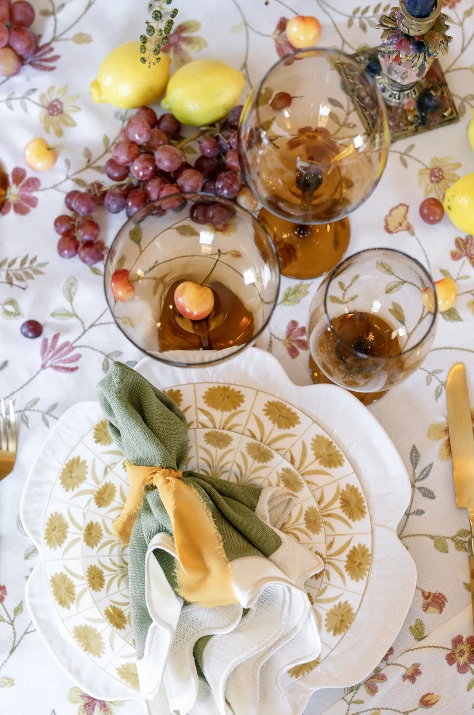
Warm neutrals can appear flat when every textile has the same finish. Texture solves that problem by creating visible differences even when the colors remain closely related.
Start With a Matte or Woven Neutral
An oatmeal-inspired linen with a visible weave or understated surface variation can make a monochromatic foundation feel intentional rather than plain.
Textured neutrals are especially useful when the florals or tableware will provide the stronger visual statements. The fabric still contributes character, but it does so through surface and drape instead of another color.
This approach also keeps the palette flexible across different table shapes. The same warm neutral can appear cohesive on rounds, long banquet tables, and specialty surfaces even when the styling above it changes.
Contrast the Base With a Different Finish
A smoother napkin against a more tactile tablecloth creates distinction without requiring high color contrast. The reverse can work equally well: a clean, restrained foundation may support a textured or patterned terracotta-inspired accent.
A gently lustrous element can also respond differently to evening lighting than a matte textile. Used selectively, that variation adds dimension around candlelight without making every component reflective.
Edit Before Adding Another Layer
Fall styling can invite excess layering. Runners, overlays, textured napkins, patterned china, colored glassware, flowers, menus, and candles can all be beautiful individually, but a warm-neutral design is strongest when there is enough open visual space for each choice to register.
Before adding another textile, identify what the table actually lacks. If the terracotta napkin already creates sufficient color, a runner may not be necessary. If a patterned cloth leads the design, an additional overlay may conceal the feature that made the linen worth choosing.
Coordinate the Palette With Florals and Tableware
Linens should be evaluated as part of the complete tablescape rather than selected in isolation. Oatmeal and terracotta become more convincing when nearby materials repeat their undertones without matching them exactly.
Build Floral Color Around Related Undertones
Florals can connect to terracotta through related shades such as peach, apricot, cinnamon, rust, toffee, blush, or deeper wine tones. Cream and ivory blooms can return lightness to the arrangement, while olive or muted foliage can connect the floral design to the earthier side of the palette.
Exact color matching is unnecessary. In fact, slight variation usually creates more depth than using one terracotta shade across textiles, flowers, candles, and paper.
The important relationship is undertone. A very pink clay textile and a strongly orange floral arrangement may feel less connected than two different shades that share the same muted, warm character.
For a more detailed approach to balancing textiles with centerpieces, place settings, lighting, and different table shapes, see how to coordinate fall wedding linens with florals and tableware. The current guidance also recommends evaluating linen and floral undertones together rather than relying on exact matching.
Keep Tableware Quiet or Deliberately Contrasting
Oatmeal and terracotta already create a noticeable warm color story, so tableware does not need to introduce another major palette.
Cream or ivory plates can keep the setting soft. Earth-toned ceramics can strengthen the organic quality of the design, while transparent glassware provides visual lightness. Amber or smoke-colored glass can deepen the fall effect when used selectively.
Metal finishes should also be edited. Warm brass, aged gold, copper-inspired tones, or polished silver can each work depending on the venue and desired formality, but using several competing metals may reduce the clarity of the palette.
Let Stationery Create a Clean Layer
Menus, place cards, and other paper details can provide useful contrast against warm linens. Cream, soft white, or pale neutral paper keeps text legible and prevents the setting from becoming overly tonal.
For more color, terracotta can appear through typography, borders, wax seals, or a restrained motif rather than a fully colored card placed directly against the same shade of napkin.
The paper should remain visually distinct from the textile beneath it. Cohesion is valuable, but important information still needs to be easy for guests to see and read.
Adapt the Palette to the Wedding Setting
Oatmeal and terracotta are versatile because their proportions can change with the architecture and atmosphere of the venue. A formal estate may call for a different interpretation than a tented garden or a wood-rich reception space.
Keep Estate and Ballroom Tables More Restrained
In formal interiors, an oatmeal base can soften ornate architecture without competing with it. Terracotta can then appear primarily through napkins, flowers, or a limited number of feature linens.
Adding champagne, ivory, or restrained metallic details can increase formality while keeping the earthy warmth intact. Cleaner linen folds and tailored proportions also help the palette feel polished rather than rustic.
Let Tented and Garden Receptions Feel Lighter
Natural light tends to make every textile more visible, so outdoor-adjacent settings often need less ornamentation.
A warm neutral cloth, terracotta napkin, natural greenery, and a few related floral tones may provide enough design information. If pattern is introduced, consider limiting it to a runner, napkin, or selected focal table instead of repeating it across every surface.
As the event transitions into evening, candlelight can deepen the warmer tones, making the same palette feel richer without requiring a separate night-time color scheme.
Balance Warm Architecture With Softer Linens
Barns, vineyards, private properties, and venues with exposed wood or warm stone already contribute substantial brown, gold, and earthy color.
In these spaces, oatmeal is particularly useful because it separates the tables from the architecture without creating a stark contrast. Terracotta should then be calibrated against the venue itself. If the surrounding wood is strongly orange or red, a quieter clay accent may provide better separation than a similarly saturated rust tone.
The goal is to complement the setting rather than reproduce every color already present in it.
Keep Warm Neutral Fall Wedding Linens Cohesive
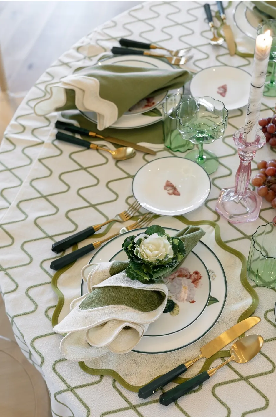
A successful palette needs to work from the first guest table to the final specialty surface. That does not require making every table identical; it requires establishing a few rules and applying them consistently.
Define the Color Hierarchy Before Selecting Pieces
Begin by deciding which shade is dominant, which is secondary, and which colors are supporting.
For example:
Oatmeal: dominant foundation
Terracotta: primary accent
Ivory or cream: light supporting neutral
Olive: small natural accent
Cognac or wine: optional depth for evening details
Oatmeal: dominant foundation
Terracotta: primary accent
Ivory or cream: light supporting neutral
Olive: small natural accent
Cognac or wine: optional depth for evening details
This hierarchy makes later decisions easier. When another attractive shade appears during planning, it can be evaluated according to whether it strengthens one of those roles or creates an unnecessary new direction.
Review the Palette Under the Event’s Lighting
Neutral colors are particularly sensitive to undertones. A fabric that looks beige in one setting may appear warmer, grayer, or more yellow in another. Terracotta can likewise move toward orange, red, brown, or pink depending on its surroundings.
Current fall-table guidance on the site recommends evaluating fabrics in conditions similar to the reception because natural and artificial lighting can change how undertones and finishes appear.
When possible, evaluate the tablecloth, napkin, florals, and place setting together rather than approving each from separate digital images. Photographing the combination can provide another useful perspective on contrast and color balance.
Repeat the Palette Without Duplicating Every Table
Round guest tables may use an oatmeal foundation and terracotta napkin, while a long head table could introduce a patterned runner within the same family. A cocktail table might use the stronger shade, and the cake display could return to the quieter neutral.
Shared colors create the connection even when the format changes. This approach is often more interesting than applying the identical textile combination to every surface.
Translate the Palette Into the Current Linen Collection
When selecting specific rental pieces, focus first on color family, finish, scale, and how each textile will function within the full table design.
Explore Warm-Neutral Foundations
The current collection includes several solid and patterned neutral directions. Latte Tuscany is described as a solid neutral, while White Sand Tuscany is also identified as a solid neutral option. Other current collection names in the broader neutral family include Sawyer Mushroom, Seabrook Fawn, Cream Casablanca, Taupe Stripe, and Shell Tuscany.
These should be evaluated as individual fabrics rather than assumed to be exact substitutes for a specific oatmeal reference. Use the desired undertone, the venue lighting, and the rest of the tablescape to narrow the right foundation.
Browsing the linen gallery can also help planners see how neutral, ochre, olive, mushroom, fawn, and other textiles behave in styled settings. The gallery currently includes combinations such as Charlotte Mushroom with Seabrook Fawn and Eloise Ochre with Sawyer Olive.
Use Ochre and Cognac for a Related Warm Accent
The collection does not need to contain a linen literally named “Terracotta” for the palette to work. Related warm families can create the same design direction when their undertones suit the event.
Eloise Ochre is a multicolor botanical pattern with lemons and florals, while Italian Flowers Cognac is a patterned linen with a subtle metallic element. These are different interpretations of warmth rather than interchangeable terracotta solids, so their suitability depends on whether the design calls for pattern, movement, or a more restrained accent.
For a broader view of available neutrals, solids, patterns, and coordinating options, planners can explore the current luxury linen rentals collection.
Consider Custom Design When the Shade Is Highly Specific
Some wedding palettes begin with an exact textile, stationery color, floral reference, or custom motif that cannot be approximated comfortably with an existing linen.
Curated Linen Collection supports custom-printed projects from pattern ideation and color selection through fabric printing, cutting, sewing, and finishing. A custom direction can therefore be considered when the exact oatmeal-to-terracotta relationship is central to the event’s visual identity rather than simply one possible palette.
Frequently Asked Questions
What Colors Go With Oatmeal and Terracotta Wedding Linens?
Cream, ivory, champagne, olive, muted sage, cognac, cocoa, dusty rose, and restrained wine tones can all support an oatmeal-and-terracotta palette. Limit the number of supporting shades so the two main colors remain easy to recognize.
Should Terracotta Be the Tablecloth or the Accent Color?
Either approach can work, but using terracotta as an accent generally creates a softer result. An oatmeal-inspired tablecloth with terracotta napkins or a runner keeps the reception light while still establishing clear fall color. A full terracotta tablecloth can be effective on selected focal tables when a richer look is desired.
Can Warm Neutral Fall Wedding Linens Work for a Formal Wedding?
Yes. Formality depends on more than color. Tailored linen proportions, restrained pattern, polished place settings, structured florals, intentional lighting, and carefully selected finishes can make oatmeal and terracotta appropriate for formal estates, ballrooms, private clubs, and evening receptions.
Do Oatmeal Linens Have to Match Ivory Plates and Flowers?
No. Slight differences among oatmeal, cream, ivory, sand, and champagne can create useful depth. Focus on compatible undertones rather than trying to make every pale element exactly the same color.
How Can I Keep a Terracotta Wedding Palette From Looking Too Rustic?
Use terracotta selectively, choose refined textile finishes, limit overtly rustic decorative motifs, and introduce cleaner elements such as structured place settings, tailored linens, restrained florals, or polished glassware. Oatmeal also helps soften the earthy quality of terracotta so the palette can move toward a more elevated, contemporary direction.
Should I Choose Linens Before Florals?
The two should be developed in coordination whenever possible. The linen covers a large portion of the table, so its undertone affects how flowers and place settings appear beside it. Comparing textile samples with proposed floral colors and tabletop materials can reveal combinations that are difficult to judge separately.
Create a Fall Palette With Warmth and Restraint
Oatmeal and terracotta offer a softer approach to autumn wedding design. Oatmeal establishes warmth without the starkness of bright white, while terracotta adds enough earthy color to make the season visible. The palette becomes more dimensional through texture, restrained supporting shades, thoughtful floral relationships, and a clear hierarchy between foundation and accent textiles.
The most successful warm neutral fall wedding linens do not depend on using more color or more layers. They depend on selecting the right undertones, deciding where each textile should lead, and allowing the full table to feel connected rather than crowded.
Curated Linen Collection offers patterned and solid linens, runners, napkins, specialty overlays, custom-printed possibilities, and nationwide shipping for event teams planning celebrations across the country. Explore the collection to begin narrowing the right warm-neutral direction, or contact the design team for guidance on an oatmeal-and-terracotta-inspired linen plan.