A multi-day corporate event rarely has just one visual identity. The atmosphere may begin with polished daytime programming, transition into networking receptions and hosted dinners, and culminate in a formal closing gala. While each experience serves a different purpose, the event should still feel connected from beginning to end.
Linens can help create that continuity. Rather than repeating the same table treatment throughout the schedule, planners can use color, texture, pattern, and finish to create an evolving design language. A restrained daytime palette may become deeper after sunset. A subtle motif introduced during an early reception may return more prominently at the gala. Textural details can become progressively richer as the event moves toward its most formal moments.
For a fall corporate event, this progression creates an opportunity to introduce seasonal depth without relying on literal autumn themes. The result can feel cohesive, sophisticated, and intentionally designed across every stage of the experience.
Establish a Linen Direction That Can Evolve Across Multiple Days
A multi-day event benefits from a visual foundation that is recognizable without becoming repetitive. The first linen decisions should therefore establish a core language that can adapt to different spaces, formats, and levels of formality.
Instead of designing every event segment independently, planners can identify a small group of colors, textures, and visual references that remain present throughout the schedule. The way those elements are expressed can then change as the event develops.
Begin With a Consistent Color Foundation
A controlled color palette gives the event a visual anchor.
For fall, this might begin with sophisticated neutrals such as ivory, mushroom, taupe, warm gray, charcoal, or muted green. Richer colors can be held in reserve for later experiences, allowing the palette to gain depth gradually.
The same colors do not need to appear in equal proportions throughout the event. A muted green might serve as a small accent during daytime sessions, become more visible during dinner, and deepen into forest or emerald tones at the closing gala.
This approach creates connection without making each table setting feel identical.
Use Texture and Pattern as Connecting Elements
Continuity can also come from repeated textile characteristics.
A subtle woven texture introduced during the first day may return later in a more dimensional form. A restrained pattern used on napkins during a hosted lunch could appear as a more prominent tablecloth or focal textile at an evening event.
These relationships do not need to be obvious. In luxury event design, the most effective connections are often discovered gradually rather than announced immediately.
Repeating a motif, finish, or material quality gives the event a visual thread that remains recognizable even as the individual linen treatments change.
Allow Each Event Phase to Have Its Own Character
Cohesion should not eliminate distinction.
A breakfast session, executive dinner, cocktail reception, and closing gala should not all create the same emotional or visual impression. Each experience can respond to its purpose while remaining connected to the larger design direction.
Daytime spaces might feel lighter and more restrained. Evening receptions can introduce stronger color and contrast. Formal dinners and the closing gala can carry greater texture, pattern, or sheen.
The objective is not sameness. It is progression.
Keep Daytime Corporate Settings Refined and Restrained

Daytime programming typically places greater emphasis on conversation, presentations, meetings, and networking. Linens should help establish a polished environment without drawing attention away from the purpose of the gathering.
For a fall event, restraint does not need to feel plain. Subtle seasonal color and sophisticated texture can create depth while maintaining a professional atmosphere.
Build Around Sophisticated Neutrals and Muted Fall Tones
Warm ivory, taupe, mushroom, stone, charcoal, muted olive, and soft gray can create a refined daytime foundation.
These colors work particularly well because they provide enough warmth to suggest the season without creating an overt fall theme. They can also accommodate a wide range of florals, tabletop finishes, and corporate visual elements.
A quieter foundation gives planners greater flexibility later in the schedule. Deeper wine, forest, navy, chocolate, or plum tones can be introduced gradually without feeling disconnected from the earlier design.
Introduce Texture Without Overwhelming the Space
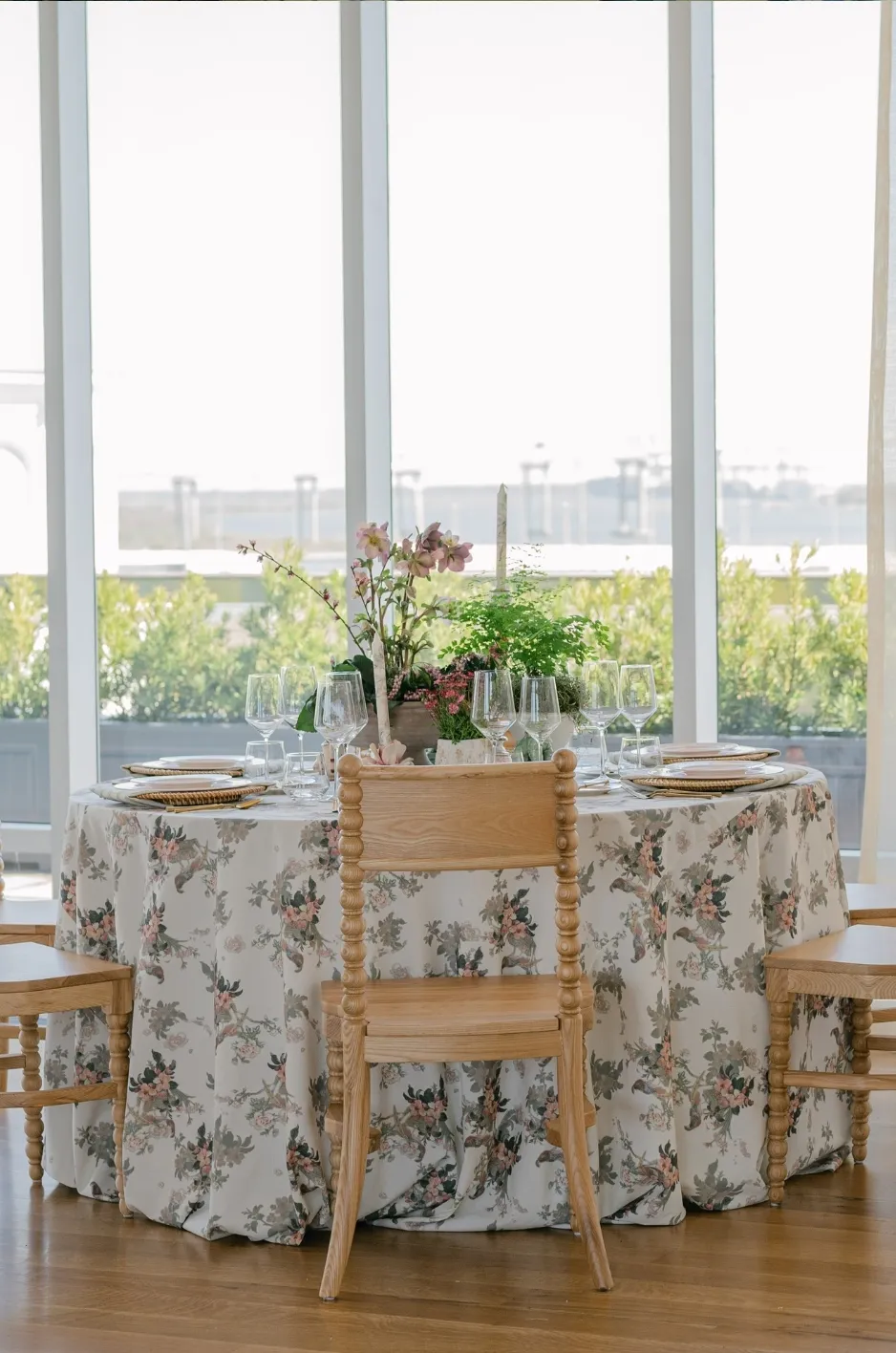
Daytime settings benefit from texture that reveals itself at close range rather than commanding the room.
Tonal weaves, subtle dimensional patterns, refined napkin textures, or softly varied surfaces can prevent neutral linens from appearing flat while preserving a clean visual environment.
The effect should feel considered rather than decorative for its own sake.
Texture is particularly valuable in fall because it can introduce seasonal warmth even when the palette remains understated.
Reference the Brand Without Making the Table Feel Promotional
Corporate events often need some relationship to the organization’s visual identity, but that connection does not need to depend on overt logos.
Brand-adjacent colors can be incorporated through linens or napkins. A familiar graphic quality can influence a custom pattern. A signature color can appear subtly within an otherwise neutral palette.
The strongest corporate tablescapes often interpret the brand rather than reproduce it literally.
This approach preserves the sophistication of the event while still allowing the environment to feel specific to the organization hosting it.
Add Greater Depth for Networking Receptions and Hosted Dinners
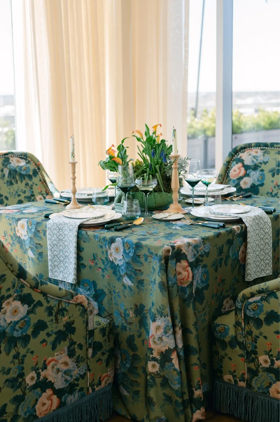
As the event moves beyond daytime programming, the linen design can become richer and more expressive. Networking receptions, hosted dinners, and social gatherings offer a natural opportunity to introduce deeper color, stronger texture, and more noticeable textile details.
Introduce Deeper Accent Colors
A restrained daytime palette can begin to evolve through accents. Wine, forest green, navy, chocolate, plum, aubergine, or deeper charcoal can appear through napkins, runners, selected cocktail tables, or specialty surfaces.
These colors do not need to replace the existing foundation. Instead, they can build on it. For example, a taupe daytime palette may transition into chocolate and champagne for dinner. Muted green used earlier in the day can deepen into forest tones for an evening reception.
The relationship between the two phases should remain visible even as the atmosphere changes.
Increase Texture and Material Contrast
Evening settings can support stronger contrasts between fabrics and finishes.
A smooth tablecloth might be paired with a dimensional napkin. A woven linen may sit alongside softly reflective tabletop elements. Patterned textiles can begin to appear more noticeably without dominating the setting.
This gradual increase in texture helps communicate that the event has moved into a more social and elevated phase. Lighting also amplifies these material differences, particularly as candlelight or directional event lighting replaces daylight.
Let Smaller Event Areas Carry More Personality
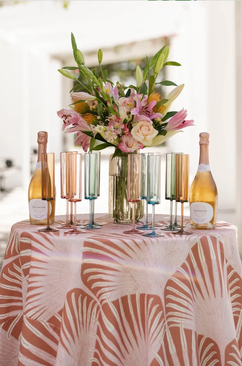
Cocktail tables, bars, hosted dinner tables, and lounge-adjacent surfaces provide opportunities for more expressive linen treatments.
Because these areas typically appear in smaller numbers than the main daytime tables, they can accommodate stronger pattern, deeper color, or richer texture without overwhelming the overall design.
A patterned cocktail linen might echo a motif introduced earlier in the day. A bar could introduce a deeper version of the established color story. A hosted dinner can carry more layered textile detail than the meeting environment that preceded it.
These shifts help different spaces feel intentionally designed for their purpose.
Use Linen to Signal the Transition Into the Closing Gala
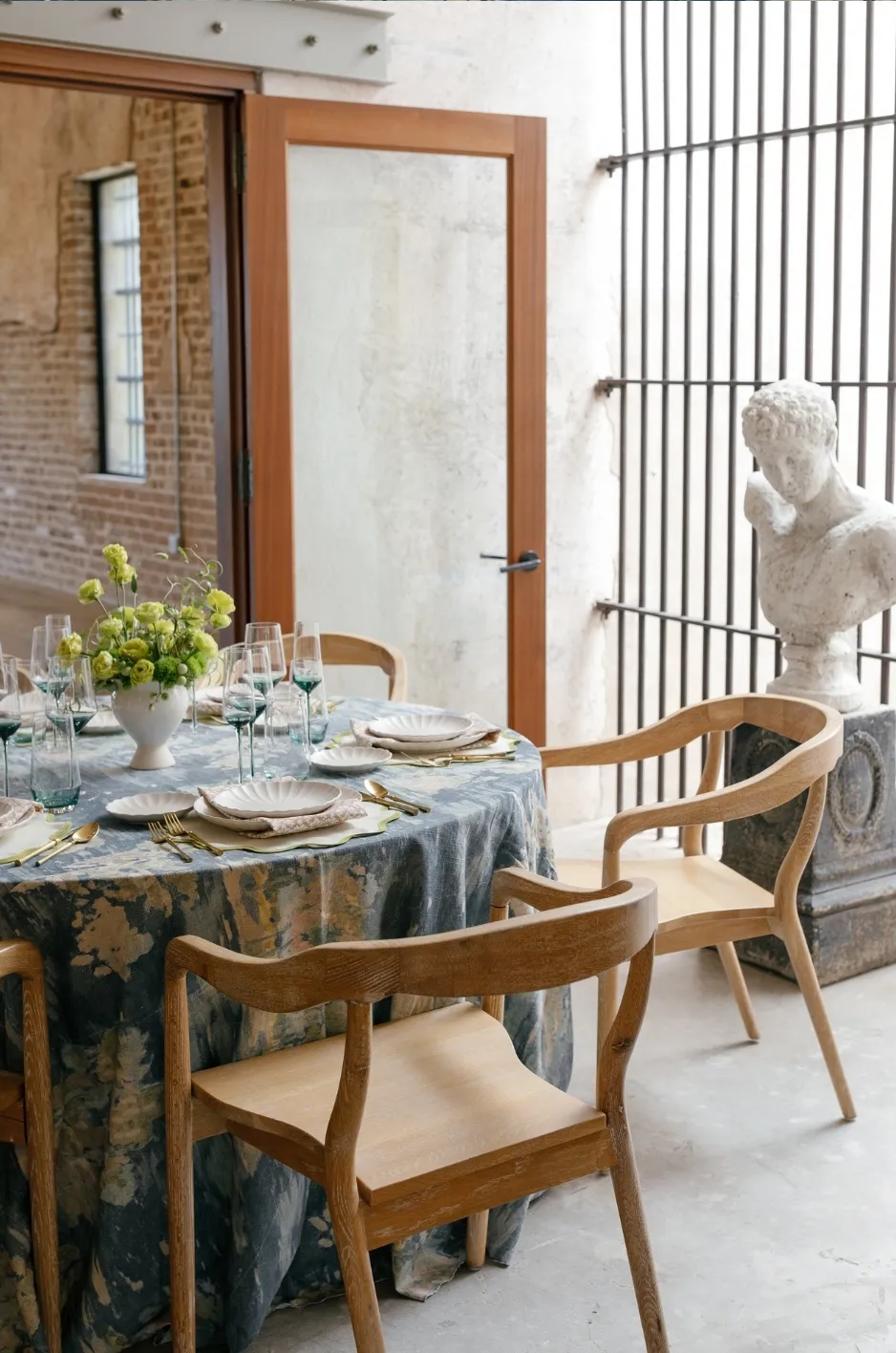
The closing gala should feel like the culmination of the multi-day experience.
Its design can be more dramatic, formal, and immersive than earlier event phases, but it should still feel connected to the visual language already established.
Linens can make that transition clear.
Deepen the Existing Color Story
Rather than introducing an entirely new palette, the gala can intensify colors already seen earlier in the event.
Soft green can become forest or emerald. Muted berry can deepen into wine or burgundy. Warm neutrals can shift toward chocolate, champagne, or charcoal.
This progression creates a natural sense of escalation.
Guests may not consciously identify the repeated color relationships, but the gala will feel connected to what came before rather than appearing as a separate event.
Introduce More Expressive Pattern and Finish
The gala provides greater freedom to use patterned linens, dimensional textiles, or controlled sheen.
A motif that appeared subtly during an earlier reception can return as a more prominent table treatment. A previously matte palette can gain luminosity through satin-like or softly reflective surfaces. Tonal patterns can become more visible under evening lighting.
The strongest gala designs typically allow one or two textile ideas to become more expressive rather than introducing several unrelated statements at once.
Create a Stronger Sense of Occasion
The closing event should feel ceremonial.
Richer linens can help establish that change in atmosphere before guests even reach their seats. Deep color, heightened texture, patterned focal tables, and carefully controlled reflective surfaces can all contribute to a more formal setting.
The distinction does not need to depend on excess.
A quieter design executed with greater depth and precision can often feel more elevated than one that introduces every decorative option at once.
Create Visual Continuity Without Repeating the Same Linen
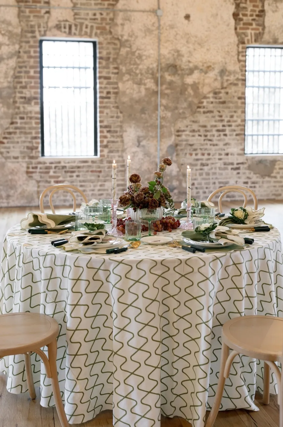
Using the same linen throughout a multi-day event may create consistency, but it can also make each experience feel visually static.
A more layered approach creates continuity through shared details rather than exact repetition.
Carry One Color Through Multiple Treatments
One color can appear differently throughout the event.
A muted green may begin as an accent napkin, become a tonal tablecloth at dinner, and return as a deeper patterned linen at the closing gala.
A champagne tone might appear as a daytime neutral, an evening runner, and a supporting color within a custom gala print.
This gives the design continuity while allowing each event phase to feel new.
Repeat a Motif at Different Intensities
Pattern can also evolve.
A motif might first appear subtly through a small textile accent. Later, it may become more visible on cocktail tables or dinner linens. At the gala, the same design could appear on a focal table or as a custom statement textile.
The repeated idea creates recognition, while the changing scale or placement prevents redundancy.
Reinterpret Familiar Textures
Texture can provide another subtle connection.
A woven quality used in daytime tablecloths might return through napkins later in the schedule. A softly reflective surface introduced at dinner might become more pronounced at the gala.
These textural relationships help individual event phases feel related even when the actual linens differ.
Let Fall Influence the Event Through Material Depth
A fall corporate event does not need leaves, pumpkins, or predictable orange-and-brown palettes to feel seasonal.
The season can be expressed more effectively through richer surfaces, sophisticated color, and layered material relationships.
Move Beyond Literal Autumn Color Palettes
Fall offers a broad spectrum of sophisticated tones.
Burgundy, merlot, plum, deep green, midnight blue, chocolate, charcoal, champagne, taupe, and warm ivory can all establish seasonal character without becoming thematic.
These colors can also be combined with corporate colors rather than replacing them.
A brand built around blue, for example, might move toward deeper navy for evening events. A green identity could shift toward olive or forest. A more neutral corporate palette can gain seasonal warmth through champagne, mushroom, or chocolate.
Use Texture to Establish Seasonal Warmth
Texture is one of the strongest ways to communicate fall without relying on obvious seasonal references.
Woven fabrics, tonal patterns, dimensional surfaces, layered napkins, and refined overlays can create visual warmth even when the palette remains relatively neutral.
The effect becomes particularly compelling as the event transitions into evening, when directional lighting and candlelight reveal subtle differences in textile surface.
Balance Richness With Corporate Sophistication
Seasonal styling should never overpower the purpose of the event.
A corporate audience often benefits from a design that feels confident and elevated rather than heavily themed. Rich colors can be balanced by quieter supporting linens. Strong patterns can be limited to focal areas. Dimensional fabrics can be paired with simpler tabletop selections.
Fall should influence the atmosphere rather than dictate every element.
Coordinate Linens With the Changing Event Environment
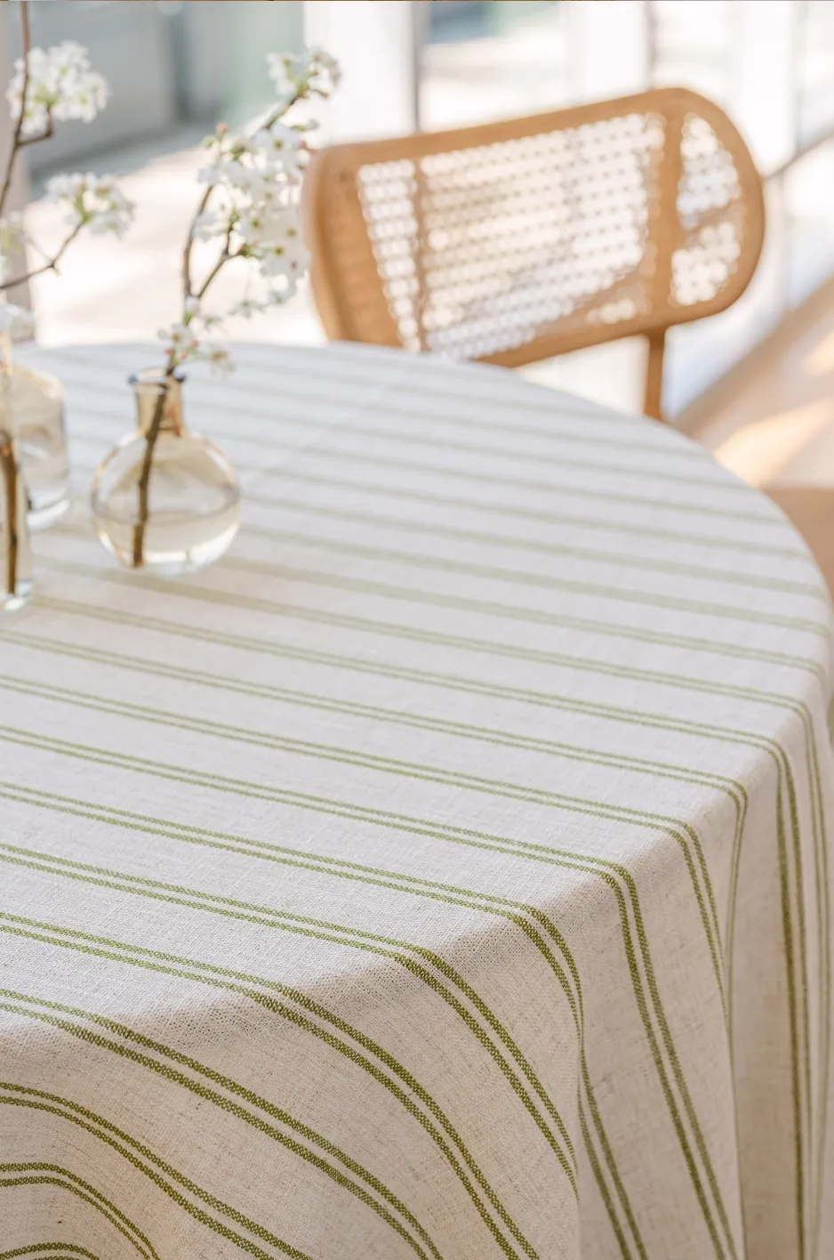
A multi-day corporate event may move through conference rooms, reception spaces, private dining areas, outdoor settings, ballrooms, and other environments.
The linen direction should adapt to these changes while preserving the larger visual story.
Respond to Different Spaces Within the Venue
Not every room requires the same degree of textile impact.
Meeting spaces may benefit from clean, understated treatments. Reception areas can support stronger accents. A private dinner may allow more textural detail, while a ballroom can accommodate a broader visual statement.
Venue architecture should also influence the linen selection.
A highly detailed interior may require more restrained fabrics. A minimalist or tented setting may give textiles more responsibility for establishing color and atmosphere.
Consider the Shift From Daylight to Evening Lighting
Lighting can dramatically change the way linen appears.
Colors that feel soft in daylight may become deeper at night. Woven patterns can gain definition as shadows develop across the fabric. Reflective surfaces can become more prominent under chandeliers or candlelight.
This makes the transition from daytime to evening particularly useful in a multi-day fall event.
A linen direction can begin with quieter materials that perform well in daylight and gradually incorporate deeper or more luminous surfaces as the schedule moves later.
Coordinate With Florals and Tabletop at Each Stage
The role of linen should change according to the other design elements surrounding it.
Daytime tables may use restrained florals and simple tabletop pieces, allowing a subtle textile texture to provide interest. A gala may introduce more elaborate flowers, patterned china, metallic details, or colored glassware, which could call for either a stronger textile statement or a quieter foundation.
Each event phase should be considered as a complete composition.
The linen does not need to carry every visual idea on its own.
Frequently Asked Questions
Should the same linens be used throughout a multi-day corporate event?
Not necessarily. Using different linens can help distinguish individual event phases while preserving continuity through shared colors, patterns, textures, or finishes.
The goal is for the treatments to feel related rather than identical.
How can linen design change from daytime sessions to evening events?
Daytime settings can begin with restrained colors and subtle textures, while evening events introduce deeper tones, stronger material contrast, pattern, or controlled sheen.
The progression should feel gradual so each phase remains connected to the event’s larger visual direction.
How can corporate colors be incorporated without making the event feel overly branded?
Corporate colors can be interpreted rather than reproduced literally.
A signature color may be softened for daytime settings, deepened for evening, or incorporated into a pattern. Custom textiles can also take inspiration from brand graphics without turning the table into a promotional surface.
What fall colors work well for sophisticated corporate events?
Wine, forest green, navy, plum, chocolate, charcoal, champagne, taupe, mushroom, warm ivory, and other nuanced tones can create a sophisticated fall palette.
The strongest selection depends on the venue, brand identity, lighting, florals, and tabletop details.
How can the closing gala feel different while remaining visually connected?
The gala can intensify ideas introduced earlier in the event.
A familiar color may become deeper, a subtle motif may appear more prominently, or a quiet texture may evolve into a richer textile treatment. These connections allow the gala to feel more formal without abandoning the established visual language.
When should custom linens be considered for a corporate event?
Custom linens can be especially useful when the event has a distinctive visual identity that planners want to translate into textile form.
They may be used throughout a smaller event or reserved for high-impact moments such as executive dinners, bars, focal tables, or the closing gala.
Create an Evolving Event Story With Curated Linen Collection
A multi-day fall corporate event should not feel visually static. As guests move from daytime programming into receptions, hosted dinners, and the closing gala, the design can evolve with them.
Linens provide a natural way to create that progression. Restrained neutrals can establish the foundation. Deeper fall tones can appear gradually. Texture, pattern, and reflective finishes can become more pronounced as the schedule shifts into evening. Familiar colors and motifs can return in new forms, creating continuity without repetition.
The closing gala then becomes the most elevated expression of a visual language that has been developing throughout the event.
With premium patterned and solid linens, specialty textile details, and custom design possibilities, Curated Linen Collection can help planners create a linen direction that moves seamlessly across multiple event moments. By approaching the entire schedule as one connected design story, each experience can feel distinctive while contributing to a sophisticated and cohesive fall event.