
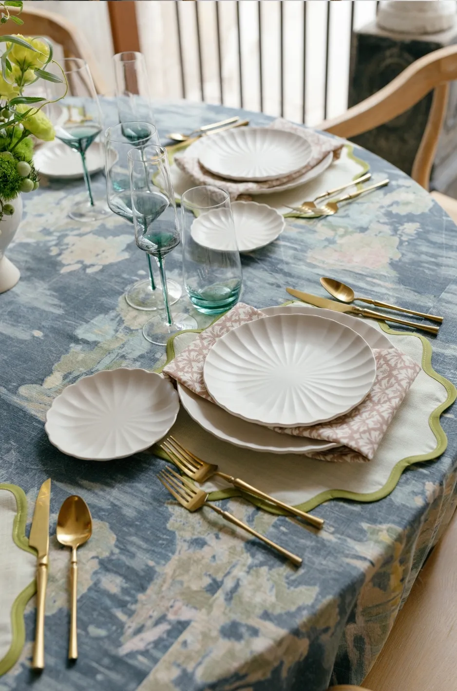
A statement tablescape does not need every element to compete for attention. In fact, some of the most memorable tables are built around a single clear visual idea, with every surrounding choice reinforcing that direction rather than introducing another one.
That focal idea might come from an expressive linen, a sculptural floral arrangement, an unexpected color, distinctive tabletop pieces, or even the architecture surrounding the table. What matters is not which element leads, but whether the composition has enough clarity for guests to understand where their attention should settle.
When pattern, color, texture, florals, candlelight, glassware, and stationery all attempt to make the same visual statement, even beautiful individual pieces can lose their impact. A more considered tablescape allows one idea to lead while the others create depth, balance, and context around it.
Start by Deciding What the Table Is About
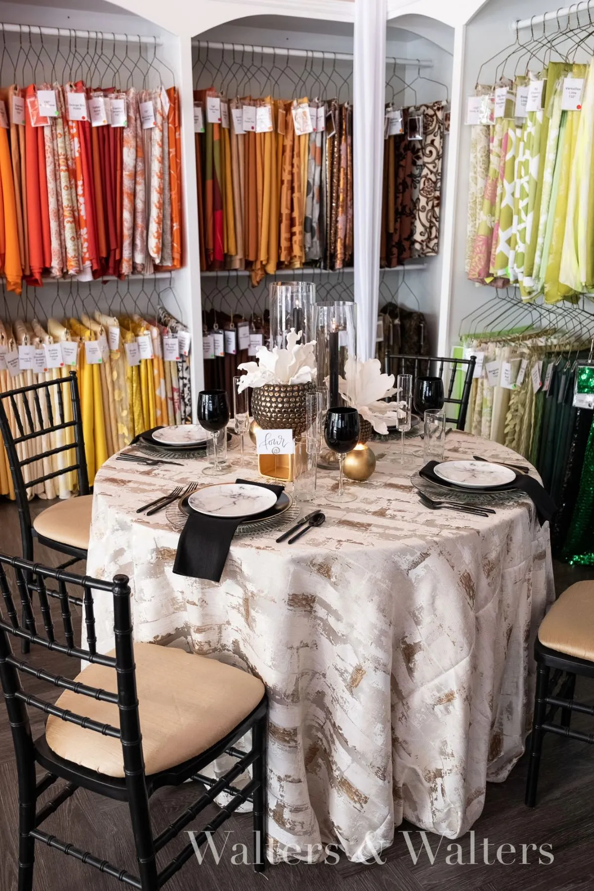
Before selecting individual pieces, it helps to define the table’s primary visual idea. This does not need to become a literal theme. It is simply the element or quality that gives the composition its point of view.
Perhaps a richly patterned linen establishes the entire palette. Maybe the floral design introduces an architectural shape that should remain the dominant feature. In another setting, the strongest idea might be monochromatic restraint, with subtle variations in texture doing more work than color.
The important distinction is between a table that has many attractive components and one that has a clear visual direction. Individual selections can all be beautiful without necessarily improving one another. A successful statement tablescape feels intentional because the relationships between those pieces matter as much as the pieces themselves.
Find the Element With the Most Visual Authority
The strongest element at the table is not always the largest or most expensive. Visual authority can come from scale, saturation, pattern, height, texture, contrast, or an unusual material.
A sculptural centerpiece may command attention because it introduces height and movement. A saturated linen can transform the table simply through the amount of color it places into the room. A distinctive patterned cloth may establish enough visual energy that everything above it needs to become quieter.
Identifying that hierarchy early makes the rest of the design more deliberate. Instead of repeatedly adding interest, the planner can begin asking a more useful question: what does this particular element need around it in order to look its best?
Let the Venue Influence the Decision
The table never exists independently from its surroundings. Architectural details, wall color, flooring, natural light, chandeliers, windows, and views all become part of the visual field whether or not they were chosen by the event designer.
A highly detailed ballroom may already offer considerable ornament and visual movement, making a more restrained tablescape feel especially effective. A neutral tent or minimal interior may leave more room for an expressive linen, dramatic color, or sculptural floral treatment to become the defining feature.
The goal is not necessarily to match the venue. It is to understand how much visual information is already present before deciding how much the table needs to contribute.
When the Linen Is the Statement
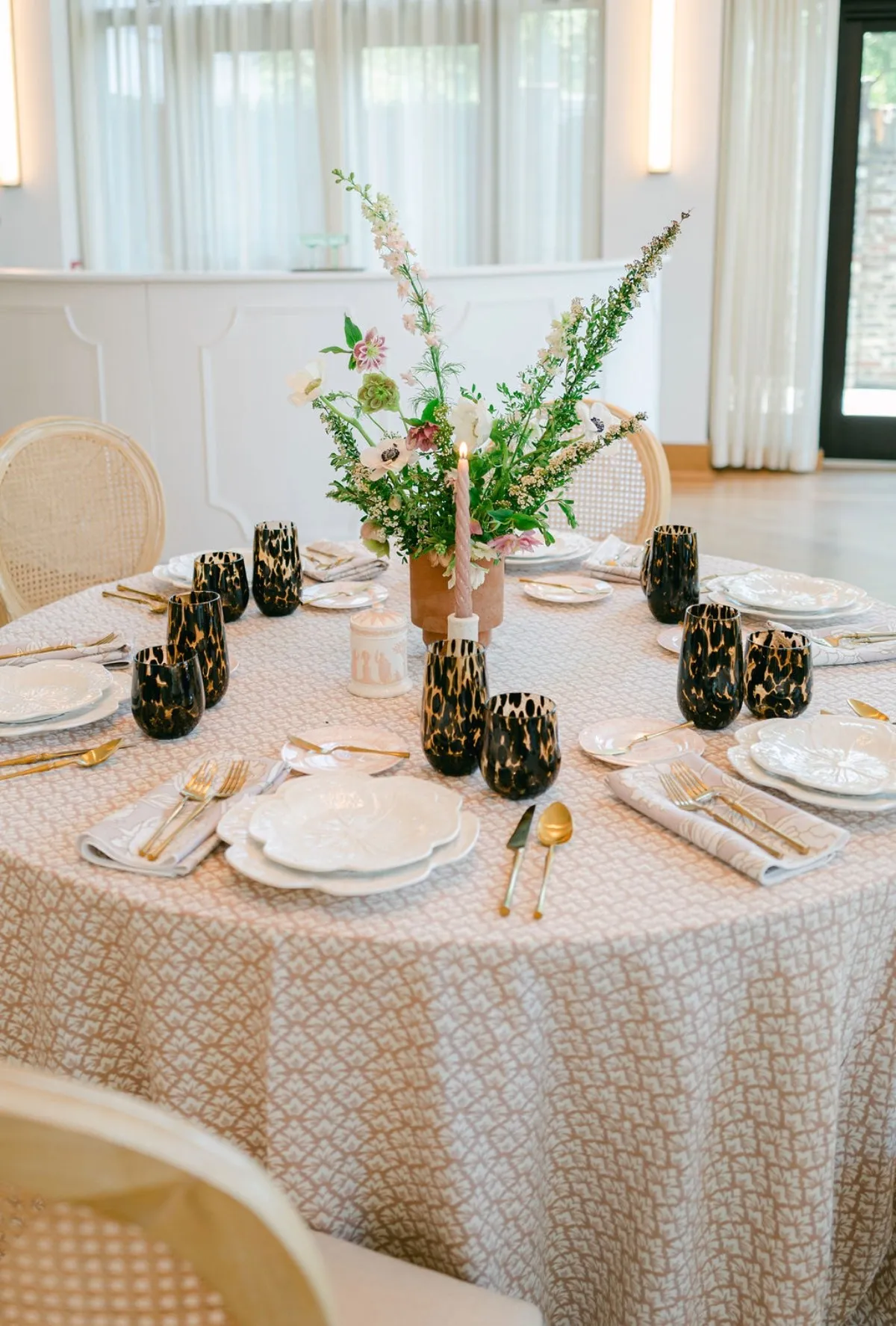
Because linen covers such a large portion of the table, it can establish the direction of a tablescape before florals, place settings, or candlelight are considered. Color, pattern, texture, and drape all contribute to the way guests perceive the table from a distance and once they are seated.
When linen is intended to lead, the rest of the composition should allow that decision to remain visible.
Pattern Can Become the Composition
A distinctive pattern introduces movement immediately. Depending on its scale and contrast, it may also establish much of the color palette without requiring additional decorative elements.
In that setting, adding elaborate florals, ornate chargers, strongly colored glassware, and detailed stationery can quickly obscure the reason the linen was chosen in the first place. Quieter supporting elements allow the pattern to remain legible.
This does not mean everything surrounding a patterned linen must be neutral. Instead, colors and materials can be drawn from within the linen itself, repeating one or two tones in a controlled way. The result feels connected without becoming literal.
Color Can Lead Without Pattern
A solid linen can carry just as much visual authority when its color is strong enough.
A saturated tone spread across a full table has a different presence than the same shade viewed on a small swatch. It becomes part of the architecture of the room, particularly when repeated across several tables.
That makes context important. The color of the chairs, florals, plates, glassware, floor, walls, and surrounding light will all influence whether the linen feels commanding, quiet, warm, cool, or unexpectedly intense.
A statement color works best when the remaining palette gives it enough space to register.
Texture Can Make a Quiet Palette Feel Intentional
Not every statement table needs dramatic contrast. Texture can create depth within a restrained palette, giving the composition presence without relying heavily on pattern or saturated color.
A dimensional weave, subtle sheen, soft hand, or tactile surface can change the way light moves across the table. These qualities become especially effective when nearby elements are simpler, allowing the fabric to reveal itself gradually rather than compete for immediate attention.
This approach can be particularly compelling when the palette is tonal. Small shifts in surface and finish become more noticeable because color is not doing all of the visual work.
When Something Else Should Lead
A sophisticated linen does not always need to be the focal point. Sometimes its most important role is to provide the foundation that allows another element to carry the composition.
Recognizing when the linen should become quieter is part of building a stronger table.
Let Sculptural Florals Take the Lead
Large-scale floral arrangements can introduce height, movement, asymmetry, and concentrated color. If the floral design already commands significant attention, an equally assertive linen may make the table feel divided between two competing ideas.
A supporting linen can still have character. It might carry a subtle texture, respond to a secondary floral tone, or provide enough color to ground the arrangement. The distinction is that it does not attempt to become a separate focal point.
When the floral composition is meant to feel sculptural, space around it becomes especially important. The surrounding tabletop should help define its shape rather than visually crowd it.
Give Distinctive Tabletop Pieces Space
Patterned china, colored glassware, statement chargers, sculptural candleholders, and metallic details can also become the table’s defining feature.
When several of these elements are already present, linen can provide the visual pause that allows them to remain distinct. A quieter foundation gives the eye somewhere to rest between more expressive objects.
Again, quiet does not have to mean plain. Color and texture can remain present, but their role changes from leading the design to giving stronger pieces the contrast they need.
Let Architecture Be Part of the Tablescape
In certain settings, the most compelling feature is not on the table at all.
Historic interiors, dramatic windows, distinctive ceiling treatments, expansive outdoor views, and architectural details can shape the visual experience before guests notice individual tabletop decisions. In these environments, a table designed to compete with the room may feel disconnected from it.
A more responsive approach considers what the venue is already contributing and builds the tablescape as part of that larger composition.
Build Supporting Elements Around the Lead Idea
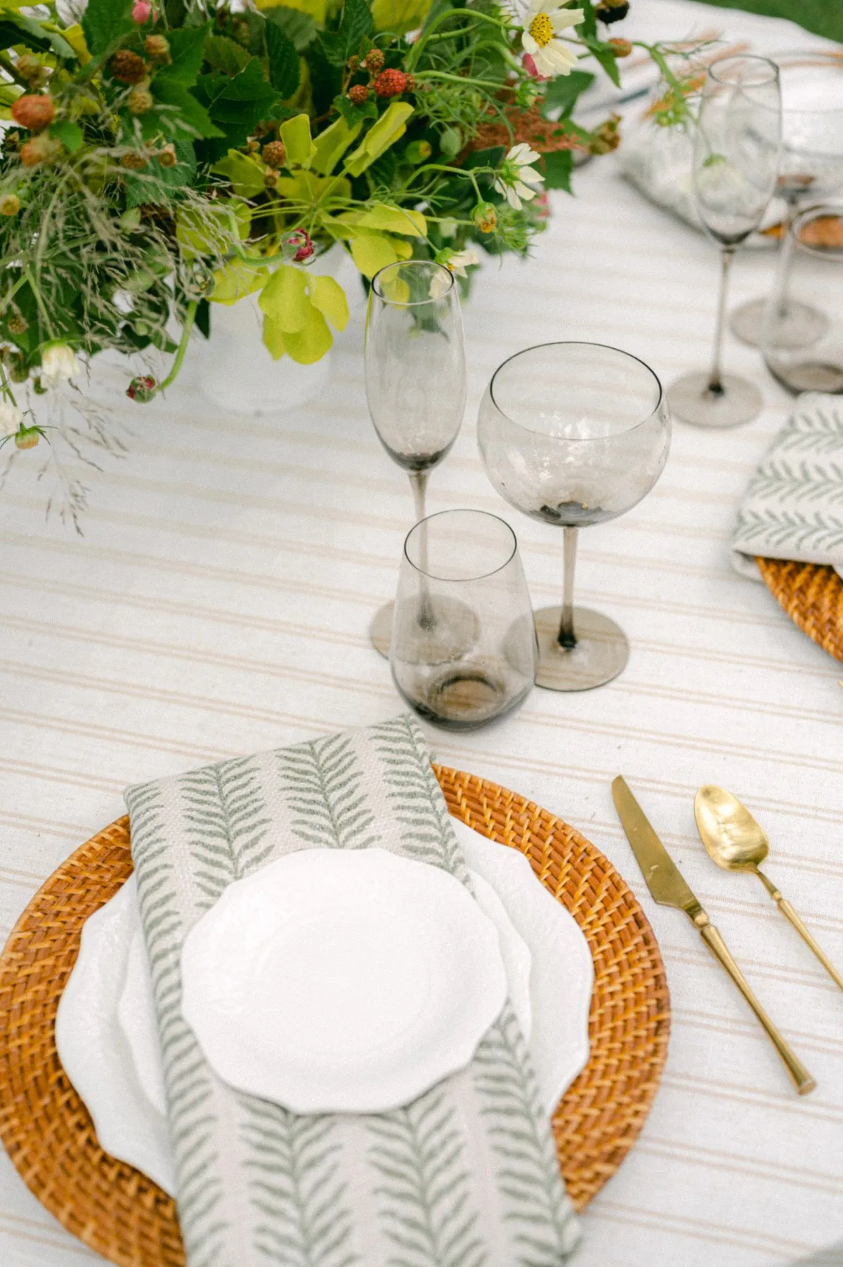
Once the central visual idea has been established, the remaining decisions should deepen it rather than redirect it.
This is where restraint becomes more useful than variety. A secondary element does not need to introduce another concept simply because there is space available.
Repeat Rather Than Introduce
Repetition can create cohesion without making the table feel overly coordinated.
A secondary shade in a patterned linen might reappear in the napkin. Florals may pick up one tone already present rather than introducing several additional colors. Warm candlelight can reinforce metallic or tonal details without adding another visible material.
These echoes create relationships across the table. They allow the eye to move naturally from one element to another because something familiar connects them.
The repetition does not need to be exact. In many cases, slight variation makes the result feel more considered than literal matching.
Think in Relationships, Not Individual Products
One of the easiest ways for a tablescape to become visually crowded is to choose every piece in isolation.
A beautiful charger does not automatically improve a beautiful linen. A distinctive glass may be less effective if it competes with an equally active pattern beneath it. An elaborate centerpiece can lose some of its authority when the surrounding tabletop contains too many other focal elements.
The relevant question is not simply whether an individual piece is attractive. It is whether that piece improves the overall composition.
Know When the Table Has Enough
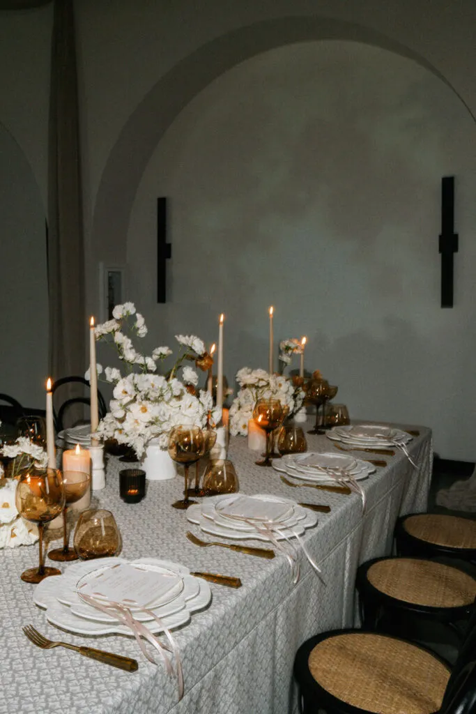
Editing is often what separates a statement tablescape from a table filled with statement pieces.
As a composition develops, there is a natural temptation to continue adding: another candle style, another texture, another accent color, another decorative detail. Yet additional layers do not always create greater depth. Sometimes they simply make the original idea harder to see.
More Detail Does Not Always Add More Impact
A patterned linen may need fewer tabletop accents. Dramatic florals may benefit from simpler stationery. Distinctive glassware can feel more intentional when the other reflective surfaces are restrained.
The most effective decision may be to remove something rather than add another layer.
This is particularly important when multiple design elements have similar intensity. Bold pattern, saturated florals, ornate chargers, colored glassware, sculptural candles, and highly detailed menus may all be beautiful independently. When they appear together, however, they may compete rather than collaborate.
Removing Something Can Finish the Design
A final edit allows the table’s visual hierarchy to become clearer. Step back and consider where the eye travels first. If that element matches the original intention, the composition is likely working. If attention jumps between several unrelated details, one or more elements may need to become quieter.
Restraint is not about making a table less interesting. It is about making the strongest idea easier to experience.
Consider the Table From Both Near and Far
A tablescape changes depending on the viewing distance.
Guests approaching the room may first register color, pattern, floral height, and the overall silhouette of the table. Once seated, smaller details such as napkin texture, glassware, stationery, and candle placement become more noticeable. A successful statement table works at both scales.
Evaluate the Full Table, Not Just the Swatch
A fabric swatch provides useful information about color and texture, but it cannot fully communicate what will happen when that fabric covers an entire table.
Pattern becomes larger. Saturated color occupies more visual space. Texture may become more or less pronounced depending on the light. Once florals and tabletop pieces are added, the balance can shift again.
The full composition should therefore be considered before any one element is judged in isolation.
Consider What Happens When the Design Repeats
A treatment created for one focal table can often support greater visual intensity than a design intended for dozens of guest tables.
Repetition amplifies pattern, color, floral scale, and decorative detail. What feels beautifully expressive once may feel dominant when repeated throughout an entire room.
That does not mean guest tables need to become generic. It simply means scale should influence how strongly each design choice is expressed.
Let Lighting Complete the Composition
Lighting can change the character of linen and tabletop materials throughout an event.
Natural daylight may reveal the true saturation and weave of a fabric, while evening candlelight can soften color and bring greater attention to texture and reflective finishes. Chandeliers, pinspotting, and ambient event lighting can each alter how the same table appears.
Texture Changes as the Light Changes
Subtle sheen or dimensional texture may become more visible as light moves across the linen. Conversely, some patterns may appear quieter under low light than they do during a daytime preview.
For events that transition from afternoon into evening, it is worth considering how the table will evolve rather than evaluating it under one lighting condition alone.
Review Color in Context
Color should also be viewed alongside the lighting, florals, tableware, and surrounding venue finishes.
The question is not simply whether the linen is a beautiful shade. It is whether that shade still supports the intended visual hierarchy once every other element enters the composition.
Frequently Asked Questions
Can the linen be the main statement in a tablescape?
Yes. Linen can anchor a tablescape through pattern, saturated color, distinctive texture, or the amount of visual space it occupies. When linen leads, surrounding elements should generally reinforce its palette or character rather than compete with it.
How do you keep a statement tablescape from looking too busy?
Choose one primary visual idea and allow the remaining elements to support it. If pattern, florals, glassware, chargers, candles, and stationery are all equally expressive, consider reducing the intensity of some supporting pieces.
Should linens be selected before florals?
There is no required order. Linen may establish the initial design direction, or it may be selected to support florals, architecture, or another focal feature. What matters is understanding which element should carry the most visual authority.
Can patterned linens work with elaborate centerpieces?
They can, but the relationship between pattern scale, floral volume, color, and surrounding tabletop pieces needs to be considered carefully. One element may need to become quieter so both can remain distinct.
How many colors should a statement tablescape include?
There is no fixed number. Palette discipline matters more than quantity. Several colors can work together when their roles are clear, while even a limited palette can feel busy if every shade competes at equal intensity.
Does every guest table need to be a statement table?
No. An event can concentrate stronger treatments on selected focal surfaces while allowing other tables to provide visual rhythm and continuity. Variation can make the most expressive moments feel more intentional.
A Statement Table Needs Clarity, Not Excess
A memorable tablescape is not defined by how many remarkable pieces can be assembled on one surface. Its impact comes from deciding which idea deserves attention and giving that idea enough room to lead.
Sometimes the linen establishes the composition through pattern, color, or texture. In other settings, it becomes the quieter foundation beneath sculptural florals, distinctive tabletop pieces, or an architectural backdrop. Both approaches can create a strong statement when the visual hierarchy is clear.
The final table should feel edited rather than accumulated. Each detail contributes, but not every detail needs to announce itself.
Curated Linen Collection offers linens across a range of colors, patterns, and textures that can either establish that creative direction or support a larger design already taking shape.