
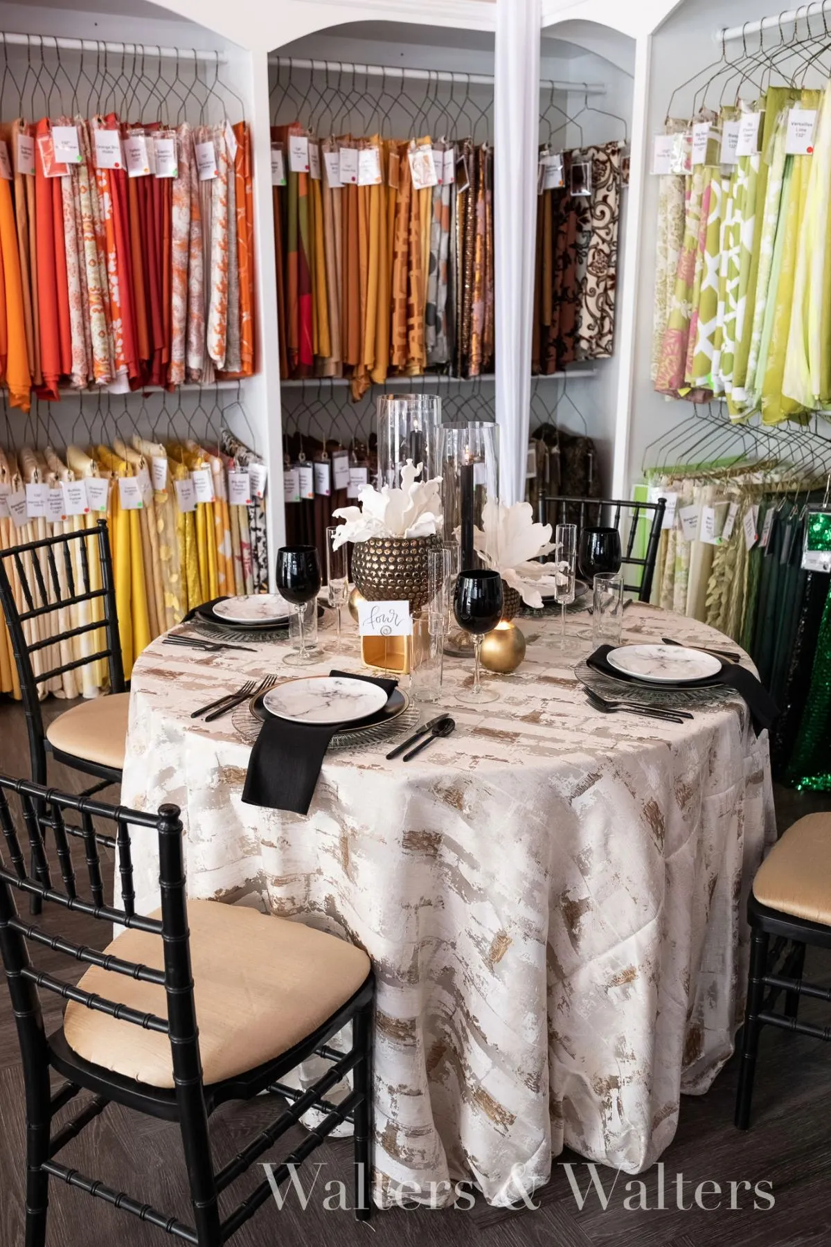
Fall tablescapes are often built around contrast. Rust meets burgundy, amber sits beside forest green, and warm metallics are layered across several seasonal shades. Those combinations can be striking, but a table does not need multiple contrasting colors to feel rich, dimensional, or distinctly autumnal.
Sometimes the stronger design choice is to stay within one tonal family.
A tonal tablescape develops depth through subtle variation rather than obvious contrast. Light and dark values move across the table, textures respond differently to the light, and materials create separation without introducing an entirely new color story. Instead of asking how many autumn shades can fit into one composition, the design explores how much expression can come from a deliberately limited palette.
The result can feel quieter, but not simpler. Tonal design depends on nuance. Every shift in saturation, undertone, texture, and finish becomes more visible because color is no longer doing all of the work.
What Makes a Tablescape Tonal Rather Than Monochromatic?
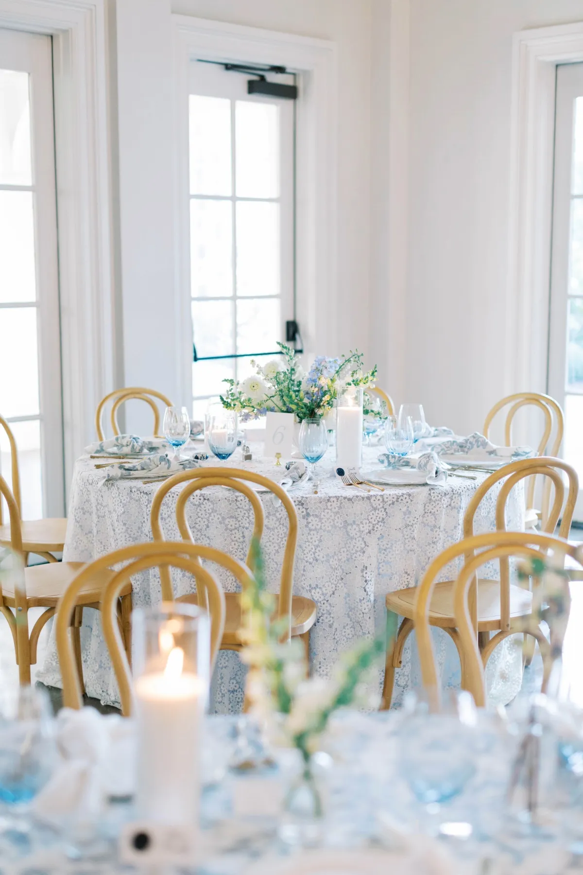
A tonal tablescape does not require every element to match exactly.
Using one identical shade across the linen, napkins, florals, candles, and tableware can make a table feel flat because the eye has very little variation to follow. A tonal design works differently. It stays within one closely related color family while allowing that color to move through lighter, deeper, warmer, cooler, softer, or more saturated interpretations.
The relationship between those shades is what creates continuity.
A warm neutral palette, for example, might move from pale cream into mushroom, fawn, taupe, and deeper brown. A green direction might begin with muted sage and progress toward olive or forest. A wine-toned table could include softened rose, mauve, plum, and a deeper burgundy note without becoming a multicolored composition.
What matters is not the number of shades but how naturally they relate.
Build With Values, Not Exact Matches
One of the most effective ways to create depth within a limited palette is to vary value.
A lighter linen can provide a broad foundation while deeper napkins or floral tones create definition above it. The relationship can also be reversed: a darker base linen may establish visual weight while softer tabletop elements keep the composition from becoming too dense.
These shifts help individual elements remain visible even when their hues are closely related.
Without variation in value, a tonal table can begin to blur together. With it, the eye can move easily from the linen to the place setting, florals, candles, and smaller details without requiring a contrasting color to separate them.
Let Undertone Hold the Palette Together
Exact color matching is rarely necessary. Two neutrals may differ considerably in depth yet still belong together because they share a warm undertone. Greens can move from muted gray-green to deeper olive without breaking the palette. Mauve, dusty rose, and wine can create a similar relationship when they share the same underlying temperature.
This flexibility is part of what makes tonal design useful. It allows the table to feel coordinated without becoming overly matched. The aim is consistency of character rather than duplication.
Know When a Tonal Palette Is the Stronger Choice
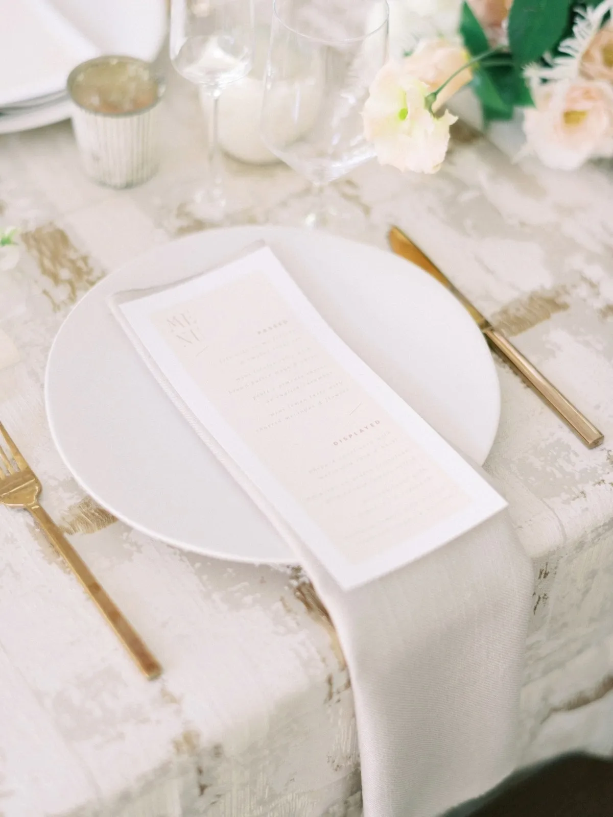
A limited palette becomes particularly effective when other elements of the design already provide visual complexity.
If the venue, florals, textile texture, or tabletop pieces are expressive, adding several contrasting linen colors may only make the composition busier. A tonal approach can create the visual quiet those elements need while still giving the table enough depth to feel intentional.
When the Venue Already Has Strong Character
Some settings already contribute significant color, pattern, texture, or architectural detail.
Historic ballrooms may have ornate moldings, patterned floors, dramatic lighting, or rich wall finishes. Other venues may offer stone, wood, expansive windows, or a visually dominant landscape. In those spaces, a complicated palette can create unnecessary competition.
A tonal linen direction gives the room space to participate in the design.
Rather than trying to overpower the setting, the table can establish a controlled field of color that responds to what is already present. Subtle changes in depth and texture provide interest without asking the table to become another major architectural feature.
When the Florals Carry Multiple Colors
Florals can introduce substantial color variation on their own. When an arrangement includes several tones, foliage, textural stems, and varying degrees of saturation, a multi-color linen scheme may leave the table without a clear foundation.
A tonal linen palette can provide that foundation.
Instead of competing with the floral direction, the textiles create a quieter backdrop that allows each floral color to remain distinct. The table still feels rich, but the richness comes from the relationship between linen and florals rather than from both elements trying to provide equal amounts of color.
When Pattern or Texture Is Already Doing the Work
Color is only one way to create visual movement.
A dimensional textile, a noticeable weave, a subtle motif, or an expressive pattern may already make the table feel layered. When that is the case, introducing several additional hues can dilute the fabric’s effect.
A tonal palette allows texture or pattern to become more noticeable.
This is particularly effective when the design depends on subtle material differences. With fewer competing colors, changes in surface and finish become much easier to appreciate.
Create Depth Without Introducing Another Color
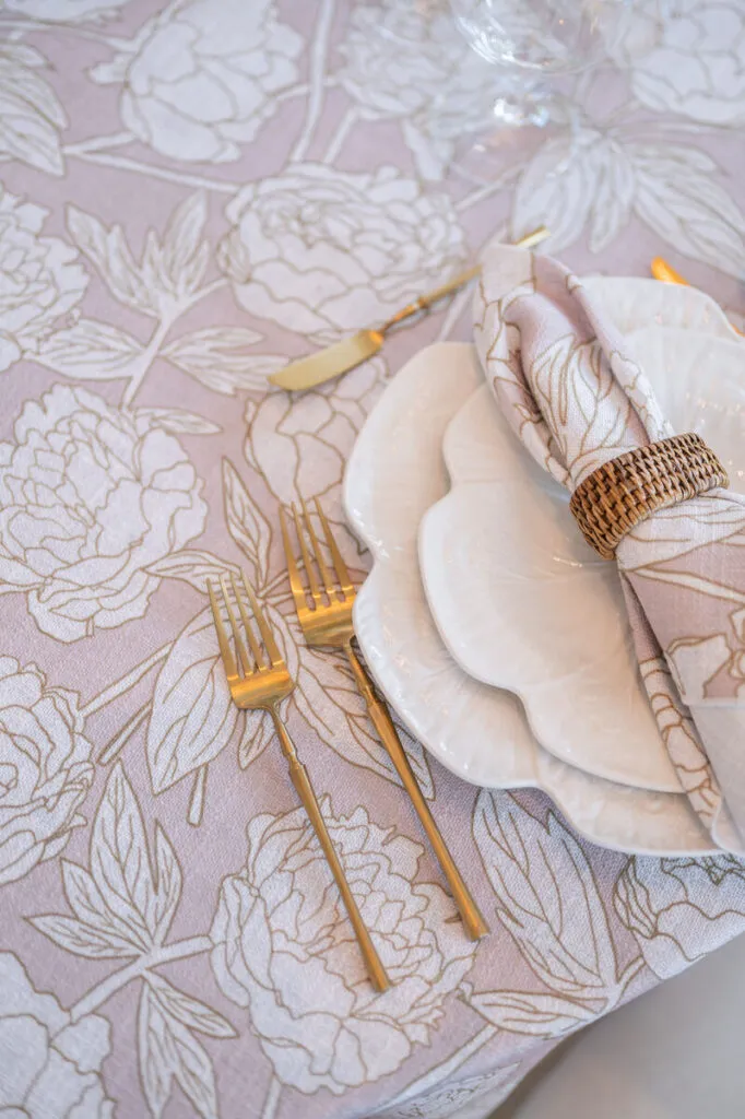
The main challenge of a tonal tablescape is avoiding flatness. The solution is not necessarily to introduce contrast through a new hue. Depth can be created through value, texture, material, sheen, and the way light moves across the table.
These differences become especially important within a restrained fall palette.
Shift From Light to Dark
A tonal table benefits from having a visible range. If every element occupies the same middle value, the composition may feel visually compressed. Introducing a lighter or deeper version of the same family can restore definition.
A deep-toned linen might support softer napkins, lighter florals, or pale ceramics. A lighter base can be anchored with darker glassware, candles, or botanical elements.
The contrast remains controlled because it stays within the same color language. That range gives the table structure without changing its fundamental character.
Use Texture to Separate Similar Tones
Two related shades can appear far more distinct when their surfaces interact with light differently.
A matte fabric may appear quieter and more grounded, while a subtly reflective or dimensional surface catches light and creates variation. Even when the colors are close, texture gives the eye something additional to interpret.
This is especially useful in fall design, where material richness can communicate seasonality without relying on an obvious collection of autumn colors.
The table can remain restrained while still feeling tactile and layered.
Allow Material to Create Contrast
Not every point of separation needs to come from another textile.
Ceramics, glass, metal, foliage, candles, and natural materials can create contrast against a narrow linen palette. Clear glassware may introduce lightness. A muted metallic finish can add reflection. Matte ceramic pieces can create weight against a softer textile surface.
These material relationships keep a tonal table from becoming visually monotonous.
They also allow the linen palette to remain disciplined rather than expanding simply because the composition needs another source of interest.
Let the Linen Establish the Color Field
Because linen covers such a large proportion of the visible table, it naturally establishes much of the color environment.
That makes the base linen an important decision in a tonal design. Its depth and saturation influence how every smaller element will be perceived above it.
If the linen carries a strong, saturated tone, the surrounding pieces may need to become quieter. If the base is soft and muted, deeper accents can create structure without breaking the tonal relationship.
Decide How Much Color the Linen Should Carry
A richly colored linen can do much of the visual work on its own. When that is the case, napkins, tableware, and florals do not need to repeat the same level of intensity. They can move lighter, softer, or more neutral within the same family.
A pale base works differently. It may need deeper notes elsewhere to prevent the table from feeling washed out.
The decision is ultimately about distribution. Instead of placing the strongest color everywhere, allow some elements to carry more weight while others support the tonal progression.
Give the Base Color Enough Visible Space
If the linen is responsible for establishing the table’s main color field, enough of that surface needs to remain visible.
A table crowded with competing objects, heavy textile layers, or oversized decorative elements can obscure the color relationship that gives the tonal design its coherence.
Visible linen creates continuity between the place settings and allows the palette to read across the table as a whole. The base is not simply a background. Within a tonal composition, it is often what holds everything together.
Use Florals to Extend the Tonal Story
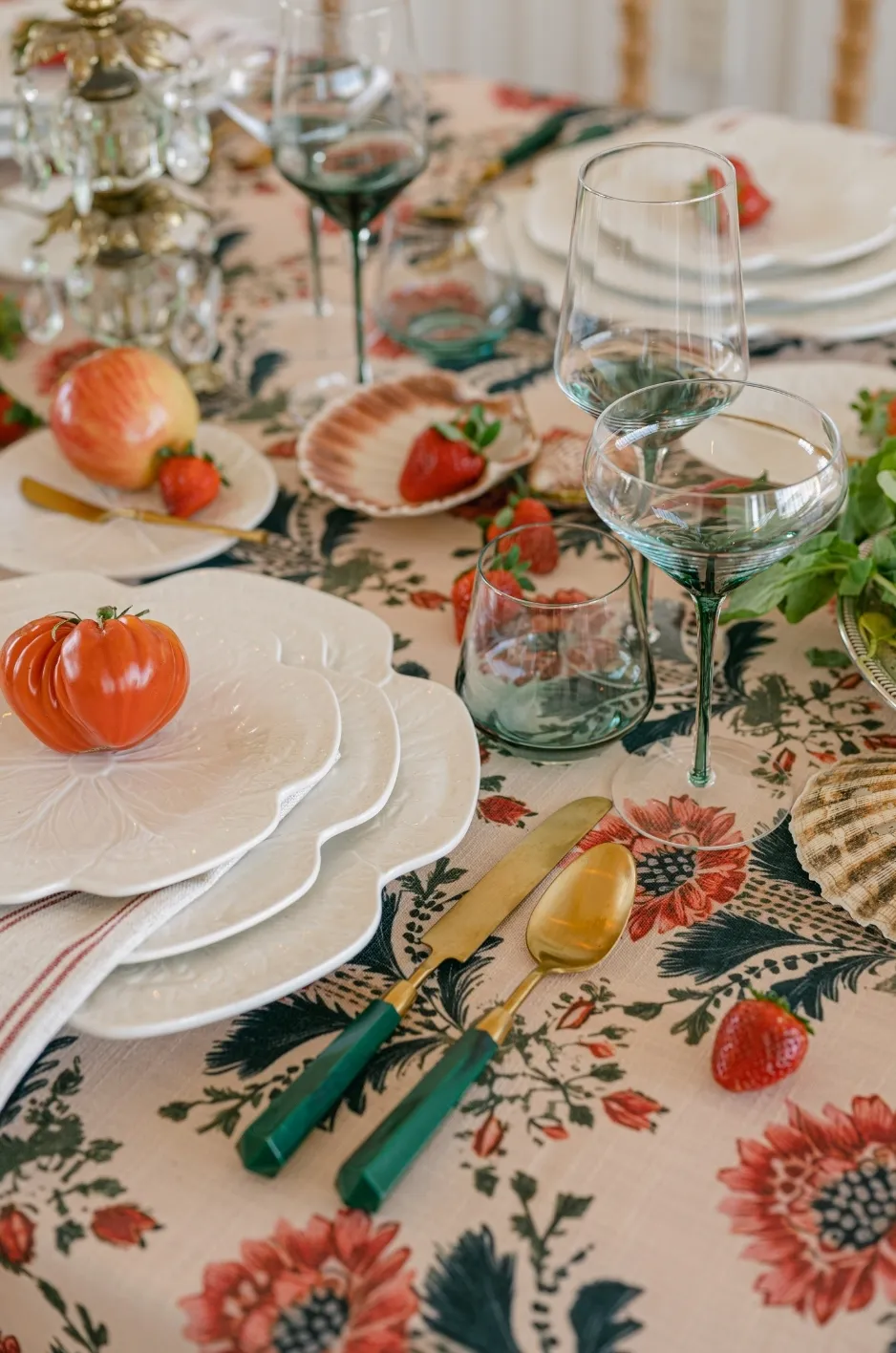
Florals can either reinforce a limited palette or pull it in an entirely new direction. For a tonal table, they work best when they extend the existing color story without matching it too precisely.
Repeat the Undertone, Not the Exact Shade
A floral arrangement does not need to copy the linen color. In fact, slightly shifting the value or saturation usually creates greater depth. Florals can sit lighter or darker than the base while sharing enough undertone to feel connected.
This creates variation without introducing another competing palette. The relationship feels intentional because the colors belong to the same visual family even when they are not identical.
Let Greenery Act as a Natural Neutral
Greenery can provide useful contrast within a narrow palette without necessarily becoming another dominant design color.
Foliage creates separation between closely related florals and textiles while also introducing an organic material quality. Depending on the direction of the table, it may function almost like a neutral.
The important point is restraint. Greenery should support the tonal composition rather than introduce so much contrasting color that it becomes a separate visual story.
Keep Tabletop Pieces From Breaking the Palette
Tabletop elements can quietly disrupt a tonal design if each one introduces a different finish or color family.
Chargers, plates, glassware, flatware, and candleholders do not need to match the linen, but they should understand their role within the composition.
Decide Which Materials Should Recede
If linen and florals are carrying most of the color story, some tabletop pieces can afford to become quieter.
Clear glass, restrained metallic finishes, neutral ceramics, or simple tableware can create structure without competing for attention.
This gives the eye moments of rest and allows small differences within the tonal palette to remain visible.
A restrained tabletop is often what makes a narrow color story feel intentional rather than limited.
Use One Controlled Contrast When the Table Needs It
A tonal table does not need to become rigidly monochromatic. Sometimes a single contrasting note provides exactly the definition the design needs. That contrast might appear in glassware, a charger, candle color, or a small floral detail.
The important distinction is scale. A controlled accent punctuates the palette. A second dominant color changes the palette entirely. If contrast is introduced, it should have a clear visual purpose.
Consider Whether Pattern Helps or Interrupts the Tonal Effect
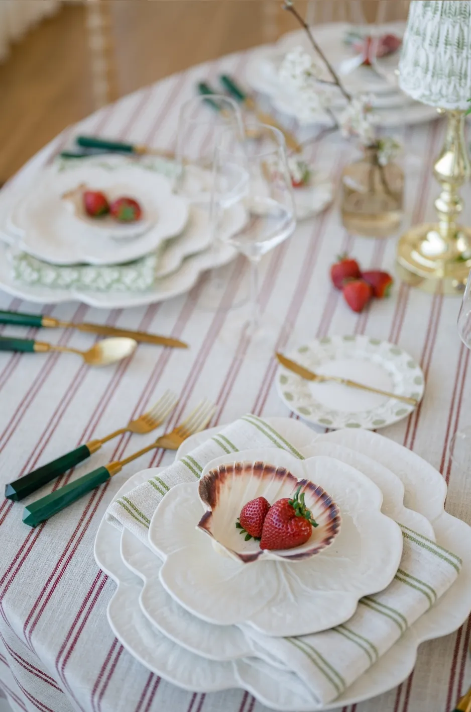
Pattern can introduce movement without expanding the color story, but only when its relationship to the tonal palette is carefully controlled.
Tonal Pattern Can Add Movement Without Adding More Color
A pattern built from closely related shades can create visual rhythm while preserving the disciplined palette.
This is especially useful when a table needs more movement but does not need another hue.
The motif provides interest through repetition and scale, while the related colors prevent the pattern from pulling the table in a new direction.
In this way, pattern becomes another form of tonal variation rather than an additional design story.
High-Contrast Pattern Changes the Direction
A pattern that introduces a strongly contrasting color can quickly become the most dominant element on the table.
That may be appropriate if the intention is to move away from the tonal concept, but the shift should be deliberate.
Before introducing a high-contrast pattern, consider whether the table genuinely needs another color family or simply needs more variation within the one already present.
Often, adjusting scale, texture, or value can solve the same problem more quietly.
Let Fall Come Through in Material and Mood, Not Just Color
A fall tablescape does not need to rely on literal seasonal colors to feel appropriate for the time of year.
Autumn can also be expressed through material weight, texture, warm light, botanical choices, and deeper tonal values.
This approach creates a seasonal atmosphere without making the table dependent on familiar fall motifs.
Autumn Does Not Require Literal Seasonal Colors
Rust, orange, burgundy, and gold may immediately suggest fall, but they are not the only way to create a seasonal table.
Muted greens, warm neutrals, softened mauves, browns, and other closely related families can carry an autumn mood when the materials and lighting support them.
What matters is the overall atmosphere rather than whether the palette contains an expected seasonal shade. A tonal table can feel unmistakably suited to fall while remaining subtle.
Mood Can Carry the Season More Effectively Than Motifs
Warm candlelight, tactile textiles, richer material finishes, and seasonal botanical forms can communicate autumn without relying on literal decorative references.
This gives the table a more enduring visual language. Rather than decorating for fall, the composition can respond to the season through depth, warmth, and materiality.
Know When the Table Needs One Contrasting Note
Restraint should never become a rule that prevents the table from working. Sometimes a tonal composition genuinely needs more definition.
Add Contrast When Everything Begins to Merge
If the linen, florals, tableware, and accents all occupy very similar values, the table may lose hierarchy.
One significantly lighter or darker element can restore separation.
That contrast does not necessarily need to be a completely different color. A deeper version of the same family may be enough.
If a contrasting hue is introduced, it should solve a problem rather than simply add variety.
Keep the Contrast Intentional
The accent should remain controlled. A single napkin color, candle tone, glassware choice, or small floral note may provide all the contrast needed. Repeating that contrast across several additional elements can quickly transform it from punctuation into a second dominant palette.
The strongest tonal tables know where to stop.
Edit the Palette Before Adding Another Hue
When a table feels unfinished, adding another color is often the easiest response. It is not always the right one.
Before expanding the palette, step back from the individual swatches and consider the entire composition.
Is there enough separation between light and dark? Do the textures feel distinct? Are the florals already supplying enough color variation? Does the table need another hue, or does it simply need better contrast within the existing family?
Often, what appears to be a color problem is really a problem of value, material, or texture.
Changing one of those variables may add exactly the depth the table is missing without disrupting the tonal direction. Another color should enter the design only when it has a clear purpose.
Frequently Asked Questions
What is a tonal tablescape?
A tonal tablescape uses related shades within one color family rather than combining several strongly contrasting hues. Depth comes from variation in value, saturation, texture, material, and finish rather than exact color matching.
Can a tonal fall tablescape still feel seasonal?
Yes. Fall character can come from deeper values, tactile materials, warm lighting, seasonal botanicals, and richer surface treatments rather than relying exclusively on traditional autumn colors.
How do you keep a tonal table from looking flat?
Introduce variation through lighter and darker shades, different textures, material contrast, pattern, and changes in finish. These shifts create definition while keeping the palette cohesive.
Can patterned linens work in a tonal tablescape?
Yes. Patterns that stay within a related color family can add movement without disrupting the tonal direction. High-contrast patterns should be used more deliberately because they can change the overall palette.
Should the linen be the darkest color on the table?
Not necessarily. The linen can occupy any part of the tonal range. A dark base can support lighter details, while a softer linen can provide room for deeper accents elsewhere.
When should a tonal tablescape include a contrasting color?
A contrasting color can help when the table lacks visual separation or hierarchy. It works best as a controlled accent rather than as a second dominant palette.
A Tonal Fall Table Finds Richness Within Restraint
A fall tablescape does not need several saturated seasonal colors to feel warm, dimensional, or connected to the season.
A more restrained palette can create just as much visual richness when it moves deliberately through changes in value, undertone, texture, material, and light. Those subtle shifts give individual elements enough definition while preserving the clarity of the larger composition.
Sometimes another color provides the contrast a table needs. In other cases, the stronger choice is to explore more fully what one color family can already do.
A tonal design is not about using less. It is about finding more variation within a deliberately limited palette.
Curated Linen Collection offers linens across a range of colors, textures, and patterns that can support this kind of nuanced tonal approach, allowing planners to build depth without relying on excess contrast.