Fine art weddings are often defined by considered details rather than a single decorative theme. Their visual direction may begin with a painting, an illustrated invitation suite, a botanical study, an architectural detail, or a landscape that holds personal meaning for the couple. Translating that inspiration into an event, however, requires more than matching a few prominent colors.
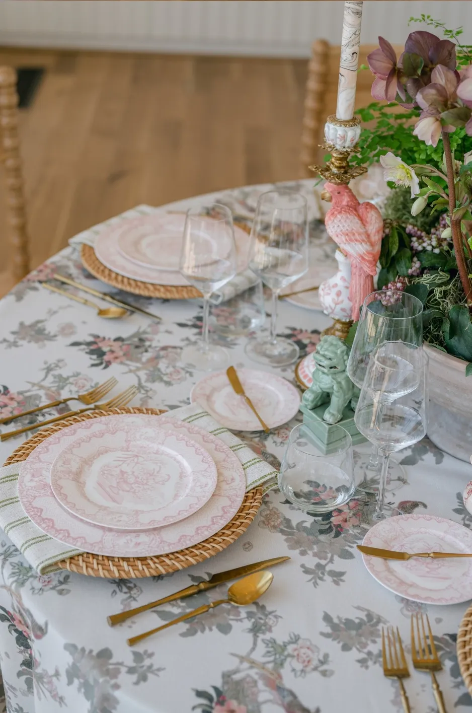
Luxury wedding linens provide an opportunity to carry the artistic reference into the reception through color, pattern, texture, proportion, and placement. A custom tablecloth might interpret the movement of a watercolor, while coordinating napkins introduce one supporting tone and quieter textiles allow the statement pattern to remain the focal point.
The objective is not to reproduce the original artwork across every table. It is to understand what gives the reference its character and use those qualities to create a cohesive textile language throughout the celebration.
Read the Artwork Before Selecting the Linens
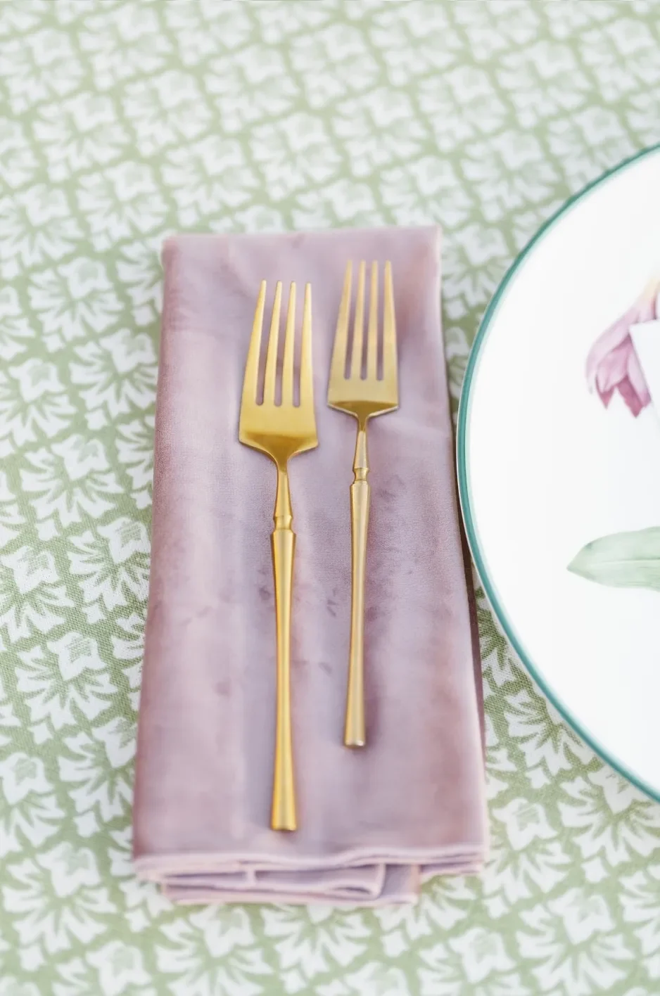
Before reviewing fabric swatches or choosing tablecloth colors, study the source material closely. An artwork may contain dozens of shades and details, but only a few of those elements may be responsible for its distinctive mood.
Identifying those defining qualities gives the linen palette a clear direction. It also prevents the reception design from becoming an overly literal collection of matching colors and motifs.
Identify the Element That Gives the Artwork Its Character
Begin by determining what initially draws the eye to the reference. In some works, the defining feature is a restrained color relationship. In others, it may be loose brushwork, deliberate geometry, dramatic contrast, or generous areas of negative space.
Potential design drivers include:
- A distinctive botanical or architectural motif
- The movement created by lines or brushstrokes
- A contrast between muted and saturated colors
- The balance between open and detailed areas
- A layered or softly faded surface
- A structured border or repeated shape
One of these qualities should generally lead the textile direction. Attempting to reproduce every visible feature can create a fabric design that feels crowded, overly literal, or disconnected from the practical needs of the table.
Separate Transferable Details From Background Information
Not every part of an artwork needs to appear in the linen design. A broad landscape, portrait, or narrative scene may provide meaningful inspiration, but it will not always translate clearly into a repeating textile pattern.
Instead, isolate details that can function successfully on fabric. A floral silhouette might become an open botanical repeat. A decorative frame could inspire the border of a custom tablecloth. The curved lines of an architectural arch might be simplified into a geometric motif.
The objective is interpretation rather than duplication. The resulting textile should feel connected to the source while remaining appropriate for table settings, room views, photography, and the other design elements surrounding it.
Define the Intended Mood in Practical Design Terms
Descriptions such as “romantic,” “elegant,” and “artistic” may express the general intention, but they offer limited guidance when selecting linens. More precise language can help planners and designers determine how the textiles should actually look and behave.
Consider whether the desired palette should feel:
- Airy or visually dense
- Tonal or high-contrast
- Structured or organic
- Restrained or expressive
- Matte or softly luminous
- Formal or relaxed
A restrained, airy direction may lead to an open pattern on a pale ground with tonal supporting linens. A more expressive direction might use a saturated custom tablecloth on selected focal tables, balanced by simpler textiles throughout the rest of the reception.
Distill the Reference Into a Usable Color Structure
A painting or illustration may contain many subtle transitions that contribute to its depth. A functional wedding linen palette, however, needs a clear hierarchy. Without one, every extracted color may compete for equal attention.
A structured palette establishes which colors will occupy the largest surfaces, which will connect different parts of the room, and which should be reserved for small moments of contrast.
Assign Colors According to Proportion
Organize the palette into three functional groups rather than treating it as a row of equally important swatches.
- Foundation colors should cover the largest textile surfaces. These may appear on most guest tables, major solid linens, or the background of a custom print.
- Supporting colors can connect the foundation to the rest of the design. They may appear through napkins, runners, overlays, placemats, or selected tablecloths.
- Accent colors should be used more selectively. A deeper or brighter tone might appear in a printed border, floral detail, candle, menu, or small textile accent without dominating the room.
The proportions do not need to be mathematically exact. The purpose is to prevent every color from appearing with the same intensity and frequency.
Refine Undertones for the Venue
Colors selected from a digital image or printed mood board may change considerably once placed in the venue. Warm stone, dark flooring, painted walls, garden greenery, tent interiors, and artificial lighting can all affect how a textile color is perceived.
A pale neutral may appear cooler in a bright coastal setting and warmer inside a candlelit ballroom. A green drawn directly from a landscape painting may need to be softened so it does not compete with the natural foliage surrounding an outdoor reception.
The goal is not always to preserve an exact digital color value. It is more important to maintain the intended relationship between the colors under the venue’s actual conditions.
Decide Which Colors Need Pattern and Which Need Restraint
A palette may contain several beautiful colors, but they do not all need to appear in the primary print. Restricting a custom textile to a controlled selection can produce a more legible and sophisticated result.
The hero linen might combine a foundation shade with two supporting tones, while another color appears only through solid napkins or a quiet runner. This gives the statement pattern visual breathing room and allows secondary textiles to contribute without repeating the complete design.
Solid linens are not simply background elements. When selected carefully, they regulate the intensity of the room and help the custom textile retain its importance.
Translate Composition and Brushwork Into Textile Pattern
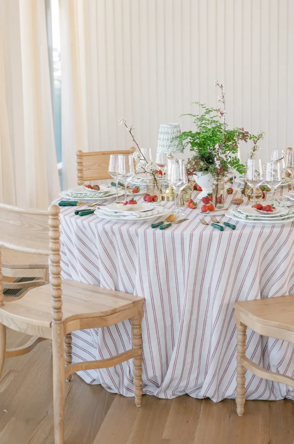
Fine art inspiration can shape more than the color palette. The movement, spacing, linework, and composition of the reference can also inform a custom textile design.
These artistic characteristics must still be adapted to the scale and function of the linen. A pattern that looks compelling on a screen may behave very differently once printed across a round dining table or partially covered by plates, florals, and glassware.
Convert Artistic Movement Into a Repeatable Motif
Different forms of artwork suggest different approaches to pattern development.
Loose watercolor marks may become a softly layered print with gradual transitions. Precise architectural linework could inspire a border, stripe, grid, arch, or medallion. Botanical studies may translate into spaced florals, foliage, or an asymmetrical garden motif. Abstract compositions can inform irregular blocks, tonal fields, or painterly repeats.
The finished design should preserve the character of the reference while functioning as a textile. Simplifying shapes, adjusting spacing, and limiting the number of colors often produce a stronger result than transferring the original image directly onto fabric.
Control the Amount of Negative Space
Negative space is particularly important when developing custom tablecloths. A sample may appear balanced when viewed on its own, but the cloth will eventually sit beneath dinnerware, glassware, menus, candles, floral vessels, and other tabletop elements.
Open areas within the design can:
- Preserve visibility around place settings
- Keep floral arrangements from competing with the print
- Prevent large tables from appearing visually heavy
- Allow important motifs to remain recognizable
- Give the eye space to rest between decorative details
A fine art-inspired print does not need to cover every inch of the textile. Deliberate spacing can make the pattern feel more considered and allow the overall tablescape to remain legible.
Adapt the Pattern to the Shape of the Surface
The shape and size of each table affect how a textile pattern will be seen. A directional border may work naturally on a long banquet table but require a different layout for a round cloth. A large botanical motif may read beautifully across an uninterrupted table surface but become difficult to recognize when reduced to napkin size.
Pattern development should account for its intended application across:
- Round guest tables
- Long banquet or estate tables
- Cocktail tables
- Cake and dessert tables
- Bars
- Runners
- Napkins
- Placemats
A pattern does not always need to be reproduced identically across every textile format. Smaller pieces can carry a simplified motif, a border, or one extracted color instead.
Assign Each Textile a Specific Role in the Reception
A bespoke palette does not require every linen to be custom printed. In many fine art weddings, the strongest composition combines one or two expressive textiles with quieter rental linens that support the same color and material direction.
Curated Linen Collection offers premium table linens alongside runners, napkins, placemats, pillows, and specialty overlays. These formats make it possible to distribute the palette throughout the reception without covering every surface in the same pattern.
Choose the Primary Statement Surface
First, determine where the complete custom design will have the greatest visual impact. The best location is not necessarily the largest table. It should be an area where the textile will remain visible and contribute meaningfully to the guest experience and event photography.
Potential statement surfaces include:
- Guest dining tables
- A long central banquet table
- The head or sweetheart table
- The cake display
- The bar
- An escort-card installation
A custom linen across every guest table can create an immersive room, while a single patterned focal table can introduce the artistic reference more selectively. The appropriate choice depends on the room size, table count, surrounding architecture, and density of the remaining décor.
Support the Statement With Curated Solids and Textures
Once the hero textile has been selected, supporting linens should reinforce its direction without competing with it.
A custom botanical tablecloth might be paired with a quieter solid drawn from the background of the print. A velvet accent could introduce depth in a limited area, while coordinating napkins repeat a secondary shade. Specialty overlays or woven textures may add variation without introducing another dominant pattern.
Supporting textiles can include:
- Tonal tablecloths
- Quiet woven textures
- Coordinating napkins
- Restrained runners
- Specialty overlays
- Framed or scalloped placemats
- Velvet or patterned lounge pillows
The strongest combinations usually vary in scale or texture while maintaining a disciplined color relationship.
Use Smaller Textiles as Controlled Echoes
Smaller textile elements can repeat selected aspects of the main design without reproducing it completely.
A napkin might use one saturated accent color from the artwork. A runner could carry only the border from the custom tablecloth. A placemat may repeat a geometric shape in a simplified form, while lounge pillows introduce a related texture away from the dining area.
These controlled echoes allow the palette to travel across the reception while preserving hierarchy. The custom tablecloth remains the primary statement, and the smaller textiles provide recognition rather than repetition.
Build a Linen Placement Plan for the Full Room
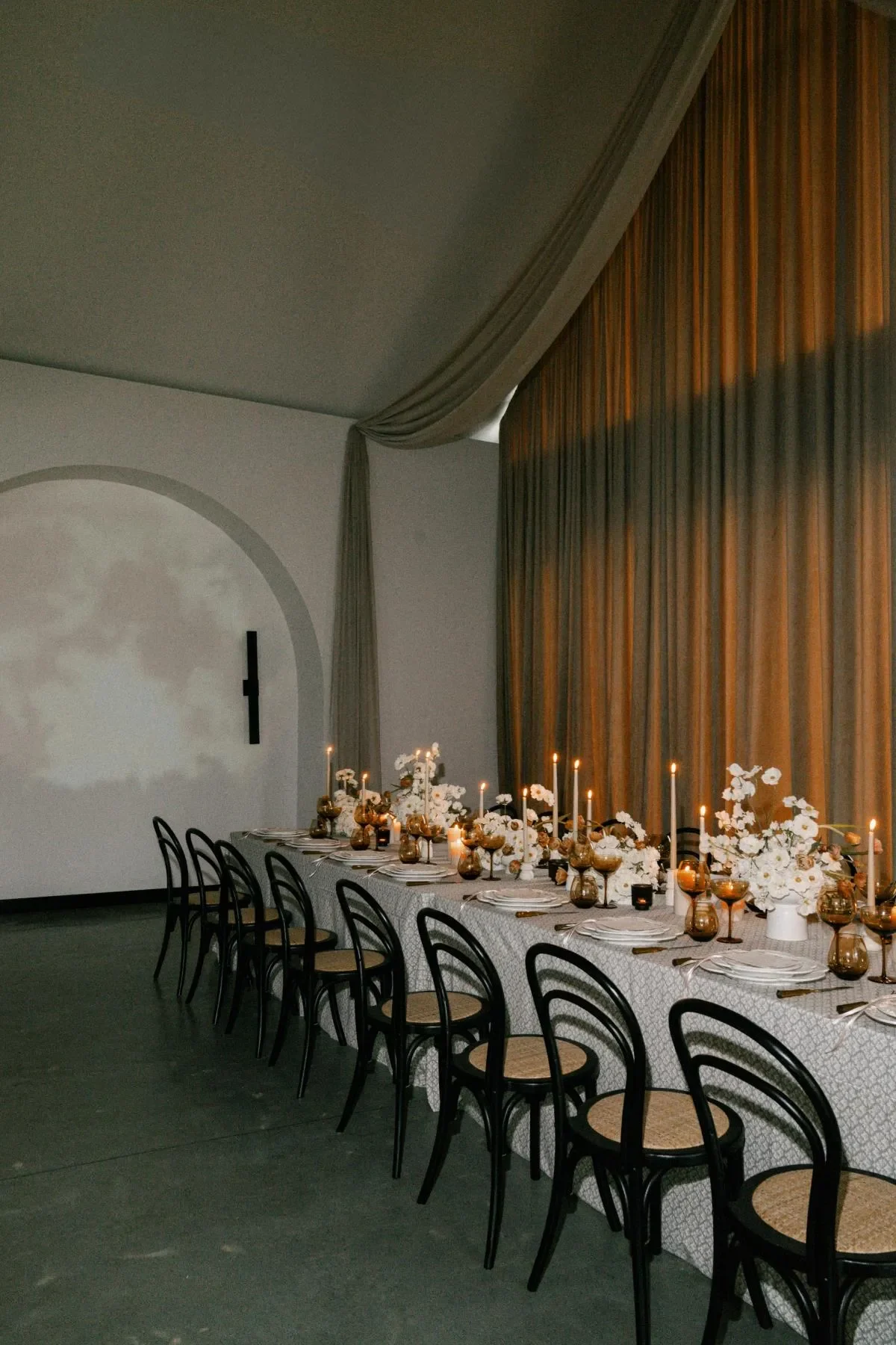
Wedding linens are experienced at several scales. Guests see them closely while seated, but they also perceive the overall balance of pattern and color when entering or moving through the room.
A placement plan helps coordinate both perspectives. It establishes where the palette should intensify, where it should become quieter, and how secondary surfaces will connect to the main tablescape.
Map Every Linen-Bearing Surface
Create a complete inventory of surfaces that may require fabric, including areas that are sometimes addressed late in the design process.
The plan may include:
- Guest dining tables
- Head or sweetheart tables
- Cocktail tables
- Bars
- Cake and dessert displays
- Welcome and guest-book tables
- Escort-card displays
- Lounge pillows
- Visible service or presentation tables
Mapping these surfaces early prevents the major dining tables from feeling carefully curated while the surrounding areas receive unrelated last-minute linens.
Establish Areas of High, Medium, and Low Pattern Intensity
Divide the room into levels of visual intensity.
High-intensity areas may include one or two prominent custom textiles, such as a central banquet table or statement bar.
Medium-intensity areas might repeat a supporting color, smaller motif, runner, or textured overlay.
Low-intensity areas should use solids and quieter surfaces that provide visual rest.
This approach creates movement through the room and prevents the event from feeling either repetitive or disjointed. The artistic reference remains recognizable, but it is expressed with different levels of emphasis.
Determine Whether Linens Should Repeat or Alternate
There are several effective ways to distribute a fine art-inspired palette.
One option is to repeat a statement linen across all guest tables, creating a highly cohesive and immersive composition. Another is to alternate the custom pattern with a coordinating solid, which can help define table groupings or reduce visual density. A third approach is to reserve custom linens for focal areas while using tonal or textural fabrics across most of the room.
The right strategy depends on:
- The number and shape of the tables
- The size of the reception space
- The amount of architectural detail
- The floral scale
- The strength of the pattern
- The distance between major focal areas
The placement should feel intentional from every important sightline rather than being based solely on individual table selections.
Check the Palette Against the Completed Table Design
Linens should not be approved in isolation. A textile that appears balanced as a swatch may feel too busy once the place setting is assembled, or its undertones may shift beside the chosen dinnerware and floral vessels.
Reviewing the palette in context makes it easier to identify conflicts before the final textile design or rental order is confirmed.
Review the Linen Beside the Actual Tabletop Materials
Whenever possible, assess the textile with representative examples of the items that will sit on or around it, including:
- Dinnerware
- Chargers
- Flatware
- Glassware
- Candles
- Menus
- Floral vessels
- Chairs or nearby upholstery
Pay attention to the relationship between finishes as well as colors. A reflective charger, ornate plate, detailed menu, and dense linen pattern may create too many competing focal points. A quieter tabletop may allow the textile to carry more visual information.
The objective is not to make every element match. It is to ensure that each one has a clear role.
Test the Relationship With the Floral Design
Florals and textiles should complement one another without becoming literal duplicates.
A detailed botanical linen may work best with a more restrained arrangement that allows portions of the cloth to remain visible. A tonal tablecloth can support a fuller or more expressive centerpiece. A floral print does not necessarily need to be paired with every flower represented in the pattern.
The floral designer and linen designer should understand which element is intended to lead the table. This helps control color repetition, density, vessel selection, and the amount of visible pattern.
Examine the Design Under Relevant Lighting
Lighting can substantially alter the appearance of a linen. Daylight may emphasize subtle tonal changes, while candlelight can warm pale colors and soften contrast. Colored uplighting may change the perceived undertones of both solids and printed textiles.
Review how the proposed design responds to:
- Natural daylight
- Warm candlelight
- Overhead venue lighting
- Evening conditions
- Colored or architectural lighting
This is particularly important for dark shades, subtle prints, metallic finishes, and colors with complex undertones.
Frequently Asked Questions
Does a Fine Art Wedding Linen Need to Reproduce an Actual Painting?
No. In many cases, the most refined approach is to interpret selected qualities from the artwork rather than reproduce the complete image.
The textile may reference its palette, movement, linework, negative space, or one recognizable motif. This creates a connection to the artwork while allowing the linen to function naturally within the tablescape.
Should Every Reception Table Use the Custom Tablecloth?
Not necessarily. Repeating the custom tablecloth across all guest tables can create a strong, immersive effect, but selective placement may provide better balance in a detailed venue or heavily layered tablescape.
The custom linen can also be reserved for the head table, cake display, bar, or another high-visibility area while coordinating solids carry the palette through the rest of the reception.
Can Custom-Printed Linens Be Combined With Rental Linens?
Yes. Combining a custom statement textile with existing premium rentals is often the most controlled way to build a complete palette.
Solids, woven textures, napkins, runners, placemats, pillows, and specialty overlays can support the custom print without requiring every textile to be produced specifically for the event.
Conclusion
A successful fine art wedding linen palette does not depend on reproducing the same image or color across every surface. It begins with identifying what gives the artistic reference its character and translating those qualities into a textile system that works throughout the reception.
Color needs proportion. Pattern needs negative space. Statement linens need quieter supporting surfaces. Every tablecloth, runner, napkin, placemat, overlay, or pillow should contribute to the same design language while performing a distinct role.
Through premium linen rentals, design guidance, and bespoke custom-printing capabilities, Curated Linen Collection can help planners and couples develop textiles that feel personal, considered, and integrated into the wider event design. The result is not simply a collection of attractive linens, but a reception environment in which artistic inspiration has been translated thoughtfully from canvas to tablescape.