
A formal gala is rarely experienced one table at a time. Guests enter the room and first register the larger composition: the scale of the dining area, the relationship between the stage and the tables, the glow of the lighting, the placement of the bar, and the colors and textures that carry across the space. Individual details become more noticeable later, but the first impression belongs to the room as a whole.
That perspective is especially important when selecting formal gala linens. Repeating the same treatment across every surface may create consistency, but consistency alone does not necessarily create a compelling room. A more considered design gives different areas distinct visual roles. Some tables should naturally attract attention, while others provide rhythm, continuity, and a quieter foundation for the event.
The most successful gala environments are therefore not built around a single impressive tablecloth. They are composed through relationships between color, texture, scale, pattern, architecture, and placement.
Begin With the Room, Not the Individual Table
It is tempting to begin linen planning with a fabric swatch or a particular color, but a formal gala usually benefits from a wider starting point. Before individual tables are styled, the planner should understand how guests will experience the floor plan and where the room naturally directs attention.
The stage, dining tables, entry points, bars, and specialty surfaces all occupy different positions within that visual field. Linen selections become more effective when they respond to those positions rather than treating every table as an isolated design moment.
Identify the Surfaces Guests Will Notice First
Not every surface carries the same visual importance. A leadership table near the stage may be immediately visible when guests enter, while a registration table establishes the event’s palette before they ever reach the ballroom. Bars, honoree tables, sponsor displays, dessert tables, and centrally positioned dining tables can also become natural points of emphasis.
These areas do not necessarily require completely different linens. Often, a subtle change is enough. A deeper tone, more pronounced texture, patterned overlay, or distinctive runner can separate an important surface from the tables around it while preserving the overall design language.
Thinking this way allows linen to help establish the visual structure of the gala rather than simply covering the furniture.
Consider Sightlines Across the Entire Ballroom
A fabric viewed on a sample table behaves very differently when it appears repeatedly across a ballroom. Color becomes more dominant at scale, pattern becomes more active, and sheen can become far more noticeable once event lighting is introduced.
For that reason, linen selections should be evaluated from both close range and across the room. A pattern that feels restrained on one table may become the defining visual feature once repeated forty times. Conversely, a subtle woven texture that seems understated in a sample may provide exactly the depth a large dining floor needs.
The surrounding environment matters as well. Carpet, wall treatments, ceiling height, chandeliers, stage lighting, floral scale, and chair finishes all contribute to how a linen reads once the room is complete.
Establish a Visual Focal Point
Most compelling gala spaces have a clear sense of emphasis. The eye should be able to move through the room without every element asking for the same amount of attention.
Linens offer one of the most effective ways to create this hierarchy because they occupy large visual surfaces. By concentrating richer or more distinctive treatments in selected areas, planners can give the room a focal point without relying on additional décor simply for the sake of impact.
Let the Most Important Tables Carry More Visual Weight
Honoree tables, leadership seating, VIP tables, and other prominent surfaces can support a stronger design treatment than the broader guest dining area.
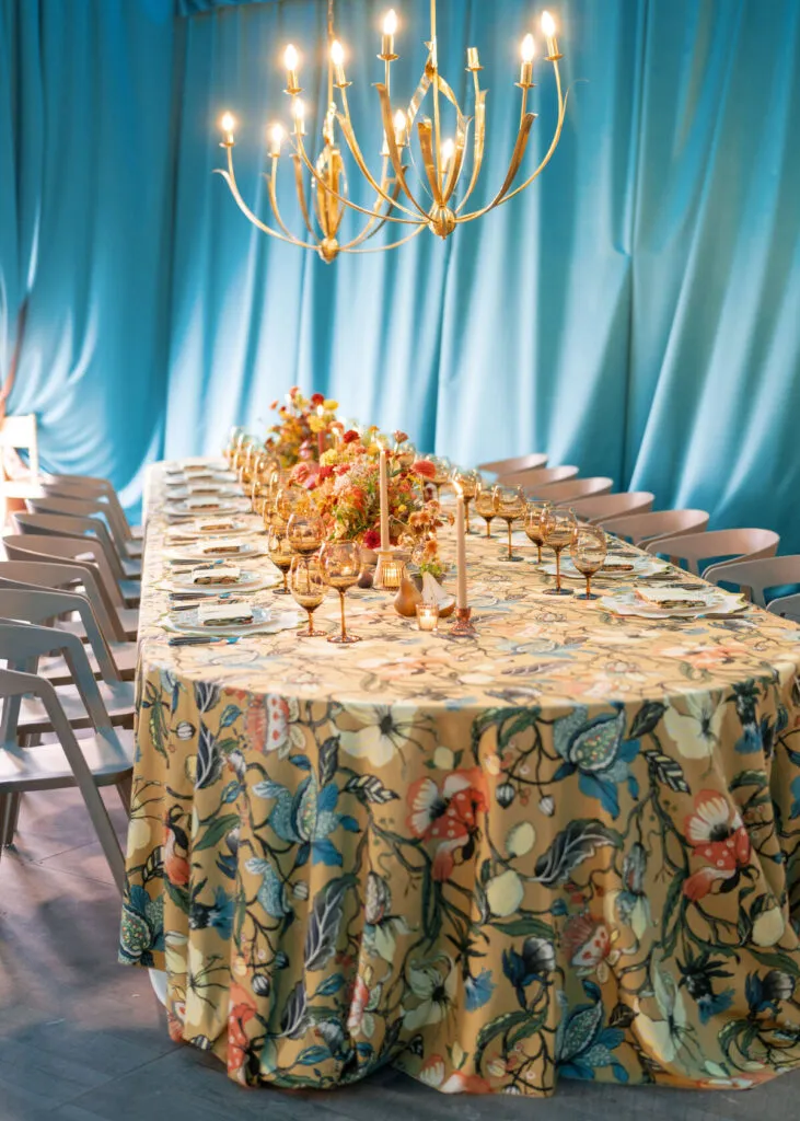
That emphasis can come from texture rather than color alone. A fabric with more dimension, a stronger woven character, or a subtle reflective quality may distinguish the table without departing from the palette used elsewhere in the room. Pattern can serve the same purpose when introduced selectively, as can a layered treatment using an overlay or runner.
The objective is not to make the focal table look unrelated to everything around it. It should feel like the most expressive version of the same visual story.
Use Restraint to Make the Focal Treatment More Effective
A statement surface only feels like a statement when the room gives it space to register.
If every guest table uses the boldest pattern, richest texture, and strongest contrast available, there is little visual distinction left for the tables intended to lead the design. Quieter surrounding treatments allow those focal areas to feel deliberate.
Restraint should not be confused with simplicity for its own sake. Supporting tables can still feel layered and complete. The difference lies in visual intensity. Their role is to reinforce the palette and create continuity without competing with the areas that deserve greater emphasis.
Give Guest Dining Tables a Supporting Role
Guest dining tables often make up the largest visual field in a formal gala, which gives them considerable influence over the atmosphere of the room. Even when they are not intended to be the primary focal point, they create the visual rhythm that holds the larger composition together.
For this reason, supporting tables should never feel like an afterthought. Their treatment may be quieter, but it should be every bit as intentional.
Create Repetition Without Making the Room Feel Uniform
Repetition is useful in large spaces because it establishes order. The challenge is preserving that order without making the ballroom feel overly uniform.
One approach is to establish a consistent base linen across the dining floor while introducing controlled variations through napkins, runners, or selected patterned treatments. Another is to work within a tonal family so tables remain connected even when subtle color shifts appear throughout the room.
The degree of variation should respond to the venue and floor plan. In a highly architectural ballroom, quieter repetition may allow the room itself to remain part of the design. In a more neutral venue, carefully distributed shifts in texture or tone can provide additional visual movement.
The goal is not variety for its own sake. Each variation should strengthen the larger composition.
Consider How Color Multiplies Across the Room
Color behaves differently when it moves from one table to dozens.
A deep burgundy, navy, bronze, or forest tone may feel beautifully controlled on a single sample table, but once it occupies a large percentage of the ballroom, it can dramatically change the mood of the space. Lighter neutrals can have the opposite effect, opening the room visually while placing greater emphasis on florals, lighting, or architectural details.
This is why linen color should never be evaluated independently from the rest of the tablescape. Chair finishes, floral arrangements, menus, glassware, chargers, and lighting all affect how that color ultimately reads.
The strongest palettes often come from considering those relationships simultaneously rather than selecting a linen first and asking every other element to adapt around it.
Use Texture to Create Depth Without Adding Visual Noise
Texture gives a gala room dimension even when the palette is restrained. A room composed entirely of visually similar surfaces can feel flat, while thoughtful shifts in weave, sheen, and softness encourage the eye to move through the space.
The challenge is balance. Texture should enrich the setting without making every surface feel active.
Mix Texture With Intention
Contrasting textures can be particularly effective when they are distributed strategically.
A matte foundation may sit comfortably beside a fabric with a subtle sheen. A dimensional woven linen can provide interest against smoother tabletop elements. Patterned pieces may feel more controlled when surrounded by quieter solids, while richer textures can be concentrated on smaller specialty tables where they will have greater impact without overwhelming the room.
What matters is the relationship between the surfaces rather than whether any individual fabric appears dramatic on its own.
Curated Linen Collection offers a range of textures, patterns, and tonal options that allow planners to build these relationships gradually rather than relying on one fabric to carry the entire concept.
Let Lighting Influence the Linen Selection
Event lighting can significantly change the appearance of linen throughout the evening.
Candlelight may soften a highly dimensional surface, while pinspotting can emphasize sheen and texture. Chandeliers can produce subtle highlights across woven fabrics, and colored uplighting may alter how both warm and cool tones appear once the ballroom transitions into its evening setting.
For events beginning in daylight and continuing after dark, the same fabric may effectively present two different personalities over the course of the event.
Considering linen under the intended lighting conditions helps ensure that the palette and texture remain balanced throughout the full guest experience.
Give Specialty Tables Their Own Design Language
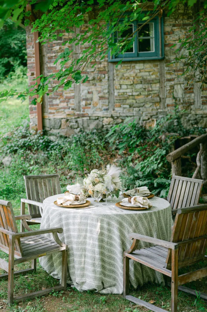
Specialty surfaces provide opportunities to introduce more concentrated design moments because they typically occupy less visual space than the main dining floor.
Bars, welcome tables, escort displays, dessert tables, and other functional areas can therefore carry stronger textile choices while remaining connected to the broader gala palette.
Bars and Cocktail Tables
Bars naturally attract movement throughout an event. They are gathering points, transition spaces, and often prominent visual elements within the floor plan.
A distinctive linen treatment can help define these areas without requiring them to duplicate the dining tables. A stronger pattern, deeper color, or more dimensional texture may work particularly well here because the treatment appears on a smaller number of surfaces.
Cocktail tables can then echo part of that treatment, helping the reception or lounge areas feel connected without becoming repetitive.
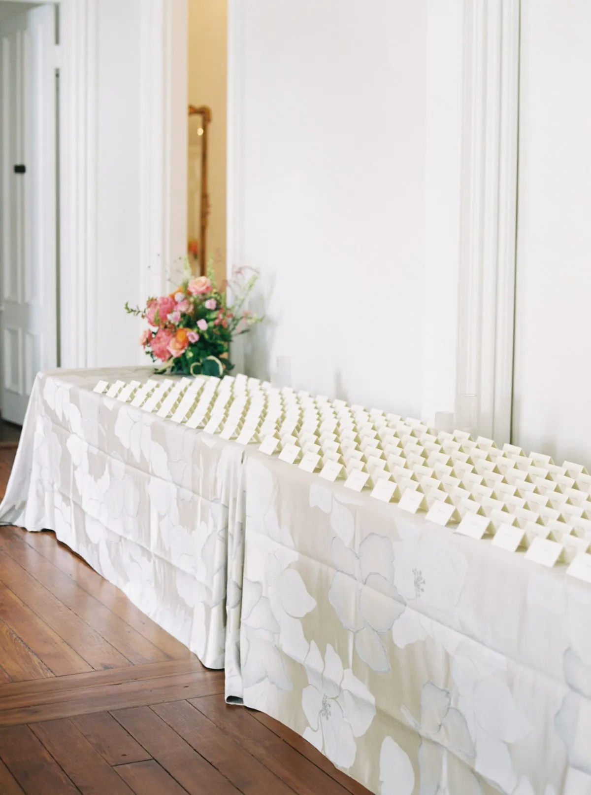
Welcome, Registration, and Escort Displays
The design story of a gala begins before guests reach their seats.
Registration tables, welcome displays, and escort-card stations introduce the palette early in the experience and can offer a preview of what appears inside the ballroom. A linen drawn from the same color family as the dining tables, or a texture that reappears later on a focal surface, can quietly establish continuity from arrival onward.
These areas should still respond to function. A beautifully styled registration table that interferes with guest flow is not successful design. The most effective treatments support both the visual direction and the practical role of the surface.
Dessert, Display, and Specialty Tables
Dessert tables, auction displays, sponsor areas, or other specialty surfaces can repeat selected elements from the primary design rather than introducing an entirely new idea.
A pattern used sparingly at an honoree table might return on a smaller display. A color appearing primarily in napkins may take on a larger role at the dessert table. A particular textural finish can move from one focal area to another.
This type of repetition makes the room feel connected while allowing individual areas to maintain their own character.
Create Cohesion Without Matching Every Surface
A cohesive room does not require every table to look identical.
In fact, excessive matching can make a large gala feel static. Cohesion is more often created through relationships: a repeated undertone, a shared material quality, a recurring accent color, or a pattern that appears selectively throughout the floor plan. Those visual references help different areas feel connected even when their treatments differ.
Choose One Element to Carry Through the Room
One of the simplest ways to establish continuity is to select a recurring design element.
That might be a common base color, a particular family of textures, a metallic undertone, coordinated napkins, or one pattern appearing in carefully chosen locations. The recurring element becomes a visual thread that ties together otherwise distinct zones.
This approach also gives planners more flexibility. The bar can feel richer, the guest tables more restrained, and the honoree table more expressive without any of those areas appearing disconnected.
Allow Different Zones to Have Different Degrees of Formality
A guest’s experience of a gala often unfolds through several environments.
The arrival space may be relatively restrained. The cocktail area may feel more social and dynamic. The ballroom can become more composed and ceremonial, while a lounge or after-dinner area might introduce a softer atmosphere.
Linens can support those transitions by shifting in intensity rather than changing direction entirely.
The result is a room that evolves naturally as guests move through it, with each zone expressing a slightly different interpretation of the same overall design.
Balance Linens With the Rest of the Tablescape
Linen occupies a significant amount of visual space, but it is never experienced in isolation. Florals, tabletop pieces, seating, lighting, stationery, and architecture all shape the finished composition.
For that reason, a linen selection should be evaluated according to what will sit above it, around it, and beyond it.
Consider Florals, Tableware, and Linen Together
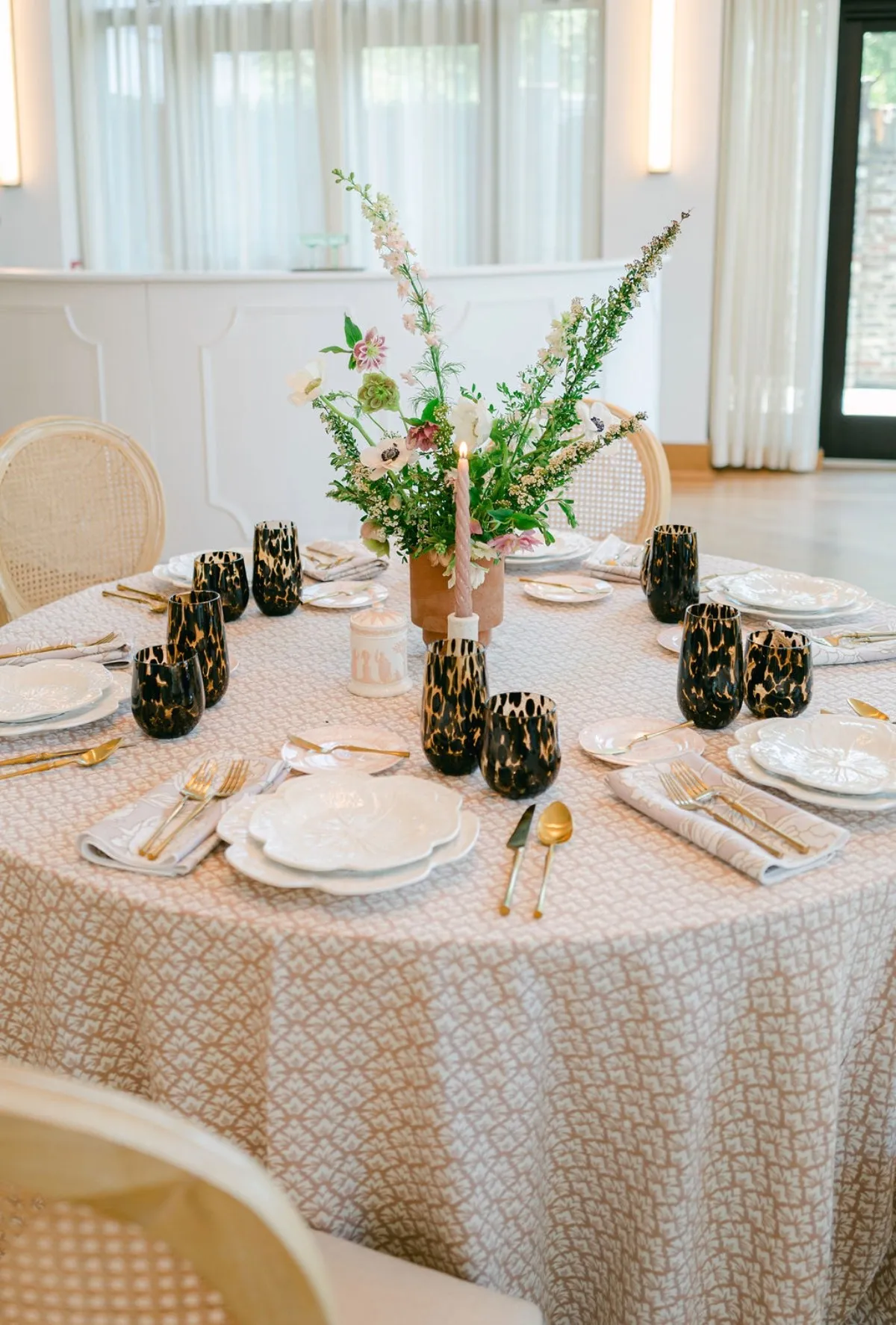
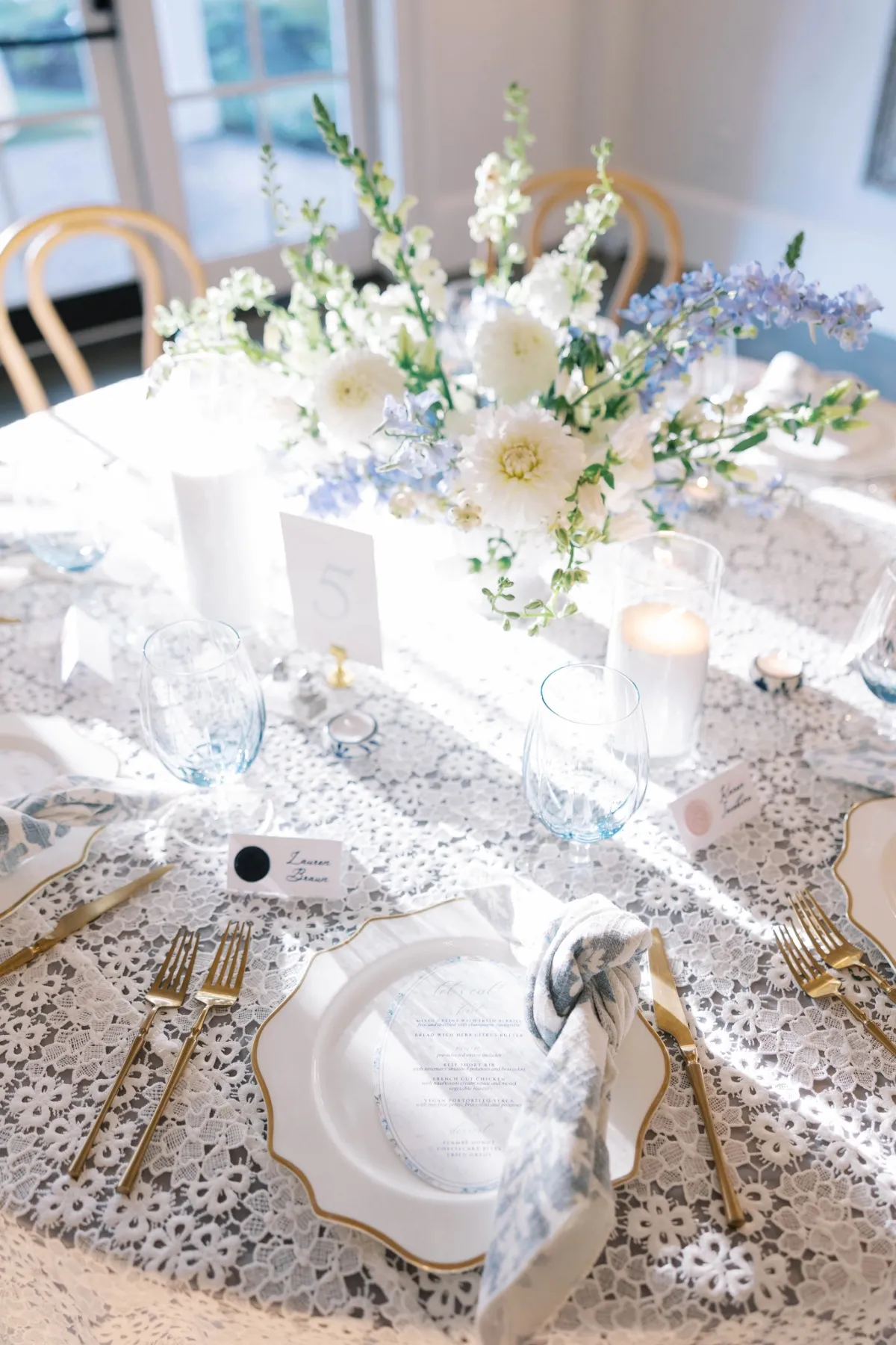
An expressive patterned linen may require a more restrained floral composition or cleaner tabletop pieces so the design has room to breathe. A quieter solid linen can serve as a foundation for sculptural florals, distinctive chargers, or richly colored glassware.
Neither direction is inherently more formal. The stronger option is the one that creates visual balance.
Instead of asking whether a linen is dramatic enough on its own, planners can ask how much visual work the fabric needs to perform once the entire tablescape is assembled. That shift in perspective often results in more nuanced design decisions.
Let the Venue Contribute to the Palette
The venue itself is already part of the event design. Historic ballrooms may introduce ornate molding, patterned carpet, chandeliers, or warm architectural finishes. Contemporary venues may offer cleaner lines, neutral surfaces, or expansive glass. Outdoor and tented settings bring surrounding landscape and natural light into the palette.
Ignoring these elements can create unnecessary visual tension. Responding to them allows linens to feel integrated into the setting rather than placed on top of it.
The room should not merely contain the tablescape. Ideally, the two should strengthen one another.
Review the Gala Design From Across the Room
Before a gala design is finalized, it helps to step away from individual details and reconsider the room as guests will experience it.
Samples and tabletop mockups are invaluable, but they naturally encourage close-range decisions. The final review should return to the broader composition: where the eye travels, which elements dominate, and whether each visual zone contributes appropriately to the whole.
Make Sure the Focal Points Are Clear
When guests enter the ballroom, the important areas should emerge naturally.
The focal point does not need to be aggressively obvious, but the room should offer a clear sense of visual direction. If every table commands equal attention, the design may need greater restraint in the supporting areas.
Conversely, if the focal table feels disconnected from the rest of the room, a recurring color, texture, or pattern can help reintegrate it into the larger palette.
Look for Elements That Compete Too Strongly
Pattern, saturated color, dramatic florals, metallic details, strong lighting, and highly textured linens can all be effective. When too many of these elements occupy the same visual space, however, the room can become difficult to read.
Editing is therefore part of the design process. Removing one layer or quieting a supporting surface can sometimes make the remaining elements considerably more impactful.
Make Sure the Supporting Tables Still Feel Considered
Restraint should never result in tables that appear unfinished.
Guest dining tables still need proportion, texture, and detail even when they are intentionally quieter than the focal areas. Their role is to establish rhythm throughout the floor plan and give the more expressive tables context.
When supporting surfaces feel complete in their own right, the room achieves hierarchy without sacrificing polish.
Frequently Asked Questions
How should linens vary between VIP and guest tables at a formal gala?
VIP or honoree tables can be distinguished through subtle changes in texture, pattern, layering, or color depth while maintaining the broader event palette. The goal is to give these tables greater visual emphasis without making them feel disconnected from the guest dining area.
Should every table at a formal gala use the same linen?
Not necessarily. Using the same linen throughout can create consistency, but a cohesive gala design can also incorporate controlled variations. Different table types may use related colors, textures, or patterns while still sharing a common visual language.
How many different linen styles should be used in one gala?
There is no fixed number. The right amount depends on the floor plan, venue, table types, palette, and overall design concept. It is generally more effective to introduce variation with a clear purpose than to use multiple linens simply to create variety.
Can patterned and solid linens be used together at a gala?
Yes. Patterned and solid linens can complement one another particularly well when their visual weight is balanced. A patterned fabric can serve as a focal treatment while quieter solids support it across larger areas of the room.
How should planners choose a focal linen for a gala?
The linen should be considered alongside the venue, event lighting, floral design, tableware, surrounding colors, and prominence of the table itself. A successful focal linen contributes distinction while still belonging to the larger composition.
A Formal Gala Should Feel Composed, Not Repeated
The most memorable gala rooms rarely depend on one design decision repeated without variation. Their impact comes from the relationship between elements: the table that draws the eye first, the guest tables that establish rhythm across the room, the specialty surfaces that introduce concentrated moments of texture or color, and the architecture that frames everything around them.
Formal gala linens become most effective when they are treated as part of that larger composition. Color, texture, pattern, scale, and placement can work together to distinguish important surfaces while maintaining continuity throughout the floor plan.
Rather than making every table equally expressive, thoughtful linen design allows the room to develop its own visual cadence. Some areas lead, others support, and each contributes to a setting that feels deliberate from the first view across the ballroom to the details guests discover once they take their seats.
Curated Linen Collection gives planners the flexibility to build that kind of layered, coordinated approach through linens designed to work both individually and as part of a larger event story.