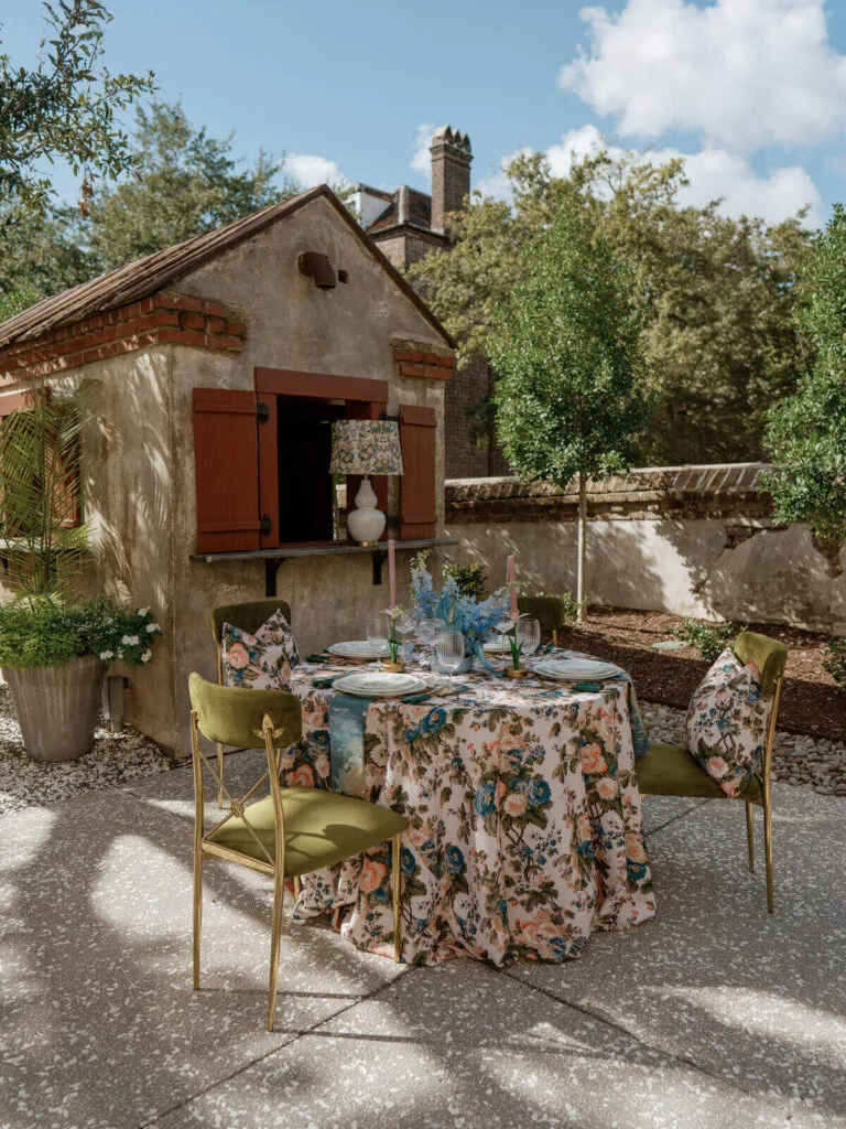
Autumn tablescapes often invite richer color, deeper texture, and a greater sense of warmth, but creating seasonal depth does not require covering every surface with heavy fabrics or layers of décor. Some of the most compelling fall tables begin with restraint: one expressive textile, a carefully considered palette, and enough visual contrast to make each element feel intentional.
The most effective autumn tablescape texture comes from relationships between materials rather than quantity. A matte linen beside polished glassware, a velvet runner against a quieter foundation, or a patterned napkin placed over a solid cloth can create dimension without making the table feel crowded. By considering weave, finish, pattern, drape, and negative space together, planners can build tables that feel unmistakably seasonal while remaining refined and balanced.
Why Texture Matters in an Autumn Tablescape
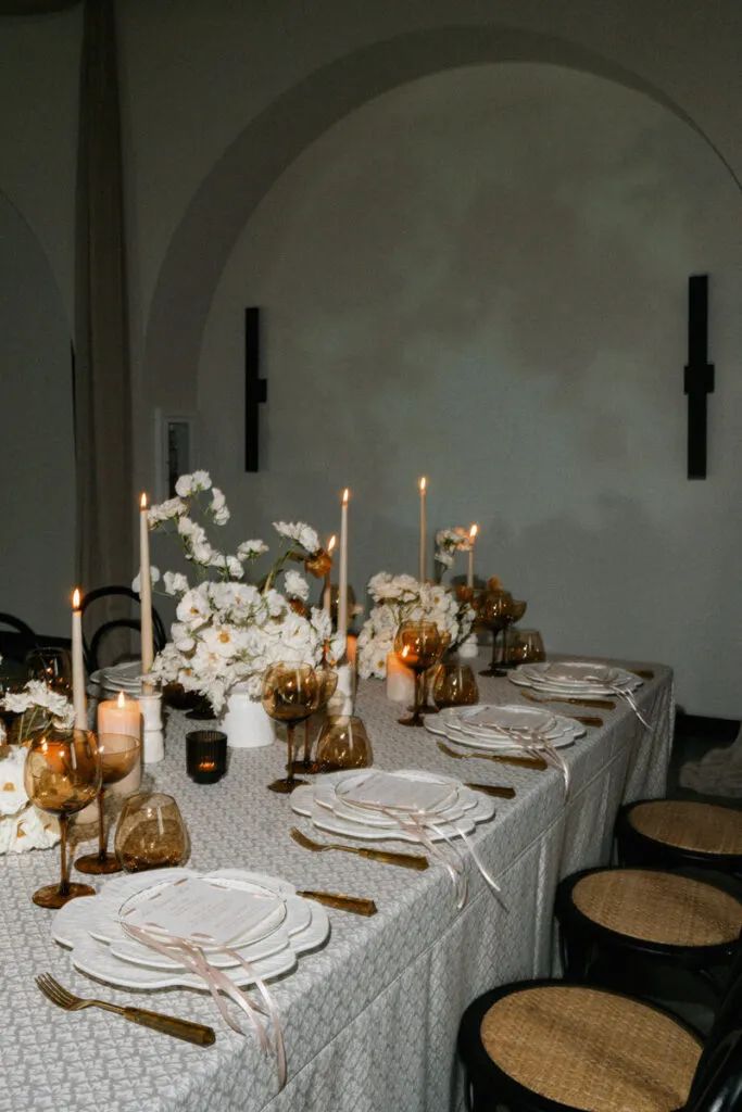
Color often establishes the first impression of a seasonal table, but texture determines how that color is experienced. The same wine, olive, champagne, or warm neutral can feel completely different depending on whether it appears in velvet, linen, sateen, or a patterned textile. Surface, sheen, and drape influence how light moves across the table and how substantial each color appears within the overall composition.
For autumn events, this creates an opportunity to move beyond predictable seasonal palettes. Instead of relying on several dark shades to communicate fall, planners can use contrasting finishes and fabric weights to establish warmth and dimension. The result feels more nuanced because the seasonal character comes from the interaction between textiles rather than color alone.
Texture Creates Depth Beyond Color
A tonal tablescape can carry just as much visual interest as one built around strong color contrast. Mushroom, champagne, warm ivory, and soft taupe, for example, can create a layered autumn setting when their surfaces differ enough to be distinguishable. A woven foundation may absorb light while a smoother accent reflects it, creating depth even when the colors remain closely related.
The same principle applies to deeper seasonal palettes. A saturated textile does not need several equally rich companions to feel complete. When paired with quieter fabrics and reflective tabletop details, a single expressive color can carry more visual authority than a collection of competing tones.
Visual Weight Is Different From Fabric Weight
A textile does not need to be physically heavy to feel visually substantial. Pattern, saturation, sheen, and contrast can all give a fabric greater presence. Likewise, a plush material such as velvet can still feel controlled when it is used selectively rather than repeated across every layer.
This distinction is particularly useful when planning autumn tablescapes. The goal is not to eliminate richness, but to determine where that richness should be concentrated. A visually strong tablecloth may require only a simple napkin treatment, while a quieter base can make room for a more expressive runner or patterned accent.
Start With One Dominant Texture
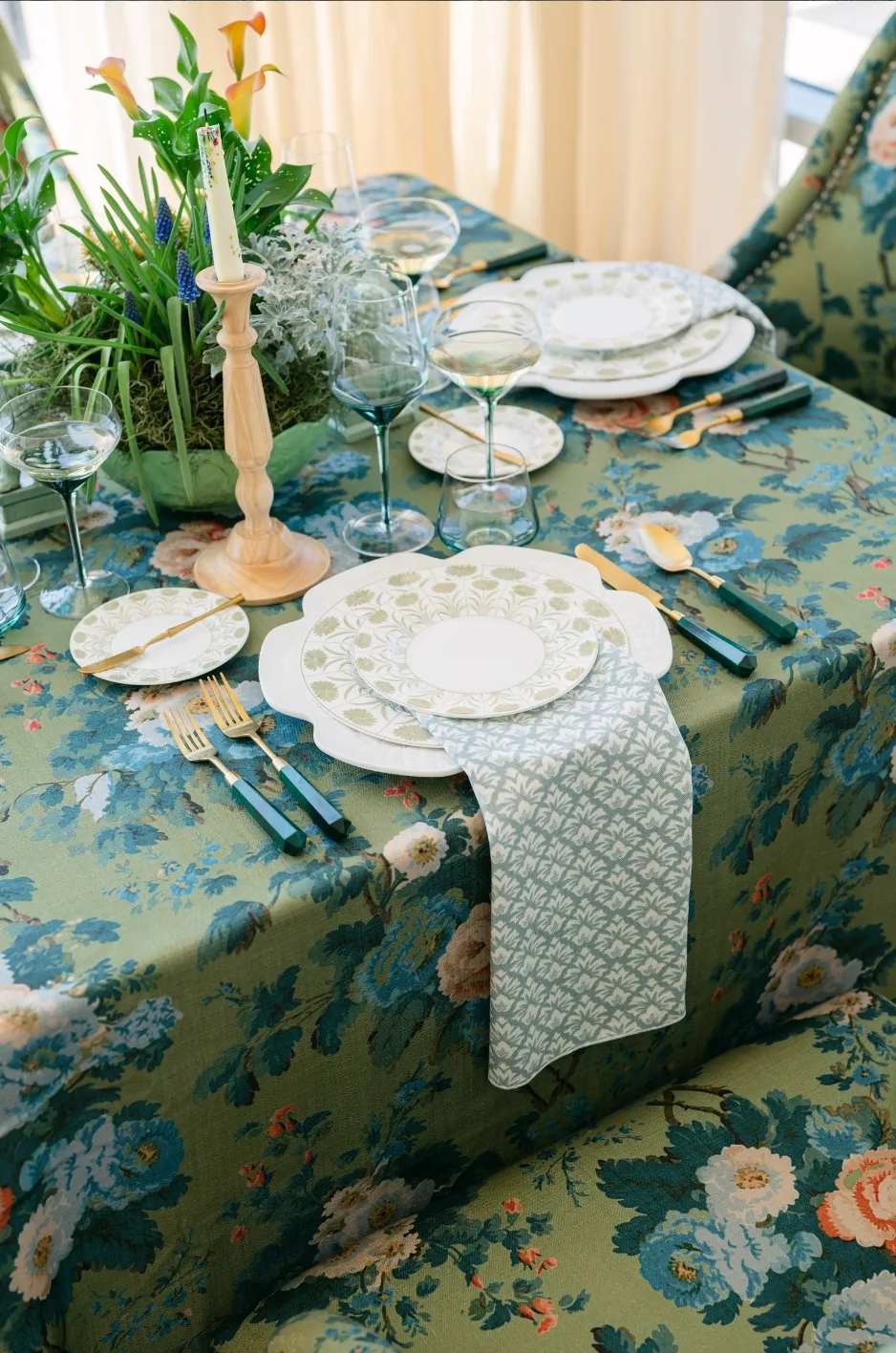
Layered tables feel most considered when one textile establishes the primary mood and the remaining materials support it. Without that hierarchy, even individually beautiful fabrics can begin competing for attention.
Choosing a dominant texture first also simplifies the rest of the design process. Once the lead fabric has been established, napkins, runners, overlays, tabletop pieces, and floral elements can be evaluated according to whether they reinforce or interrupt the intended mood.
Choose the Fabric That Sets the Mood
Different textile finishes communicate different qualities. Velvet brings depth, shadow, and intimacy, making it particularly effective for evening receptions or rooms illuminated by warm light. Woven linen has a quieter surface that can make an autumn table feel relaxed without sacrificing refinement. Jacquard and patterned textiles introduce movement, while sateen can add controlled luminosity to an otherwise matte composition.
No single fabric is inherently more appropriate for fall. The more important decision is determining what the table should feel like. A dramatic evening reception may benefit from a saturated velvet foundation, while an understated estate or garden celebration may feel more cohesive with softly textured linen and selective accents.
Let Supporting Textures Stay Quieter
Once the dominant material is chosen, supporting textiles should provide contrast without creating another focal point. A statement tablecloth might be paired with a restrained napkin, while a simple foundation could support a more decorative runner or overlay.
This is where restraint becomes especially important. If the tablecloth, runner, napkin, charger, menu, and floral treatment all introduce different textures at equal intensity, the design can lose its hierarchy. Keeping one or two elements quieter allows the strongest textile to remain intentional rather than simply becoming one more layer.
Use Contrast Instead of More Layers
Adding depth does not always require adding another material. Often, the more effective approach is to increase contrast between the surfaces already present on the table.
For autumn design, contrast can come through finish, weave, color value, or pattern. This allows the tablescape to feel layered without accumulating visual or physical bulk.
Pair Matte and Reflective Finishes
Matte and reflective surfaces respond differently to light, making them natural partners. A woven linen can provide a grounded foundation beneath polished glassware, metallic details, or a smoother textile accent. Velvet absorbs and redirects light in another way, creating deep shadows that can make nearby reflective pieces appear even more luminous.
These relationships become particularly noticeable during evening events, when candlelight and warm architectural lighting emphasize differences in surface. Instead of adding more décor to create impact, planners can use that contrast to give the existing composition more depth.
Mix Smooth and Textured Surfaces
Contrasting hand-feel also influences how a table reads visually. A softly woven cloth placed beside smooth porcelain or glass introduces enough difference to make each material more distinct. Similarly, a plush runner can create a focused moment of richness over a restrained base without requiring several additional decorative layers.
The most successful combinations tend to have a clear hierarchy. One material provides stronger tactile interest while the other offers visual calm, allowing both to register without competing.
Work With Tonal Contrast
Color can still contribute to depth, but it does not need to rely on dramatic opposites. Closely related shades often feel more sophisticated when they vary in saturation, finish, and texture.
Mushroom with champagne creates a quiet autumn palette that depends on subtle differences rather than bold contrast. Wine can feel more balanced beside softened neutrals than when paired with several other jewel tones. Deep green gains definition against warm ivory, while ochre or rust can be introduced selectively to bring seasonal warmth without dominating the composition.
The objective is not to create a prescribed fall palette, but to use tonal variation as another form of layering.
Let Pattern Add Movement Without Clutter
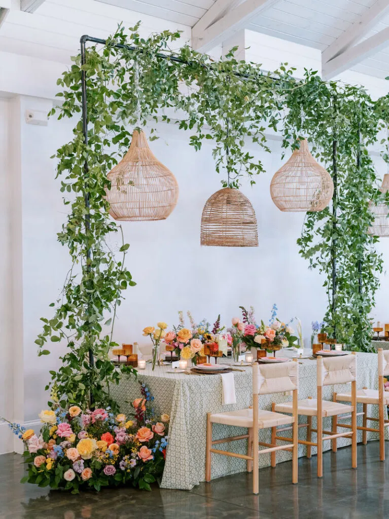
Pattern introduces energy into a tablescape, but it also increases visual weight. Used selectively, it can prevent an autumn setting from feeling flat. Used everywhere, it can make the entire table difficult to read.
The most controlled approach is to determine where pattern will have the greatest impact and allow the surrounding textiles to remain simpler.
Use Pattern as an Accent
A patterned runner over a solid foundation can create a focal line through the center of the table. A statement napkin can bring movement to individual place settings without changing the entire base. Pattern may also be reserved for selected tables, allowing a head table, sweetheart table, or feature area to carry more visual emphasis than the rest of the room.
This selective repetition gives the design rhythm without making every surface equally active.
Consider Pattern Scale
Pattern scale affects how visually dominant a textile becomes. Smaller motifs typically create quieter texture from a distance, while larger patterns read more immediately and can function almost like a graphic element within the room.
For planners seeking depth without heaviness, scale should be considered alongside color. A large, high-contrast pattern may already provide enough movement on its own, while a subtler motif can support additional layers without overwhelming the composition.
Balance Rich Linens With the Rest of the Tablescape
Linens do not exist independently from the objects placed above them. Glassware, chargers, florals, candles, menus, and table shape all affect how textile choices are perceived.
A rich linen can become more impactful when the surrounding elements are restrained. Conversely, a quieter textile can provide a calm foundation for elaborate florals or more decorative tabletop pieces. The strongest autumn tablescapes allow these elements to support one another rather than competing for the same visual territory.
Give Statement Linens Breathing Room
When a tablecloth or runner carries strong color, pattern, or texture, the rest of the table does not need to match its intensity. Simpler tabletop choices can make the textile feel more deliberate because the eye has room to recognize its details.
This is especially effective with plush or patterned fabrics. Rather than layering additional statement pieces over them, planners can allow glassware, candles, or restrained floral compositions to provide lighter contrast.
Protect Negative Space
Negative space is one of the most useful tools for keeping an autumn table from feeling heavy. An open area of cloth between a place setting and centerpiece, a simpler section of runner, or a restrained arrangement of accessories can give richer textures room to register.
Without these quieter areas, each detail begins to compete with the next. Visual depth then becomes visual density. By leaving intentional space around stronger materials, planners can maintain the sense of abundance associated with autumn while preserving clarity.
Think About the Entire Composition
A textile may look beautiful in isolation yet feel different once the full table is assembled. The color of the glassware, finish of the charger, shape of the centerpiece, table dimensions, and even the visual density of menus or place cards can change how the linen reads.
For that reason, fabric selection should be treated as part of a larger composition. The linen provides a foundation, but its success depends on how thoughtfully the remaining elements respond to it.
Use Drape to Change How Texture Reads
Texture is not determined by fiber alone. The way a fabric falls across the table can make the same material appear either structured or fluid, formal or relaxed.
Drape also changes the way light reaches the textile. Folds create highlights and shadows, giving richer fabrics added dimension while allowing lighter materials to introduce movement.
Fuller Fabrics Create Stronger Shadows
Velvet and other substantial textiles create deeper folds, particularly when allowed enough drop to show the character of the material. Under evening lighting, those folds create natural gradations in color that can make a single-tone fabric feel far more dimensional.
Because the material already carries visual presence, it often works best with quieter accents. The drape itself becomes part of the design rather than merely a functional detail.
Lighter Fabrics Create Softer Movement
Woven and more fluid textiles create a different effect. Their movement can soften the edges of a table and keep a layered setting from feeling overly formal or dense.
When paired with richer seasonal colors, lighter drape can also provide balance. The color may remain distinctly autumnal while the fabric movement keeps the overall composition airy.
Let the Event Setting Guide the Finish
Venue architecture should influence how much texture a table needs. A highly detailed ballroom may call for restrained textiles that complement the room rather than compete with it. A modern space can provide a clean background for a more expressive fabric. Garden, estate, and tented events may support softer textures that respond naturally to the surrounding environment.
The goal is not to match the venue literally, but to consider how the textile will interact with the scale, lighting, and existing visual character of the space.
Carry Texture Across the Event With Restraint
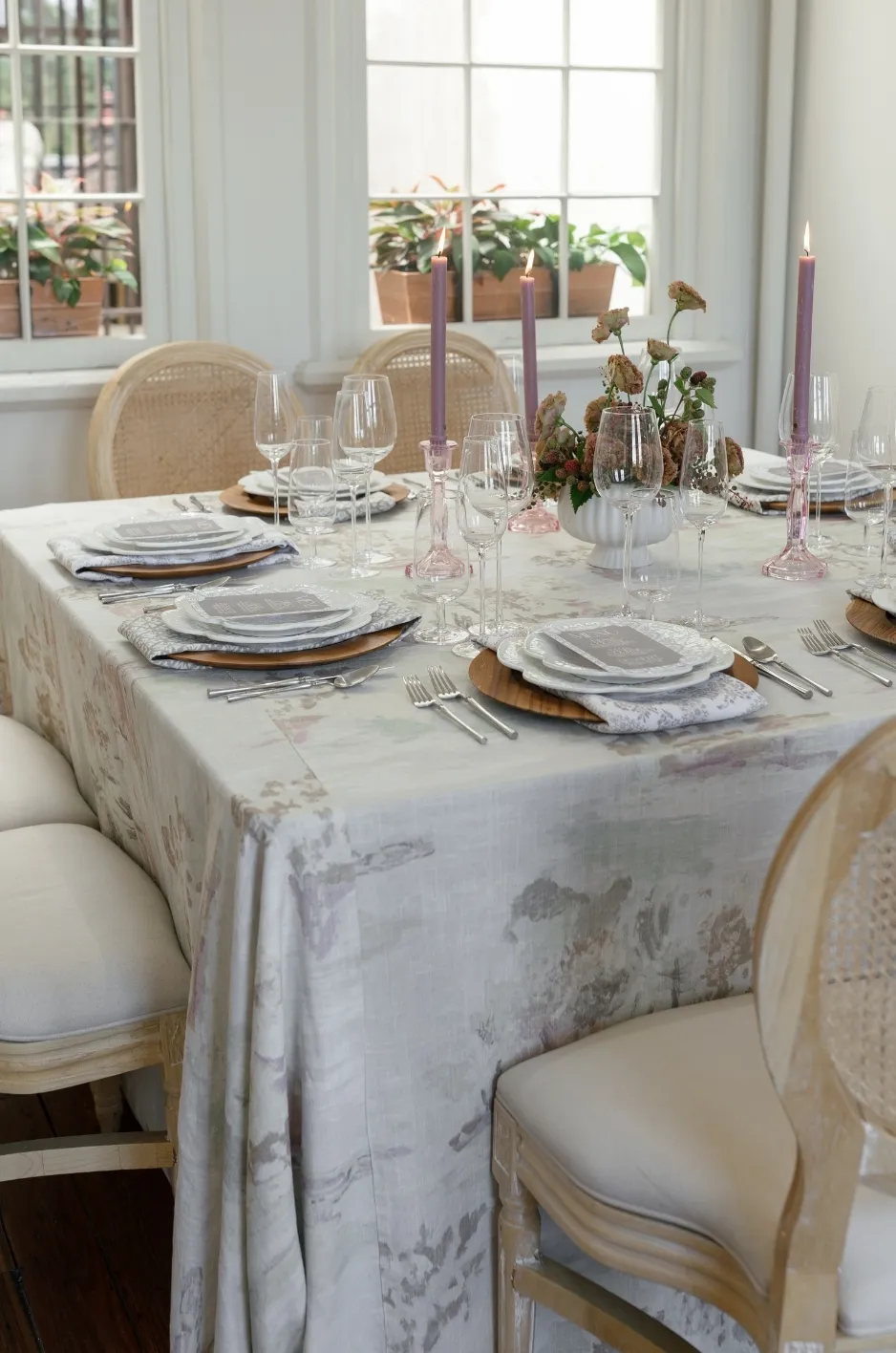
A cohesive event does not require the same textile to appear in exactly the same way on every surface. Repetition is most effective when it feels intentional rather than automatic.
The lead texture can be echoed across the room through smaller moments, creating continuity without flattening the design into a single repeated treatment.
Repeat a Lead Textile Selectively
A fabric introduced on guest tables might reappear as a runner on a feature table, a napkin at a special place setting, or a textile accent within the lounge. Pillows, cocktail tables, bars, sweetheart tables, and other focal areas can all provide opportunities to repeat color or texture without duplicating an entire table design.
Curated Linen Collection’s range of linens, runners, napkins, overlays, and complementary textile pieces gives planners several ways to continue the same visual language at different scales throughout an event.
Avoid Repeating Every Detail Everywhere
Cohesion comes from recognizable relationships, not identical styling. If every table uses the same textile combinations, pattern, napkin treatment, and accessories, the room can lose visual rhythm.
Instead, repeating one or two elements while allowing others to change creates continuity with variation. A lead color might remain consistent while texture shifts slightly, or the same patterned fabric might appear only in selected areas. The design still feels connected, but each space retains its own purpose.
Test the Full Combination, Not Just One Swatch
Fabric samples are useful, but the final design depends on how several materials work together. A textile that appears subtle on its own may become much stronger once repeated across a full table or placed beside reflective tabletop finishes.
Testing should therefore focus on relationships between materials rather than evaluating each piece separately.
View Fabrics Under Event Lighting
Daylight, warm indoor lighting, and candlelight can all change how color and texture appear. Matte fabrics tend to diffuse light, while sateen and other smoother surfaces reflect it more noticeably. Velvet develops deeper shadows as the lighting becomes warmer and more directional.
Viewing samples under lighting similar to the intended event environment can help reveal whether the planned balance of texture will remain effective once the room is fully designed.
Compare Fabrics Together
The main linen should be viewed alongside supporting textiles whenever possible. A napkin that seems understated on its own may compete with a patterned tablecloth, while a runner that initially appears too subtle may provide exactly the right contrast once placed over a matte base.
Comparing textiles with glassware, chargers, and key floral colors can also reveal whether the composition has enough variation or whether it is beginning to feel too busy. The goal is to understand how each element contributes to the whole.
Frequently Asked Questions
How many textures should an autumn tablescape use?
There is no fixed number, but a clear hierarchy usually creates the strongest result. One dominant texture supported by one or two quieter materials can provide enough contrast to make a table feel layered without becoming visually crowded.
Does an autumn tablescape need dark colors?
No. Seasonal depth can come from weave, finish, drape, and pattern even when the palette remains light or neutral. Warm ivories, mushroom tones, champagne, taupe, and other softened shades can feel distinctly autumnal when their textures create enough contrast.
Can velvet and linen be used together?
Yes. Their contrasting surfaces can work particularly well because velvet brings depth and luminosity while woven linen provides a softer, more matte counterpoint. The combination is most effective when one fabric takes the lead and the other plays a supporting role.
How can a tablescape feel layered without adding more décor?
Focus on contrasts already available within the textile and tabletop materials. Matte and reflective finishes, smooth and woven surfaces, tonal variation, controlled pattern, and thoughtful drape can all add dimension without introducing additional objects.
Creating Autumn Depth With Intention
The richest autumn tablescapes are rarely the ones with the greatest number of layers. They are the ones in which each texture has a clear role. A dominant fabric establishes the mood, quieter materials provide contrast, and the surrounding tabletop elements leave enough space for those relationships to be seen.
By approaching autumn tablescape texture through contrast rather than accumulation, planners can create warmth, dimension, and seasonal character without making the table visually heavy. Velvet can provide drama without excess, woven linen can bring softness without feeling plain, and pattern can introduce movement without overwhelming the composition.
Curated Linen Collection offers planners the opportunity to build these relationships through thoughtfully selected linens, runners, napkins, overlays, and textural accents. When each textile is chosen for how it contributes to the complete design, autumn richness becomes less about adding more and more about selecting what matters.