
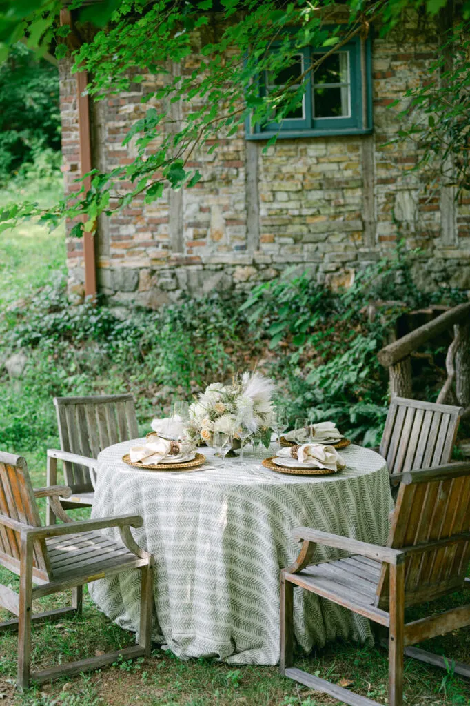
Changing the color story of a tablescape does not always require replacing its entire foundation. Often, one carefully placed linen accent can introduce enough contrast to alter the mood of the table while preserving the elements that already work. A saturated napkin against a quiet tablecloth, a runner that introduces a continuous line of color, or a more expressive linen reserved for a focal table can all shift how the overall setting is perceived.
The strongest tablescape accent color ideas rely less on adding color everywhere and more on deciding where that color should carry the greatest visual weight. Linens give planners considerable control over that decision because they can introduce color at very different scales. A napkin creates a repeated detail at each place setting, while a runner creates a broader visual line and an overlay or statement linen can transform an entire surface. When these choices are made in relation to florals, tabletop pieces, venue finishes, and the surrounding palette, accent color becomes part of a cohesive composition rather than an isolated decorative gesture.
Why One Accent Color Can Shift the Entire Tablescape
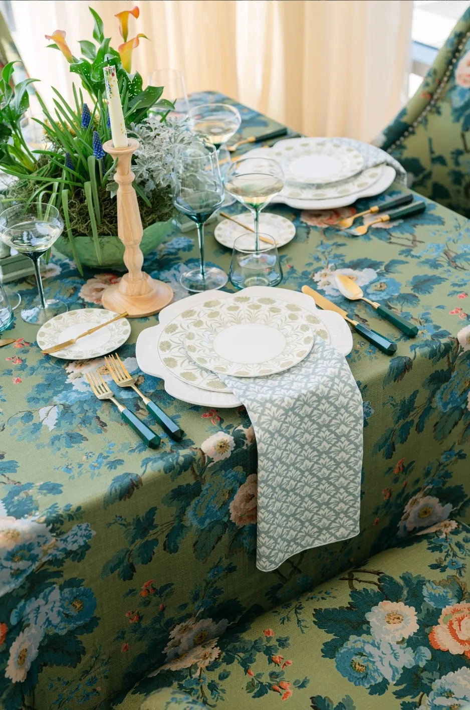
Color has an immediate effect on how a table reads, but it does not need to occupy the largest surface to make an impression. A concentrated shade placed in the right location can create definition, establish contrast, and give the eye a clear point of interest.
This makes accent color especially useful when the underlying tablescape is already cohesive. Rather than rebuilding the entire palette, planners can use a smaller textile intervention to introduce greater warmth, depth, or energy.
Accent Color Creates a Clear Focal Point
A quiet table built around ivory, champagne, taupe, or another restrained foundation can support many different design directions. Introducing one stronger linen color gives the eye somewhere specific to land without sacrificing that versatility.
The placement of the color determines how strongly it influences the design. A saturated napkin creates a focused moment at every setting, while a runner carries the same shade more continuously across the table. A statement linen on a sweetheart or cake table concentrates the color even further, allowing one surface to become a clear focal point within the room.
The objective is not simply to make the table more colorful. It is to use color to establish hierarchy.
Color Works Best When It Already Belongs in the Room
An accent tends to feel most intentional when it relates to something already present in the broader event design. That connection might come from florals, stationery, glassware, architectural finishes, or another recurring detail.
The shades do not need to match exactly. In fact, slightly varied tones can often create a more layered result. A wine-toned linen might sit comfortably beside florals that range from plum to softened rose, while a muted green napkin may relate naturally to foliage without repeating its exact hue.
Thinking in terms of relationships rather than perfect matches allows the tablescape to feel collected instead of overly coordinated.
Start With a Foundation That Lets the Accent Lead
An accent becomes more noticeable when the surrounding surfaces give it room to register. That does not mean every table needs to begin with white or ivory, but it does mean the foundation should support the intended hierarchy.
Quiet solids, subtle patterns, and restrained textures can all work as backgrounds for a more expressive color. The important distinction is between the textile that establishes the base and the textile that is meant to attract attention.
Use Quiet Solids for Stronger Contrast
Ivory, champagne, taupe, cream, soft gray, and other muted shades can provide an adaptable backdrop for stronger color. Because these tones carry relatively little visual competition, an accent introduced through a napkin, runner, or overlay becomes easier to recognize.
This approach is particularly useful when the accent itself is saturated. Jewel tones, deep greens, wine shades, ochre, or other richer hues can become visually substantial when repeated across several tables. Placing them against a quieter foundation helps preserve balance.
A restrained base also allows planners to change the character of the setting through relatively small textile decisions. The same underlying linen can feel noticeably different when paired with a deep velvet runner, a muted patterned napkin, or a warmer tonal accent.
A Subtle Pattern Can Also Act as the Foundation
A quiet foundation does not have to be completely plain. Low-contrast patterns and tonal textiles can introduce movement without competing with the accent.
The key is relative visual weight. A subtle patterned cloth in closely related shades may function almost like a solid from across the room, while still providing interest at the table. A stronger napkin or runner can then become the recognizable color moment.
Conversely, if the base textile already contains an expressive pattern, the accent may need to be quieter. Pulling one shade from the pattern into a napkin or another small linen element can create continuity without adding another competing statement.
Where Should the Accent Color Live?
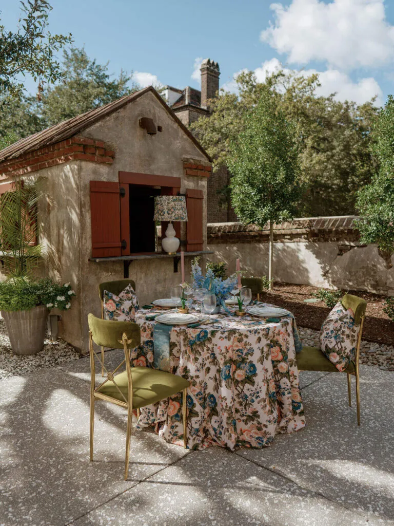
The location of an accent determines how guests experience it. A color repeated at every seat creates a different effect from one concentrated down the center of the table or reserved for a featured surface.
For planners exploring tablescape accent color ideas, choosing where the shade appears should come before deciding how many additional color details to add. Placement is often more influential than quantity.
Napkins for Repeated Pops of Color
Napkins are one of the most controlled ways to introduce an accent because they create relatively small areas of color that repeat throughout the table.
This repetition can establish rhythm without overwhelming the base linen. On a long table, the color appears at predictable intervals, helping connect individual place settings. Across round tables, the same napkin treatment can create continuity throughout the room.
Napkins are particularly effective when the floral design or tabletop pieces already provide substantial visual interest. Rather than adding another large area of color, the textile accent becomes a precise finishing detail.
Their scale also makes them useful for deeper or more saturated hues. A color that might feel dominant as a full tablecloth can appear refined when reduced to a smaller repeated moment.
Runners for a Continuous Line of Color
A runner changes the way accent color moves through a tablescape. Instead of appearing at individual place settings, it creates a directional line through the center of the table.
On banquet, estate, or family-style tables, this can be especially effective because the runner reinforces the table’s natural length. It can connect floral arrangements, candles, and other tabletop elements while introducing enough color to distinguish the center of the composition from the surrounding base.
The visual effect depends on the runner itself. A tonal textile may create subtle depth, while a richer velvet or patterned runner can become one of the strongest design elements on the table.
Because the color occupies more continuous space than a napkin, the surrounding details may need to remain quieter. A strong runner often has more impact when it is allowed to lead.
Overlays and Focal Linens for Greater Impact
When the accent color needs to define a particular surface rather than repeat throughout every guest table, an overlay or statement linen can create a concentrated visual moment.
This approach works particularly well for sweetheart tables, cake or display tables, cocktail tables, and other areas that naturally deserve additional emphasis. A stronger textile treatment can distinguish these spaces while still relating them to the primary reception tables.
The surrounding linens do not need to duplicate the statement. Instead, a shade from the focal textile might reappear in guest-table napkins or another smaller detail elsewhere in the room.
This creates connection without making every surface equally expressive.
Decide Whether the Accent Should Repeat or Concentrate
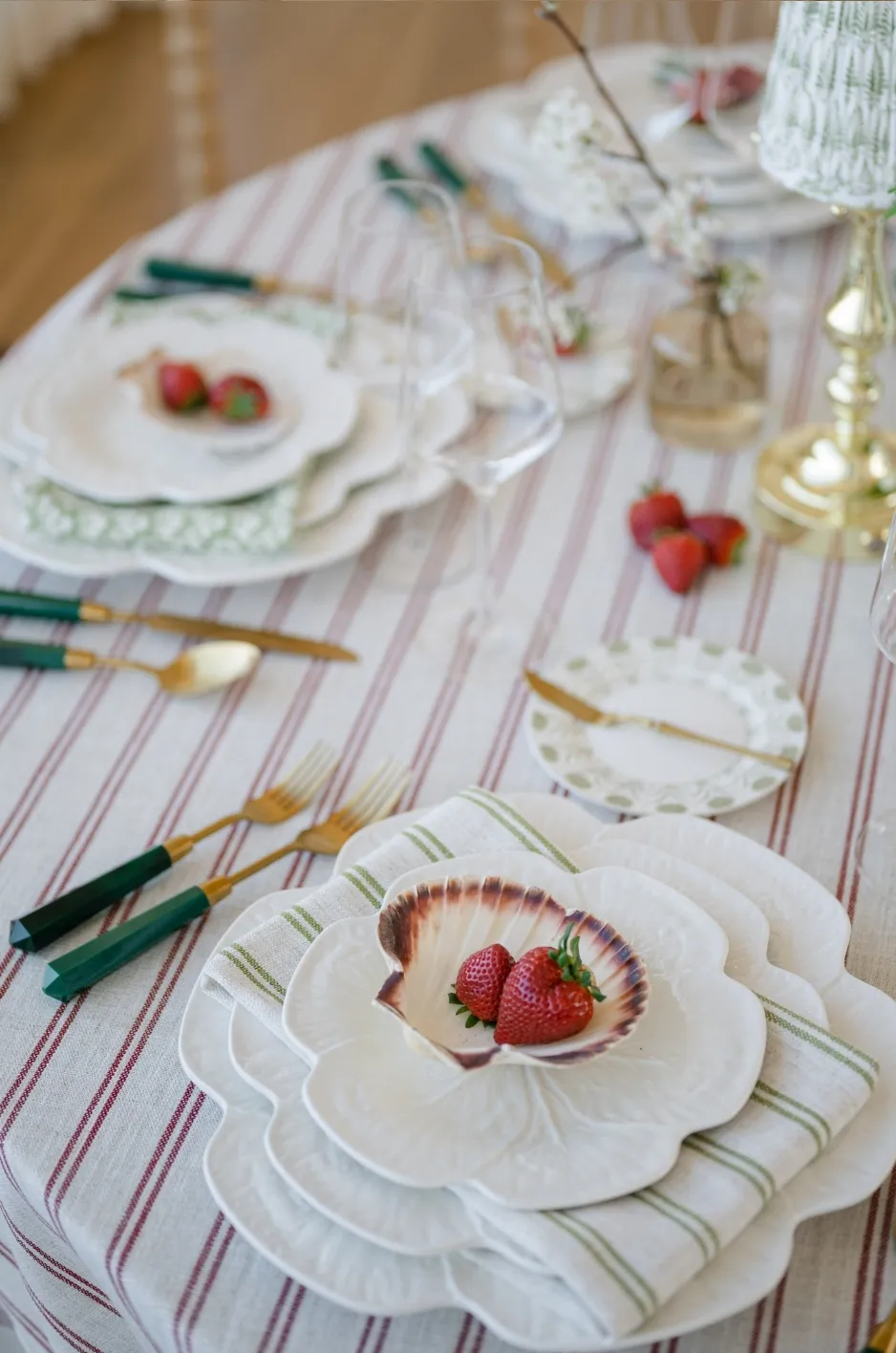
The same color can have a completely different effect depending on how widely it is distributed. Repetition creates continuity, while concentration creates emphasis.
Neither approach is inherently stronger. The right choice depends on what role the accent is meant to play within the larger design.
Repeated Color Creates Rhythm
Repeating one shade through napkins or smaller linen details allows color to travel throughout the room without occupying a large amount of visual space at any single point.
This can be particularly effective across several guest tables. Each individual accent remains restrained, but together they establish a recognizable thread that connects the room.
Repeated color also works well when planners want the floral and tabletop design to remain prominent. The textile provides continuity without competing for the same level of attention.
Concentrated Color Creates Emphasis
Concentrating the accent in a runner, overlay, or feature-table linen creates a much stronger focal moment. The color occupies more visual territory in one location, drawing the eye toward that part of the event.
This can help distinguish key tables without relying on entirely different design languages. A sweetheart table, for example, might use a more expressive linen while still borrowing colors or textures from the surrounding guest tables.
The result feels intentional because the difference reflects the importance of the space rather than appearing as an unrelated styling choice.
Use Both Approaches Carefully
Repeated and concentrated color can work together when they have a clear relationship. A statement runner on the primary table might be echoed through napkins elsewhere, or a focal overlay might introduce a hue that reappears subtly at cocktail tables.
The strongest combinations change the scale of the accent rather than simply repeating the same treatment everywhere.
This variation creates cohesion while allowing the room to develop visual hierarchy.
Build a Clear Color Hierarchy
A successful color palette is not determined by a strict limit on the number of shades used. What matters more is whether the viewer can understand which colors are leading the design and which are supporting it.
When every hue receives equal emphasis, the composition can begin to feel visually competitive. Establishing hierarchy allows several colors to coexist without losing clarity.
Let One Accent Lead
The lead accent should be the shade with the strongest textile presence. It may appear through a runner, napkin treatment, statement tablecloth, or another deliberately selected linen element.
Once that decision has been made, the remaining colors can respond to it. They might appear in smaller quantities or softer variations, helping the lead accent feel connected to the rest of the setting.
This gives the palette structure rather than allowing each color to compete independently.
Let Supporting Colors Echo Rather Than Compete
Secondary colors can enter through florals, candles, glassware, menus, or other tabletop details. These shades do not need the same visual intensity as the primary linen accent.
A supporting tone may simply appear in a floral arrangement or repeat through a small piece of stationery. That is often enough to create a relationship between elements without introducing another major color block.
This approach is particularly useful when the event already includes a varied floral palette. Instead of attempting to reproduce every flower color in the linens, planners can identify one textile accent that complements the arrangement and allow the remaining shades to stay within their original materials.
Avoid Giving Every Color Equal Weight
A tablescape can contain several colors and still feel controlled. Problems usually arise when too many of them are treated as focal points.
If the linen is saturated, the tabletop details may benefit from quieter shades. If the florals are highly expressive, a smaller linen accent may create better balance than another large area of competing color.
The objective is not minimal color for its own sake. It is a clear relationship between dominant and supporting elements.
Let Fabric Texture Change the Character of the Color
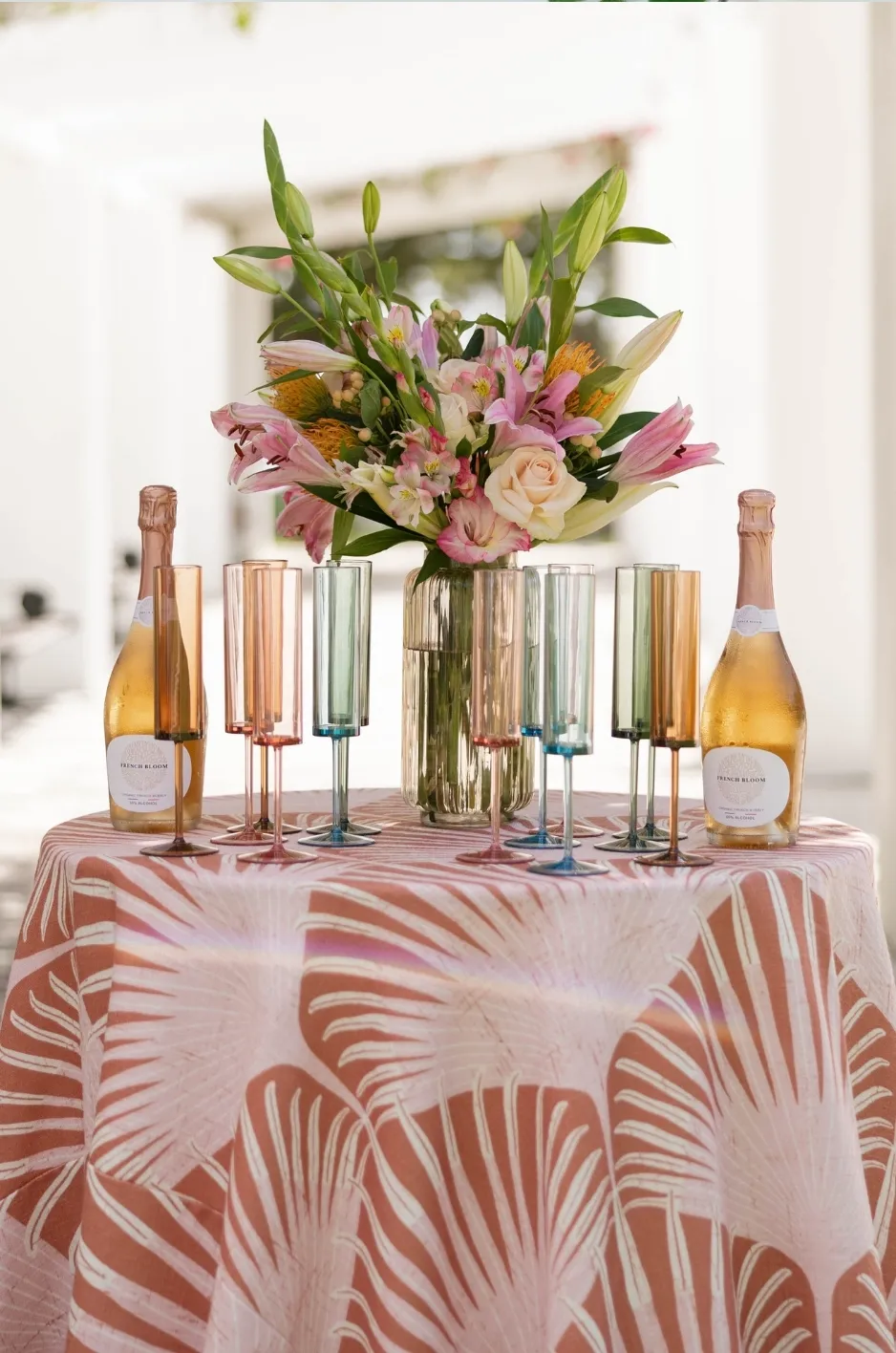
Color never appears independently from its material. Texture influences how a shade interacts with light, how substantial it feels on the table, and whether the accent reads as soft, dramatic, polished, or understated.
For Curated Linen Collection, this relationship between textile and color is particularly important because a similar hue can take on a noticeably different character depending on the fabric used.
Velvet Creates Greater Depth
Velvet brings a distinctive richness to color because its surface creates natural variations in light and shadow. Deep greens, wine tones, blues, and other saturated shades can feel particularly dimensional when expressed through velvet.
This makes it effective when planners want the accent to carry significant visual presence. A velvet runner can introduce depth along a long table, while a velvet focal linen can distinguish a featured surface without requiring several additional decorative elements.
Because the fabric itself contributes so much character, velvet often benefits from restraint in the surrounding textiles.
Matte and Woven Textiles Keep Color Quieter
Matte and woven surfaces tend to create a more subdued expression of color. Rather than relying on sheen or dramatic shifts in light, they allow the hue itself to become the primary visual element.
This can be useful when the accent should feel integrated rather than dominant. A richly colored woven napkin, for instance, can provide enough contrast against a lighter foundation without becoming the strongest feature in the room.
These quieter surfaces can also work well when the tabletop already contains reflective glassware, metallic details, or elaborate florals.
Pattern Can Introduce Color and Movement Together
A patterned linen offers another way to introduce accent color without relying on a single solid block. Several related shades can appear within one textile, giving the table both color and movement.
When pattern is involved, the surrounding palette should respond to its visual complexity. Pulling one color from the textile into napkins or florals can create cohesion, while allowing the remaining tones to stay within the pattern itself.
This helps prevent the tablescape from becoming overly literal or matched.
Balance the Accent With Florals and Tabletop Details
Linen color is only one part of the composition. The strongest tablescapes consider how it interacts with florals, glassware, chargers, candles, menus, and the overall visual density of the table.
The purpose of the accent is to contribute to that composition, not compete with it.
Avoid Matching Everything Exactly
Repeating the exact same shade through linens, florals, menus, candles, and every other tabletop element can flatten the design rather than strengthen it.
A more layered approach allows related colors to sit beside one another. A dusty rose napkin might work with florals that include blush, mauve, and deeper berry tones. An olive textile may relate to greenery without attempting to reproduce it precisely.
These variations create depth while maintaining a recognizable color story.
Give Strong Linen Color Room to Breathe
If a runner, overlay, or full linen carries a highly saturated hue or expressive pattern, the surrounding elements may need more visual restraint.
Simple glassware, quieter napkins, or a more controlled floral palette can allow the textile to remain the focal point. Negative space between stronger details also helps individual materials register more clearly.
The aim is not to strip the table of detail, but to avoid having several elements compete for the same attention.
Let Smaller Accents Support a More Expressive Tablescape
When florals, chargers, or other tabletop details already introduce significant color, the linen accent can become smaller.
A napkin may be enough to establish the relationship between the textiles and the rest of the palette. A subtle runner can provide continuity without becoming another statement.
This flexibility is what makes accent color such a useful design tool. The textile can expand or recede according to what the rest of the table needs.
Check How the Accent Responds to the Setting
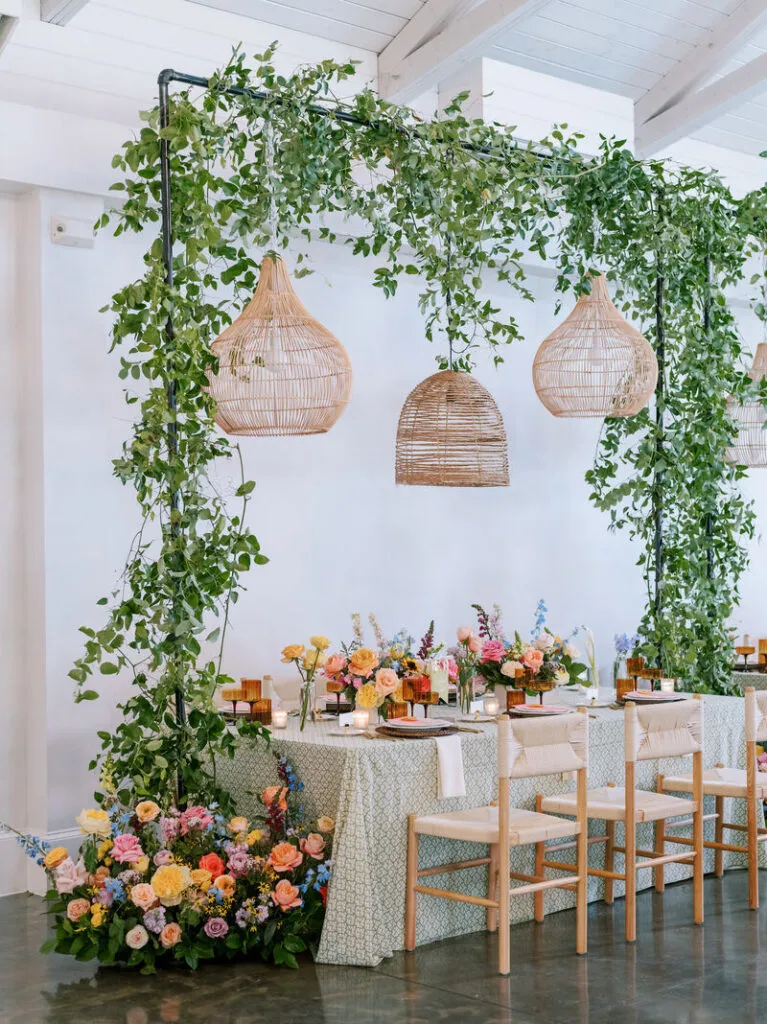
Color should also be considered within the environment surrounding the table. Venue finishes, existing tones, architectural details, and lighting can all affect how strongly an accent appears once the event is assembled.
A shade that works beautifully in isolation may need adjustment when placed inside a room with an established visual character.
Consider the Existing Venue Palette
Wall colors, flooring, architectural finishes, furniture, and permanent décor all contribute to the palette before a single linen is selected.
A venue filled with warm wood and stone may interact differently with an accent than a bright contemporary space with cooler finishes. Rather than ignoring those surroundings, planners can use them to determine whether the textile should create contrast or continuity.
This does not mean matching the venue. The goal is simply to make sure the accent feels intentional within it.
View the Color in Relevant Lighting
Light can make a textile appear warmer, cooler, softer, or more saturated. Natural daylight and evening lighting often reveal different qualities in the same fabric.
For this reason, evaluating the accent under conditions similar to the event can provide a more useful impression than relying solely on how it appears online or under studio lighting.
The effect is particularly important with richer colors and textured fabrics, where shifts in light may create greater variation across the surface.
Consider Color at Full-Table Scale
A textile sample represents only a small fraction of the final design. Once a shade appears on several runners, dozens of napkins, or a full focal table, its visual presence increases significantly.
This is another reason to think in terms of hierarchy. A strong color that appears restrained in a small sample may need fewer supporting accents once it is repeated throughout the room.
Scale should therefore influence not only the textile choice, but also how much additional color is introduced around it.
Carry the Accent Beyond the Guest Table With Restraint
A color story can continue beyond the primary tables without requiring identical textile treatments throughout the event. Repeating a shade at different scales creates connection while allowing each area to maintain its own purpose.
Curated Linen Collection’s range of table linens, runners, napkins, overlays, and complementary textile accents gives planners several ways to shift the scale of a color as it moves through the room.
Repeat the Color at Selected Focal Points
Sweetheart or head tables, cocktail tables, cake and display tables, bars, and lounge areas can all provide opportunities to repeat the primary accent.
The repetition should feel selective. If guest-table napkins carry the color, a focal table might use the same family of color through a runner or fuller linen treatment. If the main table already carries the strongest textile moment, surrounding surfaces may need only small references to it.
This keeps the room connected without making every area look identical.
Change the Scale of the Accent
Changing the size of the color moment is one of the easiest ways to build hierarchy.
A statement runner might establish the strongest version of the accent on a primary table. Guest tables could repeat the color through napkins. A nearby lounge might reference it again through a smaller textile detail.
Because the color remains recognizable while the treatment changes, the event feels coordinated without becoming repetitive.
Know When the Color Story Is Complete
Once the accent has established a clear relationship across the room, adding it to every remaining surface can weaken rather than strengthen the design.
Restraint allows the repeated moments to retain their significance. If the shade already appears at the guest tables and one or two focal areas, another large color treatment may not add meaningful cohesion.
Editing is therefore part of the color strategy. Knowing where not to repeat the accent can be as important as choosing where it first appears.
Frequently Asked Questions
What is the easiest way to add color to a neutral tablescape?
A napkin or runner can introduce a clear accent without changing the entire linen foundation. Napkins create smaller repeated color moments at each setting, while a runner provides a more continuous visual statement through the center of the table.
Should the runner and napkins be the same color?
They do not need to match exactly. If both introduce color, establishing a clear hierarchy usually creates a more balanced result. One may carry the stronger shade while the other remains quieter or relates through a complementary tone.
Can an accent color work with a patterned base linen?
Yes. The accent can pull from one of the shades already present in the pattern or introduce a complementary color. The important consideration is visual hierarchy: the accent should relate to the patterned foundation without competing with it.
Should accent colors match the florals exactly?
Exact matching is not necessary. Related or complementary shades often create a more layered tablescape. Linens can echo one part of the floral palette while allowing the flowers to retain their natural range of color.
How can accent color be repeated throughout the reception?
The same shade can appear at different scales through napkins, runners, focal-table linens, overlays, or selected textile details. Repeating the color selectively rather than applying the same treatment everywhere helps maintain cohesion without making the room feel overly coordinated.
Transforming the Table Through Intentional Color
The most effective tablescape accent color ideas are not necessarily the ones that introduce the greatest amount of color. They are the ones that give color a clear purpose within the design.
A quiet foundation can allow one shade to lead. Napkins can repeat that color with restraint, runners can create a stronger directional statement, and focal linens can concentrate it where greater emphasis is needed. Texture can then change how the shade is perceived, while florals, tabletop details, and venue finishes help place it within a broader visual story.
For planners working with Curated Linen Collection, the opportunity lies in treating each textile as part of that hierarchy rather than as an isolated decorative choice. When color is introduced at the right scale and repeated with intention, even a relatively small linen detail can reshape the way an entire tablescape feels without requiring the rest of the design to start over.