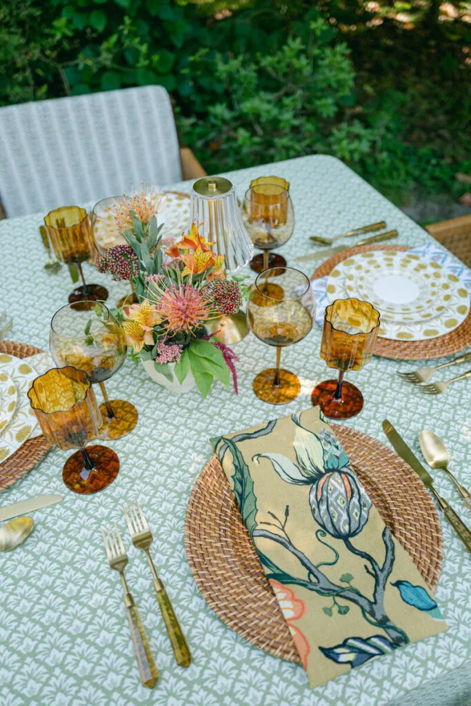
A wedding’s visual identity often begins long before guests enter the reception. It may first appear through a hand-painted invitation, a custom crest, a botanical illustration, or an architectural motif drawn from the venue. Custom printed wedding linens allow that visual idea to move beyond paper and become part of the physical reception environment.
The process involves more than reproducing an image on fabric. Artwork created for stationery must be adapted to account for pattern repetition, textile dimensions, table shape, fabric drape, lighting, and the decorative elements that will eventually cover parts of the linen. A design that appears clear on an invitation may need to be simplified, enlarged, repositioned, or recolored before it can work effectively across a tablecloth, runner, napkin, or specialty overlay.
Curated Linen Collection develops custom textiles from initial pattern ideation and color selection through fabric printing, cutting, sewing, and finishing. Its custom capabilities allow couples and planners to transform a creative reference into tailored linen details that support the complete event design.
This guide explains how to translate wedding artwork into custom printed linens while preserving the character of the original design and adapting it to the practical requirements of a reception table.
Begin With One Clear Source of Inspiration

A focused visual reference gives the custom-print process a clear direction. Combining too many unrelated images, motifs, and colors can result in a textile that feels crowded or disconnected from the rest of the wedding.
The strongest designs usually begin with one primary source and a limited number of supporting details.
Use the Invitation Suite as a Starting Point
Wedding stationery can provide several elements suitable for a custom textile, including:
- A floral illustration
- A painted border
- A monogram or crest
- A geometric frame
- A line drawing
- A color relationship
- A small symbolic motif
The linen does not need to reproduce the invitation exactly. A border may become a repeating runner pattern, while a single painted flower may be expanded into an all-over tablecloth design. A crest can be isolated for napkins or positioned on the front panel of a focal table.
The objective is to create a recognizable connection without making the reception textiles look like enlarged stationery.
Draw From the Venue’s Architecture or Setting
The venue can also provide a distinctive source of inspiration. Decorative ironwork, tile patterns, molding, ceiling details, garden layouts, or surrounding landscapes may be translated into lines, shapes, and repeating forms.
A coastal venue might inspire fluid lines or a restrained palette rather than literal shells or waves. A historic estate could inform a border through its architectural details without requiring an exact illustration of the building.
This approach helps the custom linen feel specific to its setting instead of relying on a generic wedding motif.
Translate Floral Direction Into a Textile Motif
The floral plan can influence a print through color, shape, and movement. A custom design might reference trailing stems, loose botanical forms, clustered blossoms, or the contrast between flowers and foliage.
The textile does not need to depict every flower planned for the event. Selecting one recognizable botanical form and repeating it with intention usually creates a clearer design.
The custom print should also support the actual floral arrangements rather than compete with them. When the flowers are highly detailed, a more open or tonal interpretation may provide better balance.
Incorporate a Crest, Monogram, or Meaningful Symbol
A wedding crest or monogram can become part of a broader textile design rather than appearing only as a standalone mark.
It may be:
- Repeated subtly within a pattern
- Incorporated into a border
- Positioned at the ends of a runner
- Printed on napkins
- Centered on a front-facing table panel
- Combined with a botanical or geometric frame
Small symbols tied to a meaningful location, family reference, shared interest, or personal story can also be adapted for fabric. The mark should remain simple enough to be recognizable after printing, folding, and styling.
Avoid Combining Too Many Sources
Invitation artwork, floral references, venue details, family symbols, and custom lettering do not all need to appear in one linen.
Choose the feature that carries the strongest visual identity, then use one supporting reference where needed. A venue-inspired pattern might use colors from the florals, for example, without also incorporating a crest, date, initials, and invitation border.
A disciplined starting point gives the finished textile greater clarity.
Decide What Should Be Preserved From the Original Artwork
Artwork created for paper or a digital screen may contain details that do not translate cleanly to fabric. The design team must identify which parts are essential to the artwork’s character and which can be adjusted.
Identify the Recognizable Motif
Begin by determining what makes the artwork immediately identifiable.
It could be:
- The outline of a particular flower
- A distinctive brushstroke
- A repeated leaf
- A geometric form
- The shape of a border
- A crest
- A specific combination of colors
Preserving that central feature is more important than retaining every small line or decorative detail.
Simplify Fine Lines and Small Details
Very fine lines, small lettering, subtle shading, and tightly grouped elements may lose clarity when transferred to fabric.
The artwork may need:
- Thicker outlines
- More spacing between elements
- Reduced internal detail
- Stronger contrast
- Simplified shadows
- Larger lettering
- Cleaner edges
These changes do not weaken the design. They help preserve its visual identity under the conditions in which the linen will actually be used.
Determine Whether the Design Should Feel Literal or Abstract
Some artwork translates best as a recognizable illustration, while other references become more effective when simplified into an abstract pattern.
A floral painting might remain clearly botanical for a garden reception. The same source could be reduced to loose shapes and tonal brushwork for a more editorial tablescape.
The choice should reflect the broader wedding direction:
- Literal illustrations can feel expressive and romantic.
- Abstract shapes can create a cleaner, more contemporary effect.
- Tonal interpretations add texture without becoming dominant.
- High-contrast artwork creates a stronger focal linen.
Protect the Character of Hand-Drawn Artwork
Hand-painted and hand-drawn artwork often contains irregular lines, visible brushwork, and variations in color that give it personality.
Over-refining these qualities can make the final print feel generic. The adaptation should improve clarity while preserving the movement and imperfections that made the original work distinctive.
Choose the Right Pattern Structure for the Linen

Once the artwork has been refined, it must be arranged in a format suited to the intended linen. The same motif can become an all-over repeat, a border, a placement print, or a directional design.
Use an All-Over Repeat for Continuous Pattern
An all-over repeat distributes the motif across the entire fabric.
This structure can work well for:
- Guest-table cloths
- Statement tablecloths
- Cocktail linens
- Coordinated pillows
- Larger textile installations
The repeat should feel seamless after the linen is draped over the table. Visible gaps, dense clusters, or obvious repeat lines can make the design appear mechanical.
Pattern density also matters. An open repeat leaves more negative space, while a close repeat creates greater movement and visual intensity.
Create a Border Print for Controlled Detail
A border limits the main artwork to the edges of the textile.
This approach can:
- Frame a tablecloth
- Define a runner
- Highlight a tailored or scalloped edge
- Preserve a quieter tabletop surface
- Leave room for detailed place settings
The border must be designed according to the final dimensions and intended drop. A border created without accounting for the table height may fall too close to the floor or become hidden beneath chairs.
Use a Placement Print for a Focal Motif
A placement print positions the artwork in a specific part of the linen rather than repeating it across the surface.
It is particularly effective for:
- Sweetheart tables
- Cake tables
- Escort displays
- Welcome tables
- Runner ends
- Front-facing table panels
Placement must account for the primary viewing angle, folds, table dimensions, and the decorative objects that will sit in front of the motif.
Develop a Directional Pattern for Runners
Runners have a long, narrow format that benefits from artwork designed to travel in one direction.
Botanical stems, vines, stripes, borders, and linear illustrations can reinforce the table’s length. The design should remain consistent across joined banquet tables and face the same direction throughout the reception.
Use a Tonal Print When the Table Needs Restraint
A tonal print uses closely related colors to add visual texture without becoming the table’s primary focal point.
This approach can work well when the tablescape already includes:
- Detailed florals
- Patterned china
- Illustrated menus
- Colored glassware
- A prominent backdrop
- Multiple reflective finishes
The design remains personalized but allows the surrounding elements to carry more visual weight.
Adjust the Print Scale for Each Linen Product
A pattern should not be applied at the same scale to every product. Tablecloths, runners, napkins, and overlays each present the artwork differently.
Curated Linen Collection offers custom options across tablecloths, printed runners, napkins, overlays, cocktail linens, display fabrics, and other textile accents.
Allow Larger Motifs Room on Tablecloths
Full tablecloths offer the largest area for custom artwork, but much of the surface may eventually be covered.
Before approving a large pattern, consider the space occupied by:
- Chargers and plates
- Glassware
- Menus
- Florals
- Candles
- Table numbers
- Additional linen layers
- Natural folds in the fabric
Large motifs work best when enough uninterrupted textile remains visible across the tabletop or drop.
Use Narrower or Directional Designs on Runners
The runner’s proportions may require:
- A smaller repeating motif
- A continuous border
- A stripe
- A botanical vine
- Artwork positioned at the ends
The design should remain visible between floral vessels and candle groupings rather than disappearing beneath the centerpiece plan.
Reduce and Simplify Patterns for Napkins
Napkins are folded, tucked, draped, and often covered partly by menus or plates. Only a limited section of the design may remain visible.
The artwork should still work when the napkin is:
- Folded into a rectangle
- Draped over a plate
- Placed beneath a menu
- Tucked under a charger
- Positioned beside the setting
Smaller motifs, simplified prints, borders, and isolated marks usually adapt more successfully than oversized illustrations.
Adapt the Motif for Specialty Overlays
An overlay can use a more open or selectively placed design because the base linen remains visible beneath it.
Its pattern scale should account for the overlay shape, table dimensions, intended drop, and the color or texture of the foundation.
Create Related Scales Rather Than Identical Copies
One visual motif can appear in several sizes across the reception:
- Large on a statement tablecloth
- Medium along a runner
- Smaller on napkins
- Isolated within a border or crest
- Repeated selectively on pillows or cocktail linens
Changing the scale creates continuity without making every custom textile look identical.
Refine the Color Palette for Fabric

Colors seen on a screen or printed on paper may change when applied to a textile. Fabric texture, finish, lighting, print scale, and nearby materials all influence the final result.
Begin With the Confirmed Wedding Direction
Custom color development should begin after several major design decisions are established, including:
- The venue
- Floral direction
- Tableware
- Stationery
- Lighting
- Chairs and furniture
- Existing architectural colors
This context helps the printed linen feel integrated rather than independently designed.
Limit the Number of Printed Colors
A controlled palette usually gives a pattern greater clarity.
Identify:
- One dominant color
- One or two supporting shades
- A grounding neutral
- An optional accent
Using every color from the wedding palette in one textile can make the print difficult to coordinate with florals, napkins, and tableware.
Evaluate Warm and Cool Undertones
Colors with similar names may behave differently when placed together.
For example:
- Warm ivory may conflict with cooler white china.
- Olive may coordinate differently than blue-green.
- Red-based wine may feel different from a cooler plum.
- Peach-based blush may not align with lavender-toned pink.
Physical samples allow these undertones to be compared directly.
Review Color on the Selected Fabric
The same printed shade can appear different on velvet, textured linen, a matte surface, or a gently luminous custom blend.
Curated Linen Collection offers tabletop pieces made from fabrics that include velvets, linen, and custom blends, making the selected base textile an important part of color approval.
Test the Print Under Venue Lighting
A custom sample should be reviewed in lighting similar to the event.
Natural daylight, warm interior fixtures, candlelight, and uplighting can alter the perceived depth and undertone of the colors. Dark prints may lose detail after sunset, while reflective fabrics may become more pronounced.
Plan Motif Placement Around the Table Dimensions
The artwork must be positioned according to the actual linen size, table shape, desired drop, and tabletop layout.
Confirm Exact Table Measurements
Document:
- Table length
- Width or diameter
- Height
- Intended linen drop
- Quantity
- Joined table sections
- Specialty shapes
Curated Linen Collection offers standard and specialty linen sizes, with custom sizing available for bespoke requirements.
Map the Place-Setting Footprint
Identify where plates, napkins, menus, glasses, and flatware will sit before finalizing the artwork.
This prevents the same part of the design from being hidden at every seat. A border may need to sit beyond the plate line, while a repeating motif may need enough open space between place settings to remain visible.
Account for Florals and Candle Arrangements
Mark the space that will be occupied by:
- Floral vessels
- Candles
- Table numbers
- Serving pieces
- Decorative objects
The main artwork should not be positioned entirely beneath these elements.
Protect Front-Facing Designs
Sweetheart tables, cake tables, welcome displays, and escort tables are frequently viewed from the front.
For these surfaces, confirm that:
- The central motif is aligned.
- Borders remain level.
- Text faces the correct direction.
- Seams do not interrupt the artwork.
- The design appears clearly in photographs.
Confirm Alignment Across Joined Tables
Long banquet tables may consist of several smaller tables placed together.
Repeats, borders, and runners should appear continuous across the full length. Any break in the textile should be positioned where it creates the least visual disruption.
Coordinate the Custom Print With Supporting Solids
Custom printed wedding linens usually make the strongest impact when the surrounding textiles are restrained enough to support them.
Select One Hero Printed Linen
Determine where the main artwork will appear:
- Full tablecloth
- Runner
- Napkin
- Overlay
- Focal-table linen
The other textiles should reinforce that choice rather than compete with it.
Pull Supporting Colors Into Solid Napkins
A solid napkin can repeat a quieter secondary shade from the custom print.
Selecting the print’s dominant color for every napkin may make the table feel oversaturated. A supporting tone often creates a more layered and balanced relationship.
Use a Solid Base Beneath a Printed Runner
A custom runner can carry the primary artwork while a solid tablecloth provides a stable foundation.
The base should provide enough contrast for the design to remain clear without introducing a separate competing color story.
Keep Nearby Patterns Restrained
When the printed linen contains substantial detail, consider simplifying:
- China
- Chargers
- Menus
- Glassware
- Additional textile layers
The custom artwork needs enough negative space to remain legible.
Repeat One Detail Outside the Dining Tables
A controlled element from the print can appear elsewhere through cocktail linens, lounge pillows, napkins, or display-table textiles.
Curated Linen Collection can extend custom fabrics beyond the primary tabletop to support the overall event design.
Build a Complete Table Mockup

The custom linen should be evaluated as part of the full tablescape.
Assemble a Representative Place Setting
Include:
- The custom linen
- Supporting textiles
- Plates and chargers
- Napkins
- Glassware
- Flatware
- Menus and place cards
- A floral sample
- Candles
Review the Table From Multiple Angles
Examine the print:
- From a seated position
- From standing height
- From across the room
- From the ends of the table
- From the photographer’s likely angle
Check How Much of the Print Remains Visible
When the most important part of the artwork is covered, adjust the pattern placement, floral footprint, runner width, napkin arrangement, or menu position.
Photograph the Mockup Under Event Lighting
Photographs may reveal:
- Lost detail
- Low contrast
- Excessive reflection
- Unexpected color shifts
- A pattern that appears busier on camera
Edit Competing Elements
When the table feels crowded, simplify the surrounding details instead of adding more custom features.
A hero linen should remain the clear textile priority.
Prepare the Custom Linen Order
Once the artwork, fabric, dimensions, and mockup have been approved, the design can be translated into a complete order.
Create a Product Schedule
Document each piece by:
- Product type
- Fabric
- Pattern
- Size
- Quantity
- Table category
- Intended placement
Reconfirm Final Table Counts and Dimensions
Changes to the floor plan, guest count, or furniture inventory may affect custom sizes and quantities.
Final measurements should be verified before production.
Allow Enough Time for Custom Development
Curated Linen Collection recommends placing standard orders at least four to six weeks before an event and allowing a minimum of eight to twelve weeks for custom designs.
Custom projects may require time for consultation, pattern development, color refinement, sampling, approval, printing, cutting, sewing, and finishing.
Confirm the Receiving Contact
Identify whether the shipment will be received by the planner, venue, hotel, private residence, or another designated contact.
Inspect the Linens After Arrival
Confirm:
- Quantities
- Dimensions
- Pattern direction
- Colors
- Custom details
- Supporting textiles
Questions should be addressed before the event rather than during table setup.
Preserve Packaging for the Return
Curated Linen Collection offers nationwide shipping through UPS Ground, provides tracking information, and instructs clients to repack rented linens in the supplied return packaging after the event.
Frequently Asked Questions
Can the same design be used on tablecloths, runners, and napkins?
Yes, but the scale and arrangement should be adapted to each product. A large tablecloth motif may become a directional runner design or a simplified napkin print.
How can custom linen colors be coordinated with florals?
Rather than reproducing every floral color, select one dominant tone, a few supporting shades, and a grounding neutral. Physical fabric samples should be reviewed beside the floral references.
Can a wedding crest or monogram be incorporated into a print?
Yes. A crest or monogram can be repeated subtly, placed within a border, printed on napkins, or positioned as a focal motif on a tablecloth or runner.
Should every reception table use the custom design?
Not necessarily. Custom prints can be reserved for guest tables, focal tables, runners, napkins, or display surfaces. Strategic use often creates greater impact than repeating the pattern everywhere.
How should a custom print be tested before approval?
Review a physical fabric sample and build a representative table mockup with the proposed place settings, florals, menus, and lighting.
When should custom-printed wedding linens be ordered?
Custom projects should generally begin at least eight to twelve weeks before the event. Earlier planning provides more time for artwork adaptation, sampling, approval, and production.
Turn a Wedding Design Into a Complete Textile Story
Custom printed wedding linens allow an original visual idea to move from stationery, artwork, or venue inspiration into the reception environment. The strongest results come from thoughtful translation rather than direct reproduction.
The process begins with one clear source. The recognizable parts of the artwork are then refined, simplified where necessary, and arranged into a pattern structure suited to the intended textile. Scale must be adjusted for tablecloths, runners, napkins, and overlays, while color must be reviewed on the selected fabric and under lighting similar to the event.
Table dimensions, place settings, florals, and viewing angles should guide motif placement. Supporting solids can then reinforce the custom print without competing with it. A physical sample and complete mockup provide the final opportunity to check clarity, drape, balance, and visible pattern before production begins.
Curated Linen Collection develops custom textiles from pattern design and ideation through color selection, fabric printing, cutting, sewing, and finishing. With custom sizing, design guidance, and nationwide shipping available, couples and planners can translate a meaningful visual reference into linens that feel specific to the wedding and fully integrated into its broader design.