
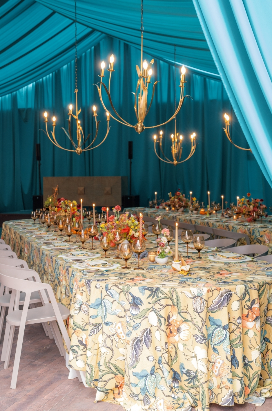
Choosing the right linen color starts with the venue. Walls, flooring, ceilings, wood tones, stone, metal finishes, carpet, lighting, and built-in furniture all influence how a linen color will appear once it is placed in the space. A shade that looks refined in a sample photo may feel too warm, too cool, too bright, or too muted against the venue’s existing palette.
For planners and hosts, linen color selection should not happen in isolation. Tablecloths, napkins, runners, overlays, and accent linens should bridge the venue’s fixed colors with the event’s chosen palette, florals, tabletop rentals, signage, and lighting. When the colors work together, the full event feels more intentional, polished, and visually balanced.
Curated Linen Collection offers luxury linen rentals, curated color options, patterned linens, and custom design details for events that require a refined color story. With the right linen palette, planners can enhance the venue’s architecture instead of working against it.
What Is Venue Color Architecture?
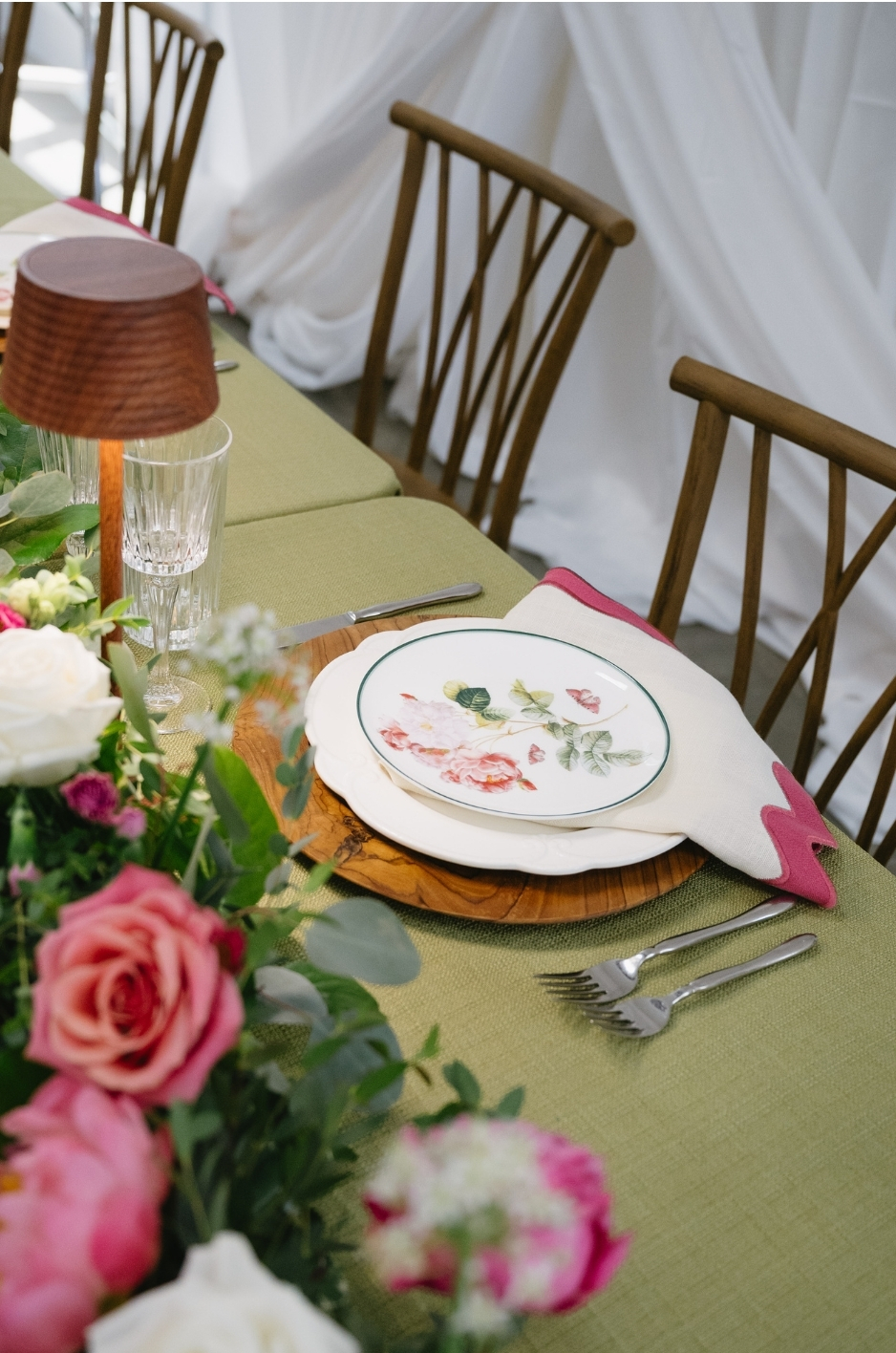
Venue color architecture refers to the permanent or semi-permanent colors already present in an event space. These colors come from architectural finishes, flooring, walls, ceilings, built-in furniture, trim, drapery, lighting temperature, and decorative features that are part of the venue itself. They create the visual backdrop for every design decision that follows.
Understanding this backdrop is essential because linens sit directly within the venue’s color environment. A tablecloth, napkin, runner, or overlay may look different depending on the wall color behind it, the floor beneath it, the lighting above it, and the furniture surrounding it. Reading the venue’s color architecture helps planners choose linens that feel connected to the space rather than forced into it.
Fixed Colors In The Venue
Fixed colors are the colors that are already part of the venue and cannot easily be changed for the event. These may include wall paint, wallpaper, flooring, carpet, tile, stone, wood paneling, ceiling treatments, columns, trim, doors, built-in bars, permanent furniture, and metal finishes.
These colors should be documented before linen selections are finalized. A ballroom with gold accents may call for warmer linen tones, while a gallery with white walls and polished concrete may support cooler neutrals, bold contrast, or clean modern color choices. The goal is to understand the room’s existing palette before adding new layers.
Flexible Colors In The Event Design
Flexible colors come from the elements planners can control. These include linens, florals, stationery, signage, candles, tabletop rentals, lounge furniture, glassware, menus, and decorative accents. Because these pieces can be selected or customized, they should respond to the venue rather than compete with it.
Linens are especially important because they cover a large visual surface. A tablecloth can shift the entire mood of a room, while napkins, runners, overlays, and accent linens can introduce supporting colors in smaller, more controlled ways.
Why Linens Should Bridge The Two
The strongest event palettes connect the fixed venue colors with the flexible event colors. Linens can act as the bridge between the two. They can soften strong architectural tones, add contrast to neutral rooms, echo existing finishes, or introduce a color that ties florals, stationery, and tabletop pieces together.
For example, a warm ivory linen may harmonize with wood floors and brass lighting, while a slate blue napkin may bring balance to a cool-toned venue. A patterned runner can also connect multiple colors at once, making the overall design feel more layered and intentional.
How Venue Color Architecture Affects The Final Tablescape
Once the linens are installed, they become part of the venue’s full visual field. The table is seen against walls, floors, chairs, lighting, florals, and surrounding decor. If the linen color ignores those elements, the tablescape may feel disconnected even if the individual pieces are beautiful.
When linen colors are selected with the venue’s architecture in mind, the tablescape feels more cohesive. The result is not simply a well-dressed table, but a room that feels balanced from every angle.
How Should Planners Read a Venue’s Existing Color Palette?
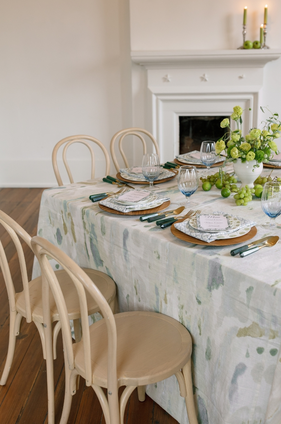
Before choosing linens, planners should study the venue’s existing palette. This means looking beyond the obvious wall color and considering every fixed surface that will appear in the event environment. Flooring, trim, ceiling color, wood tones, stone, carpet, tile, built-in bars, furniture, and metal finishes can all affect how linen colors feel once the room is fully styled.
The goal is to understand what the venue is already contributing visually. Some spaces have a quiet neutral backdrop, while others have strong architectural colors, patterned surfaces, or warm wood details. Linen colors should respond to those existing elements so the final design feels intentional instead of disconnected.
Identify Dominant Background Colors
Start by identifying the largest color fields in the venue. These are usually the walls, floors, ceiling, drapery, carpeting, tenting, or major architectural finishes. Because these surfaces occupy so much visual space, they have a direct effect on how linens will appear.
For example, a room with dark wood floors may make pale linens feel more dramatic, while a venue with white walls and light stone flooring may create a cleaner, more minimal backdrop. A ballroom with patterned carpet may require more restrained linens so the tablescape does not compete with the floor.
Identify Undertones
Undertones are one of the most important details in linen color matching. A venue may look neutral at first, but the space may lean warm, cool, or earthy depending on its finishes. Ivory walls, beige stone, gold lighting, and wood floors often create a warmer environment. Gray flooring, silver accents, blue-toned walls, or concrete details may create a cooler environment.
Linens should be chosen with those undertones in mind. A crisp white linen may feel too stark in a warm venue, while a creamy ivory may feel too yellow in a cool-toned room. Noticing these subtle shifts helps planners avoid colors that technically match but still feel visually off.
Identify Visual Distractions
Some venues include strong visual elements that need to be considered before linen selections are finalized. Patterned carpet, bold wallpaper, colorful tile, dark wood paneling, ornate ceilings, or highly decorative furniture can all influence how much color or pattern the linens should carry.
In a venue with many visual details, simpler linens may create the most elegant result. In a more minimal venue, the linens can take on a stronger role through color, pattern, or custom details. The linen plan should either calm the room, add contrast, or highlight the venue’s best features.
Note Colors That Should Be Repeated Or Avoided
During the venue review, planners should identify which colors are worth repeating and which should be avoided. A beautiful stone tone, wood finish, painted trim, or metal accent may inspire the linen palette. On the other hand, a carpet color or wall undertone may be something the linen plan needs to balance rather than repeat.
This step helps narrow the palette before florals, tabletop rentals, and other design elements are finalized. It also keeps the linen selection grounded in the actual space rather than relying only on inspiration images.
How Does Lighting Affect Linen Color Matching?
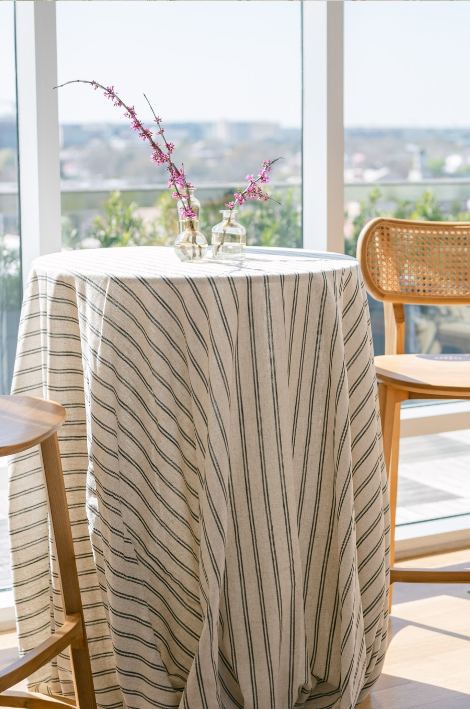
Lighting can completely change the way linen colors appear. A linen that looks soft and neutral in daylight may feel warmer under candlelight, cooler near a window, or more saturated beneath uplighting. Because linens cover large surfaces, even small color shifts can affect the overall event design.
For this reason, planners should consider the event timeline and lighting plan before finalizing linen colors. A daytime ceremony, golden-hour cocktail hour, candlelit dinner, or evening reception may each change how tablecloths, napkins, runners, and overlays are perceived.
Review Natural Light
Natural light can make linen colors appear brighter, softer, cooler, or warmer depending on the venue. Window placement, direct sun, shade, garden surroundings, tent coverage, and outdoor exposure all influence color perception. A pale blue linen may look airy in daylight, while a blush linen may become warmer near sunset.
If the event takes place during the day or early evening, planners should review linen colors during the same time window whenever possible. This helps confirm that the palette works with the actual light guests will experience.
Consider Evening Lighting
Evening lighting can deepen, warm, or soften linen colors. Candlelight, chandeliers, string lights, uplighting, pin spots, and warm bulbs often make ivory, blush, gold, terracotta, and deeper tones feel richer. Cooler lighting may sharpen whites, silvers, blues, and grays.
Because many events shift from daylight to evening, the linen palette should work in both conditions. A color that feels beautiful in natural light should still feel refined once artificial lighting becomes the primary source.
Test Samples In The Venue When Possible
Whenever possible, planners should review linen swatches, samples, or product imagery in the venue itself. The same color can look different against wood floors, white walls, patterned carpet, stone, glass, or metal finishes. Testing the linen against the actual environment helps avoid surprises on event day.
Samples should also be viewed alongside florals, tabletop rentals, stationery, candles, and any other key design materials. This gives planners a more accurate sense of how the full palette will work together.
Consider Photography Conditions
Linen colors should be evaluated for both the guest experience and the final event photography. Cameras may capture color differently depending on light temperature, flash, reflections, and surrounding surfaces. Very pale tones can sometimes appear brighter in photos, while deeper linens may create more contrast and mood.
For highly photographed events, planners should consider how linens will look in wide room shots, tabletop close-ups, detail photos, and candlelit images. A strong linen color choice should support the room in person and on camera.
How Do You Choose Linen Colors That Complement the Venue?
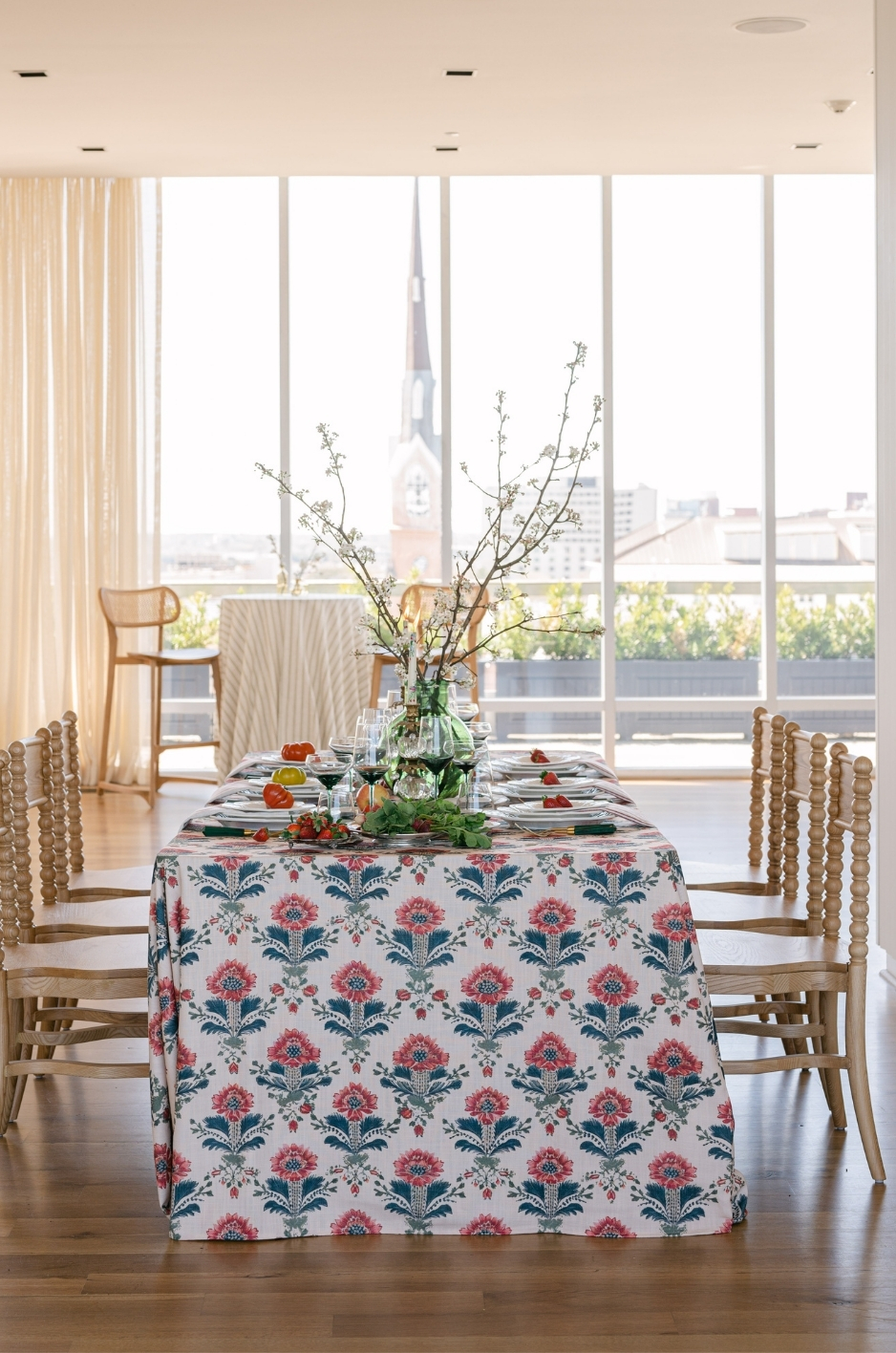
Choosing linen colors that complement a venue begins with understanding what the space already offers. A venue-inspired linen design does not always match the room exactly; instead, it may balance, soften, or enhance the existing colors. Walls, flooring, trim, furniture, and lighting should all guide the final linen direction.
A well-chosen tablecloth, napkin, runner, or overlay can make the venue feel more refined and cohesive. The linen palette should connect the venue’s fixed colors with the event’s flexible design elements, including florals, tabletop rentals, candles, menus, signage, and stationery.
Match The Venue’s Undertone
Every venue has an undertone, even when the space appears neutral. Warm venues often include cream walls, wood floors, brass accents, beige stone, amber lighting, or warm-toned furniture. These spaces typically pair well with ivory, sand, champagne, blush, terracotta, sage, espresso, or other warm neutrals. For more detail, see our article The Ultimate Guide to Summer Event Linens by Venue Type.
Cooler venues may include white walls, gray flooring, polished concrete, silver details, blue-toned surfaces, or glass-heavy architecture. These spaces often work well with crisp white, slate, pale blue, lavender, charcoal, silver, or cooler neutral linens. Matching the undertone helps the linen feel integrated into the space rather than visually separate from it.
Use Contrast With Intention
Contrast can make a tablescape feel more dynamic, but it should be used carefully. A deep linen color can create drama in a light or neutral venue, while a pale linen can soften a darker or more detailed room. Contrast is especially effective when planners want the tables to become a major visual feature. You may also find Your Guide to Historic Venue Linen Limitations helpful.
For example, a neutral gallery space may support a rich tablecloth, patterned runner, or bold napkin color. A traditional ballroom with ornate details may benefit from a quieter linen palette that lets the architecture remain the focus. The best contrast feels purposeful, not accidental.
Avoid Colors That Fight The Space
Some linen colors may look beautiful on their own but clash once placed in the venue. A cool white can feel harsh against warm ivory walls. A yellow-toned cream may look muddy beside gray flooring. A bright color may compete with patterned carpet, bold wallpaper, or strong architectural finishes.
Before finalizing the palette, planners should compare linen colors with the actual venue surfaces whenever possible. If a color feels slightly off, it is often an undertone issue rather than a problem with the color itself.
Let The Event Palette Refine The Final Choice
Once the venue colors are understood, the event palette can refine the linen selection. Florals, stationery, tabletop rentals, candles, and signage may introduce colors that either echo the venue or add a controlled layer of contrast.
Linens should sit between the venue and the event design. They can ground the palette, soften transitions between colors, or create a stronger statement when the room needs more visual impact. This makes the final design feel connected from the architecture to the tabletop. Read more in Summer Wedding Venue Linen Trends by Architecture.
When Should Linens Blend In or Stand Out?
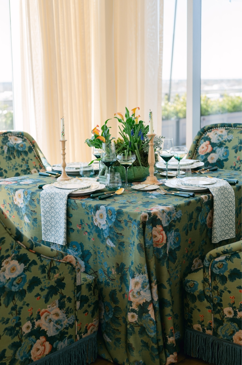
The decision to let linens blend in or stand out depends on the venue, the event style, and the role of each table. Some spaces call for quiet, tonal linens that support the room. Others benefit from a stronger linen moment that brings color, pattern, or texture into the design. The key is knowing when the linen should act as a foundation and when it should become a focal point.
Planners should consider the venue’s architecture, existing decor, lighting, and visual complexity before making this decision. A heavily detailed venue may need restraint, while a minimal venue may need linens to carry more of the design.
Blend Linens For A Refined, Quiet Look
Blended linens work well in venues with strong architecture, patterned interiors, ornate finishes, or detailed floral plans. In these settings, the linen should support the space rather than compete with it. Tonal tablecloths, soft neutrals, subtle textures, and understated napkins can create a polished foundation.
This approach is especially useful for formal venues where the room already has a clear design identity. A linen that blends with the venue can make the overall event feel elegant, calm, and cohesive.
Let Linens Stand Out In Neutral Venues
In a neutral venue, linens can carry more visual weight. White walls, simple flooring, minimal furniture, or open architectural spaces often give planners more room to introduce color, pattern, or custom details. A statement linen can make the tablescape feel more distinctive and memorable.
This does not mean every table needs a bold choice. A patterned runner, colored napkin, specialty overlay, or statement tablecloth on select tables may be enough to give the room personality while keeping the overall design balanced.
Use Focal Tables For Stronger Linen Moments
Head tables, sweetheart tables, cake tables, escort displays, bars, and welcome tables can often carry stronger linen colors or patterns than guest tables. These areas are usually photographed and naturally draw attention, making them ideal for a statement linen or custom detail.
Using stronger linens on focal tables allows planners to create impact without overwhelming the full room. Guest tables can remain more restrained while the focal areas introduce depth, contrast, or personality.
Balance Statement Linens With Surrounding Details
When a linen is meant to stand out, the surrounding decor should be edited carefully. Florals, candles, tabletop rentals, signage, and stationery should support the linen rather than compete with it. If the linen has a bold pattern, simpler flowers or solid tabletop accents may create the cleanest result.
If the linen is quiet and tonal, the decor can carry more color, height, or texture. This balance helps the full design feel intentional and keeps the room from feeling either too plain or too busy.
How Should Patterned Linens Work With Venue Colors?
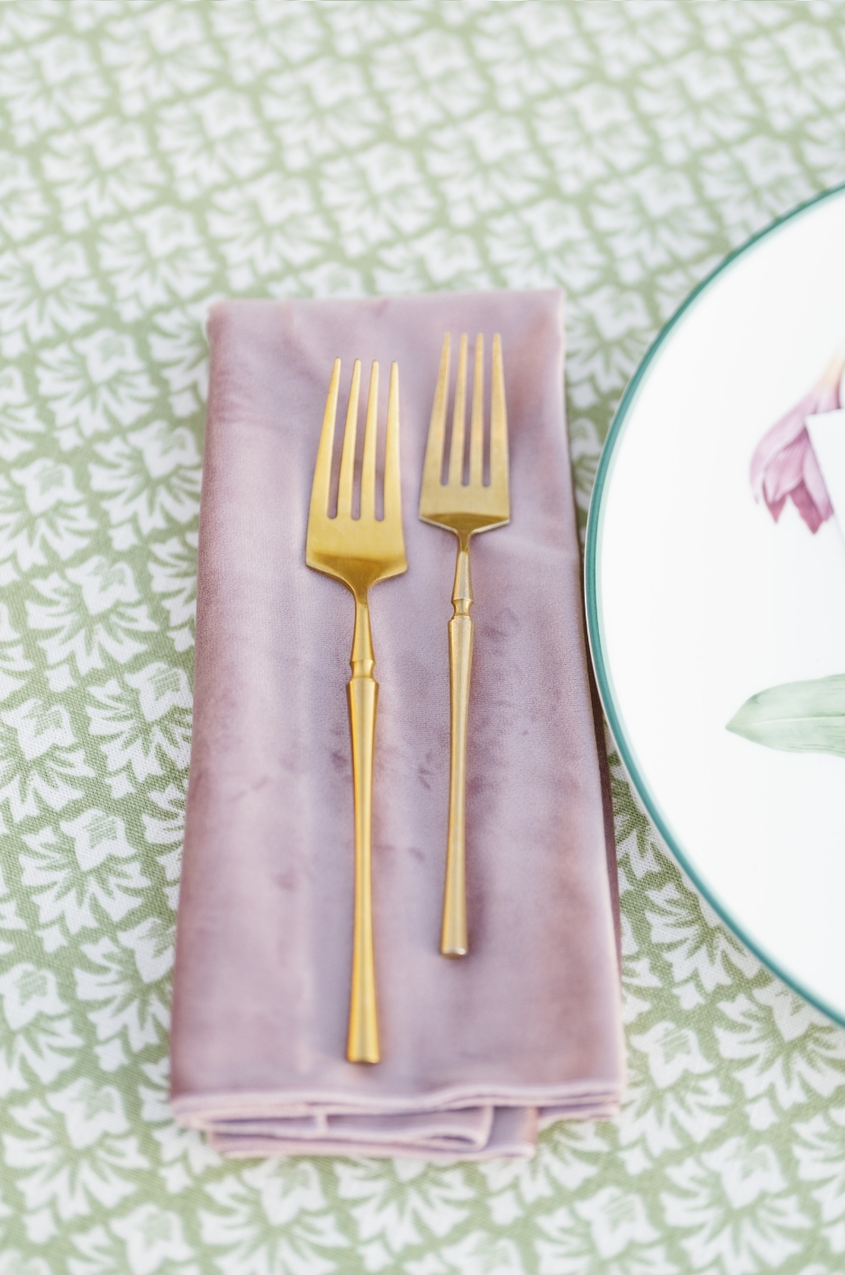
Patterned linens can bring personality, movement, and visual detail to an event space, but they should be chosen with the venue’s existing colors in mind. A pattern that looks beautiful on its own may feel too busy, too bold, or visually disconnected once it is placed against carpet, wallpaper, wood, stone, or architectural finishes.
The goal is to use pattern as part of the venue’s color story, not as a separate design layer. Patterned tablecloths, napkins, runners, and overlays should either echo the venue’s palette, add controlled contrast, or help connect the fixed venue colors with the event’s floral and tabletop design.
Use Pattern To Echo Venue Details
A patterned linen can reference colors, shapes, or motifs already present in the venue. Architectural lines, garden views, tilework, wall details, ceiling treatments, or decorative finishes can all inspire the pattern direction. This makes the linen feel integrated with the space rather than added at random.
For example, a soft botanical pattern may work beautifully in a garden venue, while a geometric print may complement a modern gallery or architectural space. A border detail can also echo trim, molding, stationery, or tabletop accents in a subtle and polished way. For inspiration from real events, browse our linen gallery.
Watch Pattern Scale Against Busy Interiors
Pattern scale matters, especially in venues that already have strong visual detail. Patterned carpet, bold wallpaper, ornate ceilings, colorful tile, or highly decorative furniture can make a large-scale linen print feel overwhelming. In these spaces, a smaller pattern, tonal print, or solid linen may create a more refined result.
In a minimal venue, a larger or more expressive pattern can work more successfully because the room gives it space to breathe. Planners should evaluate the linen pattern against the venue’s full visual field, not only against the table surface.
Pair Patterned Linens With Solid Accents
Patterned linens often look strongest when balanced with solids. A patterned tablecloth can be paired with solid napkins, clean tabletop rentals, and restrained florals. A patterned runner can sit over a solid tablecloth. A printed napkin can add detail to an otherwise neutral place setting.
This balance keeps the palette controlled. It also allows the pattern to feel intentional rather than competing with every other design element in the room.
Use Pattern Selectively In Complex Venues
If the venue already has several colors or decorative features, patterned linens should be used selectively. Focal tables, bars, escort displays, cake tables, or cocktail tables can carry pattern without applying it across the entire room.
This approach gives the event a memorable design detail while protecting the overall visual balance. Guest tables can remain more restrained while the patterned linen creates impact in the areas where it will be seen and photographed most.
Frequently Asked Questions
How Do I Choose Linens For A Venue With Patterned Carpet?
For venues with patterned carpet, start by identifying the carpet’s dominant colors and undertones. If the carpet is already visually busy, simpler linens often create the most polished result. Solid tablecloths, tonal napkins, or subtle textures can keep the room balanced.
Patterned linens can still work, but they should be used carefully. A patterned napkin, runner, or focal-table linen may be more effective than using a bold patterned tablecloth throughout the room.
What Linen Colors Work Best In A Neutral Venue?
Neutral venues offer more flexibility because the room itself is less visually demanding. Soft whites, ivory, sand, taupe, blush, sage, pale blue, charcoal, espresso, navy, or deeper accent tones can all work depending on the event style.
In a very minimal venue, linens can carry more of the design. A statement tablecloth, patterned napkin, custom runner, or richer color accent can help the space feel warmer, more layered, and more specific to the event.
Can Custom Linens Be Made To Match A Venue Palette?
Yes. Custom linens can be designed to complement a venue’s palette, undertones, architecture, or event design direction. Custom colors, prints, runners, overlays, napkins, or focal-table linens can help bridge the venue’s fixed colors with florals, stationery, tabletop rentals, and lighting.
Custom design is especially useful when a venue has a distinct color environment, such as warm stone, dark wood, patterned tile, cool gray flooring, or strong architectural finishes.
Should Patterned Linens Be Avoided In Colorful Venues?
Patterned linens do not always need to be avoided, but they should be used with restraint in colorful venues. If the room already includes patterned carpet, bold wallpaper, colorful tile, or ornate architectural details, a large-scale linen pattern may feel too busy.
In these spaces, patterned linens often work best as accents. A printed napkin, runner, bar linen, escort display linen, or cake table overlay can add personality without overwhelming the full room.
Conclusion
Linen color selection should begin with the venue itself. Walls, floors, ceilings, lighting, wood tones, stone, metal finishes, carpet, furniture, and architectural details all influence how a linen color will look once the event is fully styled. When these fixed elements are considered early, the final palette feels more polished and intentional.
The strongest linen plans connect the venue’s existing colors with the event’s flexible design elements. Tablecloths, napkins, runners, overlays, and accent linens can soften strong architectural tones, add contrast to neutral spaces, or tie together florals, stationery, tabletop rentals, and lighting.
Curated Linen Collection offers luxury linen rentals, curated color options, patterned linens, and custom design details for planners and hosts who want their event palette to feel refined and venue-specific. Explore the collection or begin a custom linen inquiry to create a linen color story that works beautifully with your event space.