Fall corporate events can range from intimate executive dinners and client receptions to multi-day conferences, awards programs, fundraising galas, and formal black-tie celebrations. Each format creates a different guest experience, but all benefit from a visual direction that feels intentional from the first impression through the final place setting.
Luxury linens help shape that environment through color, texture, pattern, scale, and placement. A deep linen color can establish the mood of an entire ballroom, while a tonal pattern or dimensional textile may create interest that is only fully appreciated at close range. The strongest designs consider linen alongside the venue, florals, tabletop pieces, lighting, corporate identity, and the overall level of formality.
For fall, that does not have to mean relying on obvious seasonal motifs. Richer color relationships, layered neutrals, tactile surfaces, controlled sheen, and thoughtful pattern can introduce seasonal depth while keeping the event polished and appropriate for a corporate audience.
Define the Visual Direction of the Fall Corporate Event
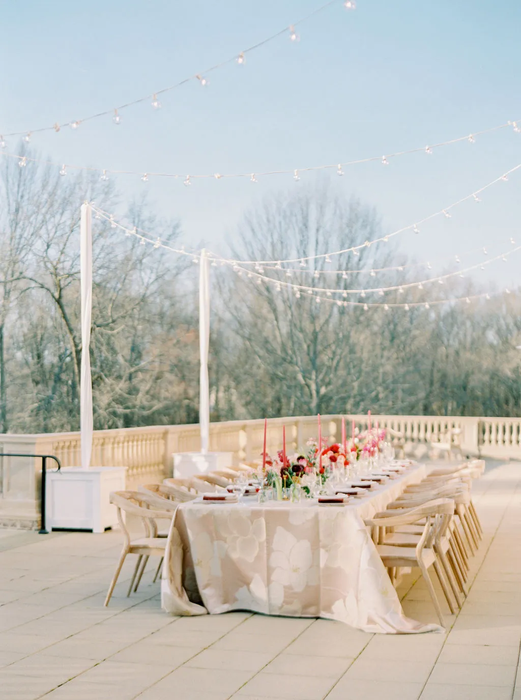
Before individual linens are selected, planners should understand what the event needs to communicate visually. A private leadership dinner may call for quiet refinement, while an awards gala can support a stronger room-wide statement. The starting point should therefore be the event experience, not a specific fabric.
Start With the Purpose of the Event
Different corporate formats place different demands on the design.
The distinctions are not rigid. An executive dinner can use pattern, and a gala can be visually restrained. What matters is whether the linen treatment supports the atmosphere the event is intended to create.
Determine the Desired Level of Formality
Luxury does not require every table to be elaborate. A formal corporate event can feel highly elevated through a monochromatic palette, precise textile choices, and a controlled use of pattern just as easily as it can through richer layers and stronger contrast.
The goal is to establish a clear hierarchy. If the linen is intended to lead the tablescape, surrounding elements may need to become quieter. If florals, tableware, or architecture already carry significant visual weight, the linen may work best as a sophisticated foundation.
Establish a Design Language Before Choosing Individual Linens
A defined visual language makes the rest of the selection process more cohesive. Before narrowing the textile options, planners should understand:
the primary and supporting color palette;
how much pattern the room should carry;
whether the design should feel matte, luminous, textural, or layered;
where statement linens will appear;
how strongly corporate identity should influence the design;
and which areas should intentionally remain quieter.
These decisions create the framework for everything that follows.
Build a Sophisticated Fall Color Story
Fall offers far more than the expected combination of orange, brown, and gold. Corporate events often benefit from a more nuanced palette in which deeper seasonal tones are balanced by refined neutrals and subtle tonal relationships.
Explore Deeper Seasonal Tones
Wine, burgundy, forest green, olive, plum, midnight blue, chocolate, aubergine, and charcoal can all create seasonal depth while maintaining an elegant character. Their impact depends on how widely they are used.
A forest-green linen across an entire dining room creates a very different impression from the same color appearing only at a VIP table or through napkins. Likewise, burgundy may act as the dominant visual field or as a concentrated accent within a quieter palette.
Balance Rich Color With Refined Neutrals
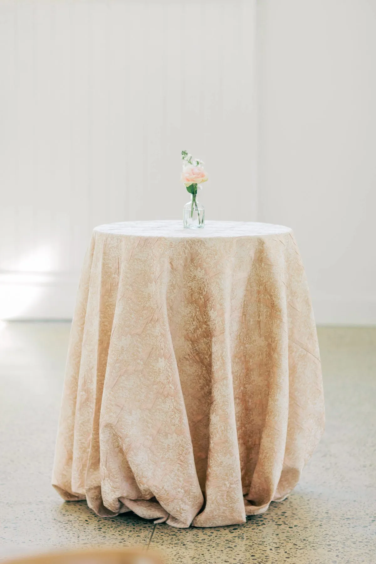
Neutrals give saturated shades room to breathe. Mushroom, taupe, champagne, warm ivory, stone, and soft gray can support deeper colors without making the overall event feel visually heavy.
A restrained neutral does not have to feel plain. Woven detail, subtle pattern, or a change in finish can add dimension even when the palette remains quiet.
Adapt Corporate Colors for Fall
Corporate colors do not need to appear in their exact brand values. Bright blue can become navy or slate, vivid green can shift toward olive or forest, and a strong red may be interpreted as wine or burgundy.
This creates a relationship with the organization without turning the tablescape into a literal extension of corporate branding.
Use Texture and Pattern to Create Depth
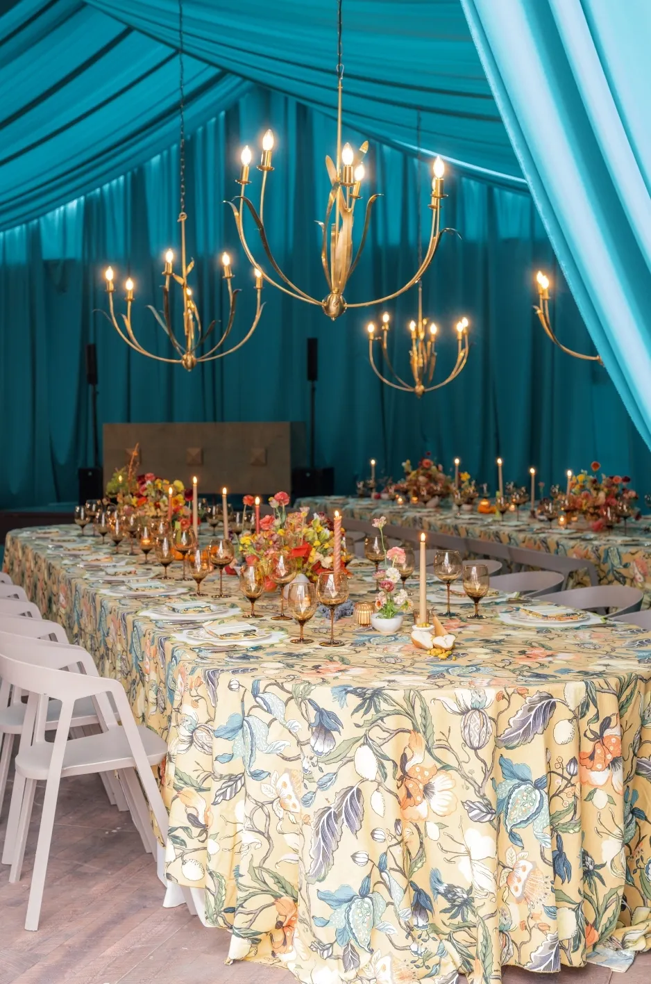
Color establishes the palette, but texture and pattern determine much of the linen’s visual character. For fall events, both can introduce richness without requiring additional thematic décor.
Build Dimension Through Texture
Smooth and dimensional surfaces can be combined to make a restrained palette feel layered. A clean tablecloth may be paired with a more tactile napkin, while a woven foundation can work against simpler tabletop materials.
Texture is especially effective in fall because it creates warmth without depending on seasonal imagery. At an executive dinner, subtle woven detail may reward close viewing; at a gala, a tonal textured linen can add depth across many tables without overwhelming the room.
Use Sheen With Restraint
Softly reflective textiles can bring controlled luminosity to an evening setting. Candlelight, chandeliers, and architectural lighting may create movement across the surface of the fabric, particularly when deeper fall colors are used.
The balance matters. If the linen already carries noticeable sheen, highly reflective tabletop elements may need to play a quieter role so that the entire setting remains composed.
Decide How Pattern Should Function
Pattern can serve several different purposes within a corporate event. It may provide subtle visual movement, establish a focal point, or become part of the broader event identity.
Tonal or low-contrast motifs are useful when planners want pattern to reveal itself gradually. More expressive designs often work best on selected tables, bars, VIP areas, or other focal surfaces where they can remain distinctive rather than being repeated everywhere.
Let Event Scale Shape the Linen Approach
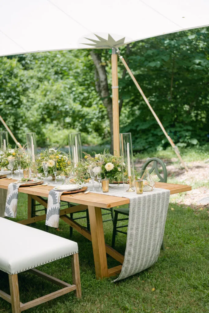
A textile that works beautifully across a handful of tables can create a very different effect when repeated throughout a large ballroom. Event scale therefore changes not only how much linen is seen, but also how guests experience color, pattern, and texture.
Give Intimate Events More Detail
Smaller events allow planners to concentrate more visual information at the table. A distinctive pattern can cover the primary dining surface, layered textile details can become more noticeable, and custom elements can be appreciated from close range.
Because guests encounter fewer tables, the design can often support greater individuality without losing cohesion.
Evaluate Large Events From Across the Room
At a gala or large corporate dinner, guests often experience the entire room before they notice individual place settings. Repeated color becomes a broad visual field, pattern creates rhythm, and reflective finishes can have a much greater cumulative impact than they do on a single sample.
For that reason, large events require both a table-level view and a room-level view. The linen should feel refined when guests sit down, but it should also contribute to a balanced composition from across the venue.
Use Repetition Without Creating Uniformity
Consistency does not require every table to look identical. A dominant linen can establish the foundation while selected tables introduce pattern, alternate tones, or richer texture.
This creates visual rhythm without flattening the room into one repeated treatment.
Style Different Areas as Part of One Event
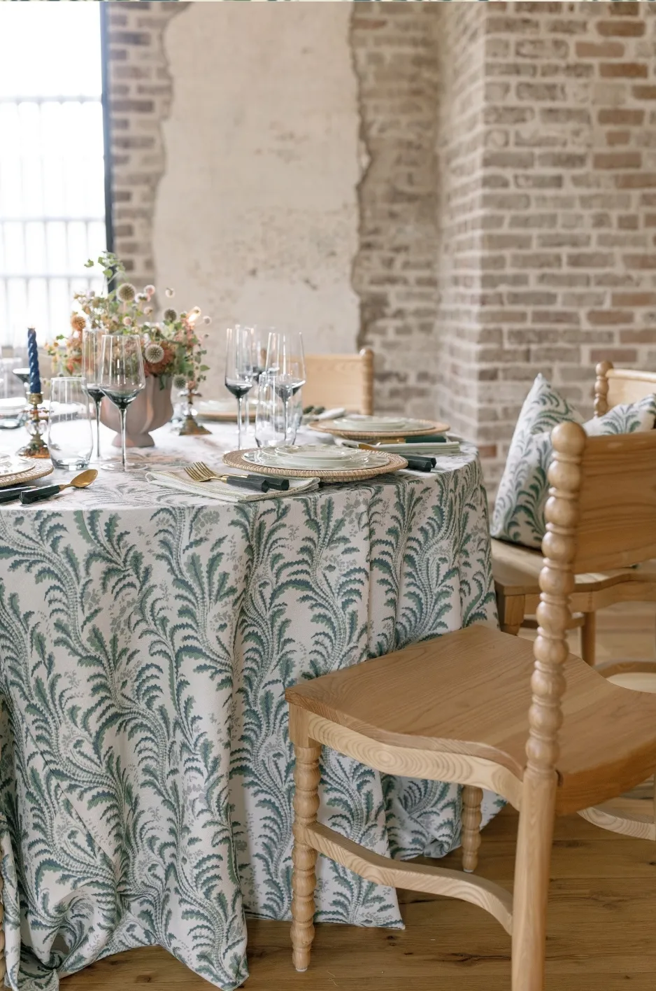
Corporate events often include much more than the primary dining room. Bars, cocktail tables, VIP areas, welcome spaces, and specialty surfaces provide opportunities to vary the textile direction while maintaining a consistent visual language.
Establish the Dining Area as the Foundation
The largest grouping of tables usually determines the dominant linen direction. Sophisticated solids, restrained patterns, or tonal textures work particularly well here because they establish continuity across the room.
Once that foundation is defined, smaller areas can carry more expressive variations.
Use Focal Areas for Stronger Textile Moments
Bars, head tables, VIP spaces, welcome tables, and other high-visibility surfaces can support more distinctive linens because they appear in limited numbers. A stronger pattern, saturated color, or dimensional textile can give these areas greater identity without requiring the entire event to adopt the same treatment.
The important principle is connection. A focal textile might repeat a color from the guest tables, while its pattern or texture creates the distinction.
Create Hierarchy Between Statement and Supporting Linens
Statement linens become more effective when they are surrounded by quieter textiles. A patterned VIP table has greater impact when guest tables provide a restrained foundation, just as a deep-colored bar can stand out against softer cocktail linens.
Supporting fabrics are not secondary in importance. They create the visual breathing room that allows stronger elements to feel intentional.
Coordinate Linen With the Complete Tablescape
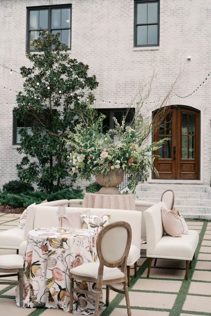
Luxury linen should never be judged in isolation. Its final effect depends on how it works with florals, china, glassware, flatware, stationery, and other design elements placed above and around it.
Consider Floral Scale and Color
Large floral arrangements already bring significant movement, texture, and color to the table. A quieter linen may provide the strongest foundation beneath them, while more restrained florals can create room for pattern or a richer textile surface.
The linen does not have to match the flowers exactly. Related shades, deeper tonal variations, or carefully chosen contrast can create greater visual depth.
Coordinate With Tabletop Pieces
Tabletop finishes can dramatically change how a linen reads. Pale china becomes more defined against darker textiles, metallic flatware gains greater presence against matte surfaces, and clear glassware allows patterned linens to remain visible beneath the place setting.
When several tabletop elements already make a strong statement, the linen may need to become quieter. When china and glassware are restrained, the textile can carry more of the visual interest.
Include Stationery and Event Graphics
Menus, place cards, event programs, and other printed elements contribute their own color and pattern. A highly graphic menu may work best against a controlled textile, while simpler stationery leaves more room for a patterned linen.
The objective is to create one composition rather than a collection of individually attractive pieces.
Let the Venue Influence the Linen Design
Venue architecture determines how much visual work the linen needs to do. Some spaces already provide extensive decorative detail, while others offer a cleaner setting in which textiles can take on a stronger role.
Work With the Existing Architecture
Ballrooms with chandeliers, detailed walls, patterned carpets, or significant architectural ornament may benefit from linens that provide balance rather than additional complexity. In these environments, a saturated solid or tonal pattern can often feel more refined than another highly decorative layer.
Modern or minimal venues create the opposite opportunity. Cleaner architecture can support stronger color, more expressive pattern, or dimensional textile surfaces because fewer permanent elements compete for attention.
Give Tented Events Greater Textile Presence
Tented events rely more heavily on temporary design elements to create atmosphere. Linens can therefore become an important source of color, warmth, and repetition across the space.
A deep fall palette, consistent textile foundation, and selected patterned moments can help transform an otherwise neutral structure into a distinctive corporate environment.
Connect Multiple Rooms Without Making Them Identical
When guests move between several spaces, the linens can evolve while preserving visual continuity. A shared color, motif, texture, or finish can connect meeting spaces, receptions, dining rooms, and gala environments without requiring the same tablecloth everywhere.
Consider How Lighting Transforms Fall Linens
Many corporate events begin in daylight and continue into the evening. The linen direction should work through that transition rather than being judged under one lighting condition alone.
Evaluate Deeper Colors After Dark
Wine, forest green, midnight blue, chocolate, charcoal, and plum may become considerably darker once natural light fades. That depth can create a sophisticated evening atmosphere, but the room may need lighter florals, metallic accents, or neutral tabletop details to preserve dimension.
Use Lighting to Reveal Texture
Woven and dimensional textiles often become more interesting under directional light. Subtle patterns can gain definition through shadow, while controlled sheen may create highlights beneath chandeliers or candlelight.
The same linen can therefore create one impression during the day and another after sunset.
Consider the Room and the Close-Up View
Guests may first see the room from an entrance and later experience the textile inches away at the table. Event photography will capture both wide scenes and detailed place settings.
A successful linen direction should remain visually effective from all of these perspectives.
Create a Visual Progression Across Multi-Day Corporate Events
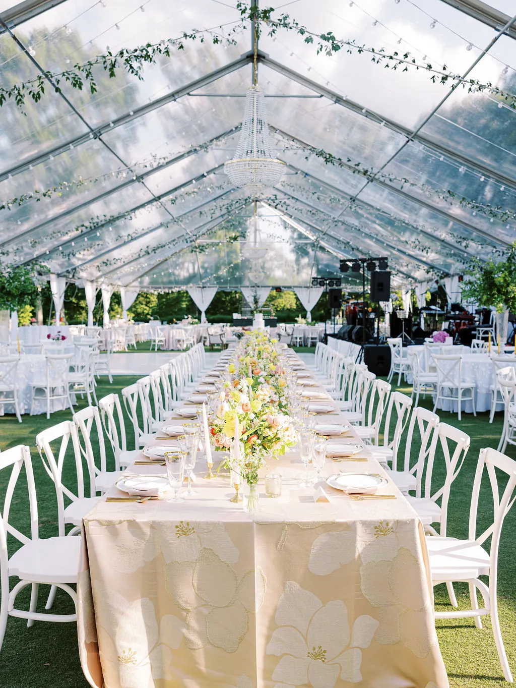
Multi-day events offer an opportunity to evolve the linen story rather than repeating the same treatment throughout the schedule. The visual direction can begin with controlled daytime settings and become richer as the event moves toward more social and formal experiences.
Move From Daytime Restraint to Evening Depth
Daytime programming can begin with warm neutrals, muted corporate colors, and subtle texture. Networking receptions or hosted dinners may introduce deeper accents, stronger material contrast, or selected patterns.
By the time guests reach the closing gala, the design can become the fullest expression of ideas introduced earlier through richer color, more noticeable texture, and stronger focal textiles.
Maintain Continuity Through Reinterpretation
The same color does not need to return in exactly the same form. Muted green may become forest, wine can deepen into burgundy, and a subtle motif may move from a napkin to a larger focal textile.
This creates a visual progression that feels connected without becoming repetitive.
Refresh an Established Corporate Gala With Intention
Annual galas create a different design challenge. Returning guests may expect some continuity, but repeating the same textile direction every year can make the event feel static.
A strong refresh identifies what is still working and changes only the elements that will have meaningful visual impact.
Preserve Recognizable Elements
A familiar color, floral direction, motif, or overall level of formality may already belong to the gala’s identity. These elements can remain while the linen introduces a new perspective through pattern, texture, color placement, or focal hierarchy.
Change One Major Design Variable
Rather than changing everything at once, planners might:
move from solids to selected pattern;
reinterpret a familiar color in a deeper fall tone;
replace a smooth foundation with a more dimensional textile;
introduce a stronger statement at the bar or VIP table;
or quiet the guest tables so another part of the event can take visual precedence.
Focused change often makes the new direction easier to recognize.
Interpret Corporate Identity With Restraint
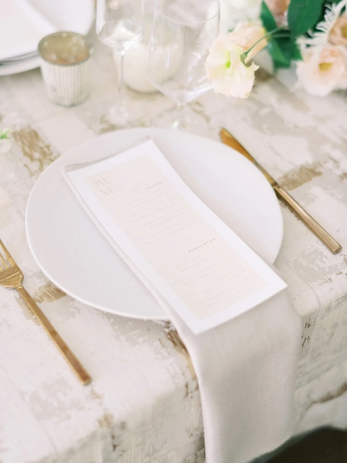
A corporate event should feel connected to the organization without allowing branding to dominate the tablescape. Linen can reference the company through color, pattern, and visual language while remaining appropriate for a luxury environment.
Begin With Interpretation Rather Than Literal Branding
Corporate colors can be softened, deepened, or adapted to fall. Graphic elements may inspire pattern without being reproduced exactly, and architectural or visual references associated with the organization can influence the textile direction more subtly.
This allows the event to feel specific to the company without turning the table into a promotional surface.
Concentrate Stronger References in Selected Areas
Welcome spaces, bars, VIP areas, or other focal surfaces can support a stronger visual relationship to the organization, while guest dining tables remain more restrained.
Keeping the most literal brand references selective allows the overall event to maintain its elegance.
Use Custom Linen When the Event Needs a Distinctive Signature
Not every luxury event requires custom linen. A well-chosen existing solid, pattern, or textured textile may already provide the right visual direction.
Custom design becomes especially useful when the event requires a more specific motif, color relationship, or textile identity that cannot be achieved through existing selections.
Give Custom Textiles a Clear Purpose
A custom pattern might draw from corporate artwork, event graphics, venue architecture, or another established visual reference. It can be used on an executive dinner table, bar, VIP area, or another focal surface where guests can fully appreciate it.
Selective placement often gives a custom textile greater impact than repeating it across every table.
Design the Textile as Part of the Whole Event
Pattern scale, color, and finish should be evaluated in relation to florals, tabletop pieces, stationery, lighting, and the venue itself. Custom linen works best when it feels integrated into the larger composition rather than added as a separate decorative idea.
Refine the Complete Fall Corporate Linen Story
Before finalizing the design, planners should step back from individual fabric selections and consider how the full textile direction works together.
A useful final review should consider:
Color: Is there a clear primary palette with enough supporting contrast?
Pattern: Does one motif lead, or are several competing for attention?
Texture: Is there enough variation to create depth without making the room feel heavy?
Scale: Will the design remain balanced when repeated across the full venue?
Hierarchy: Are statement and supporting linens clearly distinguished?
Context: Do the linens complement the florals, tabletop pieces, lighting, and architecture?
Luxury often becomes most apparent during this editing stage. Removing one competing pattern or simplifying one color relationship can make the strongest textile choices significantly more effective.
Frequently Asked Questions
What colors work well for a luxury fall corporate event?
Wine, burgundy, forest green, olive, plum, midnight blue, chocolate, charcoal, mushroom, taupe, champagne, and warm ivory can all support an elevated fall direction. The strongest palette should also respond to the venue, lighting, florals, tabletop pieces, and corporate identity rather than being selected according to the season alone.
How can a corporate event feel seasonal without looking overly themed?
Fall can be expressed through richer color, dimensional texture, tonal pattern, and material contrast rather than literal autumn imagery. Warm neutrals, deep evening tones, woven surfaces, and controlled sheen can create seasonal atmosphere while maintaining a sophisticated corporate setting.
Can patterned linens work for formal corporate events?
Yes. Tonal patterns can provide quiet depth, while more expressive designs can create focal moments at head tables, bars, VIP areas, or selected table groups. The amount of pattern should reflect the size of the event and the complexity of the surrounding décor.
Should executive dinners and corporate galas use different linen styles?
They can. Executive dinners often reward close-up detail, nuanced texture, and subtle color relationships, while galas require planners to consider room-wide repetition, visual hierarchy, and the cumulative effect of color and pattern.
How should linen styling change for a large corporate event?
Large events require greater attention to scale. A saturated color or strong pattern that feels restrained on one table may become much more dominant when repeated across a ballroom or tent. Supporting linens and selected statement treatments can help maintain balance.
How can corporate branding be incorporated subtly into linen design?
Corporate colors can be adjusted into event-specific shades, while visual references from graphics, architecture, or the brand identity can inspire more abstract patterns. The goal should be to create a visual connection without turning every table into a branded surface.
When should statement linens be used?
Statement linens work best in locations where visual emphasis already makes sense, such as head tables, VIP areas, bars, central table groups, or welcome spaces. Quieter supporting linens can then create enough contrast for those pieces to remain distinctive.
When is custom linen design worth considering?
Custom linen can be valuable when the event requires a specific pattern, motif, color relationship, or textile concept that existing selections cannot provide. It is often most effective when concentrated in high-impact areas rather than used simply for the sake of customization.
Create an Elevated Fall Corporate Event With Curated Linen Collection
The most compelling fall corporate events are not defined by a single fabric or seasonal color. They come from understanding how event purpose, scale, venue, color, pattern, texture, lighting, and visual hierarchy work together.
An executive dinner may invite guests to notice subtle textile details at close range, while a gala needs to create an impression across an entire room. A multi-day event can allow its linen story to evolve from daytime restraint to evening richness, while an established annual gala can feel renewed through one thoughtful shift in color, pattern, texture, or focal placement.
Fall adds depth to all of these settings through richer tones, layered neutrals, tactile surfaces, and carefully controlled evening contrast. Curated Linen Collection gives planners access to the textile possibilities needed to shape those ideas into a cohesive event environment.
When each linen has a clear role within the broader design, the result feels considered rather than crowded, seasonal without becoming thematic, and sophisticated from the first room-wide impression to the details at each place setting.