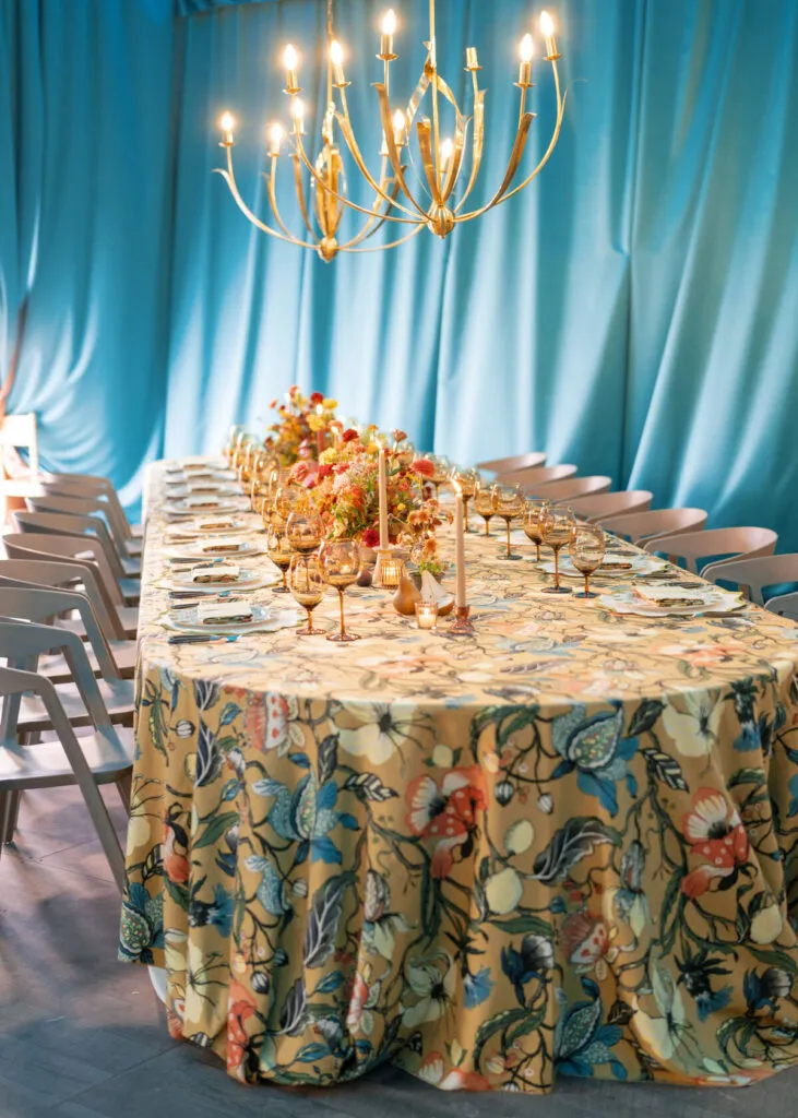
Fall event design has long been associated with rust, burgundy, amber, and warm neutrals. These colors continue to have their place, but they are not the only way to create a tablescape that feels appropriate to the season. Cooler shades, unexpected contrasts, and softened colors can offer an equally compelling direction when their relationships are carefully considered.
For wedding planners and event designers, exploring fall tablescape color combinations beyond the expected palette creates opportunities for more distinctive settings. Marigold can find balance beside smoky plum, while slate blue and burnt sienna introduce a contrast between cool and warm tones. Even dusty lavender or a predominantly black-and-ivory palette can feel appropriate for autumn when the surrounding materials support the design.
Linens provide an important foundation for these combinations. Their color, surface area, and texture influence how the entire table is perceived, allowing an unconventional palette to feel cohesive rather than disconnected from the occasion.
Why Do Some Unexpected Colors Still Feel Appropriate for Fall?
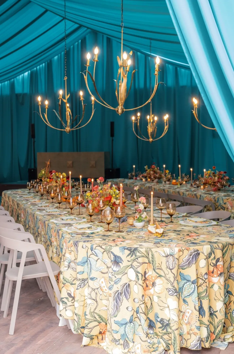
A fall palette does not need to reproduce the colors traditionally associated with autumn. Seasonal character can emerge through the depth of a shade, its relationship with surrounding colors, and the materials used throughout the setting.
A muted blue may feel cool on its own, but paired with a warmer accent and deeper neutral, it can create a compelling autumn composition. Similarly, a pale lavender linen may feel appropriate when balanced with dark olive or another grounding shade.
The distinction lies in how the colors work together rather than whether each one belongs to a conventional seasonal palette.
Seasonal Character Does Not Depend on Traditional Colors
Rust, orange, and burgundy are familiar autumn choices because they reflect colors commonly found in seasonal foliage and landscapes. However, fall also offers quieter references, including muted skies, dark greenery, weathered stone, and softened natural tones.
These influences allow designers to develop palettes that feel connected to the season without relying on an obvious autumn theme.
A slate blue tablecloth, for example, can introduce a cooler interpretation of fall, particularly when accompanied by warm floral tones or understated metallic finishes. Deep olive creates a different expression through its richness and connection to natural greenery.
Neither requires traditional orange accents to feel appropriate.
Contrast Can Be More Interesting Than a Predictable Match
Unexpected palettes often succeed because they introduce a relationship that is not immediately obvious. Warm and cool colors can create tension, while pale and saturated shades establish differences in visual weight.
The key is deciding how the contrast should function within the tablescape.
A deeply colored tablecloth may provide the foundation for a lighter napkin, creating a distinct point of contrast at each place setting. Reversing those colors can produce an entirely different impression, even though the palette remains unchanged.
Understanding this relationship helps planners use unconventional combinations as a deliberate design choice rather than simply selecting colors that feel different from traditional fall options.
Marigold and Smoky Plum: Warmth With a Deeper Contrast
Marigold and smoky plum offer a rich alternative to familiar combinations of rust and burgundy. The pairing introduces warmth with a golden yellow, while muted purple creates depth and a cooler counterpoint.
Both colors have sufficient character to influence the tablescape, making their placement particularly important. Depending on which shade occupies the largest surface, the result can feel expressive and vibrant or more subdued and dramatic.
Why the Colors Work Together
Marigold has a warm, saturated quality that naturally attracts attention. Smoky plum provides a contrasting depth, particularly when the purple has muted or gray undertones rather than a bright, jewel-toned finish.
The combination works because the colors offer different visual qualities without relying on several competing saturated shades.
Marigold introduces warmth and energy, while plum provides a darker foundation. Their contrast can create a sense of richness that feels appropriate for autumn without reproducing the season’s most familiar colors.
The exact shades matter. A softened marigold may feel more understated beside a deep plum, while a brighter golden yellow can create a more pronounced statement.
How to Translate the Pairing Into Linens
A smoky plum tablecloth paired with marigold napkins allows the deeper shade to establish the primary mood. The marigold appears in smaller areas, introducing warmth without changing the overall character of the table.
Reversing the treatment creates a stronger golden presence. A muted marigold tablecloth with plum napkins or other textile accents may feel more expressive, particularly in a room with lighter architectural finishes.
Fabric texture can also influence the pairing. A plum textile with a soft, dimensional surface may appear richer under evening lighting, while a smoother marigold linen can provide a clearer contrast.
Rather than adding several more colors, planners can allow the relationship between these two shades to establish the table’s character.
When This Combination Feels Most Appropriate
Marigold and smoky plum are particularly compelling when the event design calls for a rich palette with noticeable contrast.
Formal evening receptions can provide an effective setting, especially when warm lighting brings out the golden qualities of marigold. The pairing may also complement darker florals and understated tableware.
In a brighter venue, the same colors could create a more expressive effect. Reviewing them within the intended lighting environment helps establish whether the combination feels appropriately balanced.
Moss Green and Muted Gold: An Earthier Alternative
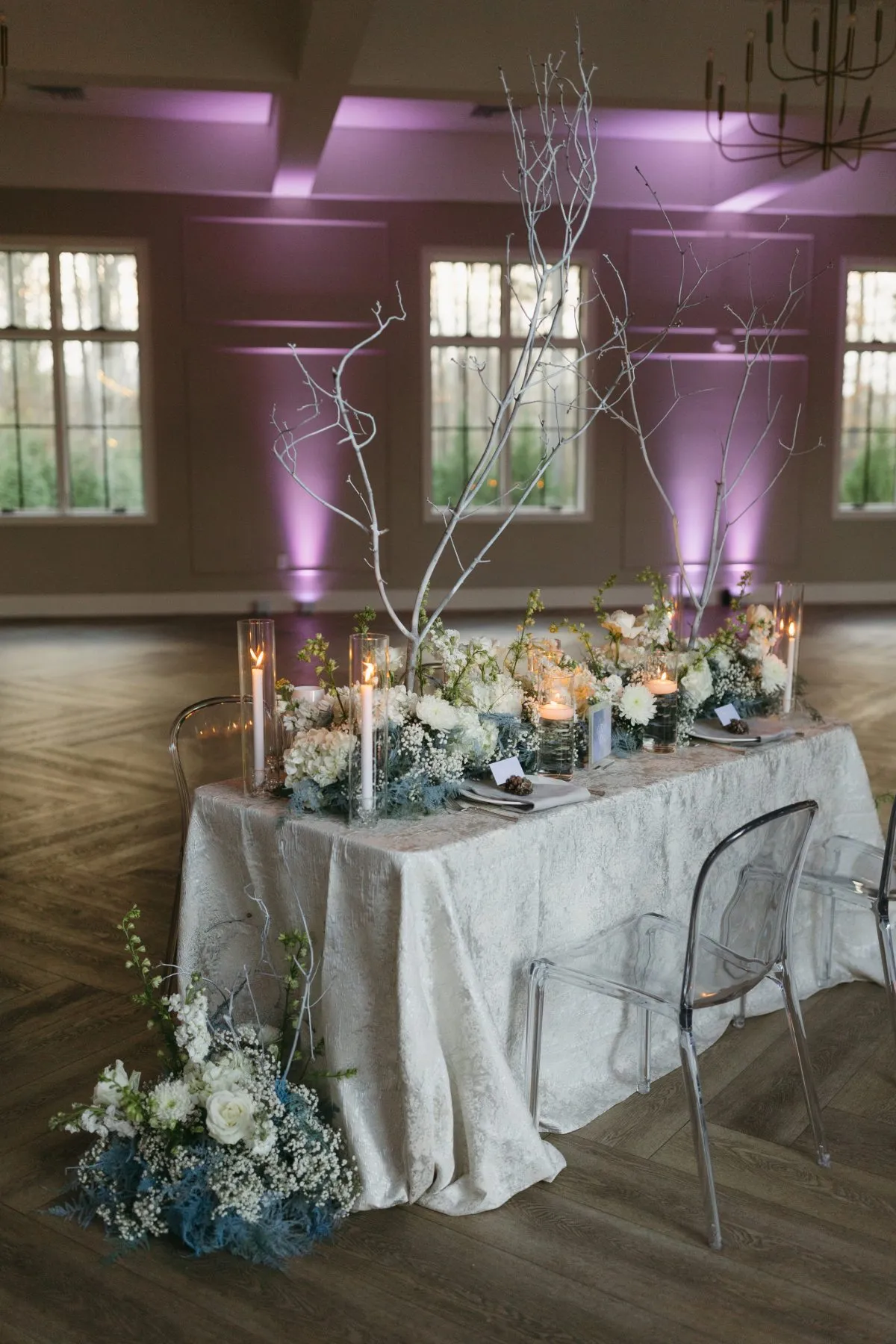
Moss green and muted gold offer a different interpretation of autumn color. Rather than creating contrast through dramatically opposing shades, the combination draws on natural tones with complementary depth and warmth.
The result can feel grounded without relying on brown or orange as the primary colors. It also provides flexibility for planners seeking a palette that works alongside natural florals, warm woods, or more decorative formal settings.
How Moss Green Establishes Depth
Moss green occupies an interesting position within fall design. It has an earthy character, but its muted quality makes it less pronounced than brighter botanical greens.
As a tablecloth color, moss green can establish a substantial visual foundation without introducing the intensity of a jewel-toned emerald.
Its depth also allows lighter materials to become more visible. Ivory dinnerware, clear glassware, and warm metallic accessories can create subtle distinctions against a moss-colored textile.
This makes the shade useful when the table should feel connected to natural autumn tones while maintaining a more restrained palette.
Why Muted Gold Creates a Softer Contrast
Muted gold introduces warmth without the brightness of a highly saturated yellow.
When paired with moss green, it can add a gentle contrast that feels connected to the earthier foundation. The effect depends on the gold’s undertones, with softer antique or ochre-influenced shades often creating a more subdued relationship.
This distinction is important because not every golden color produces the same impression.
A bright yellow-gold may become the dominant feature of the setting, while a softer shade can introduce warmth without competing with the green.
Applying the Colors Across the Table
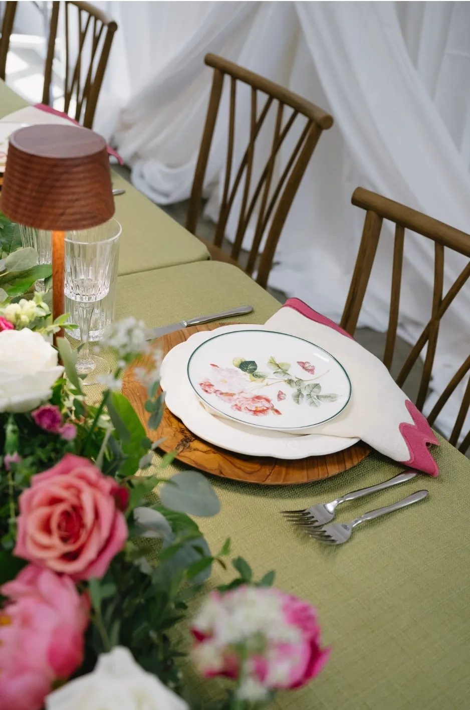
A moss green tablecloth with muted gold napkins offers a straightforward way to establish this palette. The green provides continuity across the table, while the napkins introduce a warmer detail at each place setting.
A lighter neutral base could also work, allowing moss and gold to appear through smaller textile elements and surrounding materials.
The surrounding tableware should be considered carefully. Warm metallic flatware may reinforce the golden accents, while understated ceramics can keep the relationship between the two linen colors clear.
The objective is not to repeat both shades across every available surface. Instead, their placement should create a recognizable connection within the overall composition.
Slate Blue and Burnt Sienna: Balancing Cool and Warm Tones
Slate blue and burnt sienna create one of the more distinctive departures from traditional fall palettes. The combination introduces a cool, muted foundation alongside a warm reddish-brown tone associated more closely with autumn.
Because the colors sit on different sides of the temperature spectrum, their relationship creates visual interest without necessarily requiring elaborate patterns or textured fabrics.
Why Slate Blue Changes the Character of a Fall Palette
Slate blue introduces a quieter, cooler direction than the warm shades commonly associated with autumn.
Its gray undertones can give it a muted appearance, making it suitable for settings where the palette should feel sophisticated without becoming overly dark.
As a dominant linen color, slate blue can establish a composed background that allows warmer details to become more noticeable.
It may be particularly effective in venues with neutral interiors or natural stone finishes, where the blue can complement the existing environment rather than introduce a competing color.
How Burnt Sienna Introduces Seasonal Warmth
Burnt sienna brings warmth through its reddish-brown character. Unlike a brighter orange, it often has an earthy depth that can sit comfortably beside cooler colors.
Against slate blue, the warmer shade becomes more distinct, creating contrast through temperature rather than dramatic differences in brightness.
The relationship can feel particularly balanced when both colors have similarly muted qualities. A highly saturated sienna may create a stronger statement, while a softened version allows the blue to remain more prominent.
The pairing demonstrates how a familiar autumn tone can take on a different character when placed beside an unconventional companion.
Choosing Which Color Should Lead
A slate blue tablecloth with burnt sienna napkins creates a cooler overall composition, allowing the warm shade to appear as a deliberate accent.
Reversing the colors produces a different atmosphere. A sienna tablecloth introduces more immediate warmth, while blue details provide contrast and prevent the palette from feeling entirely traditional.
Neither arrangement is inherently preferable.
The decision should reflect the surrounding architecture, floral palette, and intended atmosphere. A cooler venue may benefit from the warmth of a sienna foundation, while a space with warm lighting and wood finishes may provide an effective setting for slate blue linens.
Dusty Lavender and Deep Olive: A Softer Fall Combination
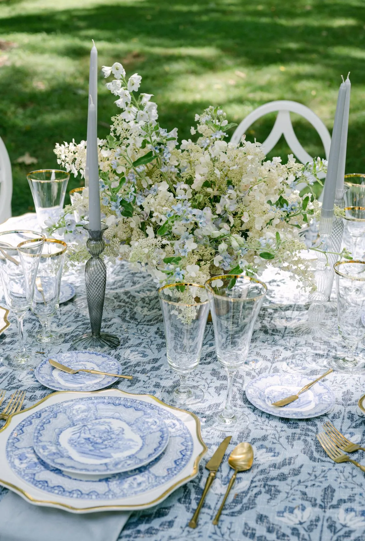
Dusty lavender and deep olive introduce a softer interpretation of autumn color. While lavender is often associated with spring celebrations, its character changes when the shade becomes more muted and is paired with a deeper, earthier green.
The combination can feel distinctive without requiring strong saturation or pronounced contrast. It is particularly useful for planners seeking a palette that incorporates lighter color while retaining a grounded seasonal quality.
Why Muted Lavender Can Work Beyond Spring
Lavender does not belong exclusively to one season. Its appearance depends on saturation, undertones, and the colors surrounding it.
A bright lavender may introduce a fresh, light quality commonly associated with spring. Dusty lavender, by comparison, carries more muted gray or mauve undertones, creating a softer effect.
This allows the color to work within deeper autumn palettes without appearing disconnected.
As a linen color, dusty lavender can introduce a gentle contrast to darker materials, particularly when the surrounding design remains relatively understated.
How Deep Olive Grounds the Palette
Deep olive provides the darker foundation that gives dusty lavender a different seasonal character.
Its muted green tone creates contrast without the brightness of more saturated botanical shades. The relationship feels less floral and more grounded, especially when supported by natural materials and softly finished textiles.
A deep olive tablecloth can establish the primary visual weight, while dusty lavender details introduce a lighter counterpoint.
This relationship allows the lavender to remain noticeable without making the overall palette feel delicate or overly pastel.
Translating the Combination Into Linen Selection
One approach is to use deep olive as the primary tablecloth color, with dusty lavender napkins providing a controlled contrast.
Alternatively, a muted lavender tablecloth may create a softer foundation, while olive appears through napkins, floral greenery, or other supporting details.
The fabric finish can influence the effect. Matte textiles may reinforce the subdued character of both shades, while a richer finish can introduce additional depth.
The combination is most effective when the colors are evaluated together rather than chosen independently. Their undertones should feel related enough to establish cohesion while retaining the contrast that makes the pairing interesting.
Black, Ivory, and Warm Metallics: A Different Expression of Fall
Not every autumn tablescape needs a recognizable seasonal color. Black and ivory offer a more graphic alternative, particularly when accompanied by warm metallic finishes that introduce subtle warmth.
This palette moves away from the natural colors traditionally associated with fall, allowing contrast, material, and lighting to establish the atmosphere.
Why Black and Ivory Create a Strong Foundation
Black and ivory provide a clear relationship between dark and light surfaces.
A black tablecloth can establish a dramatic foundation, particularly when paired with ivory napkins and lighter dinnerware. The contrast is direct and recognizable without requiring several additional colors.
An ivory tablecloth with black textile accents creates a different impression, placing greater emphasis on the lighter surface while retaining a distinct graphic quality.
The choice between these approaches depends on how much darkness the overall design should carry.
For a formal evening reception, black linens may create a stronger presence. In a brighter or more architectural setting, ivory may provide a more appropriate foundation.
How Warm Metallic Details Change the Mood
Brass, antique gold, and other warm metallic finishes can influence the character of a monochromatic table without introducing a traditional autumn linen color.
These materials create a subtle connection to the warmth commonly associated with fall, particularly under candlelight or soft ambient lighting.
A black tablecloth with ivory napkins and antique brass accessories, for example, can feel more inviting than a composition relying exclusively on high-contrast black and white.
The metallic elements should complement the linens rather than become an unrelated decorative statement.
When Monochrome Works Best
Black and ivory can be particularly effective in formal evening settings, contemporary venues, or spaces with strong architectural character.
The palette allows the shapes and materials of the tabletop to become more prominent. Glassware, flatware, and floral arrangements can each contribute distinct detail against the contrasting linen surfaces.
However, the combination may feel too stark for some event concepts.
Introducing warmer finishes, natural materials, or softer ivory tones can change the character without abandoning the monochromatic foundation.
How Can Linens Help an Unexpected Palette Feel Cohesive?
An unexpected color combination becomes more convincing when its placement is considered as carefully as the shades themselves.
A palette may work beautifully as a group of samples but create a different impression when translated across full tablecloths, napkins, and surrounding materials.
Because linens occupy a substantial portion of the visible tablescape, they play an important role in determining how the colors are perceived.
Decide Which Color Needs the Largest Surface
The dominant tablecloth color often establishes the primary atmosphere of the setting.
A deep plum tablecloth with marigold napkins feels different from a marigold tablecloth with plum accents, even though both use the same colors.
The darker foundation may create a more subdued and dramatic effect, while the warmer dominant shade introduces greater brightness across the room.
This relationship also matters when the linens are repeated across several tables.
A strong color used throughout the reception may become a defining feature of the event space, making its scale and intensity important considerations.
Use Napkins and Smaller Textile Details to Introduce Contrast
Napkins, runners, and other smaller textile elements provide opportunities to introduce a secondary color without giving it equal visual weight.
A saturated accent may be particularly effective in these applications because it creates a recognizable contrast while allowing the primary linen to remain dominant.
However, bold colors do not always need to be limited to smaller pieces.
When a strong shade is central to the event’s design direction, using it across the main tablecloth may be appropriate. The supporting textiles can then provide contrast through quieter colors or finishes.
The choice should reflect the intended visual relationship rather than a fixed rule about where color belongs.
Consider Fabric Texture and Finish
Color is influenced by the surface on which it appears.
A matte fabric may give a saturated shade a more subdued character, while velvet or another dimensional textile can introduce variations in depth and shadow. Smooth fabrics with greater sheen may reflect light differently, changing how the color is perceived throughout the event.
These qualities become especially relevant when pairing shades with contrasting temperatures or intensities.
A muted blue and warm sienna may feel balanced in similar matte finishes, while changing one textile to a more reflective surface could make that color more prominent.
Considering fabric finish alongside color helps create a more complete and deliberate composition.
How Should Planners Evaluate an Unconventional Fall Palette?
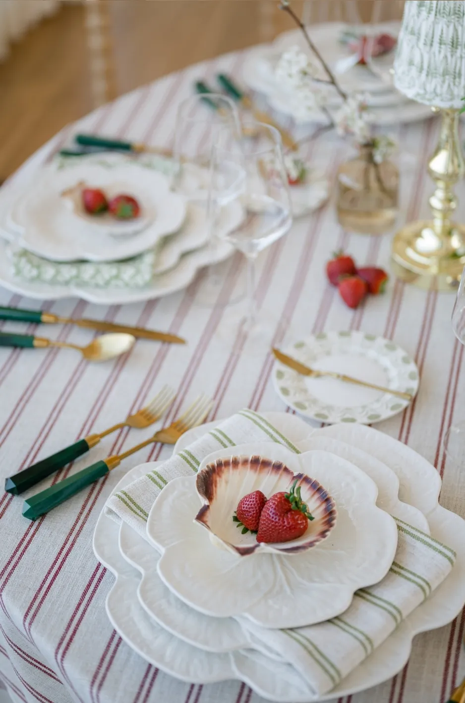
Unexpected color combinations require the same attention to context as more traditional palettes. The objective is not simply to determine whether two colors look attractive together, but whether they support the intended event environment.
Venue finishes, floral arrangements, lighting, and the scale of the linens can all influence the final result.
Review Colors Under the Expected Lighting
Lighting can change the appearance of color, particularly when fabrics have complex undertones.
Warm evening lighting may emphasize the golden qualities of marigold or burnt sienna, while cooler daylight can make shades such as slate blue and dusty lavender appear more prominent.
The finish of the fabric can amplify these differences.
When practical, reviewing linen samples under lighting conditions similar to those expected at the event provides a clearer understanding of how the palette will appear.
Consider the Venue and Floral Palette
The surrounding environment influences whether an unconventional combination feels cohesive.
A venue with warm wood finishes may complement slate blue and sienna differently from a ballroom with cooler architectural details. Similarly, floral arrangements containing strong colors can alter how the linen palette is perceived.
Planners should consider whether the chosen linens are intended to complement these features or establish a distinct contrast.
Neither approach is inherently incorrect, but the relationship should feel deliberate.
Evaluate the Full Tablescape Before Finalizing
Small fabric samples are useful for reviewing individual shades, but they cannot fully communicate how a color combination will appear across a complete table.
A saturated shade may become more prominent when used as a full tablecloth, while a subtle accent may have less impact than anticipated once surrounded by place settings and floral arrangements.
Reviewing representative table arrangements, when possible, allows planners to assess the colors at a more realistic scale.
This process can also reveal whether the palette needs additional contrast, a quieter supporting shade, or fewer competing materials.
Exploring Fall Color Combinations With Curated Linen Collection
An unexpected fall palette offers an opportunity to move beyond familiar seasonal combinations while maintaining a considered event aesthetic.
Curated Linen Collection offers premium event linens in a range of colors, patterns, and textures, providing options for planners seeking distinctive textile relationships.
Find Linens That Support an Unexpected Palette
Selecting an unconventional palette begins with identifying the character the event should communicate.
A deep, dramatic combination may call for richly colored fabrics, while a softer interpretation of autumn may benefit from muted shades and understated finishes.
Exploring the collection with a clear color direction allows planners to consider how available textiles can support the intended design.
Not every shade needs to be an exact match to the original inspiration. Related tones may create a more nuanced composition, particularly when the fabric’s texture and finish are considered alongside its color.
Create a Cohesive Color Story Through Textile Selection
A successful palette does not require every color to appear with equal prominence.
One shade may establish the table’s foundation, while another introduces contrast through napkins or a selected textile detail. The surrounding florals, tableware, and lighting can then contribute to the overall relationship.
This approach allows unexpected colors to feel integrated rather than introduced solely for novelty.
Curated Linen Collection’s selection of luxury event linens provides opportunities to explore these combinations, helping planners develop autumn tablescapes that reflect a distinctive design direction without relying on traditional seasonal formulas.
Frequently Asked Questions
Can cool colors work for fall event tablescapes?
Yes. Cool colors such as slate blue, dusty lavender, and muted gray can work beautifully for fall events. Pairing them with deeper shades, warm accents, or complementary materials can create a cohesive seasonal design without relying on traditional orange and burgundy tones.
What colors can replace traditional rust and burgundy for fall?
Alternatives include smoky plum, moss green, slate blue, dusty lavender, deep olive, and black. These shades can be combined with warmer accents or complementary neutrals to establish different interpretations of autumn color.
Should the boldest color always appear in the napkins?
No. A bold color can serve as either the primary tablecloth shade or a smaller accent, depending on the intended effect. Using it across the main linen creates a stronger presence, while introducing it through napkins or runners allows the color to contribute without dominating the setting.
How can planners make an unexpected fall palette feel cohesive?
Cohesion comes from considering the relationship between colors, their placement, and the surrounding design. Reviewing fabric undertones, texture, floral arrangements, tabletop materials, and venue lighting helps determine whether the combination creates the intended effect.
Fall Color Does Not Have to Be Predictable
Autumn provides a familiar palette of rich, warm colors, but those shades do not define the limits of seasonal event design. Unexpected combinations can feel equally appropriate when their depth, temperature, and placement are considered together.
Marigold and smoky plum introduce expressive contrast, while moss green and muted gold offer an earthier direction. Slate blue and burnt sienna balance cool and warm tones, dusty lavender and deep olive create a softer alternative, and black with ivory provides a distinct interpretation of formal fall design.
The most effective palette is not necessarily the most unusual. It is the combination that supports the desired atmosphere and works naturally with the surrounding materials.
Through thoughtful textile selection, planners can translate these color relationships into complete tablescapes that feel individual and cohesive. Curated Linen Collection offers premium event linens to support that process, providing opportunities to explore distinctive fall color directions through fabric, finish, and considered design.