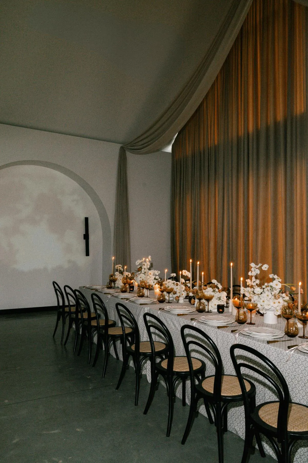
Layering a table runner over a textured base linen can give an event table greater depth, structure, and visual distinction. The combination allows two textiles to contribute to the design, but it also creates a specific challenge. When both fabrics contain prominent texture, pattern, sheen, or color, they can compete instead of working together.
Successful layering depends on compatibility, not the number of materials used. One textile should establish the main visual direction, while the other provides contrast, definition, or a carefully controlled accent. The relationship should remain visible after the place settings, flowers, candles, and other tabletop elements are added.
Planners and designers can evaluate a runner and base linen through four characteristics: surface relief, reflectivity, pattern scale, and color value. These qualities reveal whether the textiles will create deliberate contrast or merge into an overly dense surface.
Establish the Lead Textile Before Adding Another Layer
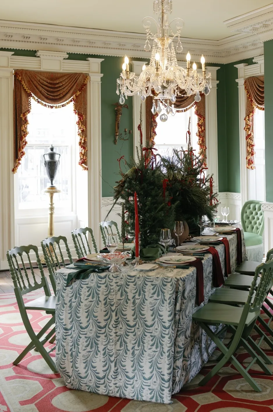
Every layered table design needs a clear visual leader. Either the textured base linen or the runner should establish the primary color, pattern, or surface treatment. When both textiles demand equal attention, the table can feel unsettled before any flowers or tableware are introduced.
Choosing the lead textile first gives every later decision a defined purpose. The supporting fabric can then add structure, softness, contrast, or movement without attempting to become a second focal point.
Let a Dimensional Base Linen Lead
A base linen with visible embroidery, pleating, raised motifs, pronounced weave, velvet pile, or an expressive pattern already brings substantial character to the table. Covering it with an equally detailed runner may hide the qualities that made the base linen worth selecting.
When the base leads, choose a runner with a quieter surface. A smooth solid, lightly woven fabric, controlled tonal variation, or tailored custom detail can create a clear centerline while allowing the dimensional foundation to remain visible.
The runner does not need to disappear. Its role is to organize and refine the surface rather than introduce another dominant textile story.
Give the Runner Priority Over a Quieter Texture
Some base linens contain subtle texture that becomes apparent only at close range. A fine woven variation, soft slub, lightly brushed surface, or understated tone-on-tone pattern can provide depth without controlling the complete design.
This type of base creates space for a more expressive runner. A custom print, contrasting color, prominent border, or distinctive woven motif can become the leading element while the tablecloth provides a sophisticated foundation.
The base should still contribute to the result. Its surface can soften the runner, prevent the setting from appearing flat, and provide visual interest between place settings.
Avoid Dividing Attention Equally
A heavily textured tablecloth, bold runner, patterned napkins, elaborate chargers, and detailed floral arrangement may all be attractive separately. Together, they can remove any sense of hierarchy.
Before finalizing the fabrics, identify which textile should attract attention first. The other should support that decision through contrast or coordination. If both pieces appear equally dominant, simplify one variable such as texture, sheen, motif, or color intensity.
Luxury event design often depends on editing. A controlled combination allows the quality of each textile to be seen more clearly.
Read the Surface Character of the Base Linen
The word “textured” can describe many different fabric qualities. A softly woven linen and a deeply embossed velvet both have texture, but they respond differently to runners, lighting, and tabletop materials.
Before reviewing runner options, study how the base linen creates its visual interest. Its physical depth, pattern direction, and interaction with light will determine which contrasts are needed.
Examine Relief, Pile, and Dimensional Depth
Surface relief refers to how far the fabric’s texture rises from its base structure. Fine woven variations create shallow relief, while embroidery, tufting, pleating, and velvet pile produce greater dimension.
A highly dimensional tablecloth often works best with a smoother runner that can rest cleanly on the surface. Pairing two deeply raised textiles may cause the runner to sit unevenly or make the table appear visually heavy.
A base with shallow texture gives the designer more freedom. It may support a runner with its own weave, pattern, or soft dimensional detail, provided the two fabrics remain easy to distinguish.
Identify the Direction of the Texture
Texture can create a sense of movement across the table. Ribbing may form a linear direction, pleats can create a repeated rhythm, and botanical embroidery may produce a more organic visual flow.
The runner can reinforce that direction or introduce a deliberate counter-direction. A linear runner over a softly organic base may create structure. A flowing printed runner over a quiet geometric weave may soften the arrangement.
Problems arise when the two directions appear accidental. Competing stripes, irregular folds, or motifs moving at similar angles can make the surface feel disorganized.
Observe How the Textile Reflects Light
Texture becomes more pronounced when light moves across it. Velvet can absorb light in some areas and reflect it in others, while satin-finish textiles create a more continuous sheen. Matte woven fabrics tend to distribute light softly.
The runner should respond to that quality. A matte runner can provide calm definition over a luminous base. A softly reflective runner may bring controlled brightness to a quiet, low-sheen tablecloth.
Two highly reflective fabrics can produce glare, particularly when combined with glassware, polished flatware, metallic chargers, and candles. Their colors may also appear different under directional event lighting.
Apply the Four-Point Contrast Test

A layered linen treatment needs enough contrast for both textiles to remain visible. However, the contrast should not be so extreme that the runner looks unrelated to the base.
The four-point test evaluates surface relief, reflectivity, pattern scale, and color value. A pairing does not need strong contrast in every category. Differences in two or three areas are often enough to create separation while preserving cohesion.
Test Surface Relief
Place the runner directly on the base linen and compare the physical depth of their surfaces. If both fabrics contain heavy embroidery, deep pile, thick pleating, or prominent raised patterns, the combination may feel too dense.
A smooth runner over a raised base creates immediate distinction. A lightly textured runner can also work when its weave is smaller and more controlled than the base texture.
When both textiles have similar relief, one should differ clearly in color value, reflectivity, or motif scale.
Test Reflectivity
Review both fabrics under the same light rather than comparing them in separate swatches or photographs. A runner that appears matte in one setting may develop visible sheen under candlelight or directional lighting.
Pairing a luminous fabric with a matte one often creates effective depth. The contrast allows light to move across the table without making the entire surface reflective.
When both textiles have sheen, look for a difference in intensity. A softly luminous runner may work over a more reflective base, but two glossy surfaces can compete with the tableware and create excessive highlights.
Test Pattern Scale
When the base or runner includes a visible pattern, compare the scale and spacing of each repeat. Patterns at nearly the same scale can interfere with one another, particularly if both contain strong lines or contrasting colors.
A runner with a small, detailed motif may work over a broad tone-on-tone base pattern. A large custom print can sit effectively over a fine woven texture that reads as a solid from a distance.
If both fabrics are patterned, one should appear quieter, larger, or more widely spaced. The distinction allows each layer to remain legible.
Test Color Value
Color value describes how light or dark a color appears. Two fabrics can have different hues but similar values, causing them to blend together when layered.
For example, a muted blue runner and medium gray base may offer little visual separation despite being different colors. A lighter blue or deeper gray could make the relationship clearer without introducing a severe contrast.
Testing fabrics in grayscale photographs can help reveal whether their values are too similar. A modest light-to-dark shift is often enough to define the runner against the textured foundation.
Let the Runner’s Construction Respond to the Base
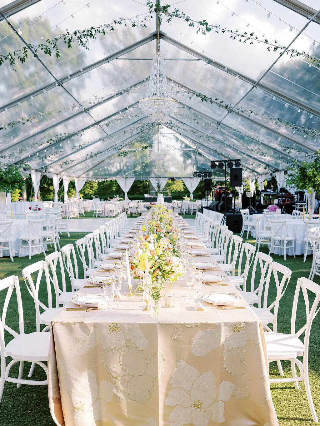
The runner’s construction affects how it rests on the table and interacts with the material beneath it. Structure, fluidity, transparency, and edge treatment can either clarify the layering or make the runner appear disconnected. The most effective construction responds to the base linen’s physical qualities rather than relying only on color coordination.
Use Structure to Define a Soft Base
A fluid or softly textured tablecloth may benefit from a runner with cleaner edges and more controlled construction. The runner creates a defined visual line through the center of the table and prevents the arrangement from appearing overly relaxed.
A structured runner can also provide a stable field for candles, stationery, and decorative objects. Its tailored quality contrasts with the softer movement of the base without concealing it.
The runner should still follow the natural line of the table. Excessive stiffness can make it look separate from the rest of the textile composition.
Add Movement Over a Crisp Foundation
A structured woven base can support a softer runner that introduces movement. A fluid fabric, gently gathered textile, or softly finished runner may keep the table from appearing too rigid.
The movement should remain controlled. Twisting, bunching, and inconsistent placement can interrupt the repeated rhythm of place settings and make the design look unfinished.
A softer runner works particularly well when the base linen has clear geometry or a tailored finish.
Consider Transparency Only When It Reveals Something Meaningful
A sheer or open-work runner can allow the texture and color of the base linen to remain visible. This can create a layered effect without placing two opaque surfaces over one another.
Transparency should reveal a purposeful feature beneath it. A subtle pattern, rich color, or dimensional weave can become more interesting when seen through a controlled upper layer.
If the base contributes little through the transparent runner, the additional layer may not be necessary. Every textile should have a visible role.
Coordinate the Edge With the Surface Beneath It
The runner’s edge influences how it meets the textured base. Tailored edges provide clarity, while scalloped, fringed, embroidered, or softly finished edges add movement and detail.
An expressive edge generally needs a quieter surface beneath it. A clean, straight edge can bring structure to a heavily textured or patterned base.
The edge should also remain visible after the tabletop is styled. If florals and place settings conceal it entirely, its decorative value is lost.
Preserve a Visible Field of the Base Textile

A textured base linen cannot contribute to the design if most of it is covered. The runner, centerpieces, candles, tableware, and stationery should leave enough open surface for the foundation textile to remain visible.
This visible field gives the table depth and proves that the layered treatment was intentional rather than accidental.
Leave Clear Side Fields
The base linen visible on either side of the runner should feel balanced. These side fields allow guests to see the texture while separating the runner from individual place settings.
When the runner is too wide, it can dominate the entire tabletop and make the base appear like a simple border. When it is too narrow, it may not provide enough structure to justify its presence.
The appropriate balance depends on the table width, place-setting arrangement, and scale of the runner’s design.
Reveal Texture at the Table Ends
Long tables provide opportunities to reveal the base linen near the ends, between decorative groupings, or around transitions in the centerpiece design.
These open areas prevent the runner from becoming one continuous visual block. They also allow the eye to move between the two textiles along the length of the table.
The base does not need to be exposed in equal amounts everywhere. Controlled variation can make the design feel more natural.
Keep the Centerline From Becoming a Solid Block
The runner often shares the table’s center with florals, candles, menus, serving pieces, and decorative objects. Together, these elements can form a dense strip that hides both the runner and the base.
Create small openings between arrangements so sections of the runner remain visible. These pauses help explain the layering and keep the centerline from feeling congested.
The table should have visual rhythm rather than uninterrupted decoration.
Integrate the Linen Pairing With the Tabletop
A runner and base linen should not be approved in isolation. Place settings, flowers, lighting, and decorative materials can alter the way the fabrics appear and determine whether their contrast remains visible.
The tabletop should support the linen hierarchy rather than introduce a new source of competition.
Let Place Settings Sit Primarily on One Visual Field
Decide whether each place setting will rest mostly on the textured base, overlap the edge of the runner, or sit fully within the runner’s field.
Consistency matters. Repeated settings that overlap the runner at different widths can make the table appear misaligned.
Placing settings primarily on the base allows the runner to remain a central design feature. A controlled overlap may create integration, but it should be repeated evenly throughout the table.
Use Florals to Frame Rather Than Conceal the Runner
A runner can help organize floral arrangements along the centerline. However, dense flowers placed continuously from one end to the other may hide the fabric almost completely.
Dividing florals into smaller groupings allows sections of the runner to remain visible. Arrangements can also frame a printed motif, border, or custom detail rather than covering it.
The linen and flowers should enhance one another. Neither should make the other unnecessary.
Balance Reflective Tabletop Materials With Fabric Sheen
Glassware, polished flatware, metallic chargers, mirrored accessories, and candlelight all introduce reflective surfaces. Their presence can intensify the sheen of the linens.
If the runner and base are already luminous, quieter ceramic, matte metal, or softly finished tabletop pieces may produce better balance.
When the fabrics are mostly matte, reflective tableware can add controlled highlights without overwhelming the textile relationship.
Allow Negative Space to Separate Textures
Open space allows the eye to distinguish between the base linen, runner, place settings, florals, and decorative objects.
Filling every section of the table can make the textures merge into one complicated surface. Negative space preserves the edges of each material and gives important details room to register.
The result feels considered rather than sparse because every visible element has a clear role.
Scale the Contrast to the Table’s Design Role
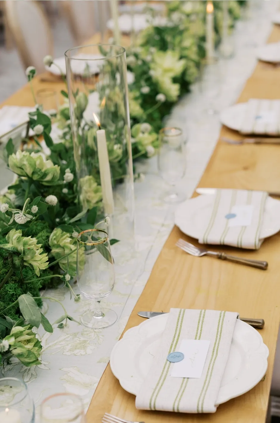
The appropriate level of contrast depends on where the table sits within the event. Repeated dining tables may need a refined treatment that creates rhythm without dominating the room. Feature tables can support stronger linen contrast because they are intended to attract greater attention.
Using one layering formula everywhere can flatten the visual hierarchy of the event.
Use Moderate Contrast Across Repeated Guest Tables
When a runner-and-base pairing appears across many guest tables, a controlled contrast can create consistency without making every surface visually intense.
A subtle value change, smooth runner over a fine texture, or restrained pattern over a tonal base may provide enough distinction. The relationship should remain clear from a normal viewing distance without competing with every centerpiece.
Repeated tables create impact collectively, so each one does not need an extreme textile contrast.
Increase Definition at Head and Feature Tables
Head tables, cake tables, escort displays, presentation tables, and other high-visibility surfaces may support a stronger runner treatment.
A more saturated color, larger pattern, custom border, or distinctive edge can increase definition. The base should still connect the feature table to the wider event design.
The stronger treatment should intensify an established idea rather than introduce a new palette or unrelated textile direction.
Reserve Custom Details for High-Visibility Surfaces
A custom-printed runner or tailored motif can be most effective on a table where guests and photographers will notice it.
The textured base should support the custom element rather than compete with it. A subtle woven foundation, tonal velvet, or restrained dimensional surface may provide enough richness while allowing the print to remain the focal point.
Custom details work best when their placement and visibility are planned before the tabletop décor is finalized.
Evaluate the Pairing Under Event Conditions
Texture changes under different lighting, viewing angles, and camera settings. Small swatches may appear balanced in a showroom but behave differently across a full table.
Testing should focus on how the two fabrics interact as a pair, especially once reflective objects and lighting are introduced.
View the Layers From the Side
An overhead view does not fully reveal surface depth. Examine the runner and base from the side or at seated eye level.
Lower angles show how the runner rests on raised texture, whether its edges lift, and how shadows form across the layered surface.
This test is especially useful for velvet, embroidery, pleating, and fabrics with a pronounced woven structure.
Examine the Pairing Under the Planned Lighting
Review the fabrics under lighting similar to the event environment. Daylight, candlelight, warm uplighting, and cool directional lighting can alter color and sheen.
Watch for glare, unexpected shadows, and shifts that cause the runner to blend into the base. A combination that looks distinct in daylight may become too similar under low evening lighting.
Testing also reveals whether the fabrics coordinate with the venue’s existing surfaces and lighting temperature.
Photograph the Textiles at Room and Detail Distance
Take one photograph from across the room and another from close range. The wider image shows whether the runner remains visible as part of the overall table design.
The detail photograph reveals whether patterns, textures, and reflective qualities interfere with one another. Cameras may flatten subtle texture or exaggerate tightly spaced motifs.
A successful pairing should work in person and in the photographs that document the event.
Recognize When the Layers Are Competing
Two attractive textiles do not automatically create a successful combination. When the pairing fails, the issue can often be traced to one of the four contrast categories.
Identifying the problem makes it possible to adjust one variable instead of abandoning the entire design.
The Runner Disappears Into the Base
When a runner becomes difficult to distinguish, the fabrics may share similar color values, surface depths, and reflectivity.
Increase contrast in one area. A lighter runner, smoother surface, more matte finish, or clearer pattern may solve the problem without changing the palette.
The runner should be visible enough to contribute structure and direction.
Both Textures Demand Attention
Two deeply dimensional textiles can make the surface feel heavy and visually crowded.
Simplify either the runner or the base. A smooth runner can clarify an ornate foundation, while a quieter base can give a richly textured runner more presence.
One textile should lead while the other supports it.
The Patterns Create Visual Interference
Patterns may compete when they have similar scales, directions, spacing, or contrast levels.
Replace one with a solid, increase the difference in scale, or select a quieter tone-on-tone pattern. The goal is to let one motif remain clearly dominant.
Pattern mixing should create depth, not visual vibration.
The Tabletop Hides the Layering Decision
If florals, candles, serving pieces, and tableware cover nearly all of the runner, the additional fabric may no longer improve the design.
Edit the tabletop to reveal the runner or remove the runner and allow the textured base to lead independently.
An invisible layer adds complexity without providing visual value.
Frequently Asked Questions
Can a textured runner be placed over a textured tablecloth?
Yes, provided the two textures differ clearly in relief, scale, or finish. Pairing a lightly woven runner with a deeply dimensional base can work well. Two heavily raised or ornate fabrics may compete.
Should the runner be smoother than the base linen?
Not always, but a smoother runner is often effective when the base has pronounced texture. If the base is subtle, the runner can carry more surface detail.
Can a patterned runner work over a textured base?
Yes. The base should be quiet enough for the runner’s pattern to remain legible. Compare the motif scale, color value, and reflectivity before approving the combination.
How can two linens in the same color remain visually distinct?
Use differences in value, sheen, texture, or construction. A matte runner over a luminous base, or a smooth runner over a raised tablecloth, can create distinction within one color family.
How much of the base linen should remain visible?
Enough should remain visible on both sides of the runner and between tabletop elements for its texture to contribute clearly. The runner should not reduce the base to an incidental border unless that effect is intentional.
Should the napkins match the runner or the base?
They may coordinate with either. Matching the runner can strengthen the centerline, while coordinating with the base can distribute the foundation textile throughout the place settings. The choice should support the established hierarchy.
What lighting conditions make textured layers difficult to photograph?
Strong directional light can exaggerate raised texture, while low, flat lighting may cause subtle layers to blend together. Highly reflective fabrics may also create glare under candles or spotlights.
When is a runner unnecessary over a textured tablecloth?
A runner may be unnecessary when the base linen already provides the required pattern, structure, and focal interest, or when tabletop décor would conceal most of the runner.
Can a custom-printed runner be paired with a dimensional base linen?
Yes. The base should remain visually restrained enough for the custom print to retain priority. A tonal textured foundation often works better than a heavily patterned one.
Build Depth Through Contrast, Not Accumulation
Sophisticated linen layering does not come from adding as many fabrics as possible. It comes from giving each textile a defined role and creating enough contrast for both layers to remain visible.
Begin by deciding whether the textured base or the runner will lead. Then compare the fabrics through surface relief, reflectivity, pattern scale, and color value. These four qualities reveal whether the combination has clear hierarchy or whether the textiles are competing.
When the runner introduces controlled contrast and the base remains visible, the table gains depth without becoming crowded. Curated Linen Collection’s textured table linens, coordinating runners, specialty textiles, and custom-printed details can help planners build layered event tables that feel expressive, balanced, and carefully composed.