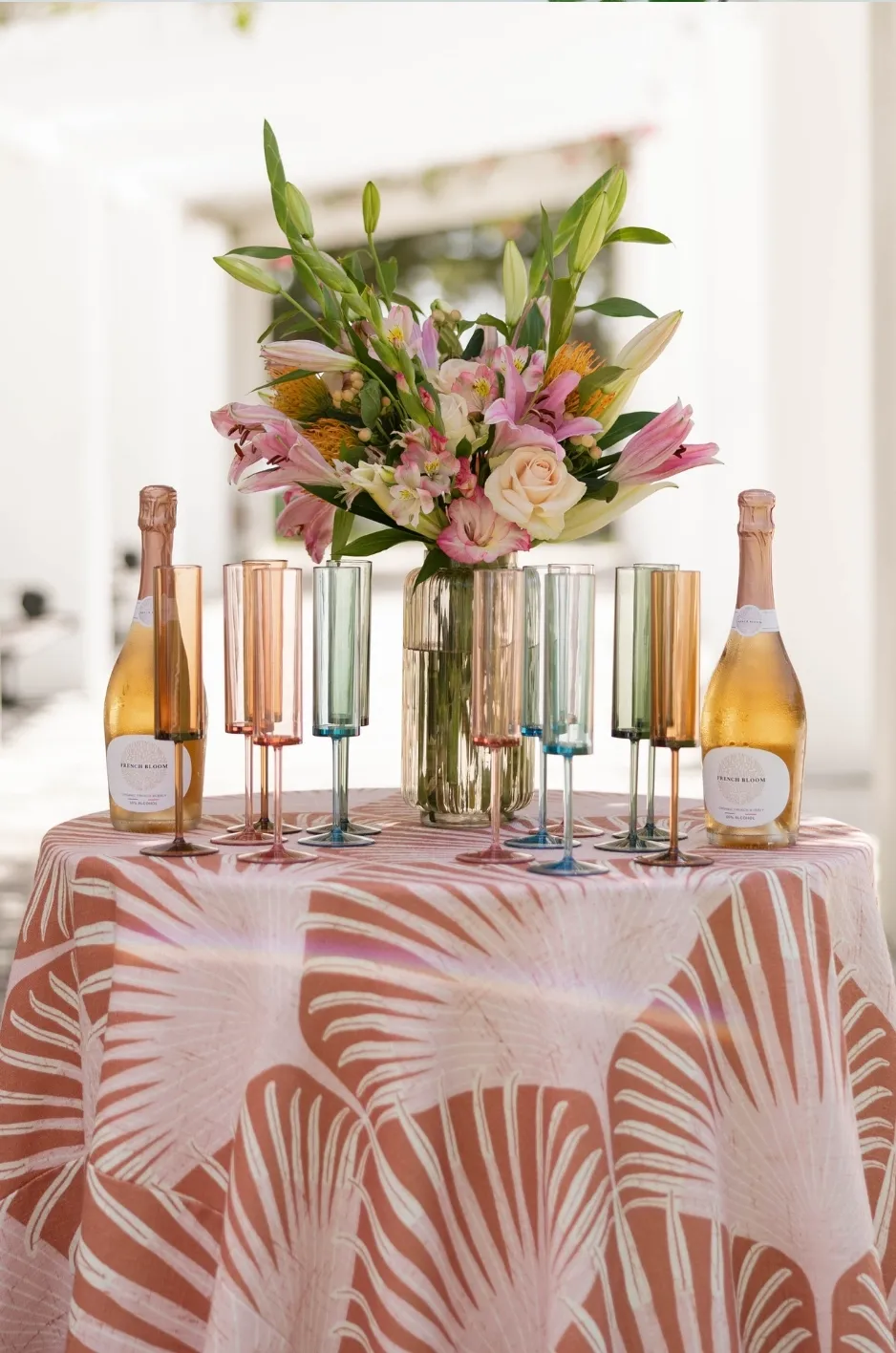
Autumn wedding colors extend far beyond predictable combinations of orange, brown, and burgundy. The most compelling fall tablescapes use color with greater intention, balancing saturated tones, softened neutrals, pattern, and texture to create a distinctive visual story. You may also find How to Coordinate Fall Wedding Linens, Florals, and Tableware helpful.
Because table linens cover some of the largest surfaces in a reception space, they have a significant influence on how the overall palette is perceived. A wine velvet tablecloth can make a room feel dramatic and intimate, while an ochre pattern may introduce warmth and movement. Layered mushroom, fawn, and champagne tones can create a quieter interpretation of autumn centered on texture rather than bold color.
Curated Linen Collection offers solid linens, rich velvets, patterned designs, runners, napkins, overlays, and custom options that allow planners and couples to build an autumn palette from the table outward. Rather than treating linens as a final accessory, the following approach uses them as the foundation of the reception design.
Build the Autumn Palette Around the Linen
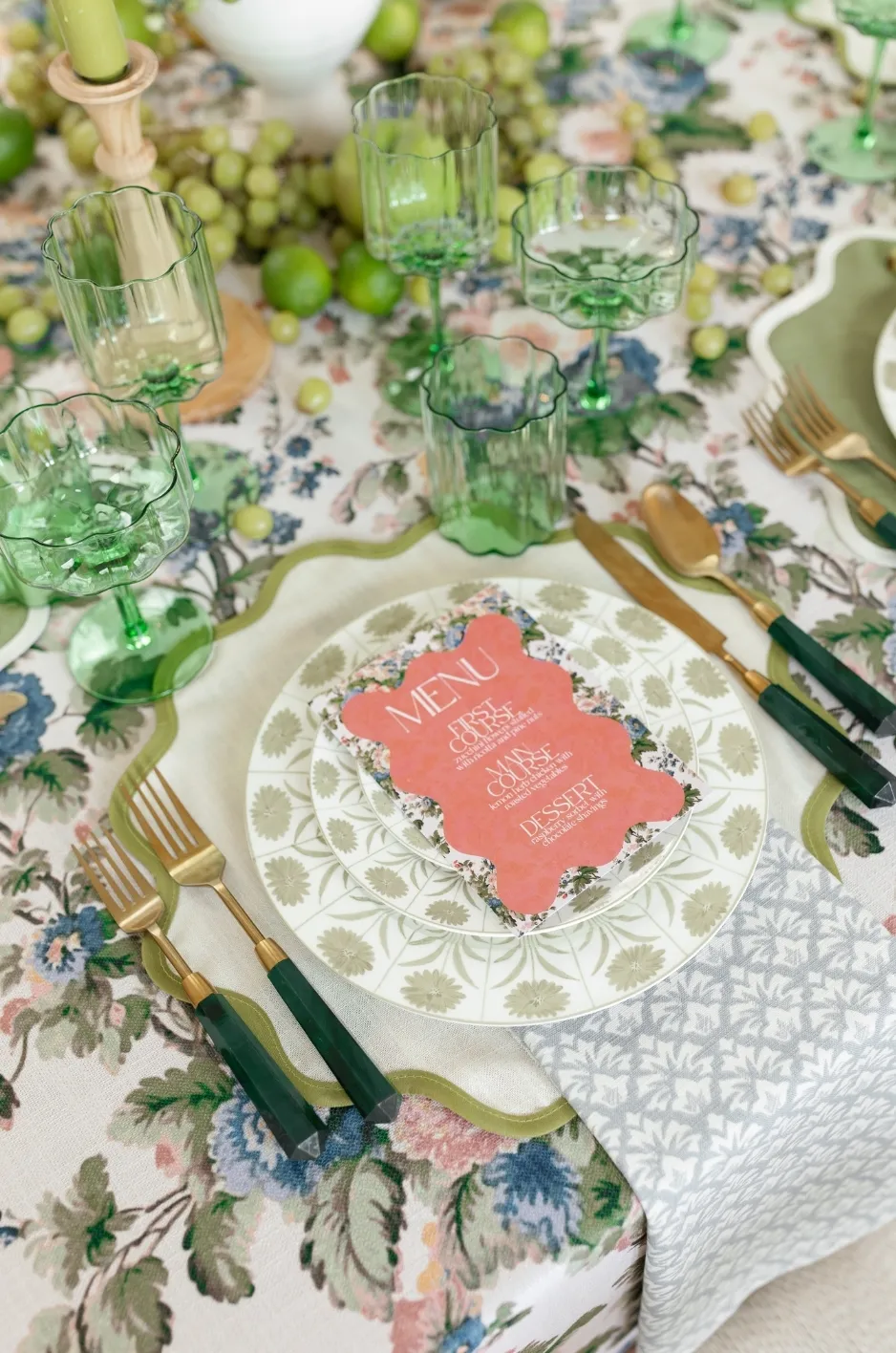
The primary table linen occupies more visual space than most individual floral, tabletop, or decorative elements. Selecting it early provides a clear foundation for the rest of the design and prevents the palette from becoming a collection of unrelated seasonal shades.
Establish a Dominant, Supporting, and Accent Color
A balanced fall palette usually begins with three levels of color rather than several shades used in equal amounts.
The dominant color typically appears on the primary tablecloth or patterned linen. A supporting shade may be introduced on selected tables, within floral arrangements, or through surrounding design elements. The accent color should appear in smaller, controlled applications, such as napkins, runners, placemats, or specialty linens.
For example, a wine-colored tablecloth could serve as the dominant tone, with muted mauve as the supporting shade and antique gold used as an accent. This creates greater depth than repeating burgundy, gold, and pink evenly throughout every table.
Decide Whether a Solid or Pattern Will Lead the Palette
A saturated solid allows the tablescape to begin with a clear color statement. Velvets are particularly effective when the goal is to create richness and visual depth, while matte or woven solids provide a quieter base for prominent floral or tabletop details.
A patterned linen offers a different starting point. Rather than selecting each color separately, planners can pull several coordinating shades directly from the artwork. A botanical or floral pattern may already contain ochre, green, blush, ivory, and brown, creating a cohesive palette without requiring every color to appear as a separate full-table linen.
Consider How the Palette Will Read Across the Room
A linen that looks beautiful on one sample table may feel considerably more intense when repeated across an entire reception.
Before finalizing the palette, consider how many tables will use the strongest color or pattern. Alternating statement linens with quieter coordinating solids can create visual rhythm and prevent the room from feeling overly saturated. The result should feel connected when viewed from a distance while still offering variation as guests move through the space.
Create a Formal Fall Palette With Wine, Ruby, and Rose Gold
Wine and ruby tones capture the richness of autumn without relying on a conventional orange-led palette. They are especially effective for formal evening receptions, historic interiors, ballrooms, and settings where deeper color can create a sense of intimacy.
Anchor the Tablescape With a Deep Wine or Ruby Linen
A wine-toned velvet, such as Wine Casablanca, creates a continuous field of saturated color. Its texture allows the shade to shift as light moves across the fabric, giving the table more dimension than a flat burgundy surface.
A ruby pattern or stripe can produce a more tailored interpretation. Designs such as Kathryn Ruby or Ruby Stripe introduce movement while maintaining the strength of the red-based palette. These options work well when the tablescape needs color without depending entirely on florals to provide visual variation.
Soften the Base With Mauve or Muted Blush
Deep wine can become visually heavy when every supporting detail is equally saturated. Muted mauve, dusty rose, or restrained blush helps soften the palette while preserving its autumn character.
Mauve Casablanca, Light Pink Tuscany, or a blush floral pattern can be introduced through selected linens or smaller table details. The key is to choose subdued pinks with gray, brown, or violet undertones rather than bright pastel shades that may feel more closely associated with spring.
Add Rose Gold or Champagne in Controlled Amounts
Metallic and softly reflective finishes can add definition to a dark palette, but they are most effective when used selectively.
Rose gold, champagne, or muted gold may appear on a focal table, runner, specialty overlay, or small linen detail. Limiting the metallic element allows it to catch the light without competing with the depth of the wine or ruby base.
Use Ochre, Cognac, and Gold for Warm Autumn Depth
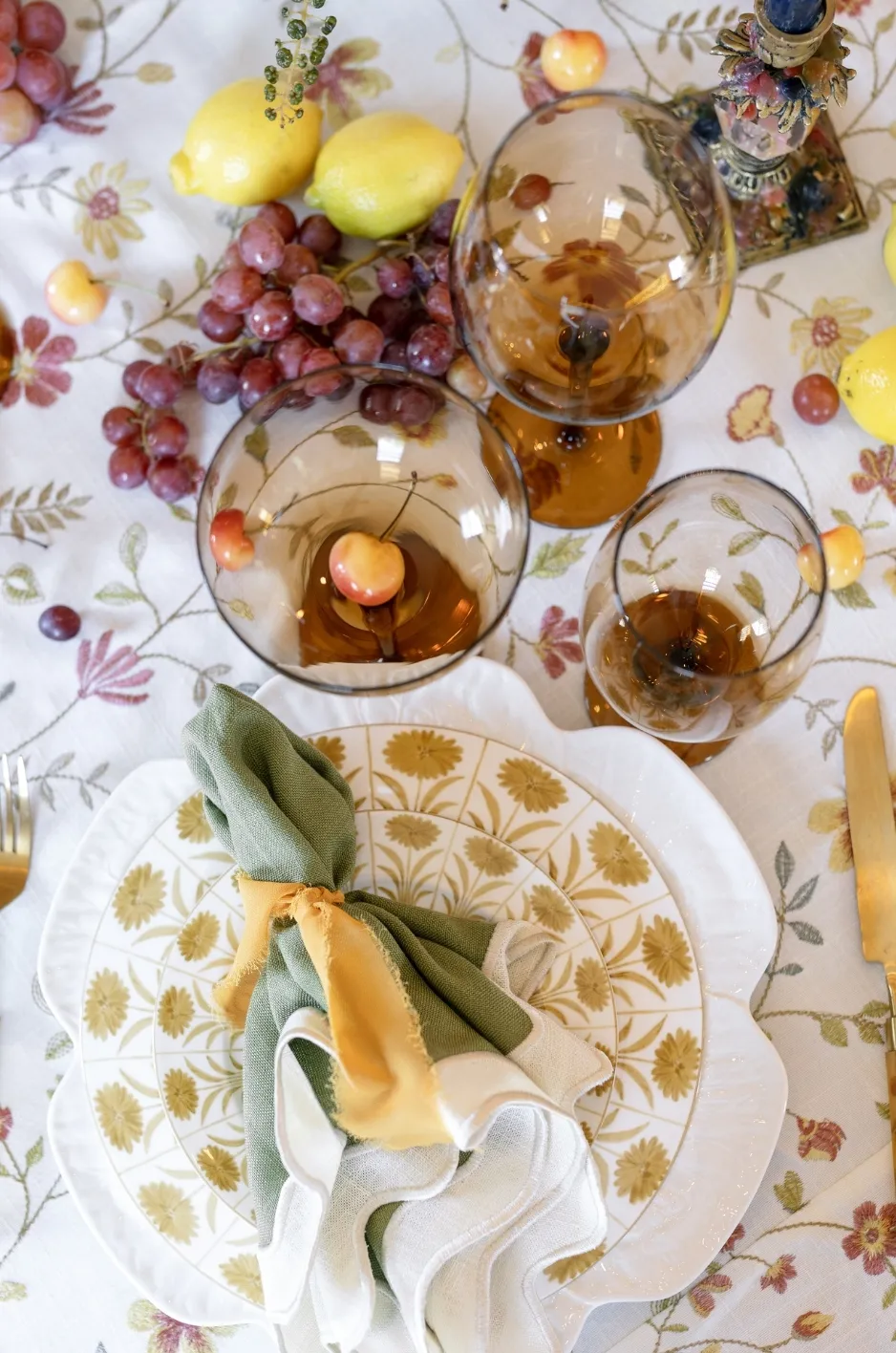
Ochre and cognac offer a more refined alternative to bright pumpkin orange. Their brown and golden undertones provide recognizable autumn warmth while remaining suitable for elevated wedding tablescapes.
Let an Ochre Pattern Establish the Color Story
A patterned linen such as Eloise Ochre can establish more than one color at a time. Its artwork can guide the selection of surrounding neutrals, florals, napkins, and other design details.
Instead of adding separate orange, yellow, green, and cream elements, planners can identify the most important tones within the pattern and repeat them selectively. This creates a palette that feels developed from a single visual source.
Pair Ochre With Cognac and Warm Neutrals
Ochre becomes more sophisticated when paired with grounded neutrals rather than brighter seasonal colors.
Italian Flowers Cognac, Seabrook Fawn, Latte Tuscany, Sawyer Mushroom, and Charlotte Mushroom offer warm brown-based directions that can support ochre without flattening its vibrancy. These combinations are particularly effective when the design should feel inviting and dimensional without becoming overly dark.
Choose Between Muted Gold and High-Impact Gold
Not every gold linen creates the same effect. A soft neutral gold can blend into an understated palette, while a saturated velvet or metallic finish becomes a prominent design element.
Palm Gold, Darcy Gold, Sawyer Gold, Golden Casablanca, Hirst Neutral, and Gold Illusion represent different approaches to introducing gold. The right selection depends on whether gold should quietly warm the tablescape or serve as one of its defining colors.
Develop a Botanical Fall Palette With Sage, Leaf, and Hunter Green
Green-based palettes retain a connection to the season without relying on literal leaf colors. Sage, leaf, olive, and hunter green can support both soft outdoor celebrations and formal evening receptions, depending on the linen’s depth and texture.
Use Sage for a Softer Autumn Interpretation
Sage provides a subdued botanical base that works well with ivory, mushroom, ochre, muted blush, and warm metallic details.
A solid option such as Sage Tuscany creates a calm color field, while a design such as Savannah Sage introduces pattern and texture. Sage is especially useful when the venue already includes garden views, stone surfaces, pale wood, or natural architectural details that should remain visible within the design.
Choose Leaf or Hunter Green for Greater Saturation
Leaf Casablanca and Hunter Casablanca offer a deeper approach to green. Their richer tones can ground a formal reception and create strong contrast against cream, gold, wine, or floral patterns.
Velvet intensifies these shades by creating highlights and shadows across the table. Under candlelight or warm interior lighting, the surface gains additional depth, making the green feel polished rather than rustic.
Prevent Green Tablescapes From Feeling Too Rustic
Green does not need to be paired with burlap, exposed wood, or obvious harvest details. To maintain a luxury direction, combine it with tailored stripes, refined patterns, metallic accents, polished neutrals, or deeper jewel tones.
A hunter green table with warm ivory and restrained gold will produce a very different effect from the same green surrounded by overtly rustic materials. The supporting textures determine whether the palette feels botanical and sophisticated or casual and themed.
Design an Evening Palette With Navy, Indigo, and Blue-Gray
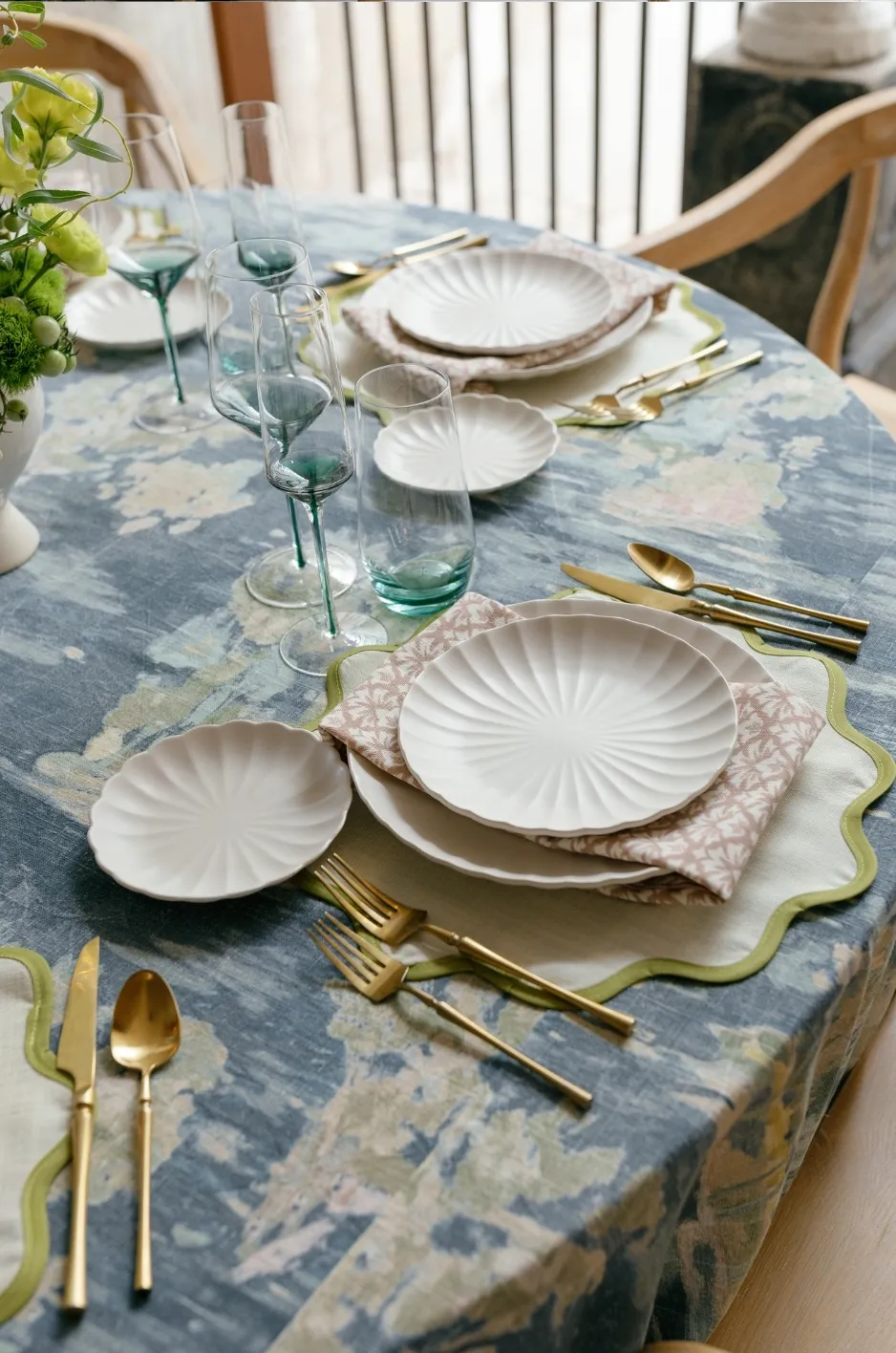
Blue is not always treated as an autumn color, yet navy and indigo can provide the depth expected of a fall palette while offering an alternative to burgundy. These shades work particularly well for evening celebrations and interiors that benefit from cool contrast. Read more in How to Use Color Contrast in Formal Fall Event Linens.
Ground the Palette With Navy or Midnight Blue
Seabrook Navy and Midnight Casablanca create strong foundations for formal tablescapes. Navy gives lighter tabletop elements greater definition and can make ochre, cognac, rose, gold, and warm neutral accents appear more pronounced.
A solid midnight velvet creates a dramatic uninterrupted surface, while a patterned navy linen introduces variation without sacrificing the palette’s formality.
Introduce Pattern Through Indigo
Jayden Indigo or Lotus Indigo can bring movement to a blue-led color story. A pattern prevents the palette from becoming too uniform and may provide secondary shades that can be repeated through napkins, focal linens, or surrounding decorative details.
Indigo patterns also offer a useful bridge between cool blue and warmer autumn accents, allowing gold, fawn, or cognac to appear intentional rather than added separately.
Use Blue-Gray for a More Restrained Transition
Slate Casablanca, Sawyer Mist, Storm Casablanca, and Brook Mist provide softer alternatives to dark navy.
These shades work well when the reception design includes stone, silver, muted blue florals, or cool architectural finishes. They can also support a transitional palette that moves from a lighter ceremony setting into a richer evening reception.
Build Understated Autumn Luxury With Tonal Neutrals
Rich autumn design does not require dark jewel tones. Mushroom, fawn, taupe, latte, cream, ivory, and champagne can create seasonal warmth through tonal variation and material contrast.
Combine Warm Neutrals Instead of Matching Them Exactly
An all-neutral tablescape becomes more dimensional when the shades are coordinated rather than perfectly matched.
Latte Tuscany, Sawyer Mushroom, Charlotte Mushroom, Seabrook Fawn, Taupe Stripe, and Cream Casablanca introduce slight differences in warmth, depth, and undertone. Used together, these variations create a layered appearance without moving away from the neutral color family.
Let Texture Create the Contrast
When the palette is restrained, the differences between velvet, woven solids, stripes, prints, and specialty finishes become more noticeable.
A cream velvet may appear deeper and more luminous than a matte ivory linen, even when the colors are closely related. Similarly, a subtle stripe or floral pattern can introduce movement without adding a new dominant shade.
This makes texture one of the most important tools in a tonal autumn design.
Add One Concentrated Autumn Accent
A neutral reception can benefit from one carefully selected seasonal accent. Wine, ochre, olive, navy, or rose gold may appear through napkins, a head-table linen, a patterned runner, or another smaller application.
Keeping the accent concentrated preserves the calm quality of the neutral palette while giving the room a clear focal point.
Control Color Saturation Across the Reception
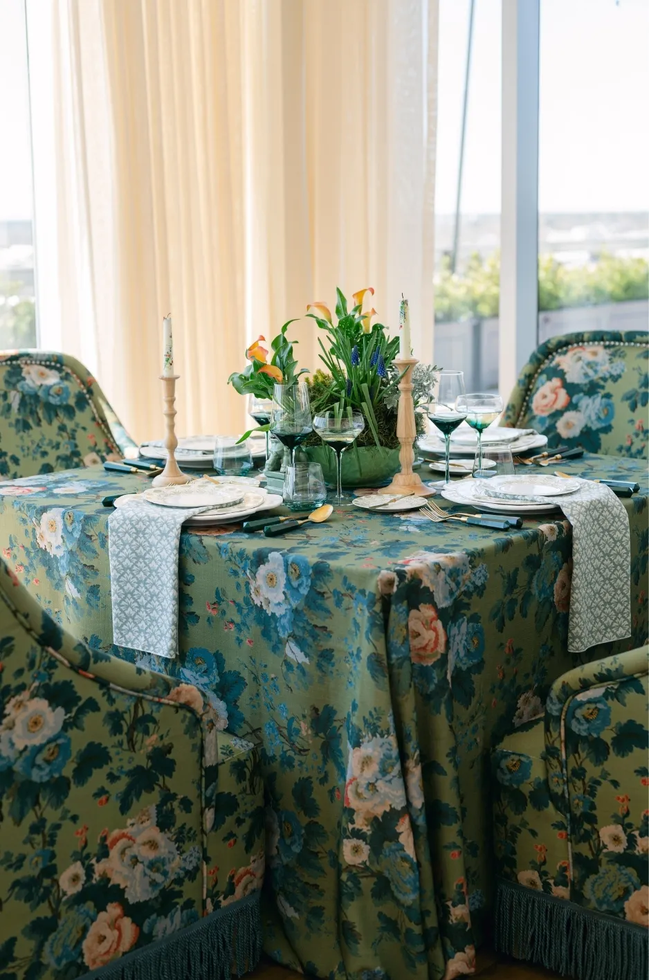
After the palette has been selected, it should be distributed strategically. Repeating the same bold linen across every surface can reduce its impact, while thoughtful variation creates hierarchy and allows statement pieces to stand out.
Place the Strongest Color on Priority Tables
The most saturated shade or distinctive pattern can be reserved for tables that naturally attract attention, including the sweetheart table, head table, cake table, escort display, or a limited number of guest tables.
For example, an ochre pattern may appear on the head table while guest tables use fawn solids with coordinated ochre napkins. This keeps the palette connected without making every table visually identical.
Reduce Saturation on the Remaining Guest Tables
Supporting tables can use lighter, softer, or more neutral linens from the same color story.
Wine may transition into mauve or mushroom. Hunter green may be supported by sage or cream. Navy may be balanced with blue-gray, fawn, or warm ivory. This approach allows the eye to move through the room while maintaining a unified design.
Repeat Accents Through Smaller Linen Elements
Napkins, runners, placemats, pillows, and overlays can carry an accent color at a smaller scale.
These elements are useful when a shade needs to appear throughout the reception without covering every table. Repetition should be noticeable enough to create continuity but controlled enough to preserve the visual hierarchy.
Evaluate How Fabric and Lighting Change the Palette
Color cannot be separated from material and setting. The same shade may look significantly different on velvet, a matte woven linen, a metallic finish, or a printed textile. Venue lighting can further alter its perceived undertone and intensity.
Compare Velvet With Matte and Woven Fabrics
Velvet creates deeper shadows and brighter highlights, which often makes wine, green, navy, and gold appear more saturated. Matte and woven linens provide a more even field of color, allowing patterns, florals, and tabletop details to take greater visual priority.
The decision should depend on whether the table linen is intended to create drama or act as a quieter foundation.
Review Colors Under the Reception Lighting
Natural afternoon light may reveal undertones that become less visible after sunset. Candlelight can warm wine, gold, ochre, and cream, while certain ballroom or tent lighting may shift the appearance of green, blue, and metallic finishes.
Colors should therefore be evaluated as part of the full environment rather than approved independently. The venue, event timing, lighting plan, and photography approach can all influence how the finished palette reads.
Check Pattern Scale Against the Table Size
A large botanical design may look expansive on a long banquet table but appear more concentrated on a smaller round table. Place-setting density, linen drop, floral coverage, and tabletop accessories also affect how much of the pattern remains visible.
Reviewing pattern scale alongside the intended table dimensions helps ensure the artwork remains legible after the table is fully set.
Use Custom Linens When the Palette Requires Greater Specificity
Some wedding palettes begin with invitation artwork, a venue detail, a crest, or a specific floral illustration. When an existing linen cannot fully express that direction, a custom design can provide a more precise visual connection.
Translate Wedding Artwork Into a Linen Pattern
Botanical artwork, watercolor illustrations, venue sketches, monograms, and wedding crests can be adapted into a custom linen design.
The artwork should contribute to the complete reception palette rather than function as an isolated graphic. Colors drawn from the stationery or venue can be repeated across the tablescape to create continuity from the initial invitation through the wedding day.
Calibrate the Design Around the Existing Palette
A custom print should be developed in relation to the chosen wine, ochre, green, blue, rose, or neutral color family.
Adjusting the background, pattern scale, and accent shades allows the linen to coordinate with surrounding solids and smaller details. This prevents the custom element from introducing colors that compete with the rest of the room.
Use Custom Color Strategically
A custom shade or pattern does not need to appear on every guest table. Concentrating it on the head table, sweetheart table, cake table, or selected reception surfaces can provide a strong visual signature.
Coordinated solids from the broader collection can then extend the palette across the remaining tables.
Frequently Asked Questions
What colors work best for an elegant fall wedding tablescape?
Wine, ruby, ochre, cognac, hunter green, navy, mushroom, fawn, mauve, and muted gold can all support an elegant fall palette. The best selection depends on the venue, lighting, linen texture, and desired level of contrast.
Can navy or blue be used in an autumn wedding palette?
Yes. Navy, indigo, slate, and blue-gray provide depth and formality while coordinating well with ochre, gold, cognac, rose, and warm neutrals.
How many colors should a fall tablescape include?
A focused palette often includes one dominant color, one supporting shade, and one accent. Additional tones may appear within patterns or florals, but they should remain connected to the primary color story.
Should a patterned linen or solid tablecloth establish the palette?
Either can lead the design. A solid creates a clear foundation, while a patterned linen can provide several coordinated shades and a more distinctive visual direction.
How can fall wedding colors feel luxurious instead of rustic?
Use polished textiles, refined patterns, controlled metallic details, layered neutrals, and saturated velvets rather than relying on literal harvest motifs or casual seasonal materials.
Can different linen colors be used on guest and focal tables?
Yes. Using a statement color or pattern on priority tables and quieter coordinating linens on guest tables creates visual hierarchy while maintaining a cohesive palette.
Create an Autumn Palette That Begins at the Table
A sophisticated fall wedding palette is not created by combining every color traditionally associated with the season. It begins with a deliberate linen direction and develops through controlled variations in tone, pattern, texture, and saturation. Read more in Fall Wedding Tablecloth Ideas Beyond Burgundy and Rust.
A wine velvet can establish a formal evening mood. An ochre pattern can supply an entire color story. Layered mushroom and fawn linens can create understated warmth, while navy or hunter green offers depth without relying on conventional autumn red.
Curated Linen Collection gives couples, planners, and event professionals access to solid linens, rich velvets, distinctive patterns, runners, napkins, specialty pieces, and custom designs that can shape the reception from the table outward. By selecting the linen early and allowing it to guide the surrounding palette, each element can feel connected, intentional, and appropriate for the setting. Explore the complete range of luxury linen rentals from Curated Linen Collection.
Explore Curated Linen Collection’s luxury linen offerings or connect with the team for assistance developing a cohesive autumn palette for an upcoming wedding. See how these ideas come together in our linen gallery.