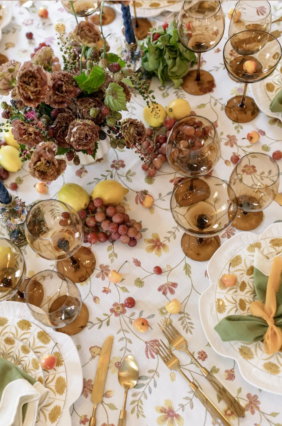
Fall wedding tablescapes often include deeper colors, expressive floral arrangements, layered place settings, candles, menus, glassware, and decorative details. Each element may be attractive on its own, but placing too many dominant features on one table can make the final design feel crowded rather than curated.
A balanced tablescape begins by deciding how every element will interact. The linen may serve as the primary visual statement, or it may provide a restrained foundation for prominent florals and tableware. Either approach can work when the design accounts for table dimensions, pattern scale, lighting, contrast, and the amount of surface that will remain visible.
This guide focuses on composition rather than general fall décor inspiration. It explains how couples and planners can coordinate luxury linen rentals with florals, candlelight, tableware, paper goods, and different table shapes while protecting the practical space guests need throughout dinner.
Curated Linen Collection specializes in tailored table linens and accessories, including tablecloths, runners, napkins, pillows, specialty overlays, velvets, linen, custom blends, custom sizes, and one-of-a-kind designs. These options give planners the flexibility to build a linen plan around the full tablescape rather than treating the tablecloth as an isolated detail.
Start With the Table Surface, Not Individual Décor Pieces
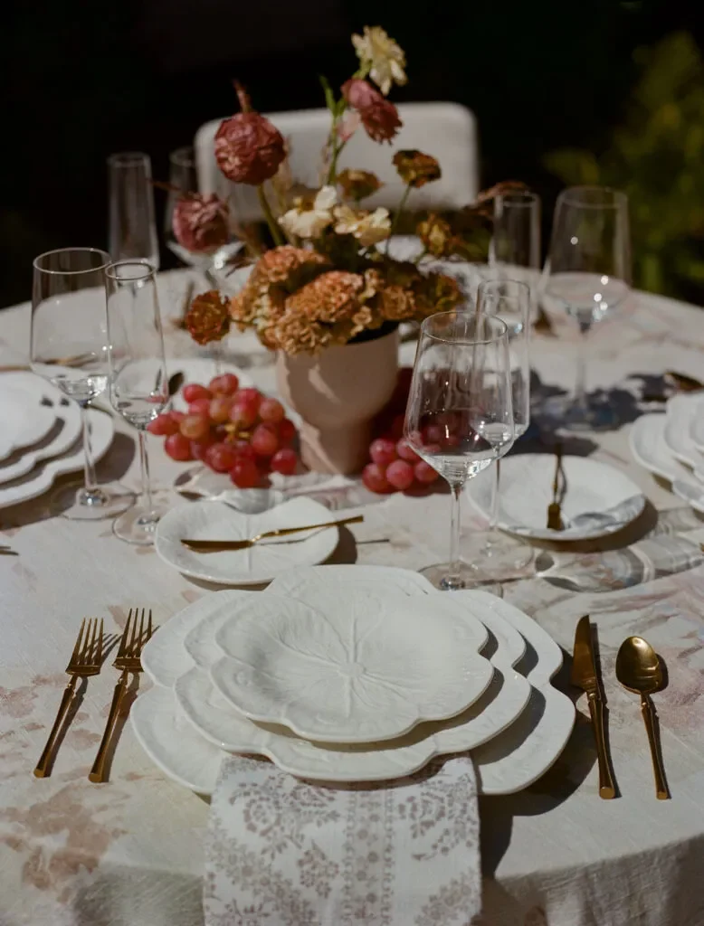
Before selecting a centerpiece, candle arrangement, or place-setting style, the design team should understand the physical surface available. Table dimensions influence how much décor can be added, how a linen pattern will appear, and whether guests will have enough room to dine comfortably.
Beginning with the table itself also prevents a common planning issue: choosing several beautiful components before determining whether they can function together within the available space.
Measure the Table’s Usable Width
The total width of a table is not the same as the amount of space available for decorative styling. Place settings occupy a significant portion of the surface, particularly when they include chargers, multiple glasses, menus, bread plates, and full flatware arrangements.
On a rectangular table, each place setting reduces the open space running through the center. On a round table, the settings create a ring around the perimeter and leave a more concentrated central area.
Before planning a runner or centerpiece, the designer should determine how much surface remains once the place settings are mapped. This helps prevent floral vessels, candles, and decorative pieces from extending into the guests’ dining space.
Map the Place-Setting Footprint
A complete place-setting mockup provides a more accurate measurement than estimating from a plate alone. The footprint may include:
- A charger or dinner plate
- Folded or draped napkins
- Menus and place cards
- Flatware
- Water, wine, and specialty glassware
- Bread plates or additional tableware
The position of the napkin is especially important because it can either expose or conceal part of the linen. A napkin placed beneath a menu on the plate leaves more tablecloth visible between settings. A napkin arranged beside the plate introduces a larger block of color directly against the tablecloth.
Mapping these elements early allows the linen to remain part of the composition instead of disappearing beneath the tabletop pieces.
Protect Space for Dining and Service
A fall tablescape can feel abundant without becoming impractical. Guests still need room to move their glasses, use their flatware, place personal items, and engage comfortably with those seated nearby.
The event team may also need access for water service, clearing courses, replacing utensils, or setting shared dishes. Tall candles, wide floral vessels, layered chargers, and decorative objects should not interfere with those tasks.
When the table begins to feel crowded, the answer is not always a larger table. Editing the number, size, or placement of decorative elements can create a more polished result while improving the guest experience.
Decide Where the Linen Should Remain Visible
The linen does not need to be equally visible across the entire surface. Instead, the design should identify the areas where its color, pattern, or texture will have the most impact.
On a round table, the linen may be most noticeable between the place settings and along the outer drop. On a banquet table, it may remain visible along the edges, beneath a narrow runner, or between spaced floral arrangements.
When a tablecloth carries an important pattern, enough surface should remain uncovered for the repeat to be recognizable. If the linen is primarily intended to introduce color or texture, smaller areas of visibility may still provide the desired effect.
Establish the Table’s Visual Priority

Every refined tablescape has a hierarchy. One component leads the design, while the others reinforce it through color, scale, texture, or contrast.
Without a clear priority, the table may contain a bold tablecloth, oversized florals, decorative china, colored glassware, printed menus, and several candle styles that all compete for attention. Individually, the pieces may work. Together, they may lack focus.
Let the Linen Lead When It Carries the Main Design
A patterned, textured, or custom-designed linen can become the primary visual feature of the table. In this approach, the fabric establishes the color story and provides the movement or detail that less expressive linens would leave to the centerpiece.
When the linen leads, the remaining selections should support it. Florals can pull from its quieter colors rather than repeating every tone. Plates and menus can provide clean areas of contrast. Napkins may use a solid shade derived from the main pattern.
The amount of visible linen also becomes more important. Large floral installations or excessively wide runners may conceal the very feature intended to define the table.
Use a Restrained Linen Beneath Statement Florals
When the floral design is large, colorful, sculptural, or highly varied, the linen can provide visual stability. A solid or tonal tablecloth gives the arrangement a clear foundation and prevents the table from becoming overly detailed.
Restrained does not have to mean plain. The fabric may still have a distinctive texture, refined finish, or subtle woven detail. Its role is simply to support the centerpiece rather than compete with it.
This approach can be particularly effective when floral arrangements include several types of blooms, branches, foliage, or vessels. The quieter foundation allows their shapes and colors to remain legible.
Simplify the Linen When Tableware Is Highly Decorative
Patterned china, colored glassware, ornate chargers, illustrated menus, and metallic flatware can create a strong place-setting composition. When several of these elements are used together, a calmer linen often helps each detail remain visible.
A complex tablecloth beneath decorative plates may make the edges of the place settings difficult to distinguish. Similarly, a heavily patterned napkin placed over detailed china can conceal both designs.
A solid linen or subtle tonal texture can provide enough contrast to frame the tableware without making the table feel visually empty.
Create One Strong Focal Point Instead of Several
The focal point does not always have to be a single object. It may be the collective effect of a patterned linen, the rhythm of repeated candles, or the shape of a floral arrangement running down a long table.
What matters is that guests can understand the table at a glance. A strong focal point gives the eye somewhere to begin, after which supporting details can be noticed gradually.
When every item demands immediate attention, none of them carries sufficient authority to organize the composition.
Coordinate Fall Florals With the Linen Without Matching Them Exactly
Fall wedding linens and florals should feel connected, but exact color matching is rarely necessary. A more layered design can be created by working with undertones, supporting shades, and intentional contrast. Read more in Burgundy Wedding Linens for Elegant Fall Tables.
This approach also gives the florist and linen specialist more flexibility. Rather than forcing every textile and bloom into one exact color, the design can use related tones that respond naturally to venue lighting and seasonal availability.
Pull a Supporting Color From the Floral Palette
The linen does not have to repeat the most prominent flower. In many cases, selecting a secondary shade produces a more refined connection.
For example, a floral arrangement dominated by wine and plum may contain quieter touches of green, ivory, blush, or brown. One of those supporting colors can guide the tablecloth or napkin selection.
This prevents the table from becoming saturated with one strong shade while still creating a recognizable relationship between the textiles and flowers.
Balance Floral Density With Pattern Density
A dense floral arrangement contains significant visual information. Multiple flower shapes, colors, foliage types, and vessel details may already create movement across the table.
Pairing that arrangement with a highly detailed linen can make both elements harder to appreciate. A more restrained textile gives the flowers space, while an expressive patterned linen may benefit from simpler arrangements or more controlled floral groupings.
Pattern density should also be considered separately from pattern scale. A large, open motif may feel calmer than a small print with many repeated details, even when both use the same number of colors.
Consider Greenery Undertones
Greenery is not one uniform color. Olive foliage can feel warm and grounded, while eucalyptus may appear cooler or grayer. Other leaves may lean yellow-green, blue-green, forest, or nearly brown.
These undertones can affect the way fall wedding linens appear beside the arrangement. A warm rust tablecloth may pair naturally with olive foliage, while a cooler green may need a different neutral or supporting shade to create cohesion. Read more in Fall Wedding Tablecloth Ideas Beyond Burgundy and Rust.
Viewing linen samples beside the proposed foliage can reveal relationships that are difficult to judge from digital images alone.
Use Contrast to Keep Both Elements Visible
Contrast allows the linen and florals to remain distinct while still belonging to the same design.
Light flowers may appear more defined against a deeper tablecloth, while rich arrangements may stand out more effectively against warm ivory, taupe, or another restrained foundation. Contrast can also come from texture rather than color. A matte floral vessel may appear more clearly against a gently luminous fabric, for example.
The objective is not to create the strongest possible contrast in every area. It is to prevent important details from blending into one indistinct field.
Plan the Linen for Daylight, Dinner, and Candlelight
Fall receptions frequently transition from afternoon light into evening. A linen that appears bright, detailed, or softly textured during daylight may read differently once candles and artificial lighting become the primary sources of illumination.
The full lighting timeline should therefore be considered before the fabric, color, and finish are finalized.
Evaluate Color in Natural and Artificial Light
Natural light reveals undertones clearly, particularly in neutrals, greens, blues, and muted reds. Warm indoor lighting may intensify yellow, amber, rust, and gold while softening cooler shades. Read more in Warm Neutrals: Styling Oatmeal and Terracotta Linens for Fall.
A deep fabric may look rich and dimensional during the day but become significantly darker after sunset. Pale fabrics may appear warmer beneath incandescent or candlelit conditions.
Whenever possible, samples should be viewed in lighting similar to the reception space. For events that span several hours, the fabric should be evaluated under more than one condition.
Create Contrast Around Dark Tablecloths
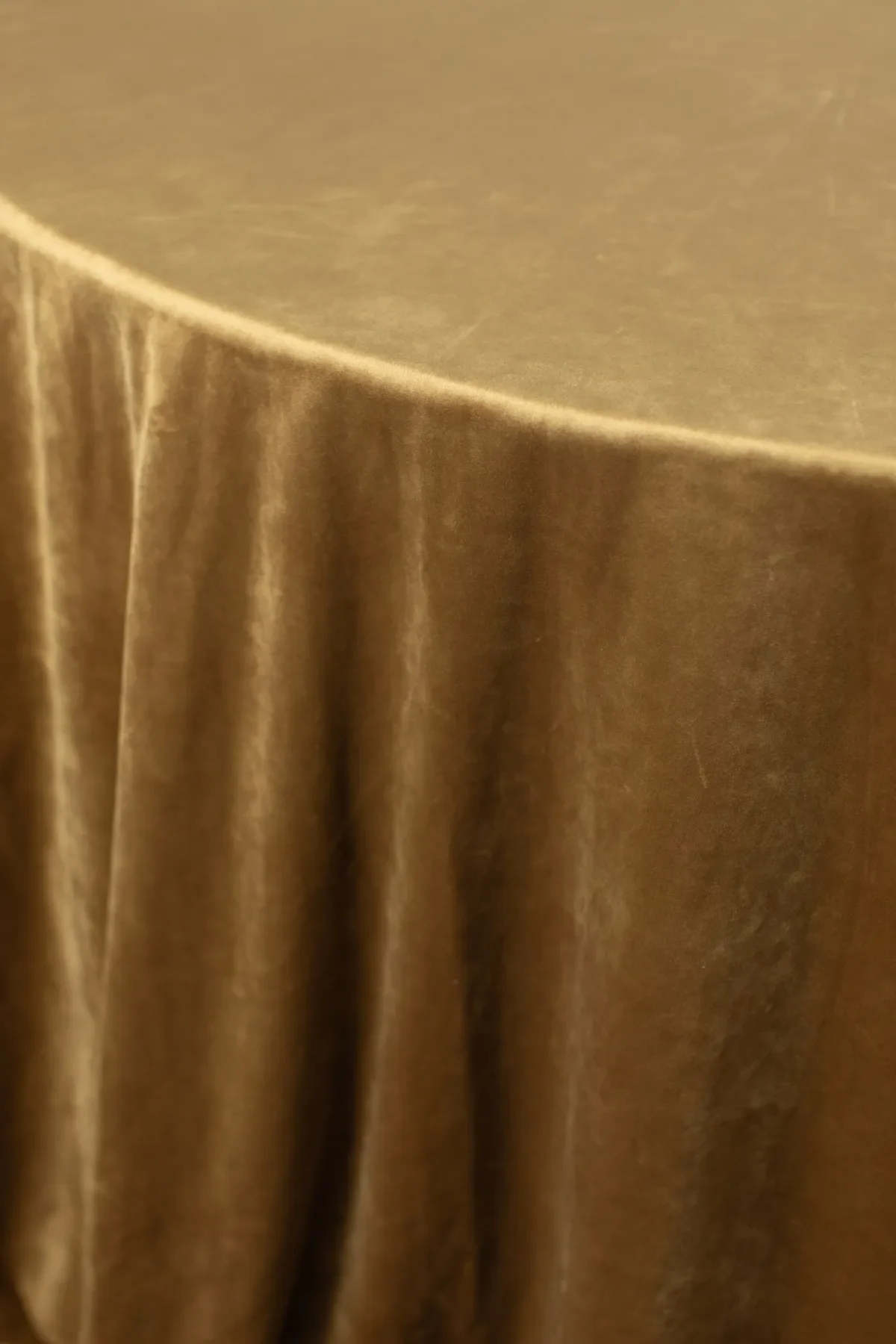
Deep fall wedding linens can create an intimate and formal atmosphere, but they require careful contrast once the room becomes darker. Read more in How to Use Color Contrast in Formal Fall Event Linens.
Light plates, menus, florals, or napkins can help define individual elements against wine, plum, forest, espresso, charcoal, or navy textiles. Candle placement may also be used to illuminate the table surface, although the design should not depend on candlelight alone to make every detail visible.
Using dark tablecloths with equally dark plates, menus, and florals may create a moody effect in person but cause the components to merge in photographs.
Control Reflective Finishes Near Candlelight
Luminous fabrics and metallic tabletop details can respond beautifully to candlelight. However, too many reflective surfaces may produce glare or make the table feel excessively bright in selected areas.
A reflective or gently lustrous linen can be balanced with matte ceramics, restrained paper goods, and soft florals. Conversely, a matte tablecloth can provide a stable foundation for polished flatware, glassware, and candleholders.
The most effective balance depends on how light moves across the room and where the tables are positioned relative to windows, chandeliers, uplighting, and candles.
Check How the Table Will Photograph
Wedding photographs may record color, contrast, and reflective finishes differently from the way guests perceive them in person.
Dark fabrics can lose subtle pattern details. Tonal combinations may appear flatter, while reflective elements can become more prominent. A centerpiece that seems appropriately scaled from a seated position may obscure the linen in overhead or room-wide photographs.
Photographing a mockup from several angles can identify these issues before the final order is approved.
Build Clear Contrast at Every Place Setting
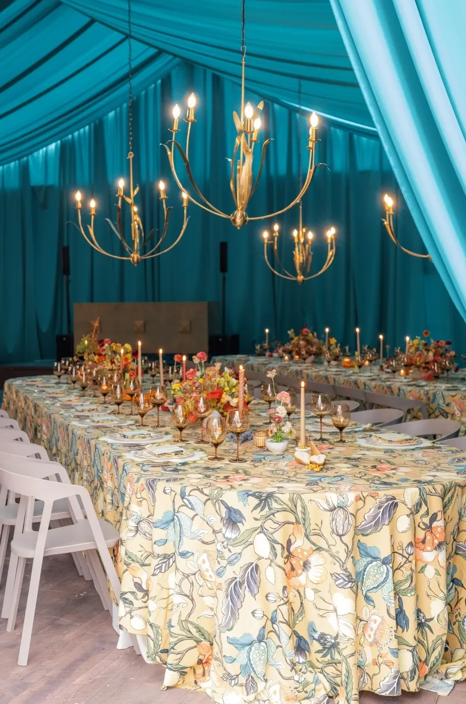
The place setting is where guests encounter the fall wedding tablescape most closely. The tablecloth, napkin, plate, menu, glassware, and flatware must remain visually distinct at that distance.
Strong contrast does not require combining black and white or using sharply different colors. It can be created through changes in value, texture, pattern scale, or finish.
Compare the Plate Color With the Tablecloth
White and ivory plates generally create clear definition against deep or patterned linens, but they can blend into very pale tablecloths. Dark or colored plates may stand out against a lighter foundation while becoming less distinct on similarly deep fabrics.
Patterned china requires additional consideration. Its design should not compete with the tablecloth directly beneath it. When both items carry patterns, differences in scale and density can help separate them.
A broad botanical tablecloth, for example, may work with china featuring a smaller border motif if their colors remain controlled.
Use Napkin Placement to Control the Composition
Napkin placement can alter the color balance of the entire table.
A napkin centered on the plate introduces a clear block of textile at every seat. This can repeat a supporting color consistently and create rhythm around the table. A napkin positioned beside the plate exposes more of the china while placing the textile directly against the tablecloth.
A draped or loosely folded napkin adds movement, while a structured fold creates a more tailored appearance. The correct choice depends on how much additional color and texture the table needs.
Keep Menus and Place Cards Easy to Read
Menus and place cards should remain legible against the linen, especially when they are positioned directly on the table rather than on a plate.
Small type, delicate illustrations, and low-contrast paper colors may become difficult to read over a detailed print. A solid backing card, plate placement, or simplified area of the pattern can provide greater clarity.
Paper goods may coordinate with the linen through color or motif, but they should not disappear into it.
Account for Colored Glassware and Metallic Details
Colored glasses and metallic flatware can reinforce the fall palette without requiring another textile layer. Amber, green, plum, smoke, and other glass tones can introduce controlled color above the table surface.
However, using several glass colors alongside multiple metals and a patterned linen can fragment the composition. Selecting one dominant glass tone and one primary metal finish generally produces a clearer result.
The table can still feel layered without every material introducing a new color.
Adapt the Linen Composition to the Table Shape
A linen plan should respond to the table rather than applying the same arrangement to every surface. Round, rectangular, square, and specialty tables create different sightlines and areas of visible fabric.
The same color story can be maintained throughout the reception while the scale, placement, and layering change according to each table’s proportions.
Design Round Tables From the Center Outward
Round tables usually place the centerpiece at the center, with guest settings arranged around the perimeter. The tablecloth is therefore most visible between the place settings and throughout the outer portion of the surface.
A central floral arrangement that is too wide can cover much of the linen and reduce dining space. More controlled vessels or clustered arrangements can preserve visible fabric while still creating floral impact.
Large-scale patterns should also be reviewed carefully on round tables because the motif may be interrupted by plates around the perimeter.
Create Direction Along Long Banquet Tables
Rectangular banquet tables naturally direct the eye along their length. Linens, runners, candles, and floral groupings can reinforce that movement.
A runner can establish a clear central line, while spaced arrangements allow sections of a statement tablecloth to remain visible. Repeated napkins and candles can create rhythm without requiring one continuous centerpiece.
The ends of the table should also be considered. Pattern placement, linen drop, and decorative details may appear more prominent from those viewpoints.
Consider Pattern Orientation and Repetition
Directional patterns require deliberate placement. Stripes, borders, botanical stems, or other motifs may need to run along the length of a banquet table rather than across it.
Large repeats can also create noticeable differences between table sizes. A motif that appears complete on one surface may be cut off awkwardly on another.
Custom sizing or thoughtful placement can help maintain the intended pattern relationship on standard and specialty tables. Curated Linen Collection offers options for standard table sizes as well as custom sizing and one-of-a-kind designs.
Avoid Repeating an Identical Layout on Every Table Shape
Cohesion does not require duplication. A reception may use round guest tables and rectangular head or family-style tables, each requiring a different composition.
The round tables might feature a patterned tablecloth with restrained centerpieces, while the long tables use a coordinating solid cloth and patterned runner. Shared napkin colors, textile finishes, or pattern details can connect the two arrangements.
This approach respects each table shape while maintaining one recognizable design language.
Add Linen Layers Only When They Solve a Design Need
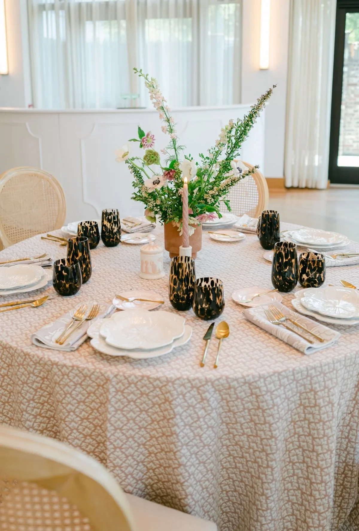
Runners, overlays, napkins, and tablecloths can create a richly layered fall wedding table. However, each layer should serve a clear purpose.
Adding textiles simply because layering feels seasonal can conceal the main linen, complicate the palette, and compete with the place settings. A stronger approach is to determine what the table lacks and introduce a layer that addresses that specific need.
Use a Runner to Direct the Eye
A runner is particularly effective on long banquet tables because it reinforces the table’s length and connects repeated floral arrangements or candles.
It can also introduce a controlled strip of color or pattern over a solid tablecloth. This allows the design to use a more expressive textile without covering the full surface.
Runner width matters. A very wide runner may leave limited space for place settings, while one that is too narrow may appear disconnected from the rest of the table.
Add an Overlay to Define a Specific Zone
An overlay can introduce texture or pattern within a contained area. It may distinguish a sweetheart table, emphasize the center of a round table, or add dimension to another focal surface.
The overlay should not obscure the relationship between the tablecloth and the rest of the design. Its shape, scale, and opacity should support the composition beneath it.
Specialty overlays are part of Curated Linen Collection’s tailored linen and accessory offering, along with runners, napkins, pillows, and multiple fabric options.
Let Napkins Bridge the Linen and Place Setting
Napkins can create the connection between the tablecloth and the smaller details placed above it.
A solid napkin may pull a secondary shade from a patterned linen and repeat it at every seat. A restrained print can bring movement to a solid tablecloth. The fabric may also relate to the florals, menus, glassware, or candle colors.
Because napkins occupy a relatively small area, they allow additional color or detail to be introduced without adding another large textile layer.
Remove a Layer When the Surface Becomes Visually Crowded
Editing is an essential part of luxury table design. If the table includes a patterned cloth, contrasting runner, decorative napkin, detailed plates, printed menu, several glass colors, and dense florals, removing one component may strengthen every remaining choice.
The linen plan should be reviewed as part of the complete table rather than judged according to the number of layers used.
A single well-scaled tablecloth and coordinated napkin can sometimes create more impact than a complex arrangement of competing textiles.
Frequently Asked Questions
Can patterned linens work with patterned china?
Yes, but the patterns should differ in scale, density, or visual weight. A large, open linen motif may pair well with china featuring a smaller border design. Keeping the shared color palette controlled can also prevent the two patterns from competing.
Should fall wedding linens match the floral colors?
They do not need to match exactly. Pulling a supporting color or related undertone from the floral palette often creates a more layered result. Contrast may also help both the flowers and linen remain visible.
How can dark linens be kept from making the table feel heavy?
Use lighter plates, menus, florals, or napkins to create definition. Candlelight and glassware can introduce brightness, while controlled open space prevents the dark fabric from feeling visually dense.
Is a runner necessary over a patterned tablecloth?
No. A runner should be added only when it creates direction, contrast, or a defined central zone. If the tablecloth already carries the primary pattern, another textile layer may conceal it or make the table feel crowded.
How much of the tablecloth should remain visible?
There is no fixed percentage, but enough fabric should remain visible for its color, texture, or pattern to contribute meaningfully. The required amount depends on whether the linen is the focal point or a supporting foundation.
Can velvet be used without making the entire table feel too heavy?
Yes. Velvet can be introduced selectively through a runner, overlay, focal table, napkin, or another controlled accent. Pairing it with cleaner place settings and restrained floral arrangements can maintain balance.
Design a Fall Wedding Table With Balance and Intention
The strongest fall wedding tablescapes are not created by adding every deep color, rich texture, floral variety, and seasonal detail available. They are created through hierarchy, proportion, contrast, and careful editing.
The process should begin with the table dimensions and available surface. From there, the design team can determine whether the linen, florals, or tableware will lead the composition. Each remaining choice should reinforce that priority while preserving space for dining, service, and conversation.
Lighting, pattern scale, table shape, and linen visibility should be tested through a complete mockup rather than evaluated separately. When the table is reviewed as one composition, it becomes easier to identify which details belong, which elements require greater contrast, and which additions can be removed.
Curated Linen Collection provides luxury linen rentals for couples and planners seeking a more considered textile plan, including tablecloths, runners, napkins, pillows, specialty overlays, velvets, linen, custom blends, custom sizing, and one-of-a-kind designs. With thoughtful selection and accurate planning, these pieces can connect florals, candlelight, tableware, and the venue into a fall wedding table that feels cohesive, functional, and intentionally composed. See how these ideas come together in our linen gallery.