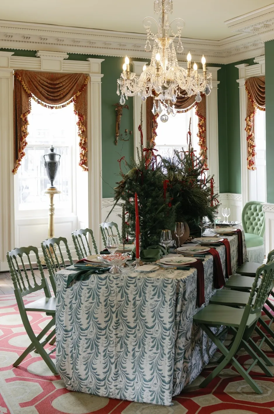
Color contrast can shape how a formal event space feels long before guests notice individual design details. The relationship between a tablecloth, napkins, printed materials, lighting, and the surrounding venue can determine whether a tablescape feels layered and intentional or overly dark, busy, and disconnected.
For fall events, contrast becomes especially important because planners often work with deeper colors, richer textures, and evening lighting. These elements can create depth, but they can also cause individual details to blend together if the overall composition is not carefully considered.
Effective contrast is not simply about pairing a dark linen with a light one. It is about deciding where the eye needs separation, where the design benefits from continuity, and how each textile choice contributes to the room as a whole.
Start With the Venue Before Building the Linen Contrast
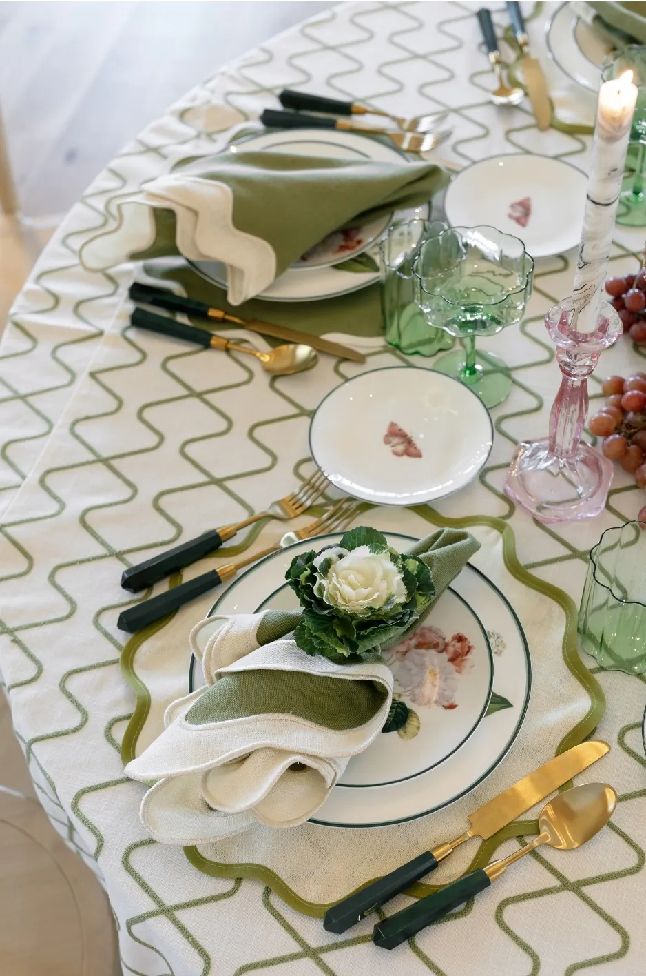
The venue provides the visual backdrop for every table in the room. Flooring, wall color, architectural details, existing drapery, furniture, and lighting all influence how linen colors appear once the event is installed.
Before deciding how much contrast a tablescape needs, planners should consider whether the surrounding space already provides visual separation or whether the linens need to create it.
Consider the Existing Color and Finish of the Room
A dark ballroom with wood paneling, patterned carpet, and low lighting creates very different conditions from a light-filled tent or contemporary gallery.
Important venue elements to evaluate include:
Flooring
Walls and architectural finishes
Drapery
Existing furniture
Ceiling details
Permanent decorative features
A deep tablecloth placed against dark flooring may visually recede, while the same textile in a bright, neutral room may become one of the strongest elements in the space.
Similarly, a light or reflective surface can appear more prominent against dark architectural finishes than it does in a naturally bright venue.
The venue should therefore be treated as part of the palette rather than as a neutral background.
Decide Whether the Tables Need to Stand Out or Settle Into the Space
Not every room benefits from highly visible tables.
In a venue with dramatic architecture, strong lighting, or extensive scenic elements, the linen design may work best when it supports the environment rather than competing with it. A more understated textile combination can provide visual continuity while allowing the room itself to remain prominent.
A simpler venue may create an opportunity for the tables to carry more of the visual character. In that setting, stronger textile contrast can help establish definition across the event space.
The decision should begin with identifying what deserves attention rather than assuming every table needs to become a focal point.
View Fall as Context, Not a Required Color Formula
A formal fall event does not automatically require burgundy, rust, orange, or brown.
Seasonal character can come from depth, texture, lighting, and the relationship between colors rather than from an obvious autumn palette.
A navy, plum, muted green, warm neutral, or other carefully developed direction can still feel appropriate for fall when it responds to the venue and overall event atmosphere. For fall palettes that rely on softer tonal transitions, explore warm-neutral styling with oatmeal and terracotta linens.
Treating fall as context gives planners more freedom to build a design around the event itself instead of forcing every celebration into the same seasonal formula.
Choose Between Tonal and High-Contrast Linen Pairings
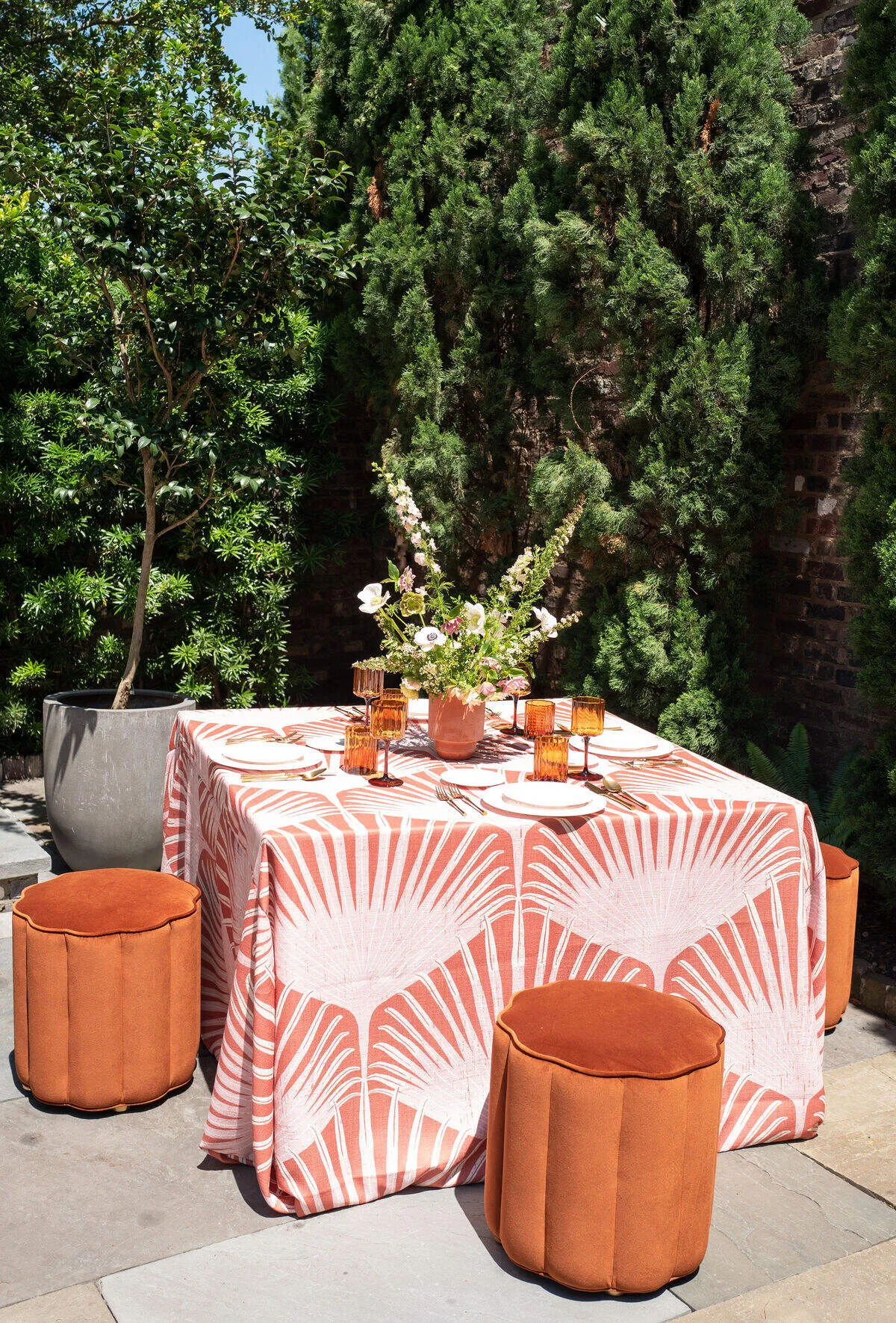
Contrast can range from subtle tonal variation to a clear difference between light and dark surfaces. Neither approach is inherently more sophisticated.
The appropriate level depends on what the table needs to accomplish within the room.
Use Tonal Contrast for a More Layered Look
Tonal combinations use related colors rather than sharp opposites.
Examples might include:
Deep green with muted olive
Plum with softer mauve
Navy with slate
Warm taupe with deeper brown
These combinations create separation through shifts in saturation, depth, or undertone without creating a dramatic break between elements.
Tonal contrast can be particularly effective when the table already includes substantial visual detail through florals, patterned tableware, printed materials, or other components. For more detail, see our article How to Coordinate Fall Wedding Linens, Florals, and Tableware.
Rather than introducing another strong color relationship, the linens can create depth quietly.
Use Stronger Contrast When the Table Needs Definition
Greater contrast can help separate important elements when the table would otherwise appear visually flat.
A contrasting napkin can break up a large expanse of a single tablecloth color. A lighter printed menu can become easier to identify against a deeper textile. A stronger linen treatment can also help dining tables remain distinct from dark flooring or surrounding architectural finishes.
Contrast is especially useful when guests need to identify functional details such as:
Table numbers
Menus
Place cards
Printed programs
Other guest-facing information
The objective is not simply to make the table more dramatic. Contrast should improve visual structure.
Avoid Adding Contrast to Every Layer
Contrast loses its effectiveness when every element competes for attention.
A high-contrast tablecloth and napkin pairing combined with strongly patterned china, bold florals, metallic accents, colorful menus, and dramatic lighting can make it difficult to identify a clear focal point.
Instead, planners can choose where contrast needs to occur and allow surrounding elements to provide visual relief.
A table may have one strong textile relationship supported by quieter tabletop pieces, or the linen may remain restrained while the florals or place settings introduce greater variation.
Controlled contrast creates hierarchy. Constant contrast creates competition.
Use Napkins to Adjust the Level of Contrast
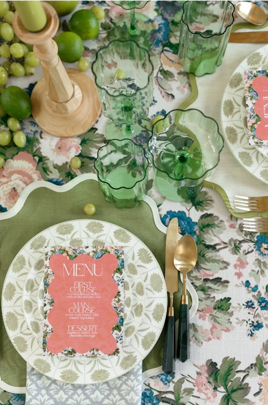
Napkins occupy a relatively small portion of the table, but they can significantly change how a linen combination reads. Because they interact directly with the tablecloth, place setting, and printed materials, napkins offer planners a useful way to fine-tune the amount of contrast without changing the primary linen selection.
Pair Similar Tones for a More Continuous Tablescape
A napkin in a related tone can help the tablescape feel cohesive when other elements already provide strong visual variation.
For example, a tonal napkin may work well when the table includes:
Detailed florals
Patterned plates
Decorative chargers
Distinctive glassware
Prominent printed materials
Keeping the textile relationship quieter allows these other components to remain visible without adding another strong visual break.
Tonal combinations can also create a more layered surface by allowing subtle differences in texture, finish, and saturation to do the work.
Introduce a Contrasting Napkin for Greater Definition
When the tablecloth covers a large surface in one dominant color, a contrasting napkin can create a useful point of separation.
This does not necessarily mean choosing the opposite end of the color spectrum. A shift in value, saturation, or warmth can provide enough distinction.
A deeper napkin on a lighter textile may anchor the place setting, while a softer or lighter napkin can provide relief against a dark base.
The amount of contrast should be considered alongside everything else on the table.
Consider Where the Napkin Will Sit on the Table
Napkin placement changes how the contrast is perceived.
A napkin placed directly on the plate interacts primarily with the tableware. One positioned beside the setting creates a more direct relationship with the tablecloth. A napkin integrated with a menu or other printed element introduces another color and material into the combination.
For this reason, linen selections should be reviewed in the context of the planned place setting rather than as isolated swatches.
The same napkin and tablecloth pairing may feel very different once the full table composition is assembled. For more detail, see our article Fall Wedding Tablecloth Ideas Beyond Burgundy and Rust.
Make Sure Menus and Event Materials Remain Visible
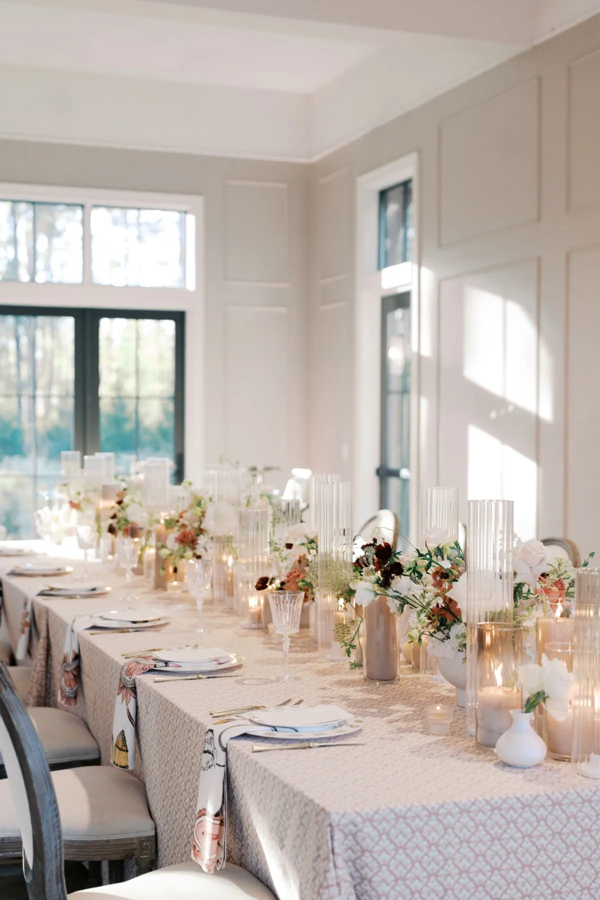
Formal events frequently include menus, place cards, table numbers, programs, seating information, or other printed materials.
These elements are functional as well as decorative. Guests need to be able to identify and read them easily, which makes their relationship with the linen important.
Check Printed Materials Against the Actual Linen
Stationery is often designed separately from the tablescape, but the final result should be evaluated together.
A menu that appears clear against a white presentation board may lose definition once placed over:
A dark textile
A detailed pattern
A heavily textured surface
A linen with significant sheen
Planners should consider how paper color, typography, borders, and other details will look against the actual textile.
Testing the relationship before the event is more reliable than evaluating either element independently.
Give Important Information Enough Visual Separation
Table numbers, place cards, menus, and similar materials should not disappear into the design.
Contrast can help important information remain visible without requiring those pieces to become oversized or overly decorative.
In some cases, the right solution is not adding another color but giving printed materials a quieter background.
A solid or less visually active textile around functional information may make the table feel more polished because the eye can immediately understand what each element is.
Account for Pattern as Well as Color
Contrast is not limited to light versus dark.
Pattern creates its own visual activity. A detailed menu placed over an equally detailed linen may compete with the surface beneath it even if their colors technically contrast.
If the textile already has a strong pattern, planners may benefit from keeping surrounding printed pieces simpler. Conversely, a restrained linen provides more room for detailed stationery to become part of the design.
The goal is clarity between layers.
Consider How Fall Evening Lighting Changes Contrast
Lighting can significantly alter how textile colors, patterns, and finishes appear.
This is especially relevant for formal fall events that begin later in the day, transition from natural light into evening, or take place entirely under controlled event lighting. For more detail, see our article Burgundy Wedding Linens for Elegant Fall Tables.
A combination that appears clearly differentiated in daylight may behave very differently once the room is dimmed.
Dark Colors Can Become Visually Closer in Low Light
Two deep colors can look distinctly different when viewed under bright light yet begin to merge as the lighting level drops.
A dark green tablecloth paired with a similarly deep napkin, for example, may appear layered during the day but much more uniform in a dim ballroom.
That does not mean dark-on-dark combinations should be avoided. It means planners should consider whether there is enough difference in tone, texture, or finish for both textiles to remain intentional once the event lighting is active.
Sheen and Texture Can Create Contrast Without Changing Color
Two textiles do not need dramatically different colors to remain distinct.
A matte surface beside a textile with greater sheen can create separation through the way each responds to light. Similarly, a textured material may produce shadows and tonal variation that distinguish it from a smoother textile in a closely related color.
This can be particularly useful in fall designs where planners want depth without introducing multiple competing hues.
Texture and finish can create visual contrast while allowing the palette itself to remain controlled. Color is only one source of distinction; balancing color, texture, and finish in event linens shows how surface qualities contribute to contrast.
Review the Linen Alongside the Event Lighting Plan
Whenever possible, textile selections should be considered alongside the lighting environment in which they will actually appear.
Relevant sources may include:
Ambient room lighting
Candlelight
Pinspots
Stage lighting
Colored uplighting
Decorative lighting installations
A linen that appears subtle under neutral lighting may become far more reflective or saturated under event lighting.
Considering these conditions early helps avoid surprises once the room is fully installed.
Balance Linen Contrast With the Rest of the Tablescape
Linens are only one component of the table.
Florals, tableware, candles, menus, glassware, place cards, and other details all contribute their own color, texture, and visual weight. Effective contrast therefore needs to be distributed across the entire tablescape rather than concentrated in every individual element.
Let a Detailed Tablescape Use a Quieter Textile Foundation
When florals, printed materials, or tabletop pieces already provide significant detail, the linen does not need to compete for equal attention.
A quieter textile foundation can help organize a complex table by giving those elements a consistent surface against which to stand.
This does not require a plain or uninteresting linen. Texture, subtle pattern, and tonal variation can still give the table depth without becoming the dominant feature.
The restraint can actually make stronger design elements easier to appreciate.
Give Simpler Tables More Definition Through Textiles
A more minimal tablescape creates an opportunity for the textiles to take on a larger role.
If the floral design is restrained and the tabletop uses clean, simple pieces, a stronger tablecloth or napkin relationship can provide much of the table’s visual structure.
Pattern, texture, or controlled color contrast can add definition without requiring additional decorative objects.
This allows the linen to become an intentional design element rather than simply a background covering.
Decide What Should Be Seen First
A successful table typically has a visual hierarchy.
The intended focal point might be:
The textile
A floral composition
Tableware
Menus or other printed details
A central installation
Once that focal point is identified, surrounding elements can be selected to support it.
If every component attempts to become the first thing guests notice, the table can lose clarity. When one or two elements lead and others provide structure, the result is generally more cohesive.
Evaluate Contrast Across the Entire Event Space
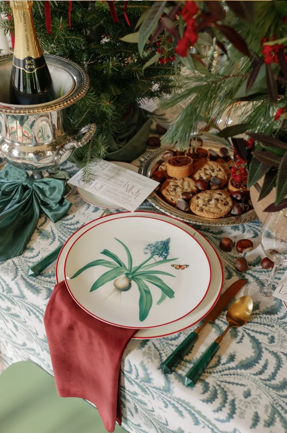
A sample table provides valuable information, but it does not show how the same linen combination will appear when repeated throughout a ballroom, tent, or other large venue. Contrast needs to work both at tabletop distance and at room scale.
Consider Repetition Across a Large Room
A strong color combination can feel balanced on a single table and become far more dominant when repeated across twenty, fifty, or more tables.
The same principle applies to pattern.
A textile that appears moderately detailed in a sample can create a much stronger visual field when it covers a large portion of the room.
Planners should consider how repetition changes the overall effect before deciding how much contrast the space can support.
Use Contrast Strategically Across Different Table Types
Not every linen-covered surface has to use the same degree of contrast.
Guest dining tables may follow one treatment while cocktail tables, specialty surfaces, or selected focal areas introduce a related variation.
The important consideration is whether those differences appear intentional within the overall event design.
A limited change in color, texture, or contrast can help distinguish certain areas without making them feel disconnected from the room.
Step Back From the Sample Table
Close-up evaluation is only one part of linen planning.
Planners should also consider how the textiles will appear:
From a guest’s seat
Across several neighboring tables
From the entrance to the room
From the stage
In wide event photographs
Details that feel significant at arm’s length may disappear at room scale, while broad areas of color or contrast can become much more prominent. Considering both perspectives helps establish the right visual balance.
Frequently Asked Questions
Do fall event linens need to use dark colors?
No. Fall linens can use light, muted, saturated, or dark colors depending on the venue and design direction. Seasonal character can come from texture, depth, and contrast rather than a specific color family. For more detail, see our article Rich Autumn Color Palettes for Fall Wedding Tablescapes.
Should napkins contrast with the tablecloth?
Not necessarily. Tonal napkins can create a more continuous look, while contrasting napkins can provide greater definition when the table needs a visual break.
Can two dark linen colors work together?
Yes. Dark colors can pair successfully when there is enough difference in tone, saturation, texture, or finish for each element to remain distinct.
How does lighting affect dark fall linens?
Lower or warmer lighting can reduce the visible separation between similar dark colors. Texture, sheen, and surrounding elements can also become more noticeable once event lighting is introduced.
Should every table at an event use the same contrast level?
No. Different table types or event areas can use related but varied levels of contrast as long as the overall linen direction remains cohesive.
Create a Balanced Fall Linen Design
The most effective use of contrast begins with a purpose. It may be needed to separate a napkin from a tablecloth, make printed materials easier to see, prevent deep colors from blending under evening lighting, or give a simple event space greater visual definition.
For formal fall events, planners can create seasonal depth without relying on predictable color combinations. By considering the venue, lighting, table composition, viewing distance, and wider room design, contrast becomes a practical tool for creating balance rather than simply another decorative layer. Explore the complete range of luxury linen rentals from Curated Linen Collection.
Curated Linen Collection offers premium tablecloths, napkins, runners, patterned textiles, and specialty linen options that give planners the flexibility to develop thoughtful textile combinations for formal fall events. See how these ideas come together in our linen gallery.