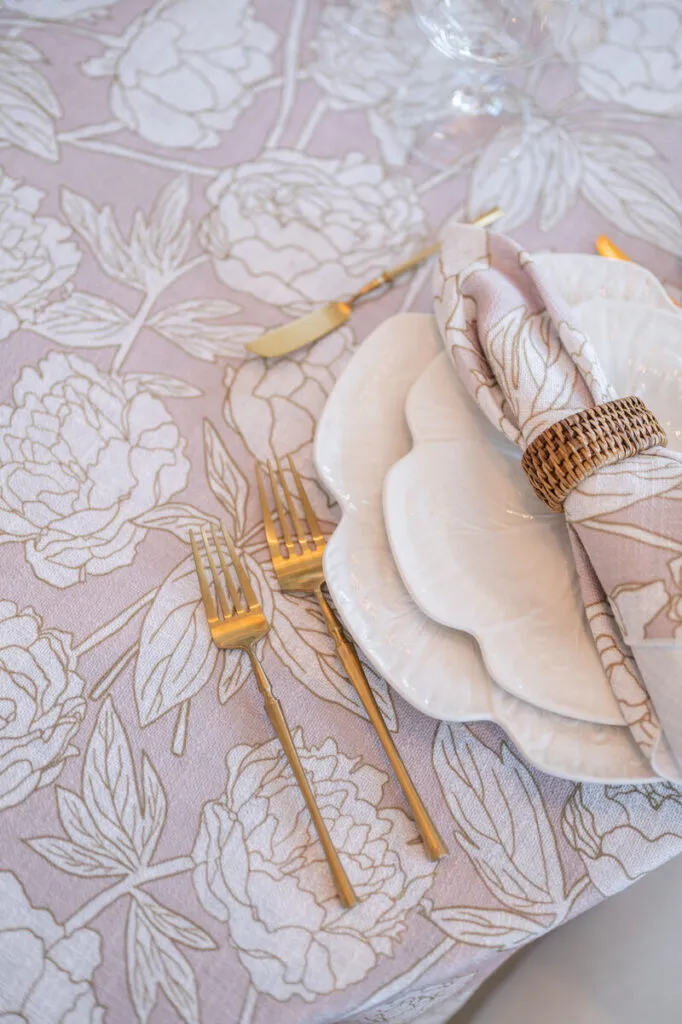
Monogrammed wedding napkins introduce a personal textile detail at every guest’s place. Because the design is repeated throughout the reception, decisions involving letter arrangement, embroidery scale, thread color, and placement have a considerable effect on the finished tablescape.
A successful monogram does not need ornate lettering, several colors, or an elaborate decorative frame. It should remain clear at close range, respond to the napkin’s fabric and drape, and sit comfortably beside the charger, menu, place card, flatware, and surrounding linens.
The embroidery must also be planned around the final napkin presentation. A monogram that looks balanced on a flat digital template may disappear inside a fold, sit beneath a menu, or face the wrong direction once the place setting is assembled.
By defining what the embroidery should communicate and reviewing its scale, density, color, and position as one complete system, couples and event professionals can create monogrammed napkins that feel personal without overwhelming the table.
Determine What the Embroidery Should Communicate
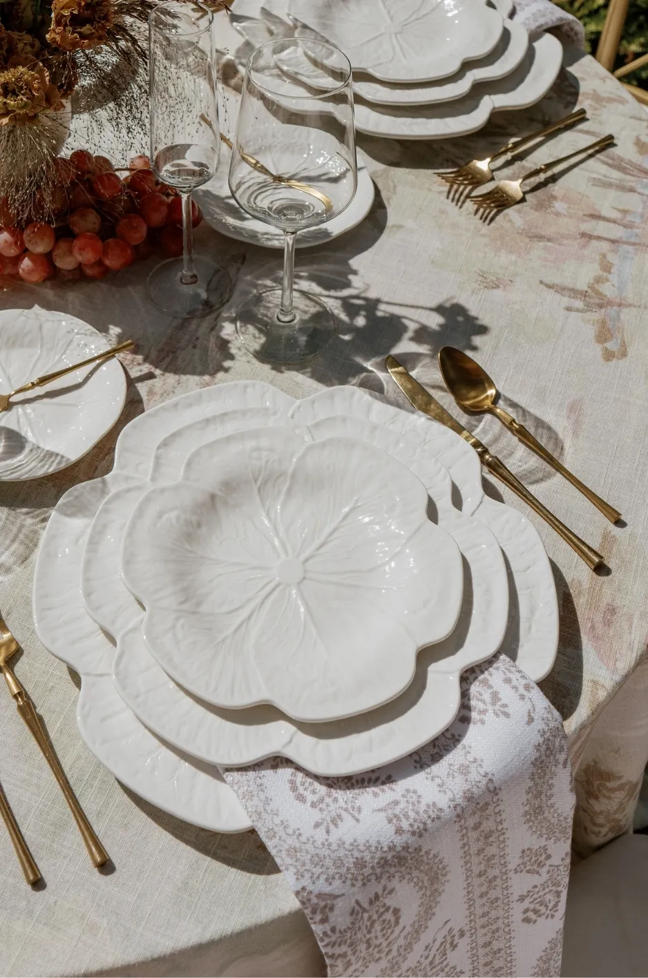
Before choosing lettering or thread color, decide what the embroidered detail should represent. It may identify the couple through their initials, reference an existing wedding monogram, or introduce one small symbol drawn from the event artwork.
The design should have one clear message. Combining multiple initials, a date, location, floral illustration, decorative frame, and additional wording can make a small embroidered area difficult to read.
Use Initials for a Direct Personal Mark
One, two, or three initials can create a recognizable personal detail without requiring a complex design.
A single initial offers the simplest composition and may represent a shared surname when that is appropriate. Two initials give both partners equal presence and can be arranged side by side, intertwined, or separated by a subtle symbol. Three initials may place a shared surname initial between the partners’ first initials.
The choice should reflect how the couple wishes to be represented rather than following one traditional format automatically.
Adapt an Existing Wedding Monogram
A monogram already used on the invitation suite can create a strong connection between the stationery and reception textiles. However, artwork designed for print may need to be simplified before it is reproduced in thread.
Thin strokes, delicate shadows, overlapping calligraphy, and small decorative flourishes may lose definition when embroidered. The monogram should retain its recognizable structure while adjusting any details that do not translate clearly to the textile.
The fabric version should feel connected to the stationery rather than functioning as an exact copy.
Introduce a Small Symbolic Motif
A flower, leaf, shell, star, architectural detail, or other event-specific motif may accompany the initials. This can be especially effective when the symbol already appears in the crest, stationery, or broader wedding artwork.
The motif should support the lettering rather than compete with it. A small botanical detail beneath the initials may add character, while a complete illustrated scene could become too dense for the napkin.
The design should remain understandable without requiring guests to examine it closely.
Exclude Information That Does Not Need to Appear
A monogrammed napkin does not need to include every piece of wedding information. Dates, locations, surnames, mottos, and decorative symbols can quickly occupy more space than the embroidery can support.
Retain the details that are most meaningful and visually clear. Other information can appear on menus, place cards, signage, or stationery where it has more room.
Editing the content often produces a more refined result than adding another decorative element.
Select a Lettering Style That Can Be Reproduced in Thread
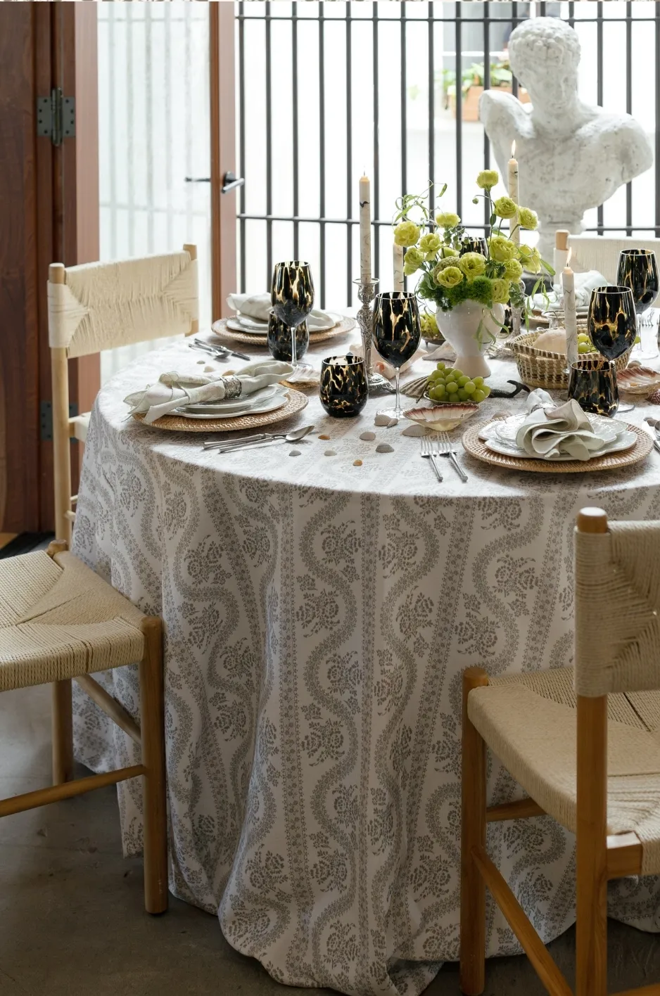
A typeface that appears elegant on a screen or invitation may not translate successfully into embroidery. Thread adds thickness and texture, which can close small spaces and reduce the clarity of delicate letterforms.
The lettering should be selected as a textile mark rather than as conventional printed typography.
Use Serif Lettering for Formal Definition
Serif letterforms can create a classic, editorial, or traditional impression. Their defined structure works well with tailored place settings and formal stationery.
The serifs must remain substantial enough to reproduce clearly. Very thin extensions may disappear, while small spaces within the letters may close when stitched.
A simplified serif design often looks more polished than an overly decorative version at a small scale.
Choose Script for Controlled Movement
Script lettering introduces softness and movement, making it suitable for romantic or illustrative wedding designs.
Look for scripts with open counters, clear separation between letters, and moderate flourishes. Closely overlapping calligraphy can become difficult to read once converted into thread.
The lettering should remain recognizable without relying on extremely fine strokes or long decorative tails.
Consider Block Lettering for a Cleaner Direction
Block or sans-serif initials can support a modern, architectural, or minimalist tablescape.
Because these letterforms contain fewer decorative features, spacing and proportion become particularly important. The initials should not sit so close together that they resemble one solid shape.
A clean block monogram can create a strong result without appearing informal.
Simplify Ornamental Frames
Wreaths, shields, borders, flourishes, and other framing devices can add structure to a monogram. They should not occupy more visual space than the initials themselves.
Choose one framing element when it strengthens the design. Secondary leaves, ribbons, dots, and decorative lines can usually be reduced or removed.
The frame should help contain and organize the mark rather than make it more difficult to read.
Establish the Embroidery’s Reading Distance
Monogram size should be based on how guests will encounter the napkin. At a wedding reception, the embroidery is usually viewed as guests approach or sit at their place settings.
It does not need to be legible from across the ballroom. Oversized initials can shift the design from a refined textile detail toward a branding element.
Design Primarily for the Seated Guest
The embroidery should feel clear and intentional when viewed from normal dining distance.
A guest should be able to recognize the initials or motif without moving the napkin or examining it closely. At the same time, the design should not dominate the charger, menu, or complete place setting.
Close-range visibility is more important than room-wide impact.
Consider the Visible Napkin Area
The size of the unfolded napkin does not determine the available embroidery area. The relevant measurement is the panel that remains visible after the napkin has been folded, draped, gathered, or placed beneath stationery.
A large monogram may look balanced on a flat napkin but become crowded within a small folded corner. Conversely, an excessively small mark may disappear beside a full-size menu.
Determine the final presentation before approving the embroidery scale.
Leave Space Around the Embroidery
A monogram needs enough open fabric around it to remain distinct. Crowding it against an edge, napkin ring, menu, or decorative border can make the design feel compressed.
The surrounding fabric functions as part of the composition. It gives the mark visual separation and allows the textile’s color and texture to remain visible.
A smaller design with sufficient breathing room often appears more refined than a larger one filling the entire panel.
Avoid Making Every Detail Equally Large
When a monogram includes initials, a frame, and a supporting motif, each element should have a defined level of importance.
The initials may serve as the primary mark, while the frame and motif remain secondary. Making every component equally prominent can create a dense and visually confusing design.
A clear internal hierarchy improves readability and gives the embroidery greater visual discipline.
Match Stitch Density to the Napkin Textile
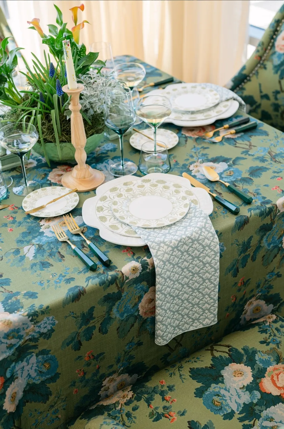
Embroidery adds physical weight and tension to a napkin. A design with large filled areas or closely packed stitches can stiffen the fabric, affect its drape, and create puckering around the embroidered section.
The design should respond to the textile’s weight, weave, and natural movement.
Use Lighter Stitching on Fluid Napkins
A softly draping napkin benefits from open, restrained embroidery. Dense stitching can create a rigid patch that interrupts the way the fabric gathers or falls.
Fine outlines, simplified initials, and selectively filled areas can preserve the monogram while allowing the napkin to move naturally. For more detail, see our article From Canvas to Tablescape: Building a Bespoke Linen Palette for a Fine Art Wedding.
The embroidered section should remain flexible enough for the chosen presentation and comfortable for guests to unfold.
Allow Structured Napkins to Support Greater Definition
A firmer napkin may accommodate clearer edges, more defined letters, and slightly greater stitch density.
This does not mean the design should become unnecessarily heavy. The napkin still needs to function as a dining textile and should not feel stiff or bulky at the embroidered corner.
The structure of the fabric should support the design without becoming secondary to it.
Reduce Density in Large Filled Areas
Large blocks of solid thread can add weight without improving the design. They may also cause surrounding fabric to pull or distort. We cover this further in How Custom Table Linens Transform Event Design.
Outline work, selective filling, or smaller solid areas can provide sufficient definition while preserving the textile’s flexibility.
When a motif contains several broad shapes, consider simplifying them rather than filling every section completely.
Review the Back and Front of the Sample
Guests will unfold and handle the napkin, so the reverse side matters as well as the visible front.
The back should feel finished and should not contain an uncomfortable concentration of thread. Excessive backing, loose stitches, or heavy embroidered areas can affect the napkin’s usability.
A well-resolved design considers the complete textile rather than only the photographed presentation. For more detail, see our article Custom Linen Design for Luxury Events.
Approve a Stitched Sample, Not Only a Digital Proof
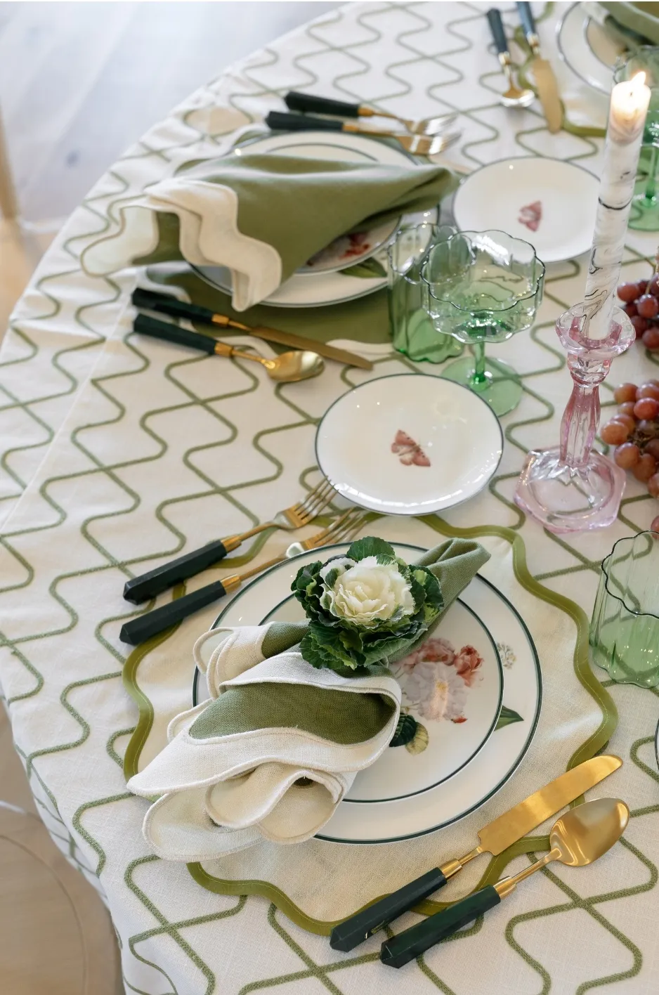
A digital proof can confirm the initial arrangement, lettering, and general color direction. It cannot fully demonstrate thread thickness, stitch density, textile distortion, sheen, or the way the design will appear after the napkin is arranged.
A stitched sample provides the most reliable basis for approval when available.
Review the Monogram at Actual Size
The embroidery should be evaluated at the dimensions intended for the final napkin.
An enlarged digital image can make small details appear clearer than they will be in production. Review the initials, spacing, frame, and motifs at their true scale.
Any feature that becomes difficult to identify should be simplified before the full quantity is produced.
Fold or Arrange the Sample as It Will Appear
The sample should be placed in the approved presentation with the actual charger, plate, menu, place card, ring, or band.
This confirms whether the embroidery remains visible and properly oriented.
It also reveals whether the selected scale feels balanced within the complete place setting.
Examine the Thread Under Event Lighting
Thread color and sheen can change under daylight, candlelight, uplighting, and directional fixtures.
Tonal embroidery may disappear in low light, while metallic thread may become more prominent than expected. Test the sample under conditions similar to the reception whenever possible.
The thread should remain visible without creating unintended glare.
Check Fabric Distortion
Look for puckering, stiffness, pulling, or uneven edges around the embroidered area.
The napkin should retain its natural drape and should not require excessive adjustment to sit correctly. If the fabric becomes distorted, the design may need lower stitch density, fewer filled areas, or a smaller overall scale.
Confirm Repeatability
The design and its placement should be consistent enough to produce a uniform result across the required napkin quantity.
A highly intricate treatment may create greater variation, while a simpler monogram can usually be reproduced with better consistency.
The finished collection should appear deliberate when viewed across the complete room.
Identify Embroidery Choices That Reduce Refinement
An embroidered monogram may be visually attractive on its own but unsuitable for the napkin, place setting, or overall event design. Recognizing common problems before production allows the design to be refined without changing the complete concept.
The Monogram Is Too Large
An oversized mark can occupy most of the visible napkin panel and begin to resemble a logo.
Reduce the scale or remove part of the decorative frame. The embroidery should leave enough surrounding fabric to remain part of the textile rather than becoming the entire design.
The Lettering Is Difficult to Read
Closely overlapping initials, thin strokes, and complex scripts can lose clarity in thread.
Increase the spacing, simplify the overlaps, strengthen narrow lines, or choose a clearer lettering style. The initials should remain identifiable without explanation.
The Stitching Makes the Napkin Too Rigid
Dense filling and large blocks of thread can interrupt the fabric’s natural movement.
Reduce the number of filled areas, use more open linework, or simplify the supporting motif. The embroidered section should remain comfortable for guests to handle.
The Thread Color Disappears
A tonal treatment may become too subtle when the thread and napkin have nearly identical color values and finishes.
Increase the light-to-dark difference or adjust the thread’s warmth or coolness. A restrained monogram still needs enough contrast to remain visible.
The Monogram Resembles Commercial Branding
Oversized initials, repeated wording, or the same complete mark on numerous surfaces can make the wedding feel branded rather than personalized.
Reduce the mark’s scale, simplify the text, and reserve the complete monogram for the napkins or another principal application.
The Embroidery Is Hidden in the Final Setting
A menu, place card, ring, plate, or fold may cover the design after the place setting is assembled.
Reposition the embroidery according to the actual napkin orientation and tabletop plan. Production placement should always respond to the finished presentation.
Develop the Embroidered Napkin Direction With Curated Linen Collection
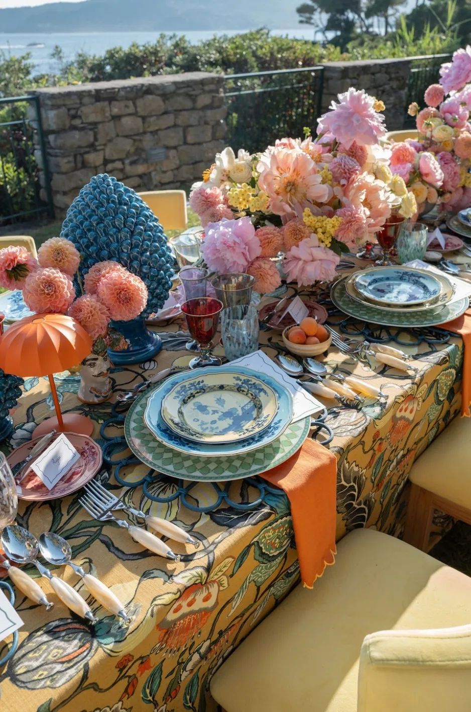
Curated Linen Collection offers premium napkins alongside table linens, runners, pillows, specialty overlays, and custom textile details for elevated events.
Developing an embroidered napkin direction begins with accurate naming information and a complete understanding of how the napkin will appear within the place setting.
Share the Final Naming and Initial Structure
Provide the exact initials, capitalization, spelling, and reading order approved by the couple.
Any surname decisions should be confirmed before the lettering is developed. This avoids designing around assumptions that may not reflect how the couple wishes to be represented.
Define the Desired Visual Strength
Clarify whether the embroidery should be tonal, near-tonal, or contrasting.
The decision should account for the napkin color, table linen, stationery, dinnerware, floral palette, and event lighting.
Provide the Complete Place-Setting Plan
Share the napkin presentation, charger, menu, place card, table linen, and any ring or band that could affect visibility.
The embroidery should be designed within this complete context rather than approved as an isolated graphic.
Review Scale and Placement Together
A monogram’s scale cannot be separated from its location on the napkin.
Review the actual visible panel, surrounding fabric, proximity to the edge, and relationship with other place-setting elements before production.
Coordinate the Embroidery With Curated Linens
Select tablecloths, runners, and supporting textiles that strengthen the monogram without repeating or competing with it.
A quiet solid, tonal texture, or restrained pattern may provide the balance needed for the embroidered napkin to remain the principal personalized detail.
Frequently Asked Questions
Should wedding napkins use one, two, or three initials?
The decision depends on the couple’s naming structure and preferred visual style. One initial creates the simplest mark, two initials provide equal emphasis, and three may highlight a shared surname when appropriate.
Can a couple use a joint monogram before the ceremony?
They can, but the arrangement should reflect their preferences and naming decisions. Couples who do not plan to share a surname may prefer two initials or another shared motif.
How large should embroidery be on a wedding napkin?
The size should be based on the visible panel after the napkin is arranged. The monogram should remain readable without occupying most of the available fabric.
Is tonal or contrasting embroidery more appropriate for a formal wedding?
Either can suit a formal wedding. Tonal embroidery creates quieter personalization, while contrasting thread provides stronger definition. The appropriate choice depends on the complete table design.
Which monogram fonts work best for embroidery?
Serif, script, and block lettering can all work when their strokes are substantial enough and the letters remain clear at the intended scale. Extremely thin or highly overlapping styles are more difficult to reproduce.
Where should a monogram be placed on a napkin?
It should appear on the panel that faces the guest and remain visible beside menus, place cards, rings, or bands. The exact position depends on the approved napkin presentation.
Can a wedding crest be embroidered on a napkin?
Yes, although a detailed crest may need to be simplified. A reduced monogram or selected motif may translate more clearly than the complete artwork.
Should the embroidery match the tablecloth or the stationery?
It can relate to either without matching exactly. The thread color and design should connect with the overall tablescape while remaining visible against the napkin. Read more in Custom Tablescape Linen Design for Stunning Events.
Can menus be placed over monogrammed napkins?
Yes, provided the menu does not cover the embroidery. The two elements should be tested together before the final placement is approved.
Should every napkin at the reception be embroidered?
Not necessarily. Embroidery may appear at every guest setting or be reserved for selected tables, depending on the event design. The application should have a clear visual purpose.
Make the Monogram a Textile Detail, Not a Display
A refined monogrammed wedding napkin depends on proportion, clarity, textile compatibility, and disciplined placement. The initials should remain readable without becoming oversized, while the thread color and stitch density should support the napkin’s natural texture and movement. For inspiration from real events, browse our linen gallery.
The embroidered detail should also be developed within the complete place setting. Menus, place cards, chargers, napkin rings, table linens, and lighting all affect how the monogram is seen. To talk through linens for your date and venue, contact our team.
Curated Linen Collection’s premium napkins, coordinating table linens, personalized embroidery guidance, and custom design support can help translate an approved monogram into a subtle textile detail that feels connected to the event and thoughtfully repeated throughout the reception. For more detail, see our article Discover the Art of Custom Linen Design for Events.