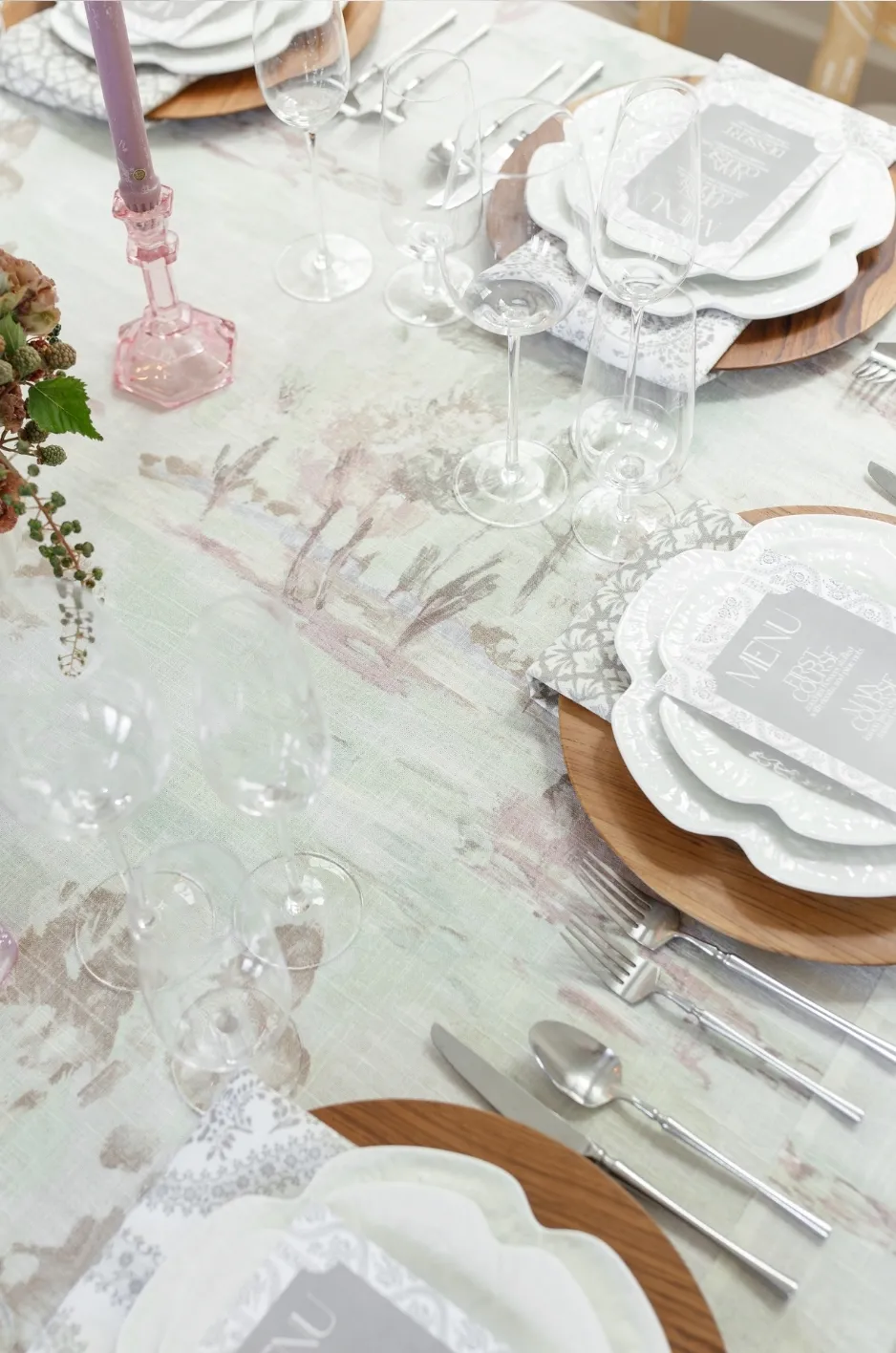
A wedding crest often begins as part of an invitation suite, but its design potential can extend far beyond paper. When translated thoughtfully, it can become a refined textile detail that connects the ceremony, reception, and surrounding event spaces.
The transition from stationery to fabric requires more than enlarging an artwork file and sending it to print. Fine linework, watercolor shading, small lettering, decorative flourishes, and closely spaced symbols may look clear on paper but lose definition when printed on a woven surface. The crest must also respond to the size, shape, placement, and function of each linen.
A napkin may require a simplified monogram, while a runner can support a repeated motif or continuous border. A sweetheart tablecloth may provide enough space for the full crest, but only when the design is positioned around place settings, florals, and the table’s primary viewing angle.
By separating the crest into usable components, refining its scale, and applying it selectively, couples and event professionals can turn one piece of artwork into a cohesive textile story.
Begin With the Crest’s Intended Textile Role
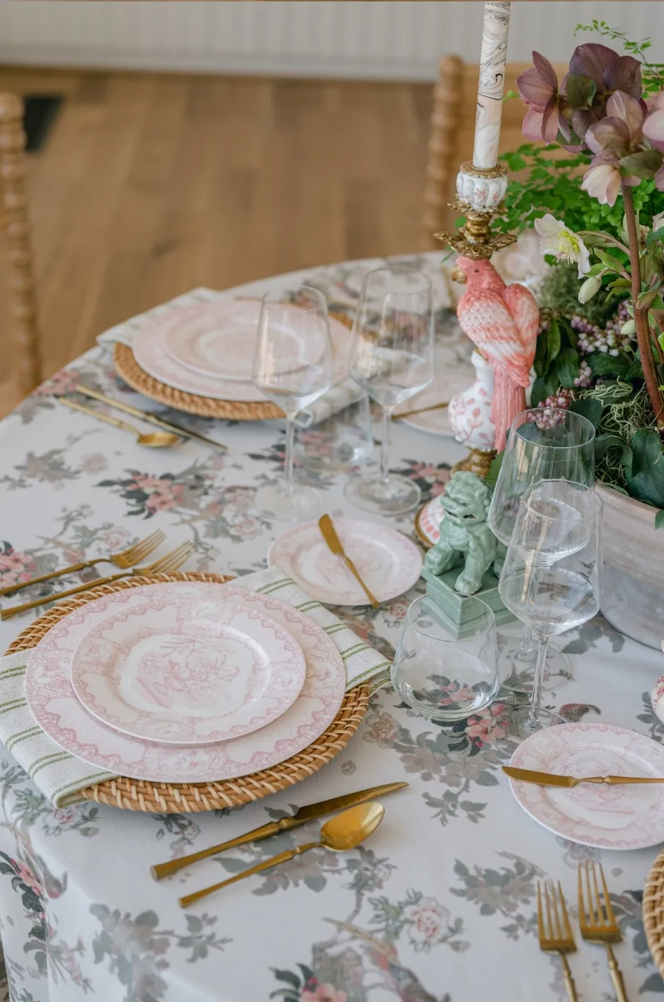
Before adapting the artwork, determine what the crest should accomplish on fabric. It may function as a discreet personal signature, a repeated pattern, a decorative border, or the principal design feature on a focal table.
One artwork file should not be applied identically to every linen. A design that works on a full tablecloth may become illegible on a napkin, while a small monogram may feel lost across a broad runner.
Defining the role of each application creates a more deliberate and visually balanced result.
Use the Crest as a Discreet Signature
A single crest can add personalization without becoming the dominant element of the tablescape. It may appear in the corner of a napkin, at the end of a runner, or on the front-facing panel of a focal tablecloth.
This direction works well when the overall wedding design already contains expressive florals, patterned linens, or architectural details. The crest remains meaningful, but it does not compete with the rest of the setting.
A discreet application also encourages closer attention. Guests may discover the detail as they approach the table or sit down rather than seeing it repeated across every surface.
Turn Selected Elements Into a Repeating Pattern
A wedding crest may contain initials, flowers, leaves, architectural illustrations, animals, framing elements, or decorative flourishes. These components can be separated and rearranged into a textile repeat.
The complete crest does not need to appear within every repetition. A floral element, shell, star, ribbon, or leaf may be enough to create a recognizable connection to the original artwork.
Repeating selected motifs often feels more integrated than placing the full emblem across the fabric in a rigid grid. It allows the linen to read as a complete textile rather than a surface covered with individual logos.
Develop a Border or Edge Treatment
Framing details from the crest can become a border along the edge of a runner, tablecloth, or napkin. This can include florals, vines, geometric lines, ribbons, or other decorative elements that surround the original composition.
A border gives the artwork a clear relationship with the linen’s shape. It can frame a table, direct attention along a runner, or add a tailored finish to a napkin.
This application also leaves the center of the textile quieter, allowing space for dinnerware, menus, candles, and floral arrangements.
Reserve the Complete Crest for a Focal Surface
The full crest often works best on a linen that has a clear primary viewing direction. A sweetheart table, cake display, welcome table, bar front, or escort-card installation may provide enough uninterrupted space for the complete design.
Supporting linens can then repeat individual colors, monograms, borders, or motifs from the crest.
This creates hierarchy. The principal application receives the most detailed artwork, while the surrounding textiles support it without duplicating the same treatment.
Separate the Crest Into Usable Design Components
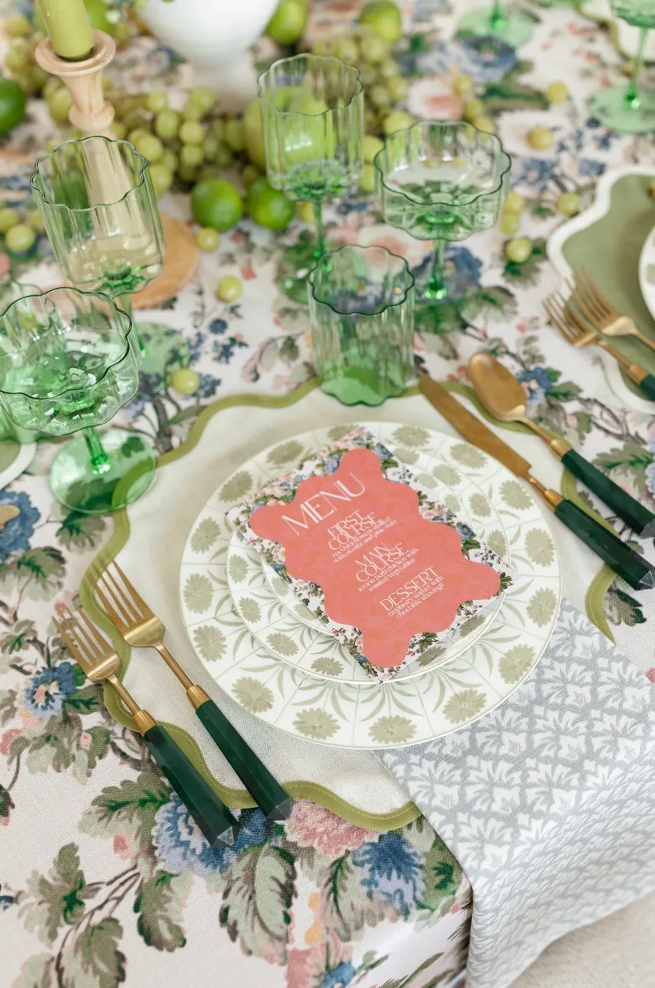
A crest designed for stationery may contain several layers of visual information. When these elements are transferred to fabric, the complete composition can become too dense, especially at smaller scales.
Separating the artwork into a flexible system allows each linen format to receive an appropriate version of the design.
Identify the Primary Mark
The primary mark is the element that makes the crest immediately recognizable. It may be the couple’s initials, a central illustration, a distinctive frame, or a particular floral arrangement.
This element should remain consistent across the most important applications. Even when other details are removed, the primary mark preserves the identity of the original crest.
For example, a crest featuring intertwined initials surrounded by garden flowers may use the complete arrangement on a focal tablecloth, while the initials alone appear on napkins.
Isolate Supporting Motifs
Smaller elements can be extracted and used independently. A flower, bird, shell, leaf, star, building detail, or decorative line may become part of a repeated textile pattern.
These supporting motifs help distribute the wedding’s visual identity without repeating the complete emblem.
They can also create variation across different linens. One motif may appear on a runner, while another becomes part of a napkin border or pillow design.
Retain a Simplified Monogram
A reduced monogram provides a practical option for smaller surfaces. It may consist of the couple’s initials, a simplified frame, or one recognizable element from the original crest.
This version is especially useful for napkins, narrow runners, small cocktail-table linens, or other applications where the complete artwork would lose clarity.
A simplified mark should still feel connected to the full crest through its lettering, color, or surrounding shape.
Remove Details That Do Not Survive Reduction
Tiny dates, thin banners, delicate shading, narrow linework, and closely spaced symbols may disappear when the crest is scaled down.
Removing these elements does not weaken the design. It protects the parts that matter most.
The artwork should be evaluated at the size guests will actually see, not only as a large digital image. If a detail becomes difficult to recognize at normal viewing distance, it should be simplified, enlarged, or removed.
Simplify Artwork for Fabric Reproduction
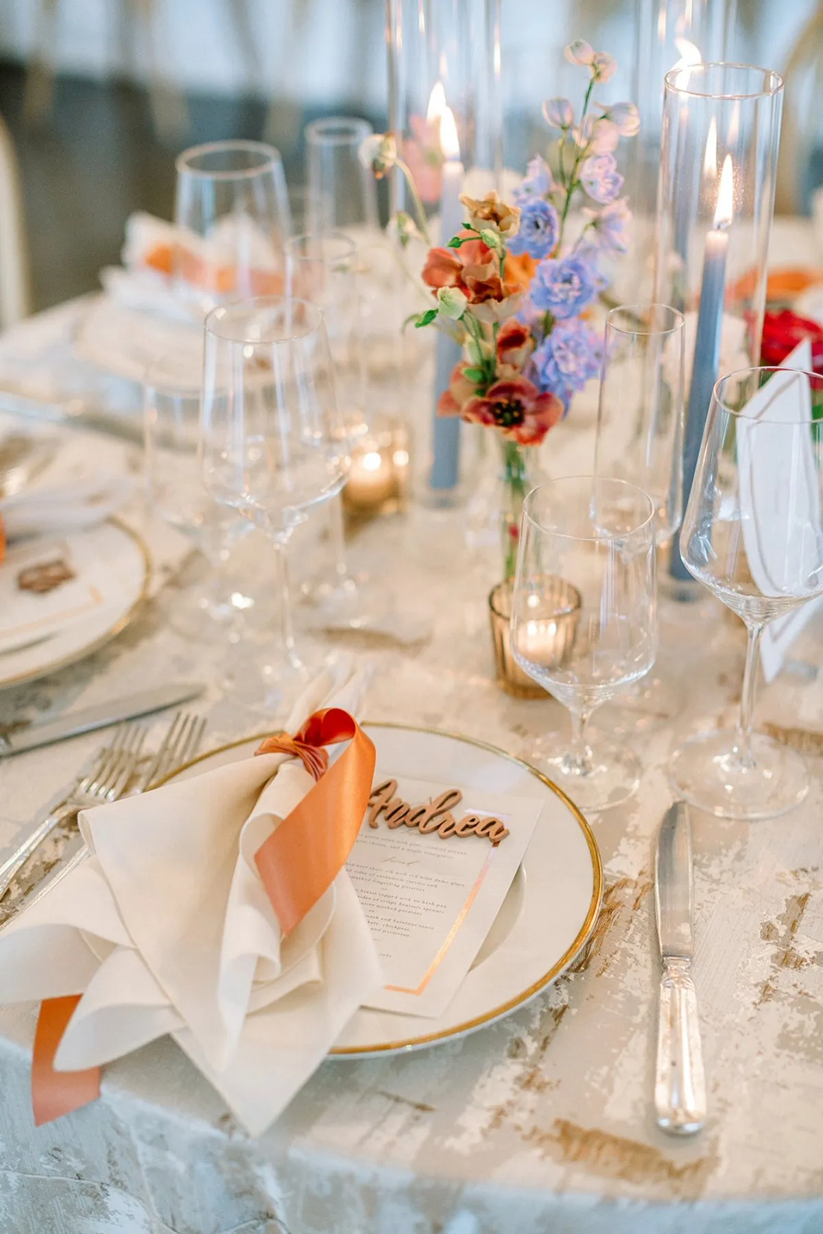
Paper and fabric behave differently. Smooth stationery can hold fine lines and subtle color transitions, while textiles introduce weave, texture, folds, shadows, and movement.
The goal of simplification is not to remove the crest’s personality. It is to preserve its visual character in a format that remains clear when printed on fabric.
Strengthen Fine Lines and Small Shapes
Delicate outlines may need to be thickened slightly so they remain visible against the textile’s surface.
Small shapes may also require more space around them. When lines sit too close together, the fabric texture can cause them to merge visually.
These adjustments should be subtle. The crest should still resemble the original artwork, but its structure needs enough definition to remain legible.
Reduce Excessive Internal Detail
Illustrations of venues, landscapes, animals, or floral arrangements often contain fine interior lines. On paper, these details create richness. On fabric, they may form a dark or indistinct area.
Reducing the number of interior lines can preserve the outline and recognizable features of the illustration.
A venue drawing, for example, may retain its roofline, windows, and entrance while removing small architectural textures that will not remain visible on the linen.
Clarify Overlapping Elements
Wedding crests often layer initials, ribbons, leaves, flowers, and illustrations. These overlaps may need to be adjusted for textile printing. Read more in Custom Wedding Linen Designs to Elevate Your Event.
Slightly increasing the space between elements can make the design easier to read. A monogram may need a quieter background, or a ribbon may need to move away from a floral cluster.
The complete composition should remain balanced after these changes.
Prepare More Than One Artwork Version
A useful crest system may include:
The complete crest
A simplified crest
A monogram
Individual motifs
A repeat pattern
Border elements
The complete crest
A simplified crest
A monogram
Individual motifs
A repeat pattern
Border elements
Each version supports a different textile application. This flexibility produces a more refined result than forcing one design to work across every surface.
Choose Between a Singular Motif and a Repeating Pattern
A single crest and a repeating pattern create different visual effects. The correct choice depends on the linen’s size, purpose, viewing direction, and relationship with the rest of the tablescape.
The design should also account for how much of the fabric will remain visible after the table is fully styled.
Use a Singular Crest for Formal Emphasis
A single crest can create a strong ceremonial focal point. It may be centered on a front-facing tablecloth panel, positioned at the end of a runner, or placed in a visible napkin corner.
This treatment gives the crest importance and prevents excessive repetition.
Placement should be planned around the complete setting. A centered emblem may appear balanced on an empty table but disappear once chairs, florals, and place settings are added.
Use a Repeat to Create a Complete Textile
A repeated pattern can make the crest artwork feel integrated into the fabric. Instead of appearing as an added emblem, the design becomes part of the textile’s overall surface.
Spacing is essential. Motifs placed too close together can make the fabric visually dense, while overly wide spacing may cause the pattern to feel incomplete.
The repeat should be reviewed at full scale to confirm that it remains balanced across the complete linen.
Use a Scattered Motif for Softer Movement
Selected crest elements can be arranged in a looser, more organic distribution. This creates movement without relying on a rigid grid.
A scattered design can work particularly well with botanical, illustrative, coastal, or garden-inspired artwork. The motifs may vary slightly in size or orientation while remaining part of one visual system.
The placement should still feel deliberate. Randomness needs enough structure to prevent the pattern from appearing unfinished.
Combine a Border With a Quiet Central Field
A border allows personalized artwork to remain visible while preserving a calmer center.
This is useful for runners and tablecloths that will hold plates, flowers, candles, and menus. The central field supports the functional parts of the tablescape, while the border frames the surface.
The treatment can also help a detailed crest feel more architectural and connected to the linen’s proportions.
Adjust the Design Scale for Each Linen Format
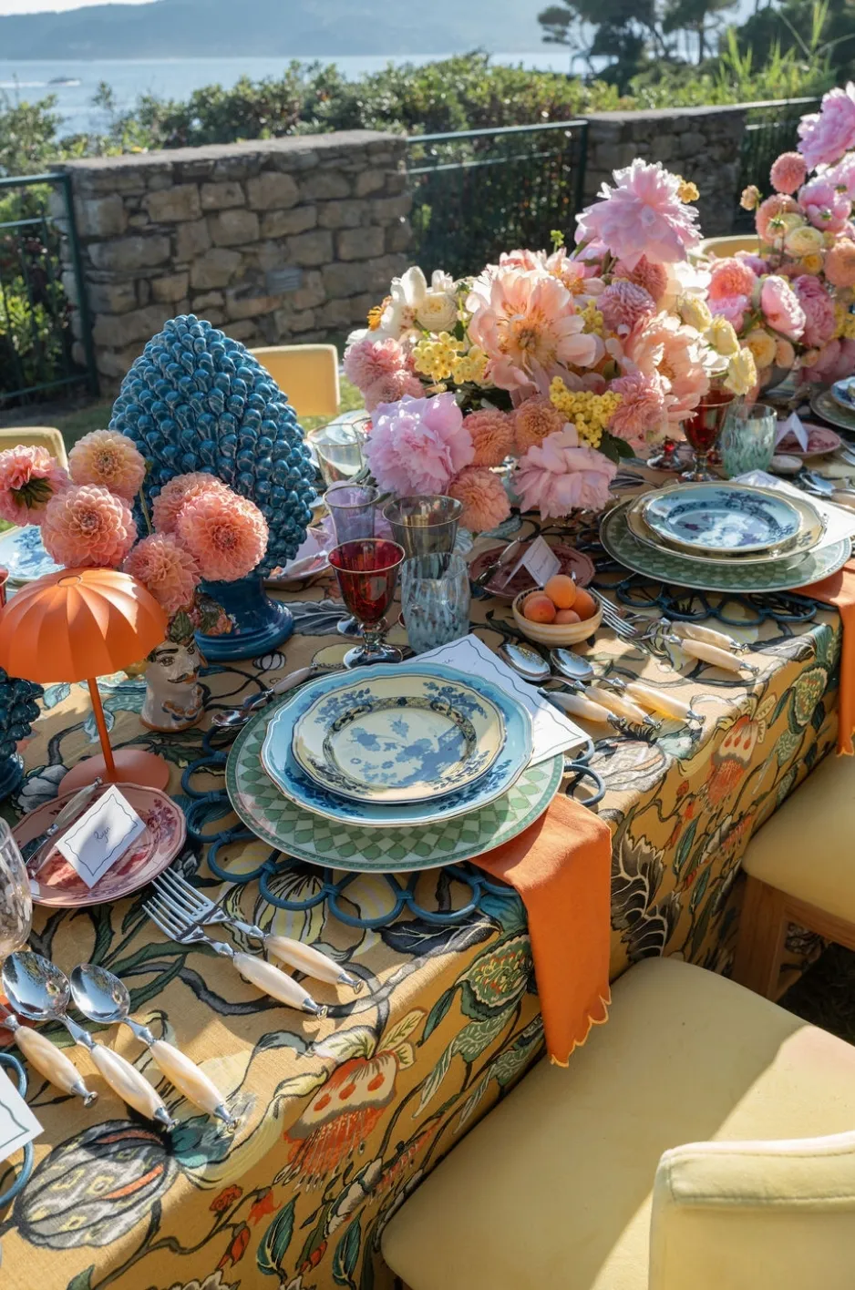
Artwork scale should respond to the linen’s size and use. A crest that looks balanced on a full tablecloth may become too detailed on a napkin or too small along a wide runner. Each format requires a separate scale decision. We cover this further in How to Use Custom Table Linens to Transform Wedding Tablescapes.
Keep Napkin Details Readable at Close Range
Napkins are viewed closely, but they are also folded, draped, gathered, or placed beneath stationery. This reduces the amount of uninterrupted fabric available. Simplified crests, monograms, borders, and isolated motifs usually work better than highly detailed compositions.
The design should be positioned according to the planned napkin presentation. A corner motif may work for a tailored fold, while a border may remain visible in a soft drape. Read more in How Custom Table Linens Transform Event Design.
Let Runners Create Direction
A runner naturally guides the eye along the length of a table. The artwork should support that movement.
A continuous border, spaced crest, repeated monogram, or directional motif can work within the runner’s narrow proportions. The spacing should account for centerpieces and place settings so the design remains visible.
A pattern that feels balanced on a square swatch may need to be rearranged for a long, linear format.
Give Full Tablecloths Enough Visual Breathing Room
A full tablecloth provides a large design field, but that does not mean it should be filled with tightly repeated artwork.
Larger surfaces often benefit from broader spacing and clearer areas of visual rest. This allows the crest or motifs to remain recognizable from across the room.
Simply enlarging a small stationery crest may distort its internal proportions. The artwork should be reconsidered for the scale of the table.
Concentrate Detail on Focal-Table Linens
Sweetheart tables, cake tables, welcome tables, and display surfaces often have a clear primary view. This allows the design to be positioned more deliberately.
A larger crest may appear on the front-facing portion of the linen, while the tabletop remains quieter.
The design should still leave enough space for functional and decorative elements. Personalization is most effective when it remains visible within the finished installation.
Position the Crest Where It Will Remain Visible
A well-designed crest loses its impact when it falls beneath a plate, wraps around a corner, disappears behind flowers, or faces away from guests.
Artwork placement should be planned according to how the linen will be draped, folded, styled, and viewed.
Identify the Primary Viewing Angle
Determine which side of the table will be seen most clearly by guests and photographers.
For a sweetheart or cake table, this may be the front-facing panel. On a long dining table, the primary view may be along the table’s length. For napkins, it is the area facing the seated guest.
The main crest or border should be aligned with that viewing direction.
Protect the Design From Tabletop Coverage
Map the likely placement of chargers, plates, menus, florals, candles, and serving pieces before approving the artwork.
A repeated motif may need wider spacing around centerpiece locations. A front-facing crest may need to sit lower or higher depending on the floral design. The linen and tabletop should be developed as one composition.
Allow for Folds, Drops, and Corners
Artwork can distort when it crosses a table edge, falls into a corner, or sits within gathered fabric.
Important symbols and lettering should remain on relatively flat sections. Decorative motifs may extend across folds more successfully because slight distortion does not affect their meaning. Full-scale testing can reveal where the design naturally bends or disappears.
Plan Napkin Placement Before Printing
A crest intended for a napkin should be positioned according to the final presentation.
A monogram placed in the center of a flat napkin may disappear inside a fold. A border may turn inward rather than facing the guest. The approved presentation should guide the artwork placement, not the other way around.
Refine the Crest’s Color for Textile Use
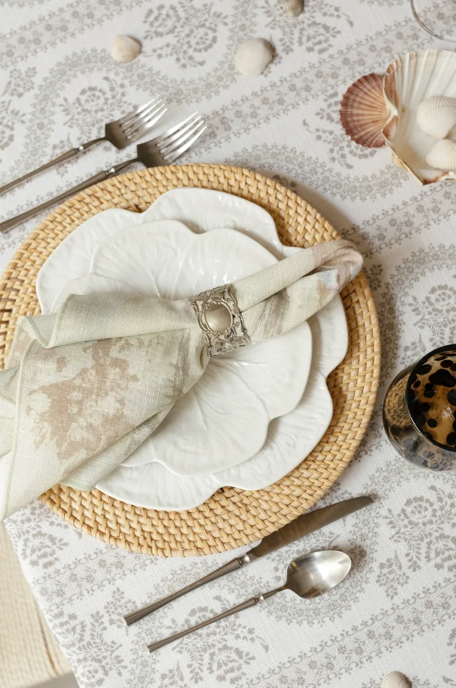
Colors can shift when they move from paper or screen to fabric. The textile’s base color, surface texture, event lighting, and surrounding materials all affect how the crest appears.
The fabric version should feel connected to the stationery without requiring an exact reproduction of every shade.
Reduce the Palette When Necessary
A watercolor crest may contain numerous subtle tones and transitions. These may become muddy or difficult to distinguish when printed on fabric.
Selecting a smaller group of recognizable colors can create a cleaner textile design. The principal floral, monogram, or framing colors can remain while minor tonal variations are simplified.
This creates visual clarity without removing the character of the artwork.
Account for the Fabric’s Base Color
The color beneath the print influences every part of the design. White, ivory, blush, blue, and deeper fabric grounds will change how printed colors are perceived.
A pale crest may lose contrast on an ivory linen, while a darker textile may require lighter or more saturated artwork.
The design should be reviewed against the actual fabric color rather than a generic white digital background.
Preserve Contrast Around Initials and Fine Details
Lettering, dates, and small symbols need sufficient contrast to remain readable.
Light-colored initials may disappear against a pale linen, while closely related dark tones can merge on a deeper base.
Contrast should be evaluated at the artwork’s actual printed size.
Coordinate With the Stationery Without Copying It Exactly
The textile version may use selected colors or motifs from the stationery while adjusting their intensity for the reception environment.
Fabric, lighting, florals, and tableware create a different visual setting from paper. Small color changes may be necessary to preserve the original relationship.
The paper and textile versions should feel related, even when they are not identical.
Decide How Often the Crest Should Appear
Personalization becomes less distinctive when the complete crest appears on every available surface. Controlled repetition creates recognition, while excessive repetition can make the design feel commercial.
A refined approach selects one principal application and uses smaller references elsewhere.
Select One Principal Crest Application
Choose the linen where the full artwork will have the strongest visual effect.
This may be a sweetheart-table cloth, runner, napkin set, cake-table linen, or another prominent textile.
The principal application should receive the most detailed or complete version of the crest.
Use Supporting Motifs Elsewhere
Secondary linens can repeat a flower, monogram, border, color, or other recognizable element.
This extends the visual identity without applying the same emblem repeatedly.
Guests can recognize the connection even when the complete crest appears only once.
Change the Scale Across Applications
A large crest may appear on a focal tablecloth, while a smaller monogram is used on napkins. An isolated motif may form a runner pattern or appear on lounge pillows.
Changing scale helps each application respond to its format.
It also prevents the design from feeling mechanically repeated.
Leave Some Linens Uncustomized
Solid and existing patterned linens provide necessary visual rest. They allow the custom crest details to retain their significance.
Not every napkin, runner, tablecloth, and overlay needs personalization. A limited number of custom elements often creates a stronger impression.
Build a Coordinated Linen System Around the Crest
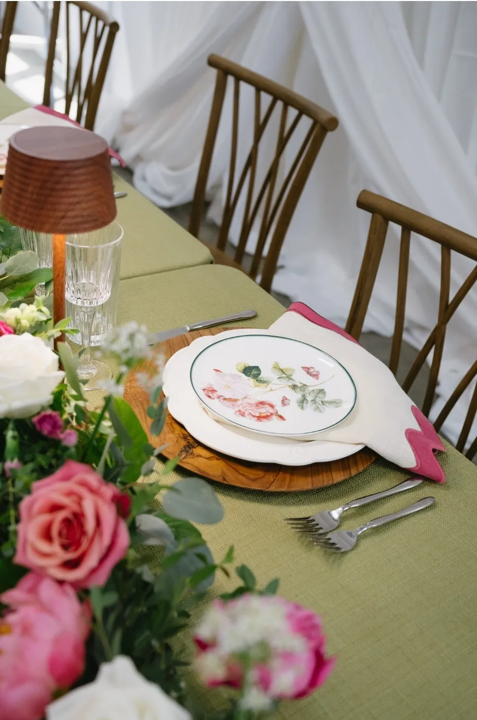
The crest should become part of a broader textile system rather than remain an isolated custom item. A complete plan may include one statement linen, one supporting design, and one quiet foundation.
Each element should have a clear role.
Establish the Statement Piece
Select the linen that will carry the complete crest or the most expressive custom artwork.
This piece becomes the design anchor. Its colors, motifs, and overall style can guide the selection of supporting textiles.
The statement linen should be placed where its detail will remain visible.
Add a Supporting Textile
Choose a napkin, runner, overlay, or pillow that repeats one feature from the principal artwork.
This may be a color, motif, border, or texture. The supporting textile should strengthen the connection without competing with the statement piece.
A solid napkin drawn from the crest palette may be enough to complete the relationship.
Introduce a Quiet Foundation
A refined solid or subtle texture can balance the custom artwork.
This foundation gives the eye space to rest and helps the crest remain the principal personalized feature.
The quiet element may appear across guest tables, under a printed runner, or behind a focal linen.
Extend One Detail Beyond the Dining Table
A small crest-related element can appear elsewhere in the guest experience. A motif may be printed on a bar linen, lounge pillow, welcome display, or cocktail-table treatment.
The extension should feel purposeful. Repeating one selected detail is usually more refined than placing the complete crest in every event area.
Frequently Asked Questions
Can an invitation crest be printed directly onto a table linen?
It may require adaptation first. Fine lines, small lettering, subtle colors, and closely spaced details often need to be simplified or strengthened for textile printing.
Should a wedding crest be simplified before it is printed on fabric?
In many cases, yes. Simplification improves clarity and allows the design to work at different scales.
What is the best linen for displaying a complete wedding crest?
A focal linen with a clear viewing direction, such as a sweetheart-table cloth, cake-table linen, runner, or front-facing display textile, can provide enough space for the complete design.
Can only part of a wedding crest be used as a textile pattern?
Yes. Individual flowers, leaves, initials, architectural details, or framing elements can be separated and arranged into a repeat or border.
Should the crest colors match the invitation suite exactly?
They should feel connected, but exact matching may not be necessary. Fabric color, texture, lighting, and surrounding décor may require slight adjustments.
How many custom crest linens should be used at one wedding?
There is no fixed number, but one principal application supported by a few smaller references usually creates a more refined result than repeating the complete crest everywhere.
Turn One Crest Into a Complete Textile Story
Successful wedding crest linens begin with adaptation rather than direct reproduction. Artwork created for stationery should be separated into usable components, simplified where necessary, scaled for each textile format, and positioned according to how the linen will be styled. For inspiration from real events, browse our linen gallery.
The full crest does not need to appear on every surface. One principal application, supported by smaller motifs, colors, borders, or monograms, can create a more refined visual identity. To talk through linens for your date and venue, contact our team.
Curated Linen Collection’s custom-printed linens, runners, napkins, specialty accents, and design guidance can help translate wedding artwork into a cohesive textile system. The result allows the crest to move naturally from paper to fabric while preserving its meaning, clarity, and connection to the complete event design. For more detail, see our article Printed vs. Embroidered Linens for Custom Event Tables.