Choosing event linens is not only about finding the right color. Pattern, texture, finish, and contrast all affect how a table looks once the full design comes together.
A richly textured solid can have as much presence as a bold print. A softly reflective finish can make a restrained color feel more dimensional. A patterned linen can establish the entire palette, while quieter textiles give that pattern room to stand out.
The strongest linen combinations create balance. Rather than making every textile a focal point, planners can decide which element should lead and use the remaining selections to support it.
Start With the Overall Linen Direction
Before comparing individual fabrics, establish the visual direction for the event. This gives every linen selection a purpose and makes it easier to determine where color, pattern, texture, or finish should carry more weight.
A clear direction also prevents the tablescape from becoming a collection of individually beautiful pieces that do not work together.
Define the Overall Mood
Start with how the event should feel. A refined, understated event may call for a restrained palette with subtle texture. A dramatic setting can support deeper colors or greater contrast. A romantic design may lean toward softer tones and delicate pattern, while a more expressive event can make room for bolder textiles.
The linen should support that mood rather than introduce a separate design language. This does not mean every fabric needs to look similar. It means the selections should contribute to the same overall impression.
Identify the Main Visual Element
Decide what should provide the strongest textile statement.
That may be:
A patterned tablecloth
A saturated color
A distinctive texture
A specialty overlay
A contrasting napkin
A runner with a strong design
Once that element has been identified, the surrounding linens can be selected in relation to it.
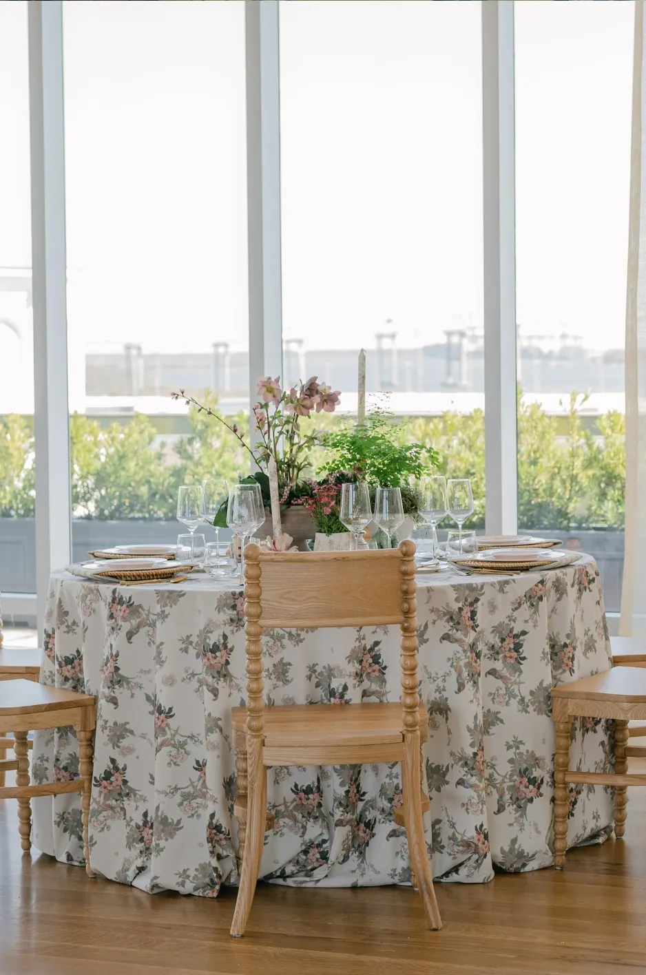
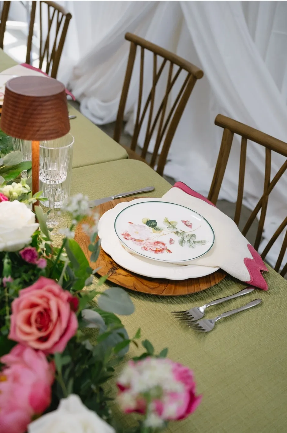
If the tablecloth is heavily patterned, for example, a quieter napkin may provide better balance than another expressive print. If the base linen is understated, a textured or contrasting accent can introduce additional depth.
Keep the Palette Focused
A cohesive linen design does not require a large number of colors.
Start with one primary color or color family and introduce supporting shades with intention. These may be closely related tones for a softer effect or selective contrasts when the design needs more definition.
A focused palette also gives planners more freedom to introduce texture or pattern because the colors are already creating a visual connection between the different pieces.
Use Color to Establish the Foundation
Color is often the easiest way to establish continuity across a linen design. Even when different fabrics, patterns, and textures are used, a consistent palette can make them feel related.
Rather than treating every shade equally, create a hierarchy between the primary color and supporting accents.
Choose a Primary Linen Color
The primary color should anchor the textile direction. It may appear on most guest tables, provide the background of a patterned linen, or serve as the color that connects several different treatments throughout the event.
The choice does not have to be neutral. Deep blue, green, plum, blush, warm earth tones, or other distinctive shades can all provide a strong foundation when they support the broader design.
What matters is consistency. Once the primary direction is established, additional colors should have a reason for being introduced.
Add Supporting Shades With Purpose
Secondary colors can add dimension without competing with the main palette.
They may appear through:
Napkins
Runners
Accent tables
Pattern details
Specialty overlays
Selected focal tables
A patterned linen can make this process especially straightforward. Instead of introducing unrelated colors, pull one or two supporting shades directly from the print.
This creates a natural relationship between the patterned and solid textiles without making every piece match exactly.
Consider Contrast
Contrast affects how much attention a linen receives. Two closely related shades create a softer transition. A deeper contrast makes one textile stand out more clearly against another.
Neither approach is inherently better. The choice depends on the role each linen is meant to play.
If the goal is an understated, layered table, tonal combinations may work well. If a napkin, runner, or focal table needs greater definition, stronger contrast can provide it without requiring additional pattern. For a focused example of how earthy color, softness, and seasonal finish work together, see warm-neutral linen styling for fall.
Add Texture Without Overcomplicating the Design
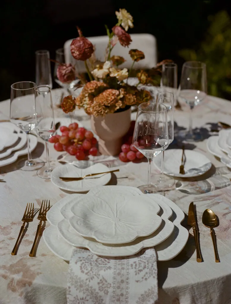
Texture introduces depth even when the palette remains simple. It can make a solid linen feel more considered and create variation without adding another color or pattern.
Because texture already adds visual information, it works best when it has a clear role within the overall linen design.
Use Texture to Add Depth to Solid Linens
A solid linen does not have to feel flat or secondary. Surface detail can give a single color more dimension, allowing the textile to feel distinctive while remaining easy to coordinate with other elements.
This is particularly useful when the tablescape already includes detailed florals, patterned tabletop pieces, or other decorative features. Instead of adding another print, a textured solid can provide richness without introducing additional visual competition.
Texture can also give a restrained palette more interest. Several related shades can feel layered when their surfaces differ subtly.
Pair Strong Textures With Quieter Fabrics
When one linen has a pronounced texture, surrounding textiles do not need to compete with it.
A richly textured tablecloth may work best with a simpler napkin. A specialty overlay can sit over a quieter base. A textured accent can add interest to a smooth tablecloth without requiring another strong design element. You may also find Best Uses for Premium Linen Fabric in Event Design helpful. When texture comes from a second textile rather than the base cloth, layering specialty table overlays for elegant events explains how to keep the finish controlled.
This creates hierarchy. The table still has depth, but guests can understand which textile is meant to receive the most attention. We cover this further in Designing a Tactile Linen Hierarchy: A Planner’s Guide to Luxury Event Table Linens.
Repeat Texture Selectively
Texture does not have to appear on every surface. It can be used to distinguish selected tables or introduce a small amount of variation within a larger event. A focal table may receive a richer textile treatment while guest tables remain more restrained, or a textured napkin may provide continuity across otherwise simple tables.
Selective use often gives the material more impact because it does not become visually repetitive.
Understand How Finish Changes the Look of a Linen
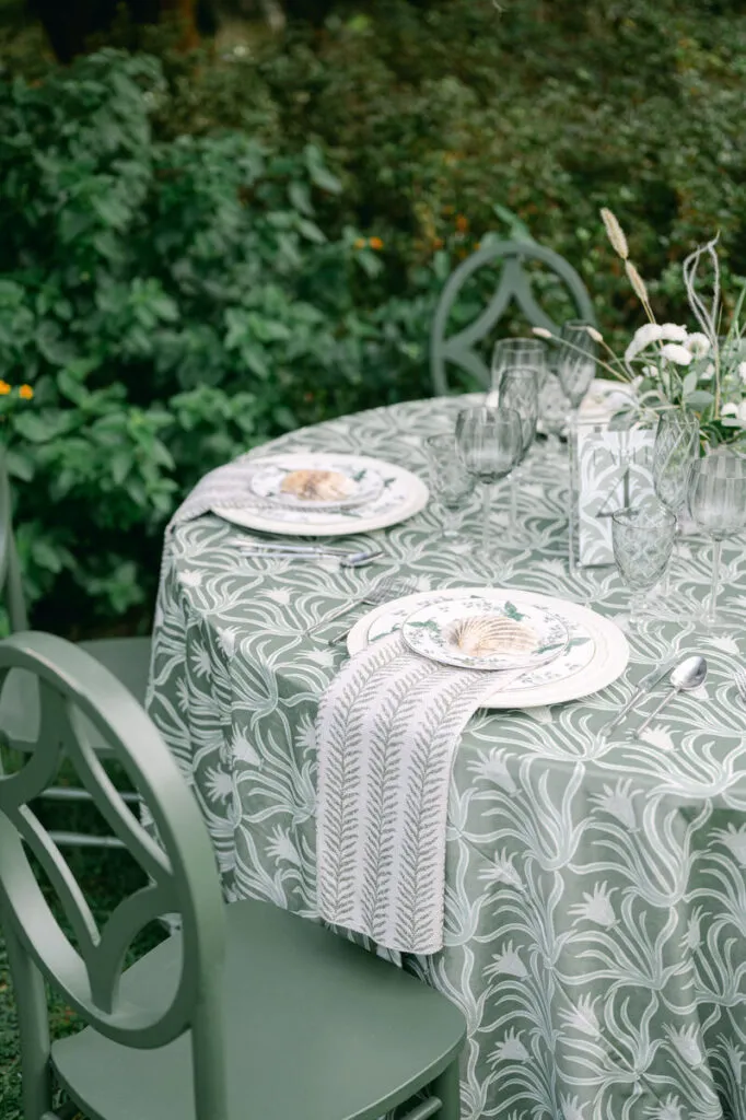
Finish affects how a linen feels visually even when the color remains the same. Matte, smooth, softly reflective, and more dimensional surfaces can each create a different impression.
This makes finish an important part of linen selection, particularly when several textiles are being combined.
Use Matte Finishes for a Softer Look
Matte linens tend to create a quieter visual foundation. They can work particularly well when the table already includes strong pattern, detailed florals, metallic tabletop accents, or another element intended to lead the design.
A matte finish also allows color and texture to take priority without adding another reflective quality to the table. That restraint can be useful in both minimal and highly detailed tablescapes. You may also find Luxurious Wedding Linens: How Texture Defines Elegance helpful.
Use Reflective Finishes for Added Dimension
A linen with subtle sheen can add depth and formality without requiring a bold color or pattern.
Reflective finishes respond more noticeably to the surrounding environment, helping the fabric feel dimensional as guests move through the space.
The effect does not need to be dramatic. A gently luminous textile can provide enough contrast against matte elements to make the overall table feel more layered.
Balance Different Finishes
When combining different linen finishes, avoid making every surface equally reflective or equally dominant.
A softly luminous tablecloth can be paired with a matte napkin. A textured runner may add dimension over a smoother base. A more expressive specialty textile can be balanced with quieter surrounding pieces.
The contrast between finishes should add depth rather than make the table feel visually fragmented.
Combine Pattern With Solid Linens
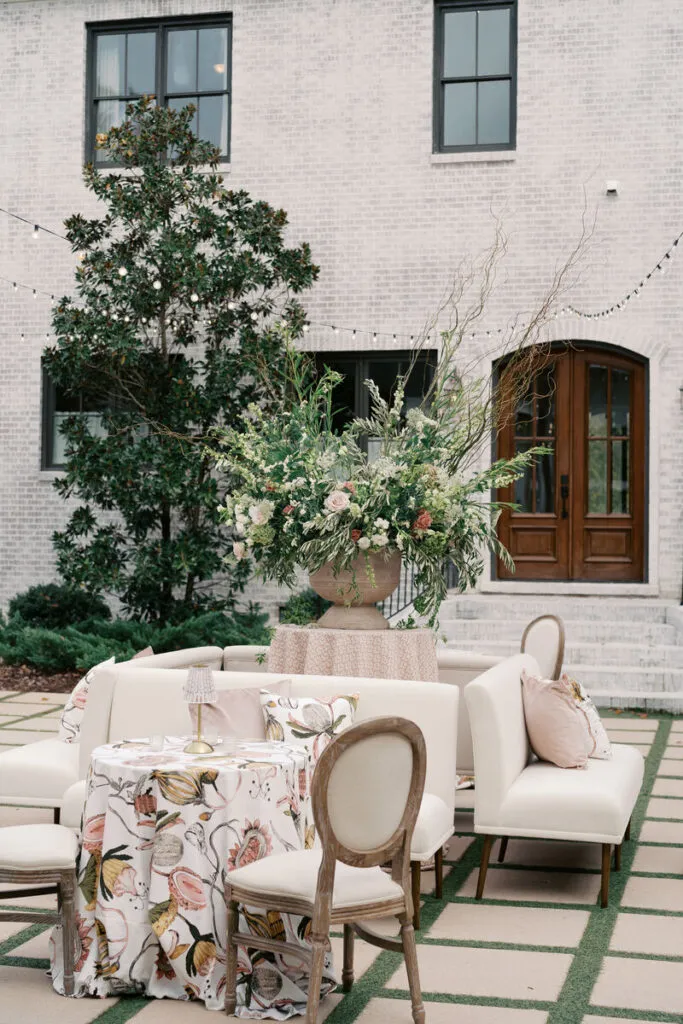
Pattern can establish a strong visual identity, but it rarely needs to appear on every textile.
Combining patterned and solid linens allows the pattern to remain distinctive while creating enough quieter space for the tablescape to feel controlled. Read more in The Sensory Tablescape: Designing with Texture, Weight, and Drape.
Let One Pattern Lead
Begin with one primary pattern. It may appear as a tablecloth, runner, napkin, or another textile detail depending on how much emphasis the design requires.
Once that pattern has been chosen, resist the urge to add unrelated prints just to create more detail. One well-selected pattern can provide enough movement, color, and personality to shape the wider linen direction. Other textiles can support it through color or texture. We cover this further in How Premium Linen Fabric Enhances Texture and Drape.
Pull Solid Colors From the Pattern
One of the most reliable ways to coordinate a patterned linen is to select solid colors already present within it. The supporting shade does not have to be the most obvious color in the print. A background tone or smaller accent can create a more subtle connection.
For example, a multicolored botanical linen may be paired with napkins in one secondary shade and a solid focal-table linen in another.
This approach keeps the palette connected without making the design feel overly matched.
Use Pattern Where It Has the Most Impact
A pattern does not need to cover every guest table to influence the event.
It may be most effective on:
Main dining tables
Selected table groups
A focal table
Long banquet tables
Runners
Napkins
Specialty surfaces
Consider how strongly the pattern reads and where additional visual emphasis is actually needed.
Selective placement can make a distinctive textile feel more intentional than repeating it across every available surface.
Balance the Linen Elements Across the Table
A finished tablescape contains several visual layers. When tablecloths, napkins, runners, patterns, textures, and finishes are all considered separately, it is easy to add too much.
The strongest combinations give each element a clear role.
Avoid Making Every Linen a Statement
If the tablecloth carries a strong pattern, it may already provide enough visual movement.
Adding an equally bold napkin, another patterned runner, and a heavily textured overlay can make it difficult for any one textile to stand out.
Instead, decide where the statement should come from.
A strong tablecloth can be paired with restrained accents. A simple base linen can support a more distinctive runner. A quiet tablecloth can give an expressive napkin more presence.
The goal is not to remove detail but to create hierarchy.
Use Smaller Linen Details for Contrast
Napkins and runners provide useful opportunities to introduce color, texture, or pattern without changing the entire table.
A contrasting napkin can add definition to a tonal setting. A runner can bring pattern to an otherwise solid design. A smaller textile detail can also repeat a color used elsewhere in the event. Napkins are one of the most visible smaller-scale texture decisions; explore luxury napkin styling for formal events.
Because these elements occupy less visual space than a full tablecloth, they can introduce stronger details without dominating the composition.
Keep the Design Connected
Multiple textiles should still feel related.
They may share:
A common palette
Similar undertones
A repeated pattern color
Complementary textures
A consistent level of formality
Exact matching is not necessary.
In many cases, a slightly varied combination feels more intentional because each textile contributes something different while remaining connected to the same overall concept.
Coordinate Different Tables Without Repeating Everything
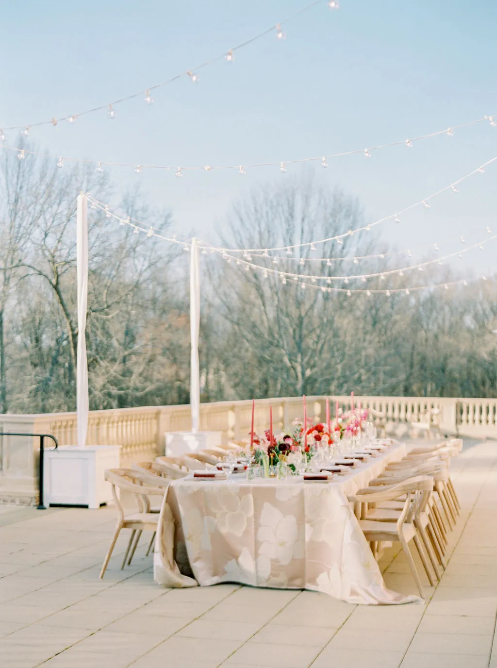
An event may include guest tables, long dining tables, cocktail tables, focal tables, and specialty surfaces. Cohesion does not require applying exactly the same linen combination to every one.
A controlled amount of variation can make the room feel more layered, provided there is a clear relationship between the treatments.
Keep One Element Consistent
When table treatments vary, repeat at least one recognizable element.
This might be:
The same napkin color
One recurring pattern
A consistent base shade
A related fabric texture
A shared accent color
The repeated element acts as a visual thread between different table groups.
For example, patterned guest tables and solid long tables may still feel connected when both use the same napkin treatment.
Give Focal Tables More Emphasis
Focal tables can use a stronger linen treatment without introducing an entirely separate concept.
A deeper shade, richer texture, more expressive pattern, or specialty overlay can distinguish the table while retaining colors or textile details used elsewhere.
The difference should feel like an extension of the main design rather than a new direction.
This allows important tables to stand apart while preserving cohesion across the room.
Limit Unnecessary Variations
Different table shapes or functions do not automatically require different linens. Using one fabric for guest tables, another for long tables, a third for cocktails, and several more for specialty tables can quickly create visual clutter.
Variation works best when there is a reason for it. If a new textile is not adding hierarchy, reinforcing the palette, or serving another clear design purpose, the simpler option may produce a stronger result.
Frequently Asked Questions
Can Different Linen Textures Be Used at the Same Event?
Yes. Different textures can create depth when they share a consistent design direction. Pair stronger textures with quieter fabrics and repeat key colors to maintain cohesion.
Do All Event Linens Need to Be the Same Color?
No. Several related colors can work together within one defined palette. A primary shade and one or two supporting colors often provide enough variation without making the design feel disconnected.
Can a Solid Linen Still Make a Statement?
Yes. A solid linen can stand out through a rich color, distinctive texture, contrast, or finish. Pattern is only one way to create visual emphasis.
How Many Patterns Should Be Used in One Linen Design?
There is no fixed number, but beginning with one primary pattern makes it easier to create a balanced design. Additional prints should have a clear relationship to the main pattern rather than competing with it.
How Can a Linen Design Feel Layered Without Looking Busy?
Choose one or two elements to provide the strongest visual interest and allow the remaining textiles to support them. A patterned tablecloth may need a quieter napkin, while a solid base can support a more expressive runner or textured accent.
Create a Balanced Linen Design
A refined linen design does not depend on using more colors, more patterns, or more layers. It comes from understanding how each textile contributes to the complete table.
Color establishes the foundation. Texture introduces depth. Finish changes visual presence. Pattern adds movement and character. When those elements are given clear roles, they can work together without competing for attention.
The most effective combinations also leave room for restraint. A statement textile becomes stronger when surrounding elements support it, while quieter linens gain dimension through thoughtful color, texture, and finish.
Curated Linen Collection gives planners the flexibility to build that kind of coordinated textile direction through patterned and solid linens and complementary linen details. The goal is not to make every piece stand out on its own, but to create a complete event design in which every linen feels intentionally selected. Explore the complete range of luxury linen rentals from Curated Linen Collection.