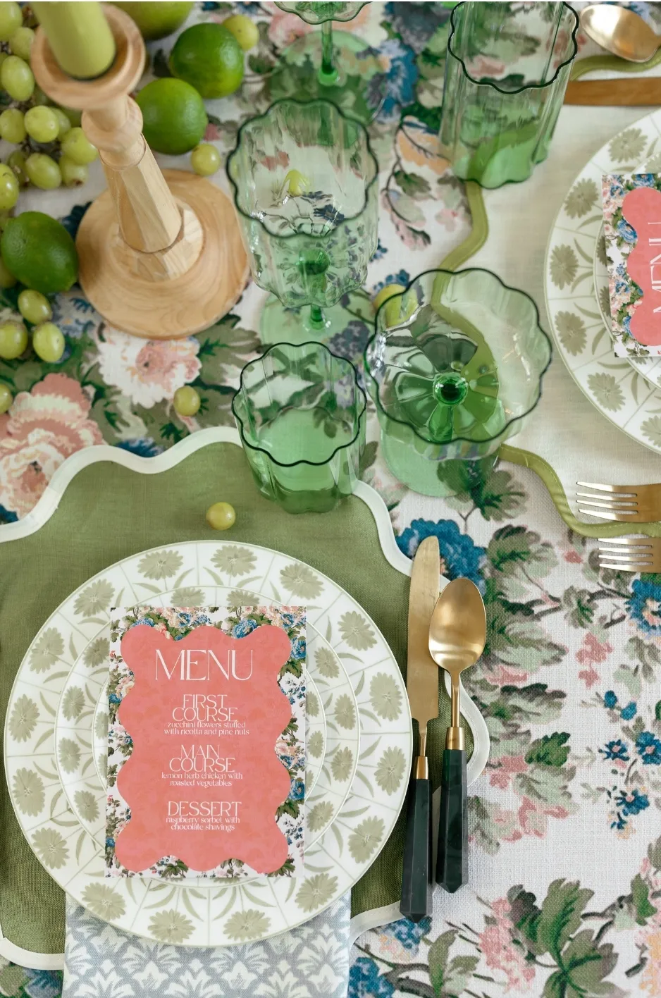
Wedding napkins may occupy less space than tablecloths, runners, and floral arrangements, but their repeated presence gives them considerable influence over a reception design. One napkin appears at nearly every seat, creating a consistent line of color, pattern, or texture throughout the dining space.
The right napkin can connect a statement tablecloth to the place setting, introduce pattern to a solid foundation, or repeat an accent color found in the florals and stationery. The wrong combination can make plates difficult to distinguish, conceal an otherwise beautiful print, or cause the table to feel unnecessarily busy.
Choosing luxury wedding napkin rentals therefore involves more than matching a napkin to a color swatch. Couples and planners must consider the visual priority of the table, the scale of each pattern, the undertones of the fabrics, the plate and menu design, the napkin’s placement, and the amount of detail already present in the tablescape.
Curated Linen Collection offers luxury napkins alongside table linens, runners, pillows, and specialty overlays, with colors, prints, textures, trims, custom sizes, and one-of-a-kind designs available for high-end celebrations.
This guide explains how to pair wedding napkins with patterned and solid table linens while creating place settings that feel layered, clear, and intentionally composed.
Pair Solid Napkins With Patterned Tablecloths
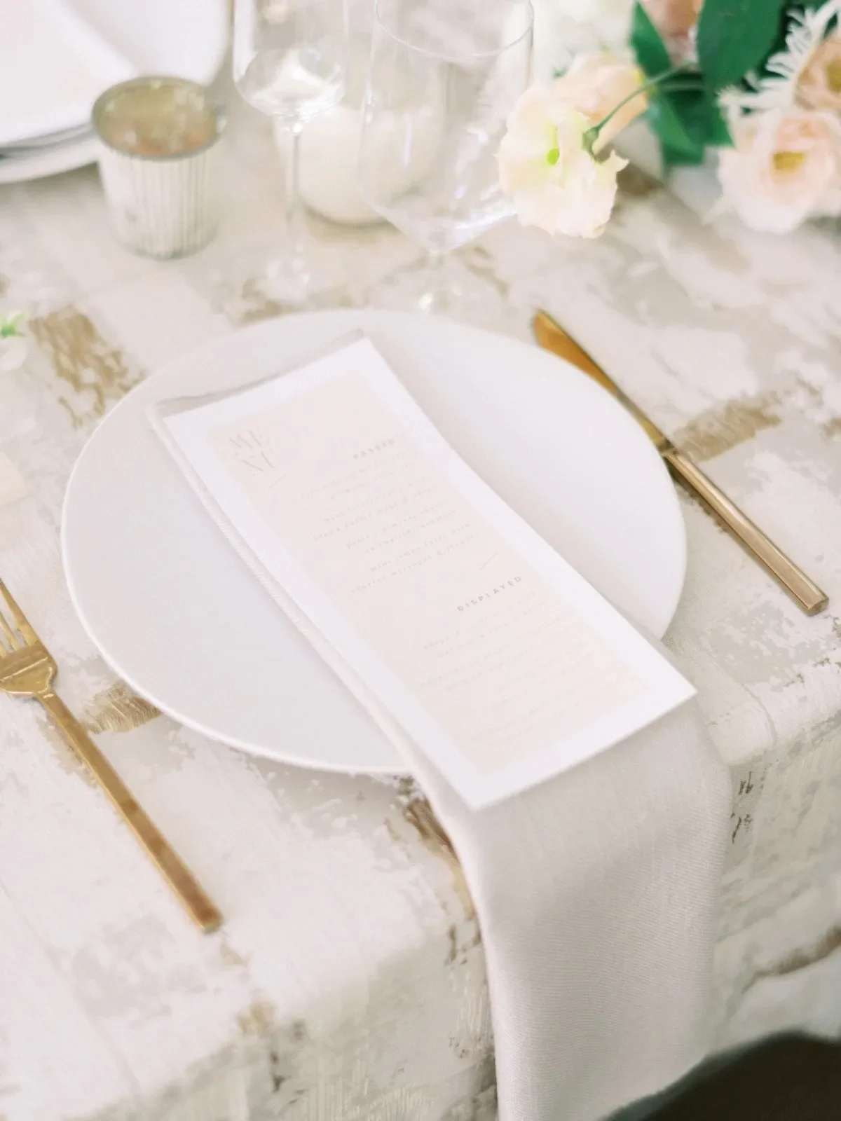
A solid napkin is often the clearest complement to a patterned tablecloth. It can repeat a selected shade, provide contrast around the plate, and give the eye a visual pause within a detailed setting.
Solid does not have to mean plain. Texture, trim, shape, and placement can give the napkin character while preserving the tablecloth’s role as the dominant textile.
Pull a Supporting Color From the Pattern
The napkin does not need to match the tablecloth’s most prominent color. Choosing a secondary shade often creates a more layered and deliberate combination.
For example, a floral tablecloth dominated by blue may contain smaller touches of sage, ivory, rose, or gold. Selecting one of those quieter colors for the napkin establishes a clear connection without concentrating too much of the dominant shade at every place setting.
Curated Linen Collection’s gallery demonstrates this approach through combinations such as Greer Fern with Brook Mist napkins, Eloise Ochre with Sawyer Olive, and Daphne Ivory with Sawyer Mist. These pairings connect through related colors while allowing each linen to remain visually distinct.
Use Contrast to Define Each Place Setting
A napkin should remain visible against both the tablecloth and the plate. When its value is too similar to the surfaces around it, the place setting can lose definition.
A lighter napkin can break up a deep or colorful tablecloth. A darker napkin may create structure over a pale or lightly patterned foundation. Contrast can also come from texture or trim when the colors are intentionally tonal.
This distinction becomes especially important when the napkin is positioned beside the plate, where it sits directly against the tablecloth without the visual separation provided by china or a charger.
Coordinate Undertones, Not Just Color Names
Color names can be misleading. Two products described as ivory may differ considerably, with one appearing warm and creamy and the other leaning cooler or grayer. Greens may contain yellow, blue, gray, or brown undertones, while pinks can shift toward coral, lavender, rose, or peach.
Napkin samples should therefore be viewed directly against the tablecloth and, where possible, beside the proposed florals, plates, and paper goods. Evaluating the materials together provides a more reliable result than comparing names or digital images.
The goal is not necessarily an exact match. Related undertones can make different colors feel connected even when their depth or saturation varies.
Add Interest Through Texture or Edge Details
A solid napkin can contribute more than color. A dimensional weave, gently luminous finish, scalloped edge, or contrast border can create a designed focal point while preserving the patterned tablecloth’s visibility.
Curated Linen Collection’s Sadie Scalloped Napkin, for example, pairs an ivory body with an olive scalloped trim, introducing both color and shape without relying on a full print.
Finishing details are most effective when their visibility is considered during styling. A decorative edge should not be completely hidden beneath a large menu or folded inward where guests cannot see it.
Use Patterned Napkins Over a Solid Linen Foundation
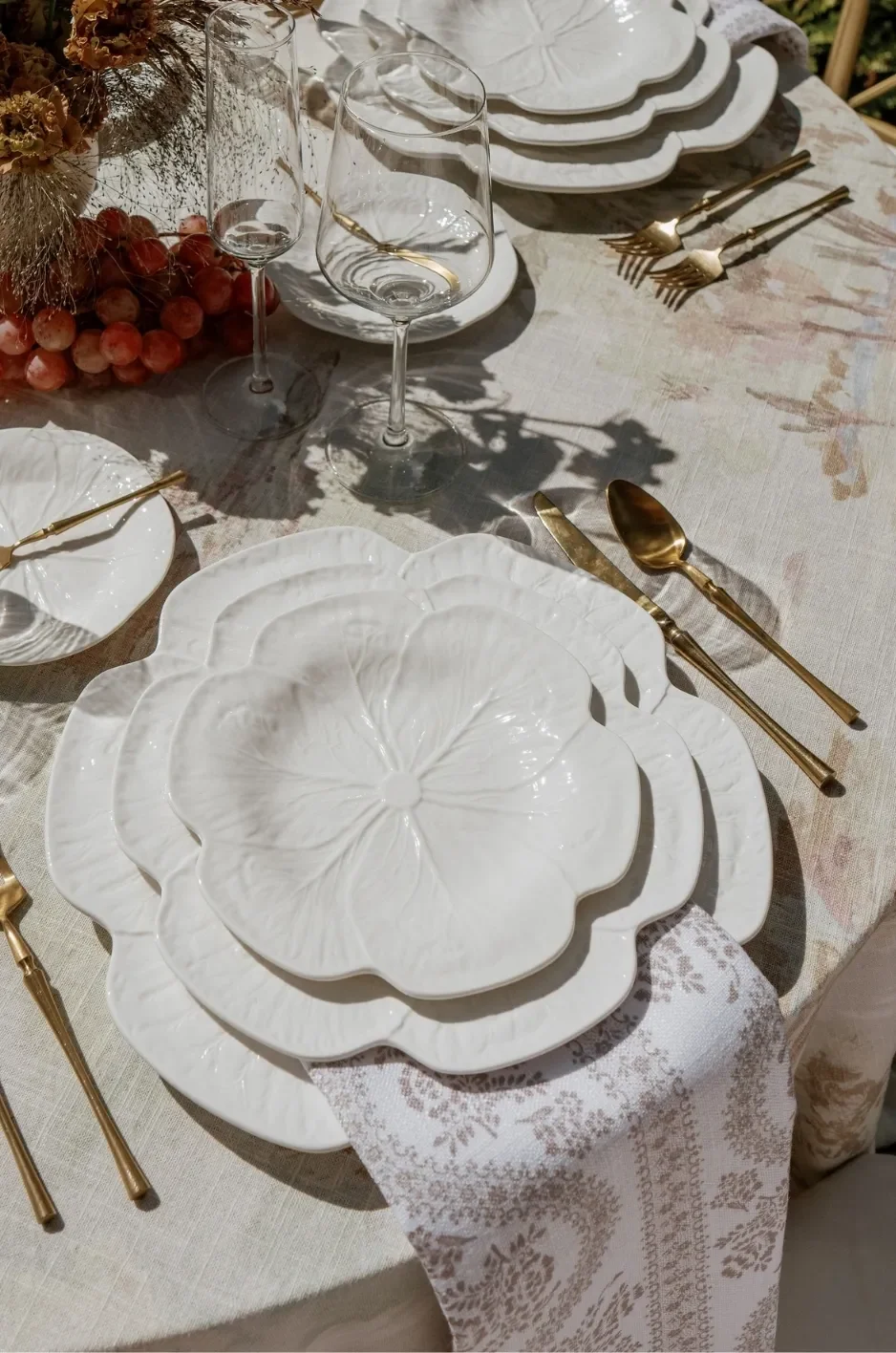
A patterned napkin can introduce a controlled visual moment at every seat when the primary table linen is solid, tonal, or lightly textured. This gives the tablescape personality while keeping the largest textile surface restrained.
Because napkins are folded or draped, the selected print must work within a smaller and less predictable visible area than a tablecloth.
Select a Pattern That Remains Clear When Folded
A fabric pattern shown as a flat sample may appear completely different once folded into a napkin. Large motifs can become fragmented, while small details may disappear into the folds.
Before approving a patterned napkin, test it in the intended presentation. Confirm that enough of the motif remains visible and that the fold does not repeatedly conceal the most important part of the design.
Directional prints also require attention. A stripe, botanical stem, or border may need to be positioned consistently so every place setting appears intentional.
Match Pattern Scale to the Place Setting
Small and moderately scaled patterns often adapt well to napkins because several repeats can remain visible within the folded area. Large-scale prints can still work, but they usually require a more open or softly draped presentation.
The appropriate scale also depends on the plate and menu. A detailed napkin placed under illustrated paper goods may create too much visual density, while the same print beside a simple white plate could provide the table’s needed interest.
Testing at full place-setting scale is more useful than reviewing a small swatch alone.
Connect the Print to Another Wedding Detail
A patterned napkin can relate to another design element without reproducing it exactly. Its colors may reflect the floral palette, while its motif might echo the invitation suite, venue architecture, wedding crest, or surrounding landscape. For more detail, see our article Luxurious Wedding Napkin Rentals to Impress Your Guests.
Custom napkins can also incorporate original patterns, borders, monograms, or artwork developed specifically for the celebration. Curated Linen Collection offers custom options that can include personalized napkins, print development, monograms, trims, and coordinated textile details.
The relationship should remain subtle enough that the table feels coordinated rather than themed.
Keep the Surrounding Tabletop More Restrained
When the napkin carries a strong print, nearby elements need enough simplicity for it to remain visible. A clean plate, restrained charger, solid menu card, or limited glassware palette can create the necessary visual space.
The patterned napkin does not need to be the only decorative item, but it should not sit beneath several other equally detailed surfaces. Editing the surrounding layers allows the print to make a clearer contribution.
Balance Patterned Napkins With Patterned Table Linens
Pattern can be used successfully in both the napkin and tablecloth, but the combination requires control. Rather than choosing two prints because they share a color, evaluate how their scale, density, direction, and visual weight interact.
A layered pattern combination should feel connected at a distance and remain understandable when viewed closely from a seated position.
Combine Different Pattern Scales
Two patterns of the same scale tend to compete because the eye cannot easily determine which one should lead. Combining different scales creates a clearer hierarchy.
A tablecloth with a large botanical motif may work with a narrow stripe or small geometric napkin. A subtly patterned tablecloth may support a more expressive floral napkin.
The difference should be obvious enough that the textiles perform separate roles rather than blending into one busy surface.
Limit the Shared Color Palette
Patterned linens do not need to repeat every color found in one another. Using one or two connecting shades is often sufficient.
A napkin may repeat the tablecloth’s green and ivory while introducing a quieter blue. Alternatively, the tablecloth and napkin may share only one accent color while using different supporting neutrals.
Limiting the shared palette creates cohesion without making the combination appear overly matched.
Separate the Patterns With a Plate or Charger
A solid plate or charger can create a visual boundary between the tablecloth and napkin. This is particularly helpful when the napkin is centered on the place setting.
White, ivory, or another restrained plate color gives the eye a pause before encountering the second pattern. A menu can provide a similar break when it uses a clean background and limited typography.
This separation makes it easier to combine expressive textiles while maintaining a legible place setting.
Review the Combination From a Distance
Two patterns that look balanced in a small mockup may feel much stronger when repeated across a ballroom or tent. Since the napkin appears at every seat, even a modest print can become a significant design feature when viewed across multiple tables.
Create at least one complete table mockup and observe it from several feet away. Consider how the linen combination contributes to the room as a whole, not only to a close-up photograph.
Choose a Napkin Fabric That Supports the Intended Presentation
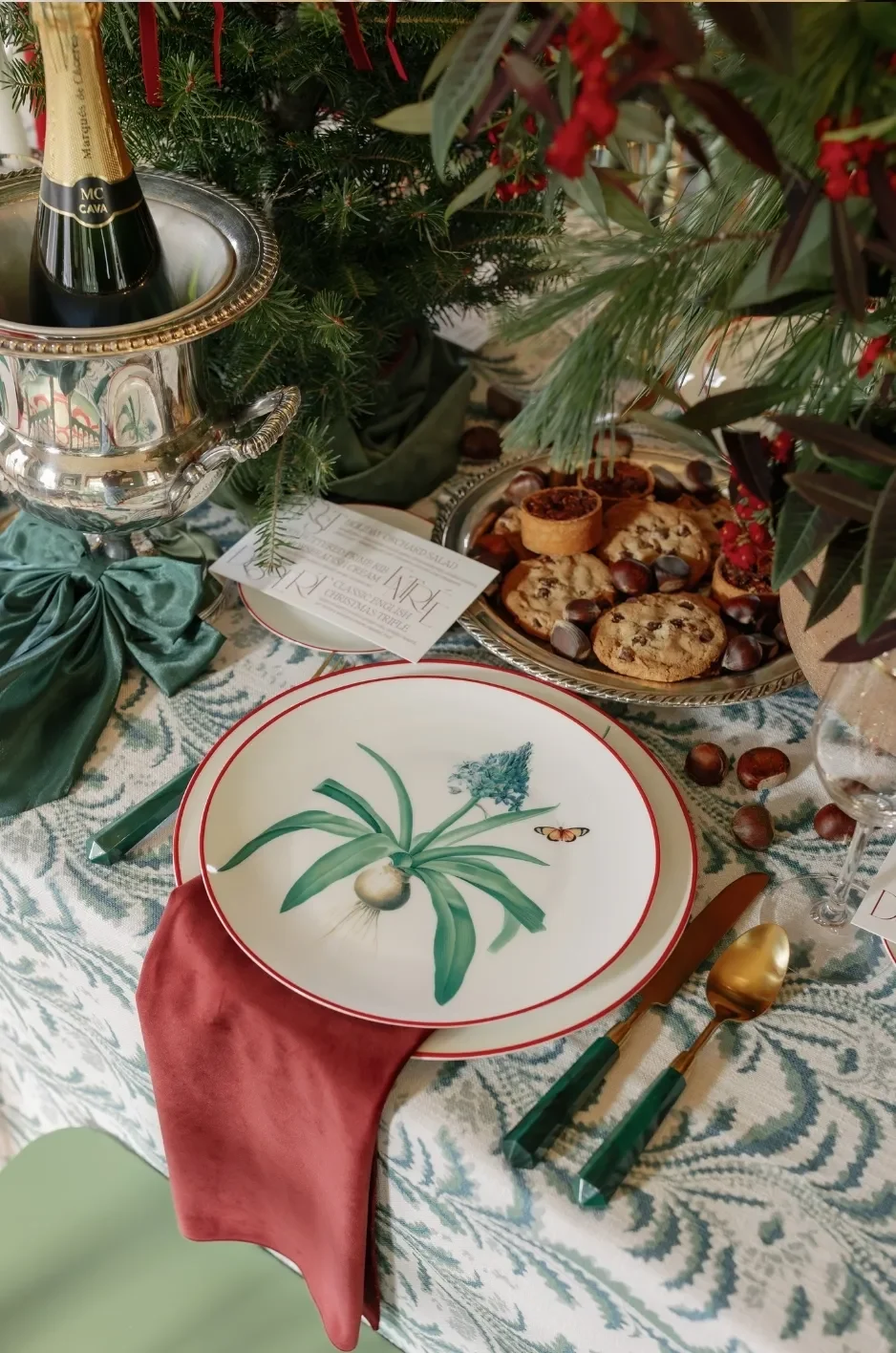
The napkin fabric affects its texture, drape, light response, and ability to maintain a particular arrangement. Selecting a material without considering the intended placement can result in folds that collapse, borders that disappear, or draping that feels too stiff.
Curated Linen Collection offers napkins and related linens in fabrics that include velvet, linen, custom blends, and other elevated textiles selected for high-end events.
Use Structured Fabrics for Tailored Placements
Fabrics with more body are suitable for clean, repeated arrangements. They can support pocket presentations, compact rectangles, structured folds, or precise placement beneath a menu.
A tailored presentation can create consistency across a large number of guest tables, particularly when the place settings include formal tableware or carefully aligned stationery.
The fold should remain achievable for the event team and should not require excessive adjustment during setup.
Select Fluid Fabrics for Soft Draping
A softer textile can create movement when placed loosely across a plate or allowed to fall gently beside the place setting. This approach can make a formal table feel less rigid while allowing the fabric’s texture and finish to remain visible. You may also find The Art of Luxury Napkin Styling for Formal Events helpful.
Fluid materials should still be tested for practicality. An overly long drape can interfere with flatware or extend into a guest’s lap, while an arrangement that is too loose may appear inconsistent across the table.
Consider How the Finish Responds to Light
Matte napkins tend to create a softer, more grounded appearance. Gently luminous fabrics can reflect chandeliers, candlelight, and surrounding colors, adding dimension to the place setting.
The napkin finish should be evaluated beside the tablecloth. When both surfaces are highly reflective, the combination may feel overly bright. A luminous napkin may work more effectively against a matte foundation, while a textured or matte napkin can balance polished chargers and glassware.
Test How the Fabric Shows Trim and Scalloped Edges
Decorative finishing depends on the napkin retaining enough shape for the detail to remain clear. A scalloped border should not collapse beneath the plate, and contrast trim should follow a visible edge rather than becoming lost within a tight fold.
The napkin presentation and finishing treatment should therefore be selected together. The most beautiful border has little effect when the planned fold hides it entirely.
Coordinate Napkins With Plates, Menus, and Place Cards
Napkins sit directly beneath or beside several place-setting components, including plates, menus, place cards, chargers, flatware, and glassware. Their relationship with these items determines whether the setting feels clear or visually congested.
Color is only one consideration. Pattern, scale, texture, and the available negative space are equally important.
Compare the Napkin With the Plate Color
A white or ivory plate often creates strong definition over a colored or patterned napkin. However, a pale napkin may disappear beneath similarly toned china unless a border, texture, or charger provides separation.
Colored plates require more deliberate comparison. A blue napkin and blue plate may work when their depths differ clearly, but they may merge when the tones are too close. Patterned china may benefit from a solid napkin or a print with a noticeably different scale.
Evaluate the plate and napkin together rather than assuming they will coordinate based on color descriptions.
Keep Menus Easy to Read
Menus placed over napkins require sufficient contrast. Fine typography can become difficult to read when positioned over a detailed pattern or deep textile.
A lighter menu card, solid backing, or simplified napkin area may solve the problem. Alternatively, the menu can be placed on the plate while the napkin sits beside it, allowing both details to remain visible.
Legibility should take priority over creating another decorative layer.
Use Place Cards as a Connecting Detail
Place cards can create a subtle relationship between the napkin and other parts of the table. Their border may repeat the napkin trim, while the type or small motif can draw from the same accent color.
The place card does not need to duplicate the napkin pattern. A restrained reference usually feels more sophisticated and prevents the setting from becoming overly coordinated.
Account for Chargers and Decorative Tableware
Chargers introduce another surface between the tablecloth, napkin, and plate. Metallic, woven, patterned, or colored chargers can significantly change how the textiles appear.
A strongly textured charger may pair best with a smoother napkin. An ornate or patterned charger may need a restrained textile. When the charger already provides the main accent color, the napkin can repeat a quieter supporting tone instead of introducing another competing shade.
Use Napkin Placement to Control Color and Pattern
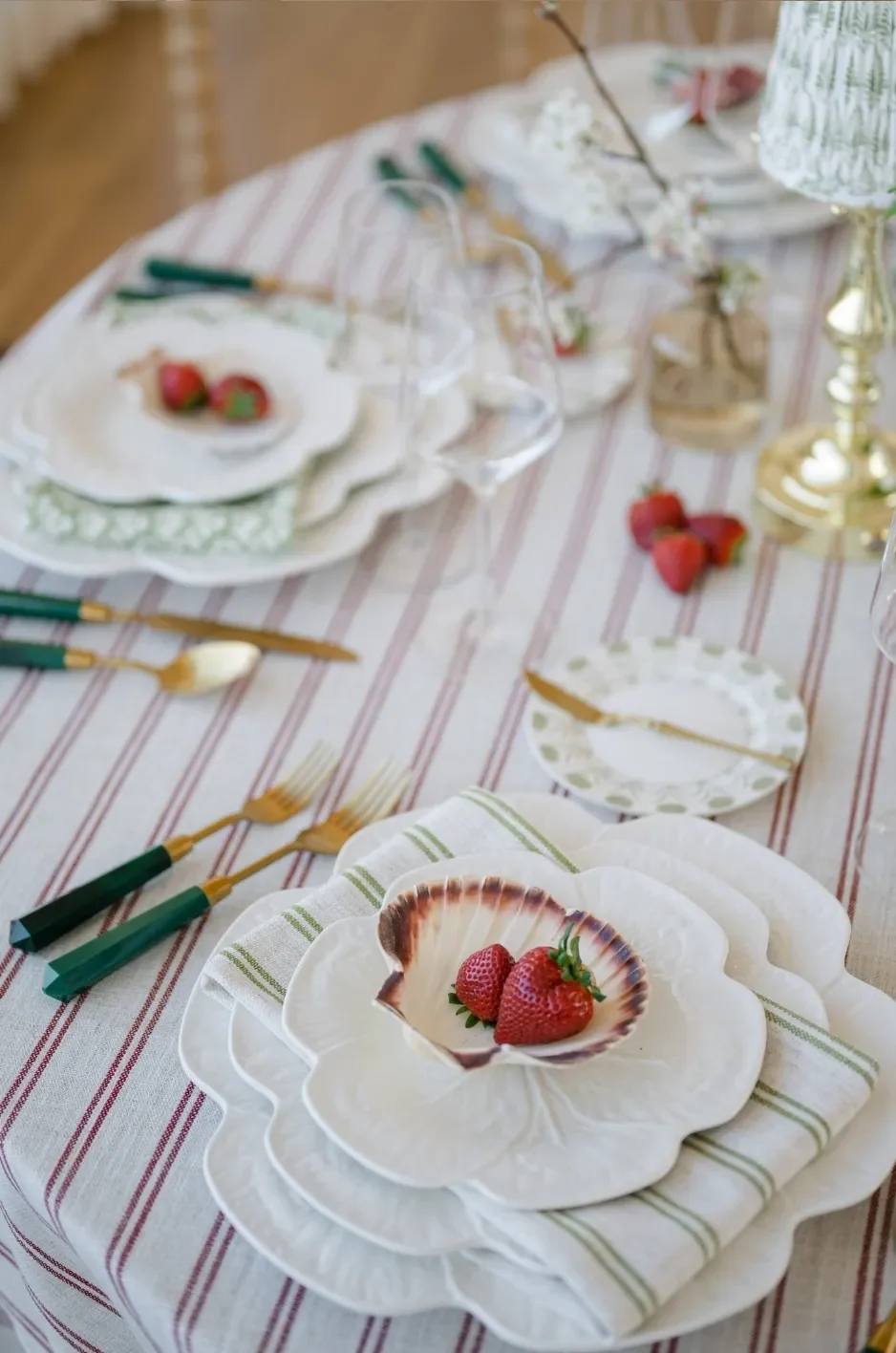
The same napkin can produce different effects depending on whether it is placed over, beside, or beneath the plate. Placement determines how much of the color or pattern is visible and whether custom details remain exposed. The decision should be made during the mockup stage rather than left entirely to the setup team on the wedding day. Read more in Luxurious Wedding Napkin Rentals to Elevate Your Event.
Place the Napkin Over the Plate for Maximum Visibility
Centering the napkin over the plate gives it a prominent role in the place setting. This arrangement works well for patterned napkins, monograms, scalloped edges, or distinctive borders.
It also creates a repeated line of color around the table. When viewed from across the room, the napkins may become one of the most noticeable design elements.
Menus and place cards can be layered over the napkin, provided they do not conceal its most important details.
Position the Napkin Beneath a Menu
A napkin can serve as a textile foundation for a menu card, giving the stationery more visual presence and connecting it to the surrounding table design.
The napkin should be wide enough to frame the menu without appearing uneven. Decorative edges may remain visible around the paper, while the menu provides a solid break when the napkin itself is patterned.
Place the Napkin Beside the Plate to Expose the China
A side placement is useful when the plate or charger carries an important design. It allows the china to remain fully visible while introducing a distinct block of textile against the tablecloth.
This method works particularly well with solid napkins paired with patterned table linens, since the napkin can provide a calm section of color beside the more expressive surface.
The placement should leave adequate space for flatware and glassware.
Tuck the Napkin Beneath the Charger
Tucking part of the napkin beneath the charger limits how much fabric is visible. This is effective when only a border, scalloped edge, monogram, or controlled section of color should appear.
The placement can create a refined layered effect without covering the plate. However, the setup team needs a clear visual reference to ensure the exposed portion remains consistent at every seat.
Use a Soft Drape for a More Relaxed Composition
A softly draped napkin introduces movement and highlights the fabric’s hand and finish. It may fall over the plate, beneath a menu, or slightly toward the table edge.
Although the presentation is less structured, it should still look deliberate. The drape should not obscure glassware, interfere with flatware, or vary so dramatically that the place settings appear unfinished.
Make Custom Napkin Details Visible and Purposeful
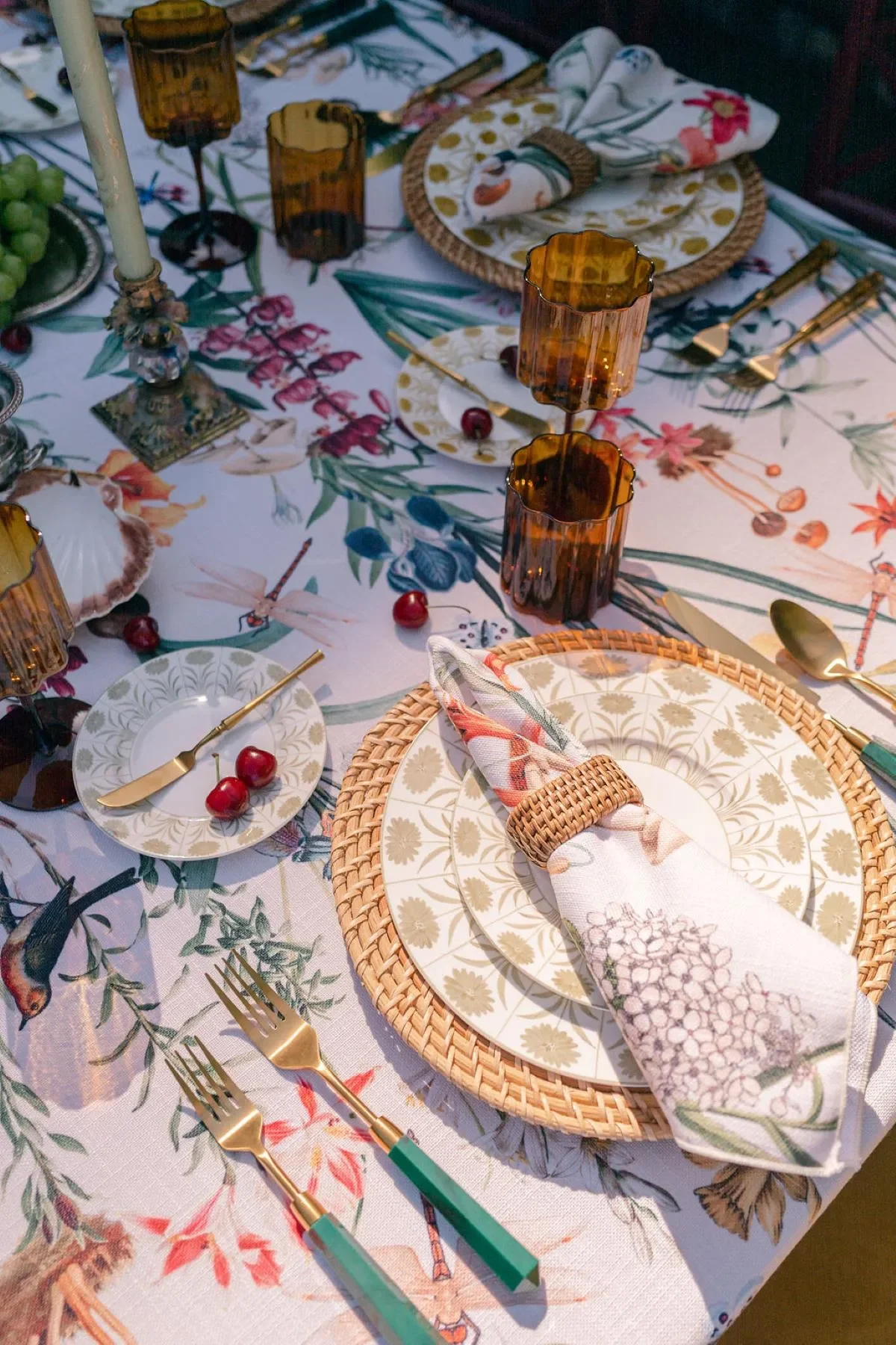
Custom wedding napkins can connect the tablescape to the stationery, venue, florals, or a personal motif. Their impact depends on thoughtful scale and placement rather than the number of customized details included.
Curated Linen Collection supports one-of-a-kind designs, custom sizes, printed patterns, monograms, trims, border treatments, and other personalized linen elements.
Develop a Custom Color or Printed Pattern
A custom napkin pattern may originate from an invitation illustration, venue feature, floral direction, crest, or selected artwork. The design should be adapted for the napkin’s dimensions and proposed fold.
Small repeats often remain visible across different placements, while larger motifs require controlled positioning. Physical samples or accurate mockups can help confirm the pattern’s scale and color before production.
Add a Scalloped Edge or Contrast Border
Scallops and contrast borders introduce shape and color without covering the full napkin in pattern. They can connect a neutral napkin to a colorful tablecloth or add definition against a similarly toned plate.
The border color may repeat a small detail from the tablecloth, florals, glassware, or stationery. This creates a recognizable connection while keeping the overall place setting restrained.
Position Monograms and Wedding Crests Carefully
A monogram or crest should be designed around the intended fold. A corner placement may work for napkins tucked beneath chargers, while a centered mark may be better suited to an arrangement over the plate.
Orientation matters as much as location. The design should face the guest correctly and remain visible after the menu, place card, or decorative accessory is added.
Reserve Custom Designs for Selected Tables
Custom napkins do not necessarily need to appear at every seat. They may be used at the sweetheart table, head table, family tables, or another focal area while guest tables use a coordinating solid.
This approach can distinguish important tables without introducing an entirely separate design direction. A shared color, trim, or fabric finish can maintain continuity across the reception.
Balance Custom Napkins With Supporting Linens
When the napkin includes a crest, original print, strong border, or multiple colors, the tablecloth and runner may need to remain quieter.
Customization is most effective when the detail has room to be noticed. Pairing a custom napkin with several other heavily personalized textiles can dilute its impact rather than strengthen it.
Frequently Asked Questions
Should wedding napkins match the tablecloth exactly?
No. Napkins often create a more layered look when they coordinate rather than match. A solid napkin can repeat a supporting color from a patterned tablecloth, while a patterned napkin can introduce detail over a solid foundation.
Can patterned napkins be paired with patterned table linens?
Yes, provided that the patterns differ in scale or visual density. Limiting the shared color palette and using a solid plate or charger between the textiles can help maintain clarity.
What napkin color works with a statement tablecloth?
A secondary color from the tablecloth is often more effective than its dominant shade. The napkin may also provide deliberate contrast through a lighter, darker, or complementary tone.
How should a scalloped napkin be positioned?
Place it so the decorative edge remains visible. It can be centered over the plate, tucked partly beneath the charger, or arranged beneath a menu that does not conceal the scallops.
Can napkins be customized with a pattern or monogram?
Yes. Custom napkins may include original patterns, monograms, crests, borders, trims, and other personalized details. The design should be planned around the napkin’s dimensions and intended placement.
Complete the Place Setting With the Right Luxury Napkin
Wedding napkins should not be selected as an afterthought or reduced to a single matching color. Their repetition across the reception gives them the ability to connect the tablecloth, plates, menus, florals, glassware, and stationery into one cohesive design.
The process begins by establishing whether the tablecloth or napkin should lead. Patterned tablecloths often benefit from solid napkins that repeat a supporting color, while restrained foundations create room for printed, bordered, scalloped, or custom napkins. When both textiles include patterns, differences in scale, density, and visual weight help each one remain clear.
Fabric and placement are equally important. The napkin should support the intended fold or drape, respond appropriately to the venue’s lighting, and preserve the visibility of trims, monograms, or printed details. A complete place-setting mockup can confirm whether the colors, patterns, tableware, and paper goods work together before the rental order is finalized. For help choosing linens for your event, request a quote.
Curated Linen Collection provides luxury napkins in a range of colors, patterns, textures, and finishes, along with table linens, runners, pillows, specialty overlays, custom sizes, and one-of-a-kind designs. Through thoughtful coordination and careful placement, the right napkin can become a defining layer of the wedding table rather than simply its final accessory. You can view every fabric in our luxury linen rentals collection.