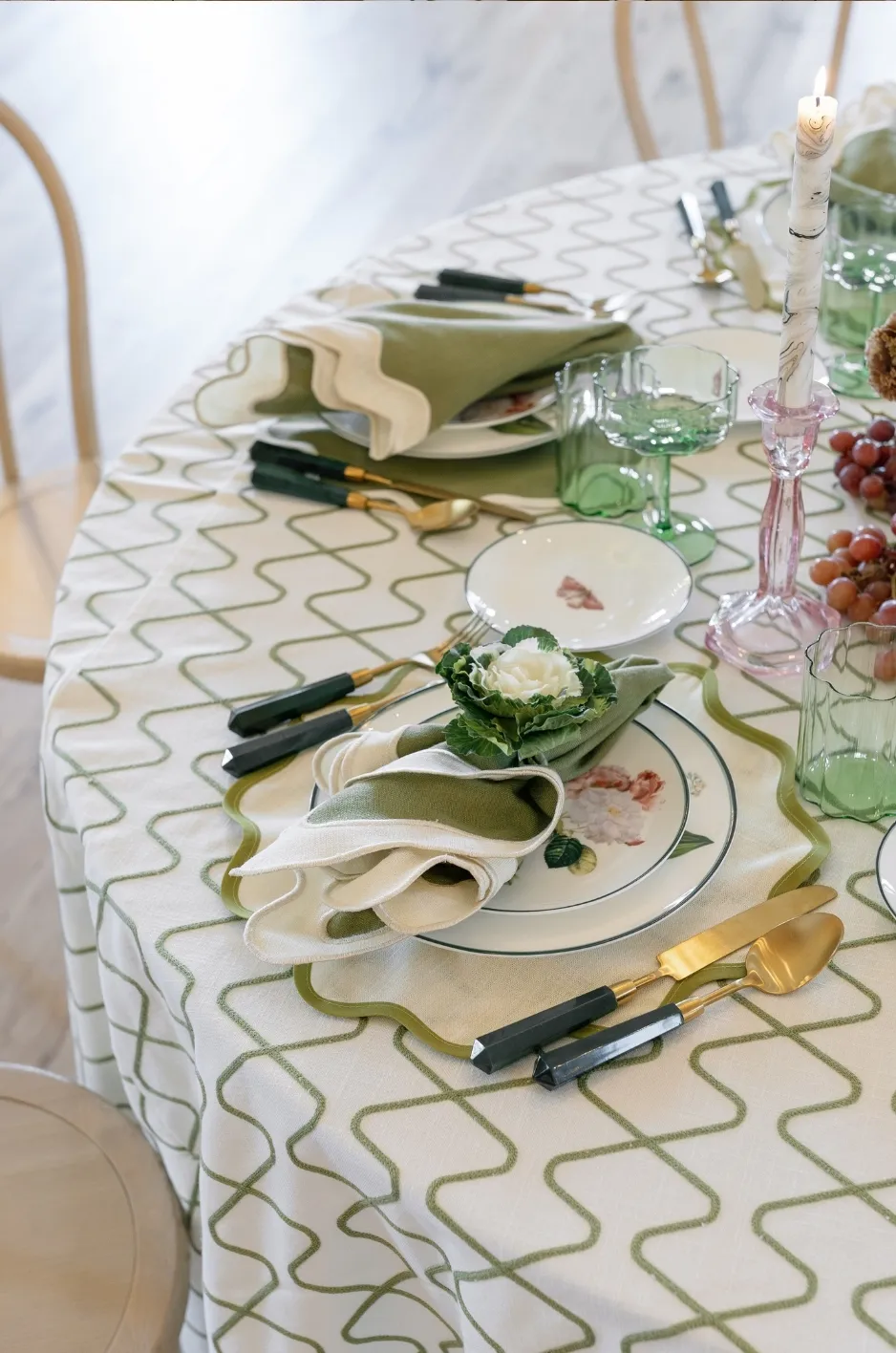
A napkin may occupy only a small portion of a wedding table, but its placement can shape how the entire setting is perceived. It sits at the point where the table linen, charger, dinnerware, stationery, flatware, and floral details meet, making it one of the most visible textile elements at each guest’s seat.
The most effective wedding napkin presentation is not necessarily the most elaborate. It is the presentation that supports the table design, works with the selected fabric, displays important details clearly, and remains practical for guests and service teams.
A tailored fold may bring order to a layered place setting, while a softer drape can introduce movement and texture. A menu holder can organize stationery, and a visible border or custom motif can give every seat a more personal finish. The right choice depends on what the napkin needs to accomplish within the complete tablescape.
Read How the Napkin Naturally Behaves
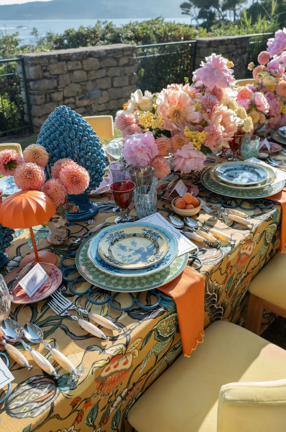
Every napkin has its own weight, drape, texture, and edge construction. These qualities determine whether it creates clean lines, soft movement, or a more relaxed form.
Rather than forcing a fabric into a presentation it cannot hold, planners should select a treatment that works with the textile’s natural behavior. This creates a more polished result and improves consistency across the room.
Structured Napkins Create Defined Lines
A firmer napkin can support tailored rectangles, layered panels, and other presentations that rely on clear edges. It may also provide a stable surface for a menu or place card.
Structured fabrics work particularly well when the place setting needs order. They can balance expressive chargers, detailed stationery, or organic floral arrangements by introducing a controlled textile shape.
The fabric should still be flexible enough for guests to unfold comfortably. Structure should create definition without making the napkin feel rigid.
Fluid Napkins Produce Softer Movement
A fabric with a relaxed drape is better suited to loose rolls, soft gathers, knots, or gently placed folds. These presentations allow the textile to move naturally instead of compressing it into sharp lines.
Fluid napkins can soften a highly structured table. They may work well with geometric chargers, crisp menus, straight-edged flatware, or tailored table linens.
The arrangement should still appear deliberate. Random bunching or inconsistent draping can make the table look unfinished.
Textured Napkins Need Simpler Handling
A visible weave, dimensional finish, decorative edge, or rich surface can provide enough detail without an intricate fold.
A simple presentation allows guests to see and feel the texture. It also prevents multiple layers from becoming bulky or hiding the qualities that made the napkin distinctive.
When texture is the main feature, consider a tailored layer, quiet roll, or restrained drape that leaves a generous portion of the textile visible.
Patterned Napkins Require Planned Orientation
Directional prints, borders, and large motifs should be positioned consistently across every place setting. Folding patterned napkins without considering orientation can result in some guests seeing the principal motif while others see only a secondary section.
Before approving the presentation, identify which part of the pattern should face the guest. Confirm whether the motif needs to appear centered, along an edge, or in a specific corner.
Consistency is especially important when the pattern carries a custom or event-specific detail.
Select From Five Presentation Families
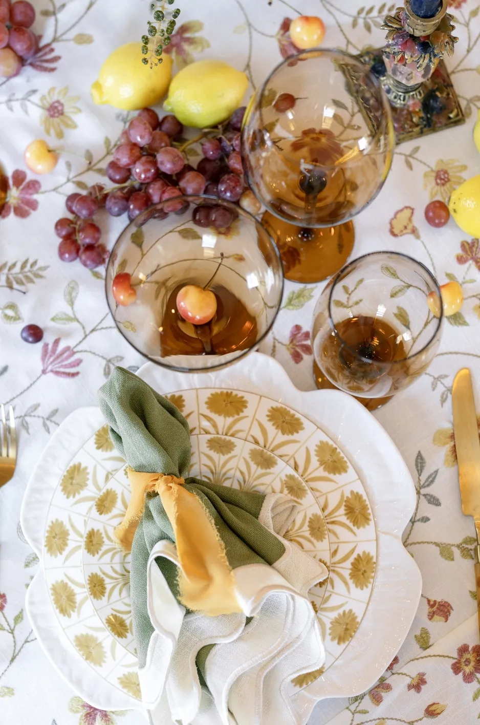
Instead of choosing from a long list of named folds, it is more useful to consider the effect and function each presentation creates. Most wedding napkin treatments fall within five broad families.
These categories can be adapted to different fabrics, colors, patterns, and place-setting styles without requiring the same exact fold at every event.
The Tailored Layer
The tailored layer uses a clean rectangular or square presentation, usually placed on the charger, plate, or table surface. It creates order and provides a visible field of color or pattern.
This option works well when the napkin needs to support a place card, small menu, or decorative detail. It can also bring clarity to a table that already contains several textures.
Its strength comes from proportion and alignment rather than complexity.
The Soft Drape
A soft drape allows the napkin to move across the plate, beneath a dinnerware layer, or beside the setting. It is particularly effective when the fabric has a graceful fall or an expressive edge.
The drape should appear controlled, with similar length and direction at every seat. It should not cover the most important part of the charger or extend into the guest’s dining space unnecessarily.
This presentation adds softness without requiring an elaborate fold.
The Gathered Form
A gathered form includes loose rolls, soft knots, and fabric held by a ring or band. It introduces dimension and can give a fluid napkin more structure.
This treatment may be useful when the napkin needs to occupy a smaller area or when a ring, ribbon, or decorative band forms part of the table design.
The gathering should not be so tight that the fabric becomes heavily compressed or difficult for guests to open.
The Stationery Holder
A stationery holder is chosen specifically to organize a menu, place card, note, or small printed detail. It may use a pocket, layered panel, band, or carefully positioned opening.
The stationery should remain the correct orientation and should not shift during setup. Printed names and menu text need enough contrast against the napkin to remain legible.
This presentation works best when function guides the design.
The Edge Presentation
An edge presentation allows part of the napkin to extend toward or over the table edge. It creates a vertical line of color and can mark each seat clearly, especially when plates are not pre-set.
The fabric should not touch the floor or interfere with the chair. Its length and alignment should remain consistent across the table.
This treatment can make a strong visual contribution without adding more objects to the place setting.
Build a Clear Focal Order at Every Seat
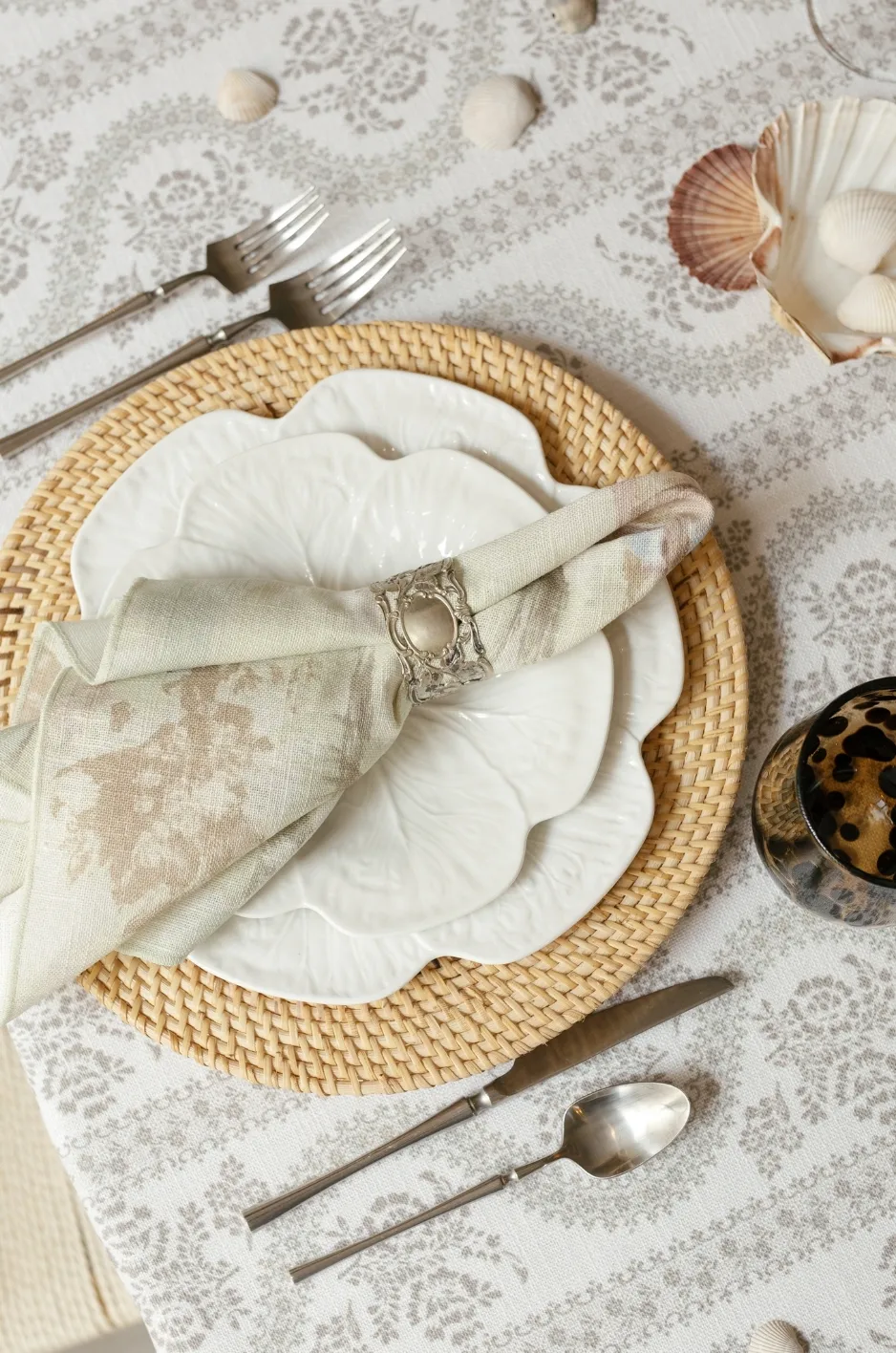
A wedding place setting may contain a charger, plate, menu, place card, napkin, floral detail, favor, and decorative hardware. When each item attempts to become the focal point, the arrangement can feel crowded. For more detail, see our article Luxurious Wedding Napkin Rentals to Elevate Your Event.
A refined setting establishes a clear order. Guests should notice one principal element first, followed by supporting details that reveal themselves gradually.
Decide What Guests Should Notice First
Determine whether the primary focal point should be the napkin, charger, menu, place card, or custom textile detail.
If the napkin contains a strong pattern or color, the surrounding pieces may need to remain quieter. If the menu features elaborate artwork, the napkin may function as a restrained background.
The focal order should reflect the complete wedding design rather than treating each piece independently.
Keep Printed Information Readable
Menus and place cards should remain easy to read from a seated position. Their text should not curve around a tight roll, disappear inside a deep fold, or sit against a pattern that reduces contrast.
The printed piece should also be easy to remove. Guests should not need to dismantle several decorative layers before they can see the menu or find their name.
Practical clarity contributes to a more polished experience.
Allow the Charger or Plate to Remain Visible
A distinctive charger may be a significant part of the place-setting design. Covering most of it with an oversized napkin treatment can reduce its impact.
When the dinnerware carries the primary texture, pattern, or color, use a smaller presentation or position the napkin so part of the charger remains visible.
The napkin and charger should frame one another rather than compete for the same space.
Preserve Areas of Visual Rest
Open space helps guests distinguish the napkin, stationery, dinnerware, and floral details. Without it, the materials can merge into one dense decorative cluster.
Visual rest does not make a setting feel unfinished. It gives important details enough space to be noticed.
A few well-positioned elements often appear more refined than a large number of overlapping accessories.
Place the Napkin According to the Service Plan
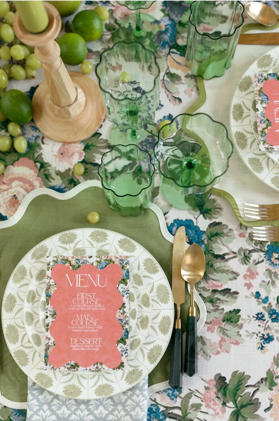
The napkin’s initial appearance is important, but the place setting also needs to function once guests are seated. Plate placement, menu removal, flatware access, and the catering sequence should all influence the chosen presentation.
A design that interferes with service may require unnecessary adjustments during the event.
On the Charger or Dinner Plate
A centered napkin creates an orderly and symmetrical composition. It also gives the textile strong visibility when guests first approach the table. You may also find Luxurious Wedding Napkin Rentals to Impress Your Guests helpful.
This option works particularly well when the napkin carries color, pattern, or a custom detail. The presentation should be easy to remove before the first course if required by the service plan.
Menus and place cards may be positioned on top, provided they do not hide the most distinctive area of the napkin.
Between Plate Layers
Placing the napkin between a charger and a smaller plate allows only part of the fabric to remain visible. This can introduce color or texture without covering the full place setting. You may also find Napkin and Place Setting Formality Calibrated to Venue Type helpful.
The napkin should not make the upper plate unstable. Its placement should also remain consistent so every setting has the same amount of visible fabric.
This treatment is most effective when the napkin serves as an accent rather than the main focal point.
Beside the Flatware
A side placement keeps the charger, plate, and menu unobstructed. It may be useful when the dinnerware is highly decorative or when stationery occupies the center of the setting.
The napkin should align with the flatware or another clear reference point. Uneven positioning can make repeated place settings appear disorganized. Read more in Luxury Wedding Napkin Rentals for Elegant Table Settings.
A soft roll, tailored rectangle, or gathered treatment can all work beside the plate.
Across the Table Edge
A napkin extending over the edge can introduce a strong vertical accent. It is especially useful when the table is not set with a full stack of plates.
The length should remain controlled, and the fabric should not interfere with the chair, guest movement, or service team.
This presentation should be tested at the actual table because chair height and tabletop dimensions affect how it appears.
Coordinate the Napkin With the Table Linen Without Matching It Exactly
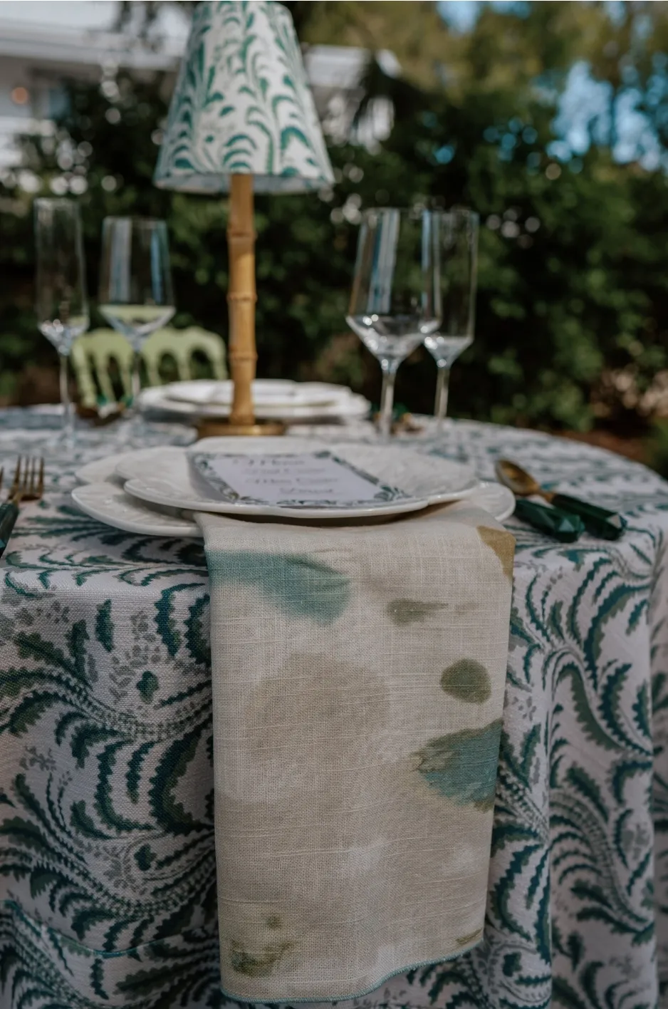
The napkin and tablecloth should feel related, but they do not need to share the same color, pattern, or material. A more layered relationship can be created by translating one feature from the base linen into another form. The goal is to connect the guest’s individual setting with the larger textile foundation of the table.
Pull a Supporting Color From a Patterned Tablecloth
A solid napkin can repeat one recognizable color from a patterned tablecloth. This creates continuity while allowing the base linen to remain the principal pattern. We cover this further in The Art of Luxury Napkin Styling for Formal Events.
Select a color that appears clearly within the print. A minor shade that is difficult to notice may not create a strong enough relationship.
The napkin can either match that color closely or use a deeper or softer variation for additional dimension.
Introduce Pattern Over a Quiet Foundation
When the tablecloth is a refined solid, a patterned napkin can add a smaller point of visual interest at every seat.
The presentation should display enough of the motif to make the pattern legible. A highly compressed fold may reduce the fabric to a collection of unrelated colors.
Patterned napkins can be particularly effective when the table design needs variation but does not require a full patterned tablecloth.
Contrast Texture Within a Tonal Palette
Napkins and table linens in related colors can remain distinct through texture and finish.
A matte napkin may create definition over a softly luminous tablecloth, while a woven or dimensional napkin can add interest to a smooth base.
This approach creates depth without introducing another strong color.
Avoid Equal Pattern Intensity
When both the tablecloth and napkin contain visible patterns, one should be quieter, smaller in scale, or more tonal.
Two dominant prints placed directly beside one another can make the setting difficult to read. The napkin may work best as a restrained pattern when the base linen already carries strong movement.
Clear hierarchy allows both textiles to contribute.
Integrate Stationery and Small Decorative Details
Menus, place cards, rings, ribbons, and botanical accents can strengthen the napkin presentation, but each item should have a defined purpose.
Adding several accessories automatically can make the setting feel overworked. The napkin should not become a surface for every available decorative idea.
Position Menus Without Hiding the Textile
A large menu may cover most of the napkin’s visible surface. This can be a problem when the fabric contains a pattern, border, or custom detail.
Consider a narrower menu, offset placement, or treatment that reveals an intentional section of the textile.
The napkin should still contribute visibly after the stationery is added.
Give Place Cards a Stable Surface
Place cards should remain upright or flat according to their design. They should not tilt inside a loose fold or become hidden by gathered fabric.
The card’s size should suit the napkin presentation. A very small card can disappear on a broad textile field, while an oversized card may cover the entire napkin.
Both pieces should remain easy for guests to identify.
Use Rings and Bands to Create Structure
A ring, ribbon, or tailored band can organize a fluid napkin and introduce a small finishing detail.
Its material may coordinate with the flatware, charger, stationery, or another textile element. It should not introduce a separate color or design language without a clear connection to the table.
The hardware should also be easy for guests to remove.
Add Botanical Details Selectively
A small flower, herb, or leaf may add a natural accent, but it should not stain the fabric, obscure the place card, or interfere with the menu.
Fresh materials should be selected and positioned carefully. A botanical detail should remain subordinate to the napkin and complete place setting.
When the florals are already prominent elsewhere on the table, another botanical accent may be unnecessary.
Protect the Visibility of Custom Napkin Details
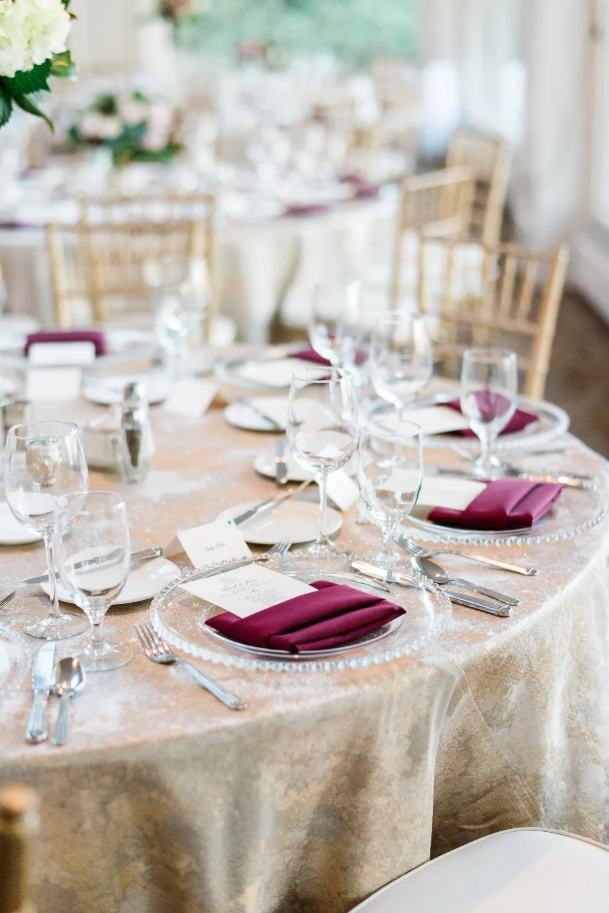
A custom napkin can carry a monogram, printed motif, border, illustration, or other event-specific element. Its presentation should be designed around that feature from the beginning.
Folding the napkin first and adding personalization later may place the custom detail in an awkward or invisible position.
Design the Fold Around the Motif
Identify the exact area of fabric that will remain visible after the napkin is arranged. The motif should fit within that panel without being cropped, folded, or covered.
A tailored layer or simple drape may provide a more effective display surface than a compact fold.
The textile should be reviewed in its final orientation before production or event setup.
Keep Borders Facing the Guest
Decorative borders, contrast edges, and tailored trims should appear in a consistent position at every seat.
Folding the border inward removes the feature that distinguishes the napkin. It may also create inconsistent results if setup teams interpret the orientation differently.
A clear reference image can help maintain uniform placement.
Test Custom Details With the Menu and Place Card
A custom motif may look perfectly positioned until a menu or place card is added. Complete mockups reveal whether the stationery hides part of the design.
Adjust the fold, orientation, or card placement until the custom detail remains legible.
Reviewing the full composition is more reliable than approving each item separately.
Use Personalization With Restraint
A small crest, motif, monogram, or custom edge can create a personal detail without turning the napkin into signage.
Oversized names or repeated messages may compete with the place card and menu. A quieter treatment often feels more integrated with a luxury tablescape.
The personalization should reward closer attention rather than dominate the complete setting.
Develop the Final Napkin Direction With Curated Linen Collection
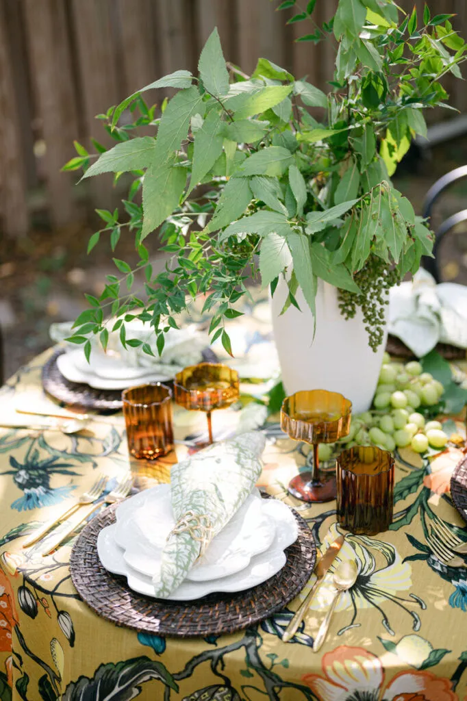
Curated Linen Collection offers napkins alongside table linens, runners, pillows, and specialty overlays, with options that support both curated and custom event concepts.
The final napkin direction should begin with the complete table design rather than with a fold selected in isolation.
Begin With the Complete Table Concept
Review the tablecloth, runner, charger, plate, glassware, menu, place card, florals, and service style before choosing the napkin presentation.
This wider view reveals whether the napkin needs to provide color, calm, contrast, texture, or personalization.
Select the Napkin for Its Design Role
Choose the napkin according to what it needs to contribute. A quiet table may benefit from pattern, while an expressive base linen may require a restrained solid.
The presentation should support that role and preserve the textile’s strongest feature.
Compare More Than One Presentation
Test a tailored, fluid, and functional option with the actual place-setting materials.
One may display the pattern more clearly, while another may improve stationery placement or create better balance with the charger.
The strongest option should make the setting feel complete without adding unnecessary complexity.
Document the Final Orientation
Provide the setup team with a clear reference that shows the visible edge, motif direction, menu position, place-card placement, and relationship to the plate or charger.
Detailed visual guidance helps maintain consistency across every guest table.
Frequently Asked Questions
Should wedding napkins match the tablecloth?
They do not need to match exactly. The napkin may repeat a color from the tablecloth, introduce a coordinating pattern, or create contrast through texture and finish.
Which napkin presentation works best with a menu card?
A tailored layer or stationery-holder presentation usually provides the most stable and readable surface. The best option depends on the size and orientation of the menu.
Can patterned napkins be folded without hiding the design?
Yes. Use a presentation with a broad visible panel and plan the orientation around the principal motif or border.
Are elaborate napkin folds appropriate for every wedding?
No. The presentation should suit the fabric, place setting, guest count, and service plan. A simple treatment performed consistently often creates a more refined result.
Where should a napkin be placed when there is no plate on the table?
It may be positioned beside the flatware, centered at the seat, placed over a menu, or extended carefully toward the table edge.
How can a monogram remain visible after the napkin is folded?
Position the monogram within the panel that will face the guest, then test the presentation with the menu, place card, and other accessories.
Should napkin rings match the flatware or charger?
They may coordinate with either, but an exact match is not required. The finish should relate to the complete tabletop and avoid introducing an unrelated design element.
How many napkin presentations should be used across one reception?
One consistent presentation is usually sufficient for guest tables. A different treatment may be reserved for a head table or another focal setting when there is a clear design reason.
What is the most practical napkin presentation for a large guest count?
A tailored layer, simple drape, or controlled roll is generally easier to repeat consistently than a complex sculptural fold.
Let the Napkin Complete the Setting
A refined wedding napkin presentation begins with purpose. It should respond to the textile’s natural behavior, support the focal order of the place setting, accommodate stationery, and work with the planned service sequence.
The napkin does not need an elaborate fold to make an impact. Color, texture, pattern, custom detail, and precise placement can create distinction when they are used with restraint.
Curated Linen Collection’s designer napkins, coordinating table linens, runners, and custom-printed details can help planners and couples develop place settings that feel cohesive, polished, and specific to the event. The final presentation should connect every element at the guest’s seat while leaving enough visual space for each detail to be appreciated. Explore the complete range of luxury linen rentals from Curated Linen Collection.