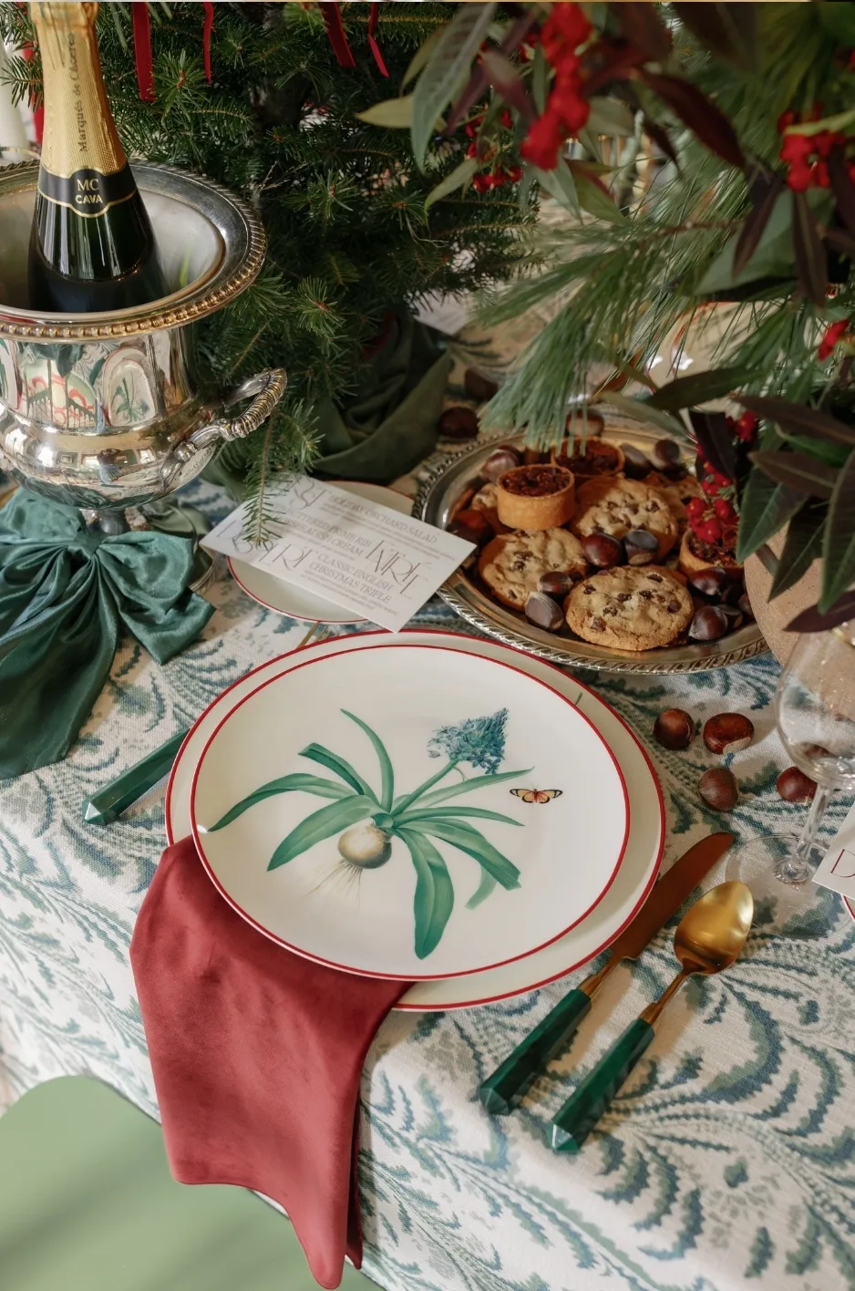
Burgundy has a natural place in fall wedding design, but the most compelling tables do not rely on one dark red repeated from centerpiece to napkin. Wine, ruby, oxblood, berry, and muted red all sit within the broader burgundy family, giving couples and planners room to build a palette with depth rather than a single flat color.
For fall receptions, burgundy wedding linens can serve as the visual anchor, a smaller accent, or a bridge between warm seasonal florals and more restrained tabletop elements. The difference comes down to saturation, texture, pattern, and placement. A wine velvet tablecloth creates a very different atmosphere from a ruby-striped napkin or a multicolored block print, even when all three share red undertones.
This curated edit focuses on using wine and ruby textiles intentionally, with enough contrast and breathing room to keep the finished reception polished rather than overly themed.
Why Burgundy Works So Well in a Fall Wedding Palette
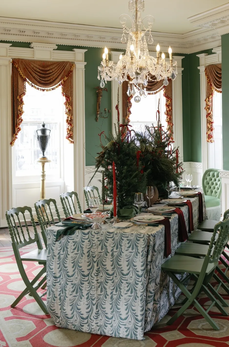
Burgundy has enough depth to establish a strong seasonal mood without limiting the rest of the design to conventional autumn colors. Depending on what surrounds it, the shade can read romantic, tailored, botanical, dramatic, or quietly formal.
Build With a Family of Reds Instead of One Exact Shade
Trying to match every red element exactly can make a wedding palette feel rigid. A more layered approach allows wine, ruby, berry, muted rose, and restrained rust tones to sit within the same composition.
The key is controlling the undertones. A deep wine linen may pair comfortably with dusty pink and warm ivory, while a cleaner ruby can feel sharper alongside green, blue, or crisp neutral details. When several red tones appear together, repeating one supporting neutral throughout the tablescape helps the variations feel deliberate.
This approach also creates more flexibility with florals. Flowers rarely arrive in perfectly identical shades, so a palette built around a family of related reds can accommodate natural variation without making the arrangement look disconnected from the linens.
Let Texture Change the Mood of Burgundy
Color is only one part of the decision. Fabric texture determines how much visual weight burgundy carries across the room.
A deep velvet can create a saturated, intimate effect that works especially well when the textile is intended to be a focal point. A flatter woven fabric feels more restrained, while a stripe introduces movement and breaks the color into smaller intervals. Patterned linens can push the palette in another direction entirely by mixing burgundy or ruby with secondary hues.
Consider the emotional effect you want before choosing the textile. A candlelit dinner may benefit from the depth of velvet, whereas a daytime estate or tented reception may call for a patterned or striped interpretation that gives the red more visual space.
Ground Burgundy With Quieter Colors
Burgundy becomes easier to use when the surrounding palette gives it room to lead. Ivory, cream, oatmeal, taupe, mushroom, champagne, and soft stone tones can all act as visual buffers around saturated red.
Green is another useful counterpoint, particularly when it comes from foliage or a restrained linen accent rather than several competing décor elements. Muted blue can create an unexpected contrast with ruby, while blush softens the transition between deep red and pale neutrals.
There is no need to introduce every supporting color on every table. Choosing one dominant burgundy family, one primary neutral, and a limited set of accent tones usually creates a more coherent result.
A Curated Wine and Ruby Linen Edit for Fall
The strongest burgundy tables do not all interpret the color in the same way. Within the current collection, Wine Casablanca, Ruby Stripe, and Kathryn Ruby offer three distinct approaches: solid velvet, graphic stripe, and expressive pattern.
Wine Casablanca for Saturated, Textural Depth
Wine Casablanca is a rich red-burgundy velvet available in multiple tablecloth formats as well as napkins. Its solid color and velvet construction give it enough presence to establish the palette without requiring a second strong pattern.
Used across guest tables, a wine velvet creates a highly saturated foundation. That makes restraint especially important above the linen. Consider lighter dinnerware, translucent glassware, restrained candle vessels, or florals that incorporate cream, blush, muted greenery, or tonal reds rather than adding several more dominant colors.
Wine velvet can also work as a concentrated statement rather than a room-wide treatment. A head table, sweetheart table, cake table, or another visually significant surface can carry the deeper textile while surrounding guest tables remain neutral. Repeating the wine tone through napkins or smaller accents elsewhere helps the statement table feel integrated with the larger room.
For receptions with lower ambient light or extensive candlelight, review the complete mockup before committing to several other dark elements. Deep florals, dark chairs, heavy tableware, and burgundy velvet can create a beautiful intimate setting, but the design still needs areas of contrast so individual details remain visible.
Ruby Stripe for a Cleaner, Graphic Interpretation
Ruby Stripe introduces burgundy-adjacent red through a patterned rather than solid surface. The collection offers the stripe in tablecloth and napkin formats and identifies Wine Casablanca and Kathryn Ruby among its complementary pieces.
A stripe changes the rhythm of the table. Instead of one uninterrupted field of red, negative space separates the color and gives the surface more movement. That quality can make ruby feel appropriate for fall without creating the visual weight of a full dark-red tablecloth.
For a restrained approach, use Ruby Stripe on selected tables while keeping neighboring tables in a solid neutral. Another option is to use the stripe at every place setting through napkins, allowing a quieter tablecloth to establish the base. This creates repetition across the room while keeping the strongest pattern at a smaller scale.
Because stripes already contribute structure, floral arrangements can take a softer form. Loose foliage, textural blooms, and arrangements with an intentionally limited color range allow the pattern to remain visible instead of competing with another highly graphic element.
Kathryn Ruby for Pattern and a Broader Color Story
Kathryn Ruby takes the palette beyond burgundy alone. The current design is a modern block print combining red, blue, and green tones, with tablecloth and napkin options available. The collection specifically pairs it with Wine Casablanca and Ruby Stripe.
This option is useful when the wedding palette already includes botanical green, muted blue, or other colors that need to connect back to the red family. Instead of adding those hues separately through several pieces of décor, the linen can establish the relationship within one pattern.
When a multicolored print leads the design, the rest of the tabletop benefits from editing. Pull one or two colors from the linen rather than trying to echo every shade equally. A solid wine napkin, simple place setting, or florals focused mainly on green and soft neutrals can support the pattern without making the composition too busy.
Pattern scale also matters. Review the linen across the actual table dimensions whenever possible. A print that appears balanced on a small sample may read very differently once it extends across a large round or rectangular surface.
How to Build the Rest of the Tablescape Around Burgundy
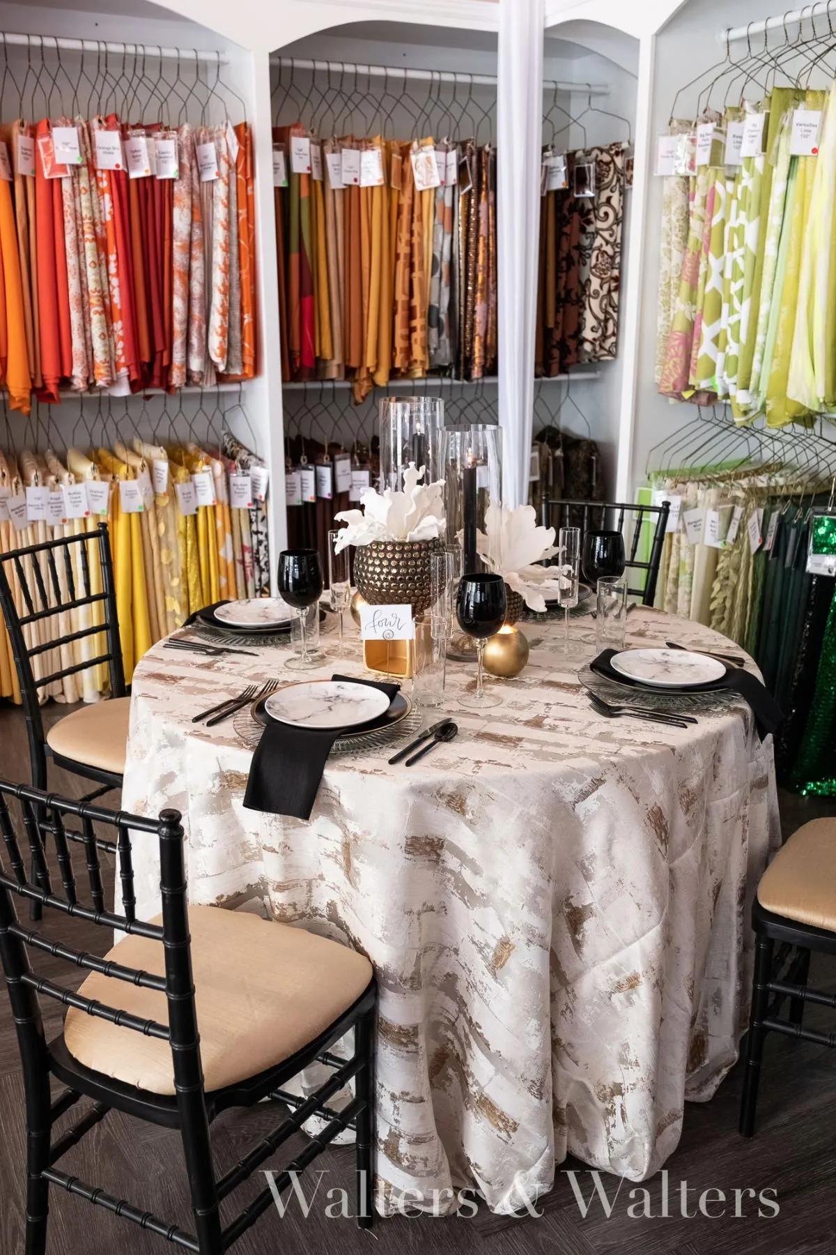
Once the linen direction is established, the remaining decisions should support it rather than introducing a second competing palette. Florals, tabletop pieces, paper goods, and lighting can each reinforce the wine-and-ruby story in a different way.
Coordinate Florals Without Matching Them Exactly
Burgundy florals on burgundy linens can work, but they need tonal separation. If the tablecloth is very deep, flowers that move through berry, dusty rose, mauve, blush, cream, or brighter red can create enough variation for the arrangement to remain visible.
Greenery can provide another layer of separation. Olive, sage, and deeper foliage tones complement red naturally while preventing a floral arrangement from becoming one solid block of burgundy.
For a patterned ruby linen, simplify the flower palette further. If the table already includes red, green, and blue, florals can concentrate on one of those families plus a neutral. The goal is to let the textile and arrangement communicate with each other without duplicating every color.
Use Candlelight to Add Warmth, Not More Color
Candles are especially effective in a burgundy fall tablescape because they add warmth without requiring another saturated hue. Clear glass, metallic holders, or neutral-toned vessels can introduce reflection and dimension while leaving the linen color intact.
Candle quantity and arrangement should respond to the centerpiece scale. If florals are low and expansive, narrow tapers or small votives can add height and variation. If the floral design is already tall or visually complex, simpler candle groupings may provide a cleaner counterbalance.
Mockups are particularly valuable here. Evaluating the linens, flowers, candles, dinnerware, and glassware together makes it easier to determine whether the table needs another layer or would benefit from removing one.
Choose Tabletop Finishes That Preserve Contrast
A saturated burgundy foundation can support several tabletop directions. Warm metallic accents can reinforce an autumnal atmosphere, while silver-toned or clear elements can make the palette feel sharper. Cream and ivory dinnerware lighten the surface, and transparent glassware introduces detail without covering large areas of the textile.
Black or very dark accents can add definition, but use them selectively when the linen is already deep. A dark tablecloth, dark chair, dark plate, and dark centerpiece vessel may leave too little contrast, especially in an evening venue.
For patterned linens, neutral tabletop pieces often offer the most flexibility. Their quieter surfaces let the print remain legible from both seated and room-wide perspectives.
Where to Use Burgundy Wedding Linens Across the Reception
A cohesive textile plan does not require every table to wear the same linen. Burgundy can move through the reception at different scales, creating continuity while still giving important moments their own identity.
Create a Burgundy Statement Table
A sweetheart or head table is a natural place for a saturated wine linen because the smaller application can have a strong visual effect. If the guest tables are dressed in ivory, taupe, or another neutral, the burgundy table immediately establishes hierarchy.
Connect that focal point back to the room with one repeated element. Burgundy napkins, a ruby floral note, or a patterned accent on selected guest tables is often enough. The repetition should be visible without making every surface identical.
This strategy is also useful when the room already includes significant architectural detail, colorful carpeting, dramatic walls, or elaborate lighting. Concentrating burgundy on one or two important tables can create seasonal depth while allowing the venue itself to remain part of the composition.
Use Burgundy Napkins as a Controlled Accent
Napkins offer one of the most precise ways to distribute color across a reception. Because they repeat at every seat, even a relatively small piece of fabric can create a clear rhythm through the room.
A wine napkin on a warm neutral tablecloth adds depth without overwhelming the table. A ruby stripe can introduce pattern on an otherwise understated surface. When the main tablecloth is patterned, a solid wine napkin can instead help calm the composition and repeat one of the print’s deeper tones.
Napkin placement also affects how much color appears in photographs and from across the room. A broad fold over the plate displays more burgundy, while a narrower fold or placement beside the setting makes the accent more restrained.
Mix Statement and Supporting Linens
For larger receptions, alternating textile roles can make the room feel intentionally layered. One table type might feature a burgundy or patterned linen while another uses a neutral base with ruby napkins. Long tables and rounds can also receive different treatments while sharing the same overall palette.
The important point is to establish a rule before mixing. For example, all rectangular tables might carry pattern while rounds remain solid, or focal tables might use Wine Casablanca while guest tables repeat ruby through napkins. A clear system creates variation without randomness.
When you coordinate fall wedding linens, florals, and tableware as one composition, these shifts in color and pattern become easier to control because each element has a defined visual role.
How to Keep a Burgundy Palette Refined
Burgundy can dominate a room quickly. The goal is not to reduce its impact, but to decide where that impact belongs so the wedding still feels dimensional and personal.
Leave Space Between Saturated Elements
If the linen is the primary burgundy statement, everything surrounding it does not need to be equally dark. Pale flowers, clear glass, warm neutrals, and open areas of the tabletop help distinguish individual design components.
The same principle applies across the room. Burgundy linens do not require burgundy draping, burgundy furniture, burgundy florals, and burgundy stationery simultaneously. Repeating the color in two or three deliberate places often creates a stronger visual identity than using it everywhere.
Let the Venue Influence the Shade
The same textile can feel different against a white tent, a wood-paneled interior, a bright conservatory, or a dark ballroom. Existing materials and colors should therefore be part of the linen decision from the beginning.
Warm wood and stone can reinforce the earthy qualities of wine tones. Pale architectural settings create stronger contrast. Rooms with existing red, purple, or patterned finishes require more careful comparison so the selected burgundy does not clash with permanent surroundings.
If possible, evaluate a swatch or complete sample within the event setting and under lighting similar to what guests will experience.
Limit the Number of Hero Elements
A strong tablescape usually benefits from a clear hierarchy. If a patterned ruby tablecloth is the main visual feature, the centerpiece, place setting, menu, and glassware can take supporting roles. If the florals are exceptionally colorful and sculptural, a solid wine linen may provide depth without introducing another pattern.
Deciding what should attract attention first also makes other choices easier. Each additional element can be evaluated according to whether it supports the focal point or competes with it.
Frequently Asked Questions
Are Burgundy Wedding Linens Only Appropriate for Formal Weddings?
No. Fabric, pattern, and surrounding colors influence formality as much as the shade itself. Wine velvet can feel rich and evening-focused, while a ruby stripe can create a lighter, more graphic look for an estate, tented, garden, or daytime reception.
What Colors Pair Well With Burgundy Wedding Linens?
Warm ivory, cream, taupe, mushroom, champagne, blush, dusty rose, muted green, and selected blues can all work with burgundy. The strongest combination depends on the burgundy’s undertone, the venue, florals, lighting, and the amount of pattern already on the table.
Should Burgundy Be the Tablecloth or an Accent Color?
Either approach can work. A full burgundy tablecloth makes the color foundational, while napkins or selected statement tables create a more restrained interpretation. The right scale depends on how much other color and pattern the reception already contains.
Can You Mix Wine and Ruby in the Same Wedding?
Yes. Wine and ruby can create useful tonal variation when they share a clear supporting palette. Use a consistent neutral or repeated accent to connect the shades, and avoid adding too many additional saturated reds with unrelated undertones.
Do Patterned Burgundy Linens Work With Colorful Florals?
They can, but one element should lead. With a multicolored or strongly patterned linen, florals often look more cohesive when they concentrate on a limited selection of shades from the textile rather than trying to reproduce the entire print.
How Do You Prevent Burgundy Tables From Feeling Too Dark?
Introduce contrast through lighter dinnerware, neutral flowers, transparent glassware, candlelight, pale stationery, or lighter surrounding tables. You can also use burgundy selectively through napkins or focal tables rather than covering every surface in the deepest shade.
Conclusion
Burgundy gives fall wedding tables a strong point of view, but its versatility comes from treating the color as a spectrum rather than a single formula. Wine velvet can bring saturated texture, ruby stripes can introduce graphic movement, and multicolored patterns can connect burgundy with greens, blues, and other elements already present in the wedding palette.
The most balanced burgundy wedding linens are styled with deliberate contrast. Decide where the deepest color should lead, give pattern enough room to be seen, and let florals, tableware, candles, and supporting neutrals reinforce rather than compete with the textile.
Curated Linen Collection currently offers Wine Casablanca, Ruby Stripe, Kathryn Ruby, and a broader range of luxury tabletop linens and accessories, with nationwide shipping available. Couples, planners, and designers can explore the linen collection, add preferred pieces to a quote, or contact the design team for guidance on a tailored linen plan.