
Fall corporate events do not need pumpkins, leaf motifs, or an orange-and-brown color scheme to feel appropriate for the season. For formal dinners, galas, awards events, and receptions, a more refined approach is often more effective.
Seasonality can come through deeper color, richer texture, considered pattern, and carefully placed accents. These details allow planners to acknowledge fall while preserving the polished character expected of a corporate event.
The strongest fall corporate event linens support the event’s existing visual direction rather than replacing it with a seasonal theme. By making a few deliberate shifts, planners can create a setting that feels warmer and more dimensional without allowing fall to dominate the design.
Start With the Existing Event Palette
A fall linen plan does not need to begin with a list of traditional autumn colors. In many cases, the event already has an established palette influenced by the company, creative direction, florals, or other design elements.
Instead of replacing those colors, planners can adjust their depth and supporting tones to make the overall setting feel more seasonal.
Deepen Colors That Are Already in the Design
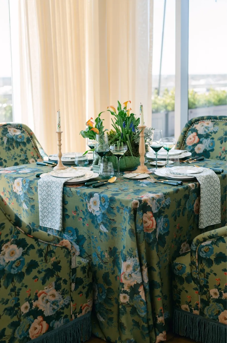
One of the simplest ways to move a corporate event into fall is to work with deeper versions of colors already present.
A lighter blue palette might shift toward navy or midnight blue. Green can move toward olive, moss, or forest tones. Soft neutrals can gain greater depth through taupe, mushroom, espresso, or warmer ivory.
This approach maintains continuity with the original event concept while giving the room more seasonal weight.
It can be especially effective for corporate events where a particular color family is already important. The planner does not need to abandon the established palette simply because the event takes place in fall.
Introduce Warm Accent Colors Selectively
Fall colors tend to feel more sophisticated when they are used with restraint.
Burgundy, rust, amber, plum, ochre, and deep green can all bring warmth into the linen plan, but they do not need to cover every table. A richer tone may appear through napkins, runners, select table linens, or another controlled textile detail. Oatmeal and terracotta can warm up a corporate palette without feeling overly themed; explore warm-neutral linen styling for fall.
Smaller placements allow the color to register as seasonal without turning it into the event’s entire identity.
This also gives planners more freedom to work with neutral, blue, black, cream, or other palettes that may better suit the company or event format.
Keep Corporate Colors in the Mix
Corporate events may already have colors associated with the company or program. Those colors can remain part of the design rather than being replaced with a standard fall palette.
The key is proportion.
A strong corporate color may work well as an accent against a deeper neutral or seasonal supporting tone. If the existing color is already dark or saturated, it may require very little adjustment for fall.
The goal is to make the event feel seasonally considered while still recognizable as the event the planner set out to design. Read more in Linen Zoning for Large Galas: A Planner’s Guide.
Use Texture to Create a Fall Feel Without Adding More Color

Color is not the only way to communicate seasonality. Texture can give a tablescape more depth and visual warmth even when the palette remains neutral or restrained.
This is particularly useful for sophisticated corporate events, where adding several seasonal colors may feel too decorative. You may also find Gala Linen Rentals: Transform Your Summer Corporate Events helpful.
Introduce Richer Textile Surfaces
Fall offers an opportunity to use linens with greater visual depth.
Velvet and other textural textiles can create a richer foundation for a formal dinner or evening reception. Even when used in a neutral shade, a more dimensional surface can make the table feel noticeably different from a lighter seasonal setting.
Planners can also use texture selectively. A richer treatment does not have to appear on every table to influence the overall atmosphere.
A few deliberate textile moments can be more effective than covering the entire room in one heavy treatment.
Use Texture to Add Interest to Restrained Palettes
Neutral fall tables do not need to feel plain.
When the palette consists primarily of ivory, taupe, charcoal, navy, or similar restrained tones, textile variation can provide the depth that might otherwise come from stronger color.
A textured table linen can create visual interest beneath clean tabletop elements, while a tactile napkin or runner can introduce a quieter seasonal detail.
This is a useful approach when planners want the room to feel warm and polished but not overtly autumnal.
Keep Rich Textures in Balance
Fall styling can become visually heavy when dark colors, dense textures, strong florals, and substantial tabletop pieces are all used together.
Planners should consider what each element is contributing before adding more textile detail.
If the primary linen already has a strong texture, supporting textile pieces may work better when they are simpler. If the room itself contains dark finishes or substantial décor, lighter or quieter linens can provide needed contrast.
The objective is depth, not weight.
Bring Fall Into the Design Through Pattern
Pattern provides another way to establish a fall mood without relying on recognizable seasonal imagery.
For corporate events, the most versatile patterns are often those that suggest richness, movement, or natural influence while remaining abstract enough to work beyond a literal theme. Read more in Best Event Linen Rentals for Outdoor Summer Weddings and Corporate Events.
Choose Seasonal Character Over Seasonal Motifs
A linen does not need printed leaves or harvest imagery to read as fall.
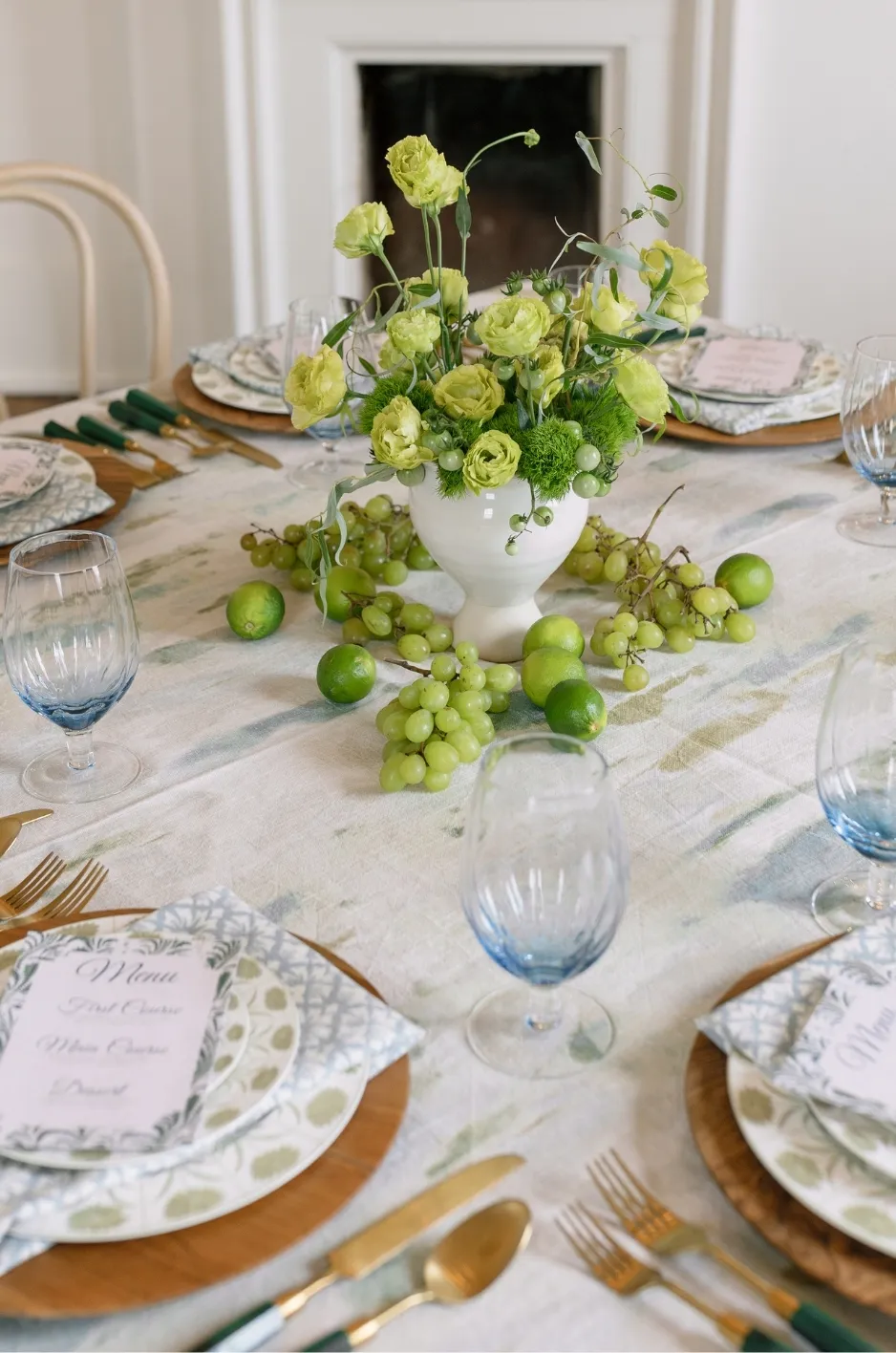
Abstract designs, refined botanical influences, geometric patterns, and painterly prints can feel seasonal through their palette and visual weight rather than through obvious imagery.
A pattern incorporating deep green, burgundy, muted gold, or warm neutral tones may provide enough seasonal direction on its own.
This keeps the design sophisticated and gives planners more freedom to coordinate the linen with the rest of the event.
Give Strong Patterns Space to Work
A distinctive patterned linen usually has more impact when it is not surrounded by several equally strong treatments.
If pattern is used across the guest tables, surrounding textile details can remain more restrained. If only select tables feature pattern, related solids can carry the palette through the rest of the room.
This creates variety while maintaining a clear design relationship between different areas.
The pattern should contribute to the fall atmosphere, not become something the rest of the event has to compete against.
Match the Pattern’s Energy to the Event
Not every corporate event needs the same level of visual expression. You may also find Corporate Summer Event Venue Linen Branding helpful.
A formal awards dinner may benefit from a more restrained pattern that adds depth without distracting from the program. A creative-industry reception may allow for a stronger or more expressive textile direction.
The event’s purpose should remain more important than the season.
Fall can shape the design language, but the linen still needs to make sense for the audience and format.
Adjust the Linen Plan to the Corporate Event Format
A corporate dinner, networking reception, and awards program all use the event space differently. The linen strategy should respond to those differences rather than applying one seasonal treatment to every type of event. For more detail, see our article Corporate Event Linen Rentals for Dinners & Award Nights.
This gives planners a more practical way to introduce fall where it will have the greatest visual effect.
Keep Seated Dinners Controlled and Refined
At a formal dinner, guests spend significant time at the table, so the linen becomes a major part of the immediate environment.
A deeper solid, restrained pattern, or richer texture can establish the fall direction without requiring extensive seasonal decoration.
For tables already carrying prominent florals or detailed tabletop pieces, the linen can remain quieter. When the tabletop is restrained, the textile may take on a stronger visual role.
The complete table should feel intentional rather than densely decorated.
Give Receptions More Visual Variation
Cocktail receptions often contain a greater mix of surfaces, including cocktail tables, bars, registration areas, and lounge-adjacent tables.
This creates opportunities to distribute the fall palette rather than repeating one linen treatment throughout the space.
A deeper accent might appear on cocktail tables, while a related neutral carries the bar or welcome area. Another coordinating textile can reinforce the palette elsewhere.
Using related treatments gives guests a consistent seasonal impression as they move through the event without making every surface identical.
Keep Program-Focused Events Visually Clear
For awards programs, presentations, or events with a prominent stage, the surrounding design should support rather than compete with the program.
Strong seasonal color or pattern may be better concentrated away from areas containing screens, signage, or presentation elements.
Guest tables can still bring fall into the room through color and texture, but the linen plan should preserve clear visual hierarchy.
The result feels seasonal without distracting from the purpose of the event.
Carry the Fall Direction Across the Event
A cohesive fall design should extend beyond the main dining tables, but that does not mean every surface needs the same linen.
Repeating a few selected seasonal cues is usually enough to make separate areas feel connected.
Connect Different Areas Through Color
A color introduced on guest tables can reappear elsewhere in a smaller way.
For example, a deep green used on dining tables might return through a runner on a welcome table. A burgundy napkin could connect with a related textile treatment in the cocktail area.
This type of repetition helps establish continuity without making the event feel overly coordinated.
Use Smaller Textiles to Extend the Seasonal Palette
Napkins and runners can carry the fall direction into areas where a full seasonal tablecloth would feel excessive.
This is particularly useful when the primary event palette is neutral. A richer accent textile can shift the overall impression without requiring major changes across every surface.
Curated Linen Collection’s range of table linens, napkins, runners, and specialty overlays gives planners several ways to distribute a seasonal textile direction according to the role of each table.
Let Different Surfaces Play Different Roles
The main dining tables may be the visual foundation, while a bar, welcome table, or cocktail area introduces a stronger accent.
Another event might reverse that relationship, keeping guest tables more expressive while allowing supporting surfaces to remain quiet.
There is no need to make every surface equally prominent. A stronger hierarchy can make the entire event feel more considered.
Know When the Design Has Enough Fall
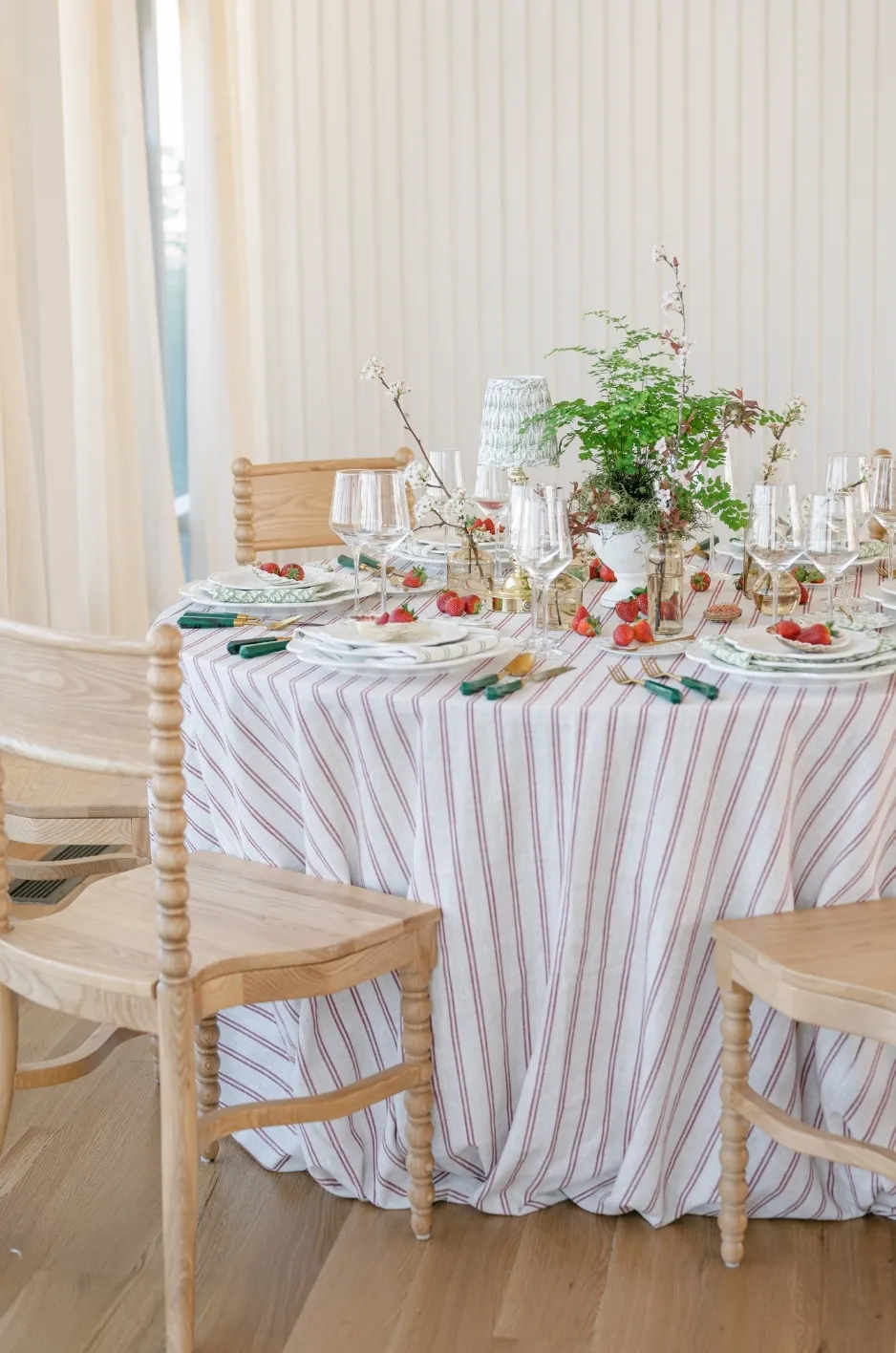
One of the most important parts of sophisticated seasonal design is knowing when to stop adding seasonal references.
If the linen palette, texture, florals, and lighting already establish a fall atmosphere, additional motifs and decorative cues may not improve the design.
Skip Literal Details When the Season Is Already Clear
Pumpkins, leaves, harvest motifs, and other familiar autumn symbols can quickly shift a formal corporate event toward a themed look.
They are not necessary when the palette and materials already create a clear seasonal impression.
A deep textile, warm floral palette, and considered use of texture may communicate fall more effectively than several literal references combined.
For a polished corporate setting, suggestion is often stronger than repetition.
Balance Deep Colors With Visual Relief
Fall palettes can become heavy when every surface uses dark, saturated, or warm colors.
Introduce lighter neutrals or quieter textile moments where the room needs visual relief. Ivory, soft taupe, muted stone, or another restrained tone can give deeper colors more presence by creating contrast around them.
This is especially important in venues that already contain dark flooring, wood finishes, or low lighting. To refine visibility and contrast across a formal room, see how to use color contrast in formal fall event linens.
A fall setting can feel warm without feeling visually dense.
Keep the Event Identity More Important Than the Season
The final room should still feel appropriate for the company and the reason guests are gathering.
If a design choice feels seasonal but does not fit the tone of the corporate event, it is probably unnecessary.
The best fall styling supports the event rather than becoming the event. Color, texture, and pattern should create an atmosphere that feels timely and intentional while allowing the program, company, and guest experience to remain central.
Frequently Asked Questions
What Colors Work Well for Fall Corporate Events?
Burgundy, deep green, plum, navy, rust, chocolate, taupe, and warm neutrals can all work well. Choose colors that also fit the event’s existing palette and level of formality.
Do Fall Event Linens Need to Be Dark?
No. Light and neutral linens can still feel appropriate for fall when paired with richer texture, deeper accents, seasonal florals, or warm tabletop details.
Can Corporate Colors Be Used for a Fall Event?
Yes. Keep the relevant corporate colors and introduce fall through supporting shades, richer tones, or texture rather than replacing the established palette.
How Can a Corporate Event Feel Like Fall Without Using Orange?
Use deep green, burgundy, plum, navy, chocolate, warm neutrals, rich texture, or subtle pattern. Fall does not depend on orange or other traditional autumn colors.
Should Every Table Use the Same Fall Linen?
No. Different tables can use related solids, patterns, napkins, or runners as long as the colors and overall design direction remain connected.
Create a Fall Setting That Still Feels Refined
Sophisticated fall event design is less about adding seasonal décor and more about changing the depth and character of the room. A richer palette, considered texture, well-placed pattern, and controlled repetition can establish fall without making a corporate event feel themed.
For planners, the most effective approach is to begin with the event’s existing identity and add seasonal cues only where they strengthen the design. This keeps the room appropriate for the company and occasion while still giving it a distinct fall atmosphere.
Curated Linen Collection offers patterned and solid table linens, napkins, runners, specialty overlays, and custom textile options that give planners flexibility to create a polished fall linen direction for sophisticated corporate events. For help choosing linens for your event, request a quote.