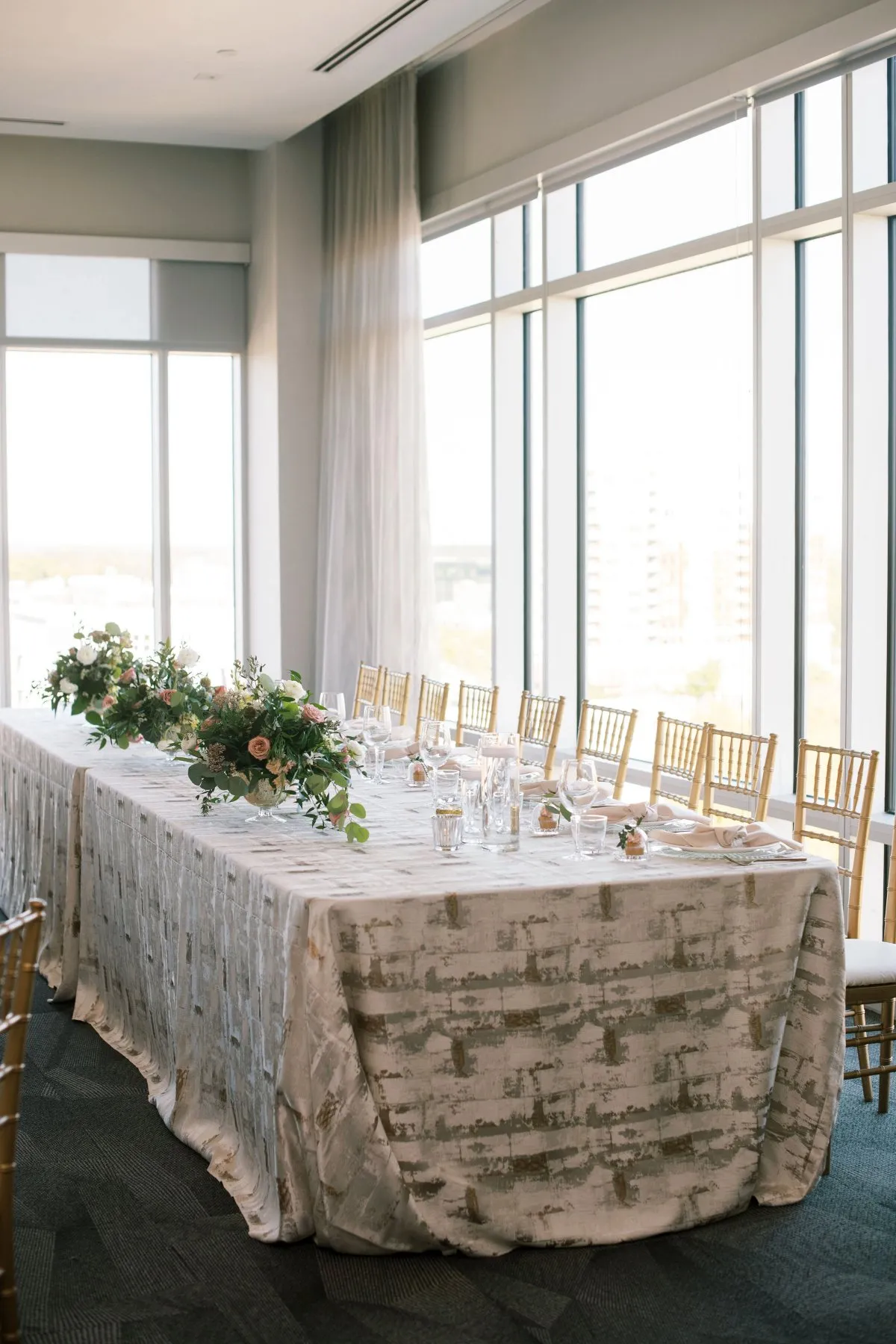
Choosing the main table linen establishes an important part of the event design, but it does not finish the table. The napkin, charger, china, menus, place cards, florals, and other details still need to work with that textile rather than compete with it.
The most effective approach is to treat the selected linen as the visual anchor. Once planners understand what it already contributes through color, pattern, texture, or finish, the remaining decisions become easier to refine. A polished event linen design does not require adding more detail at every step; instead, it depends on knowing where contrast is needed, where color should repeat, and where simplicity will strengthen the overall setting.
Start With What the Main Linen Already Adds
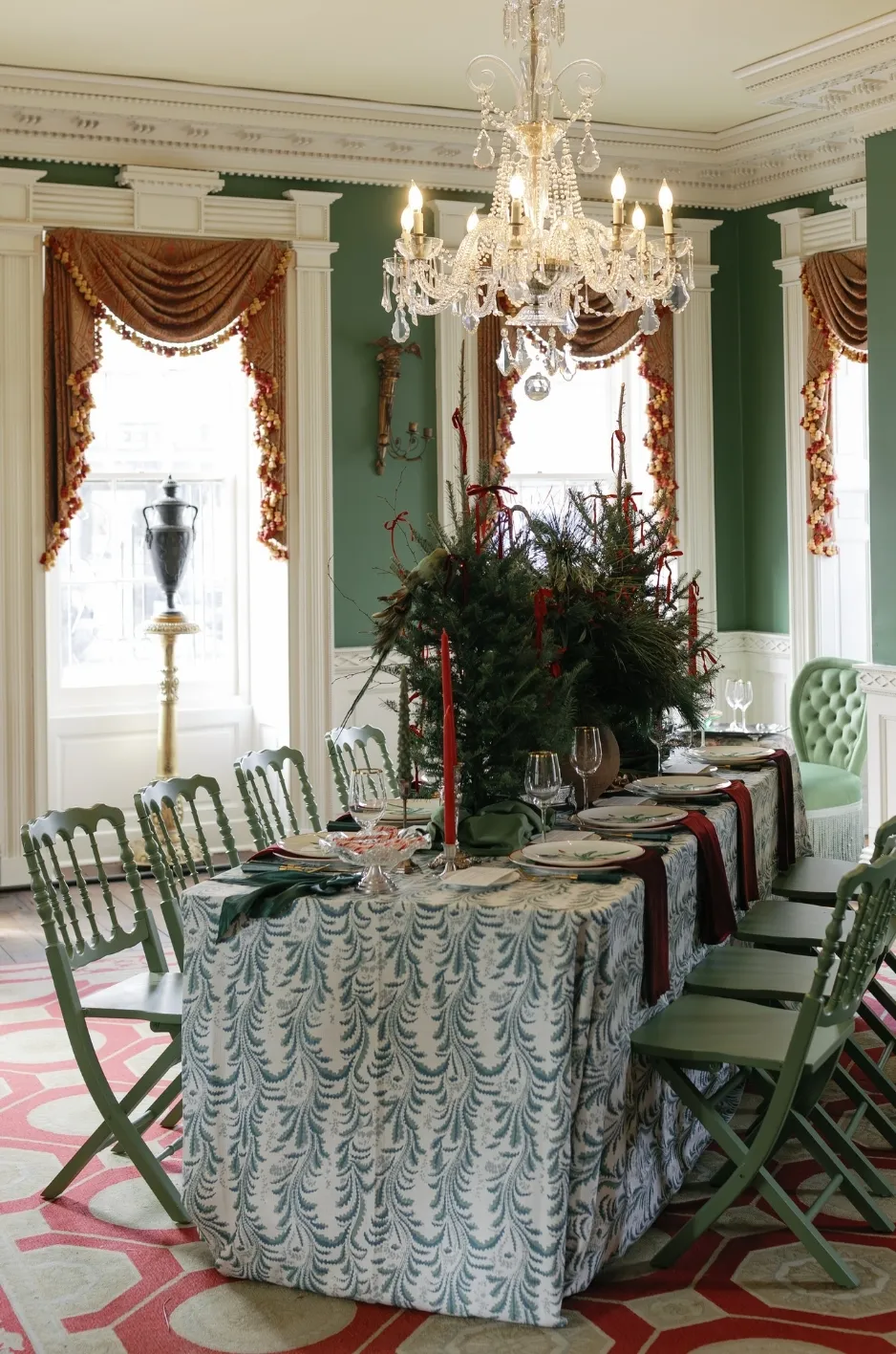
Before selecting the remaining details, consider what the tablecloth is already doing visually. A bold patterned linen creates a very different starting point from a restrained solid or a linen with subtle texture, so understanding that difference helps determine how much more the place setting actually needs.
Identify the Linen’s Strongest Feature
Begin by identifying what stands out most about the linen, whether that is its color, pattern, texture, or overall depth.
If pattern is already the strongest feature, there may be little reason to introduce another prominent print through the napkin or paper details. When the linen is a quiet solid, however, the place setting may have more room for contrast, texture, or pattern elsewhere.
Decide Whether the Setting Needs More or Less Detail
A strong linen does not need several other statement elements around it. When the tablecloth already carries significant visual weight, supporting pieces such as napkins, chargers, or menus can remain quieter and allow the primary textile to stand out.
A more understated linen creates different opportunities. Planners may have room to introduce a deeper napkin color, a subtle pattern, or a distinctive edge detail without making the table feel overly decorated.
Keep the Main Linen as the Reference Point
Once the tablecloth is confirmed, the remaining selections should relate back to it. That does not mean everything needs to match, but each piece should make sense beside the linen rather than introducing an unrelated design direction late in the process.
Using the main linen as a consistent reference point also makes it easier to edit the table as other elements are added.
Choose a Napkin That Supports the Linen
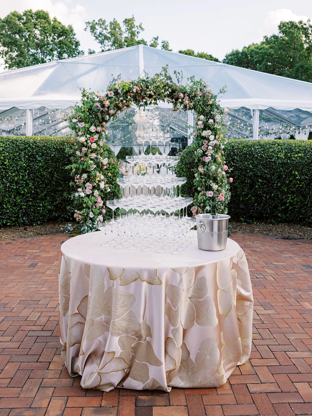
The napkin is one of the most important textile decisions after the tablecloth because it sits directly within the place setting and repeats at every seat.
Depending on the design, it can reinforce the established palette, introduce useful contrast, or add a smaller-scale detail without changing the overall linen direction.
Use a Solid Napkin With a Strong Patterned Linen
When the tablecloth already features a noticeable pattern, a solid napkin can provide needed balance. Choose a tone that appears within the pattern or naturally complements the broader event palette so the napkin feels connected without introducing another competing print.
This approach allows the table to remain layered while keeping the main pattern easy to appreciate.
Add More Interest When the Main Linen Is Simple
A solid or understated tablecloth gives the napkin more freedom to contribute visually. A richer color, subtle print, or refined edge detail can add interest at the center of the setting without overwhelming the larger table surface.
This is particularly useful when planners want to give a restrained linen plan more dimension without adding another full layer to the table.
Pull From the Linen Without Matching It Exactly
The napkin does not need to be the same color as the tablecloth. A secondary tone from a patterned linen, or a lighter, deeper, or warmer version of the main color, can create a more considered relationship.
Exact matching can sometimes make the place setting feel flat, while slight tonal variation introduces depth and makes the separate textile elements easier to distinguish.
Create Enough Contrast Around the Place Setting
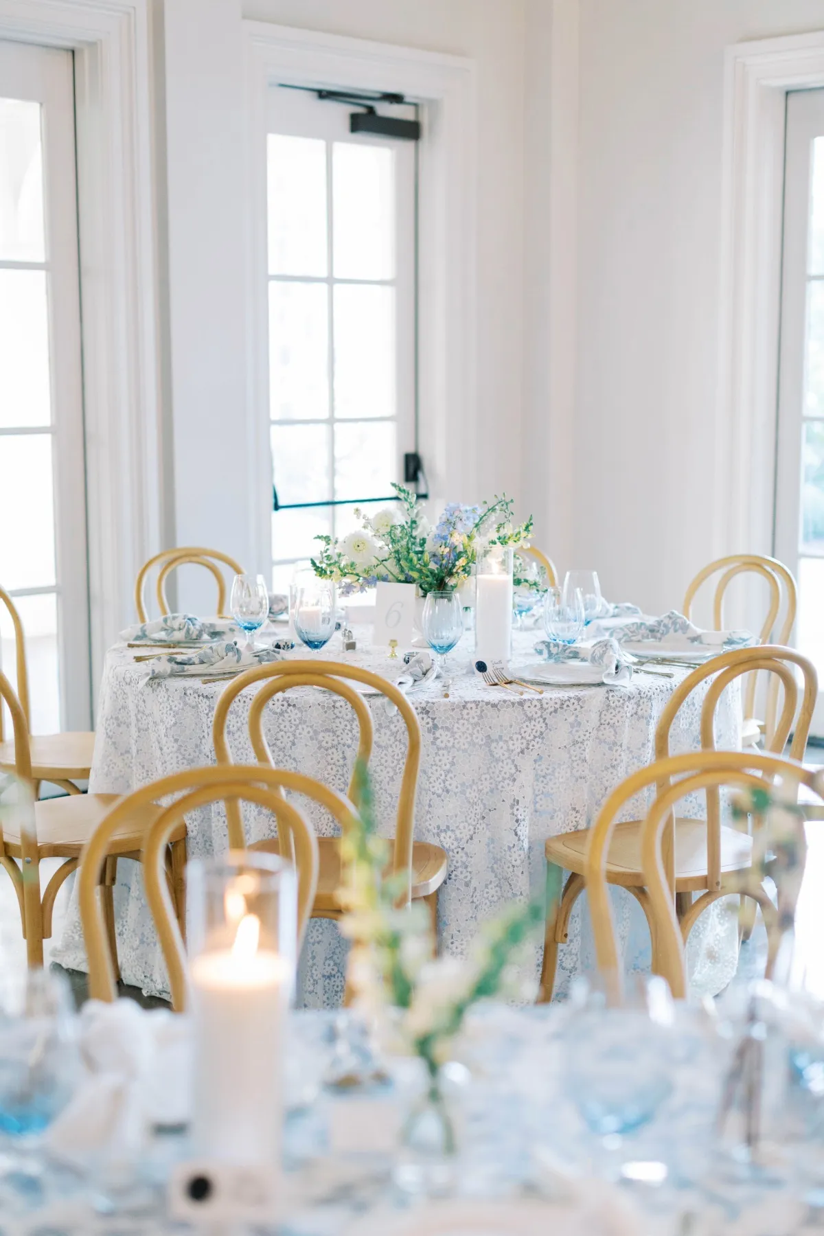
Contrast helps the individual components of the table remain visible. When the linen, charger, plate, and napkin are too similar in color or finish, the setting can lose definition even when each piece is attractive on its own.
The aim is to create enough separation for the place setting to read clearly without introducing colors or finishes that feel disconnected from the established palette.
Check How the Charger Reads Against the Linen
Because the charger creates one of the largest visual breaks between the tablecloth and dinnerware, its relationship with the linen deserves careful attention.
Make sure the charger remains distinct enough from the table surface to frame the setting clearly. The contrast does not have to be dramatic; a shift in depth, temperature, texture, or finish may provide enough separation.
Use the Napkin to Break Up Similar Tones
When the tablecloth and china fall within a similar color family, the napkin can introduce useful definition. A deeper textile against a pale linen, or a lighter napkin against a dark tablecloth, can separate the layers of the place setting while preserving a cohesive palette.
This approach works especially well with tonal or monochromatic designs where contrast needs to come from subtle variations rather than entirely different colors.
Avoid Contrast That Feels Disconnected
Adding contrast should not mean introducing an unrelated accent simply to make the setting more dramatic. A contrasting napkin or tabletop detail should still relate to the linen, florals, tabletop finishes, or broader event palette.
If a color stands out because it appears nowhere else within the design, it may make the table feel less cohesive rather than more interesting.
Decide Where the Napkin Should Sit
Napkin placement affects how much of the textile is visible and how strongly it contributes to the finished setting. The right choice depends on the napkin design as well as the other pieces that need to share the place setting.
Place It on the Plate When the Napkin Should Be Seen
An on-plate placement works well when the napkin contributes an important color, pattern, or edge detail. Because it sits near the center of the setting, the textile becomes more visible and can help connect the plate, charger, and main table linen.
When the surrounding design already contains significant detail, keeping the fold simple can prevent the napkin from becoming another competing decorative element.
Place It Beside the Setting for a Cleaner Plate Presentation
A side placement may be more effective when decorative china, a charger, menu, or another tabletop feature deserves greater visual attention. Moving the napkin away from the center of the plate also creates more open space within the setting.
This can work particularly well when the table already includes several layered elements and the planner wants a cleaner overall presentation.
Consider the Final Setting Before Choosing the Fold
The napkin fold should support the available space and the visual direction rather than becoming a decorative feature simply for the sake of complexity.
If the table linen or tabletop already contains strong pattern, a clean fold may be all that is needed. More structured treatments can work when the surrounding setting is quieter and there is room for the napkin itself to have greater presence.
Account for Menus, Place Cards, and Paper Details
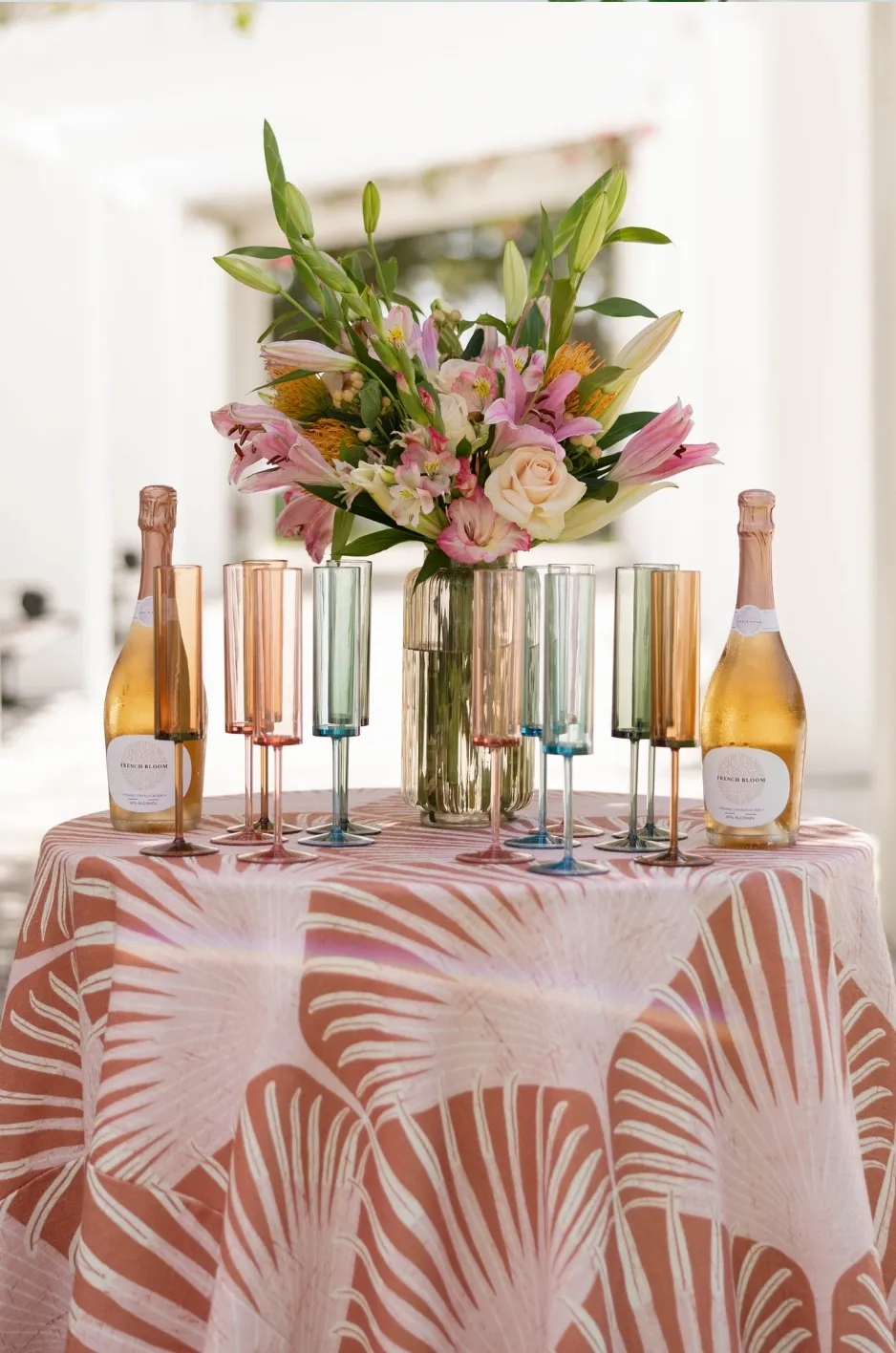
Menus and place cards occupy a relatively small area, but they still add color, typography, and visual detail to the place setting. For that reason, they should be reviewed alongside the linen and napkin rather than introduced only after the textile decisions are complete.
Keep Printed Details Easy to Read
A menu placed over a patterned napkin or highly detailed plate can quickly become difficult to read. If printed pieces are an important part of the setting, give them a sufficiently clean background or adjust their placement so the typography remains clear.
The printed elements should feel integrated into the place setting without disappearing into the surrounding pattern.
Let Paper Pieces Support the Existing Palette
Menus and place cards can reinforce colors that are already present rather than introducing another major direction. A neutral paper stock, restrained border, or subtle accent color may be enough to connect the paper pieces with the linen plan.
This keeps the table visually cohesive while preventing small details from introducing unnecessary colors.
Avoid Stacking Too Many Decorative Elements
A plate does not automatically need a napkin, menu, place card, decorative object, and additional accent layered together. When several pieces occupy the same small area, the center of the setting can become visually crowded.
If that happens, remove the least important element and reassess the arrangement. A clearer composition usually feels more polished than one in which every available detail has been included.
Decide Whether the Place Setting Needs Another Textile Detail
Once the tablecloth and napkin are established, planners should pause before adding runners, overlays, or other fabric elements. Additional textiles can be effective, but they should solve a clear design need rather than simply add another decorative layer.
Add Another Textile Only When It Improves the Design
A runner or overlay can be useful when the table needs more contrast, texture, or hierarchy. If the setting already feels balanced, however, another textile may create more visual activity without contributing anything meaningful.
Evaluating the table before adding another layer helps keep the final design intentional.
Skip Extra Layers When the Linen Already Has Strong Presence
Patterned, richly colored, or highly textured tablecloths often require fewer supporting textiles. Adding an overlay or runner can obscure the feature that made the primary linen effective in the first place.
When the main tablecloth already provides enough interest, allowing it to carry the design can create a stronger result than continuing to add layers.
Keep Supporting Details Secondary
If additional textiles are used, they should remain clearly secondary to the main linen. A runner, napkin, or smaller accent may introduce another tone or texture, but it should still allow the tablecloth to remain visually understandable.
This hierarchy helps the table feel layered without making every textile compete for attention.
Review the Full Place Setting With Florals and Tabletop Pieces
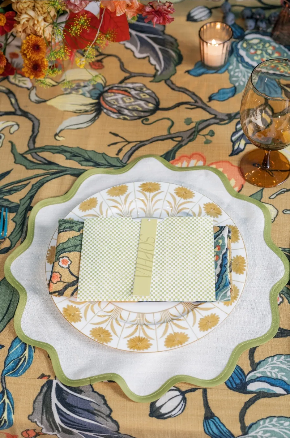
A linen combination can look balanced on its own and feel very different once florals, glassware, flatware, china, and other elements are introduced. Reviewing the completed setting is therefore an important final step before selections are confirmed.
Check the Balance of Pattern
If the tablecloth, napkin, china, and floral vessels all contain visible patterns, the setting may need editing. Decide which pattern should carry the strongest visual role and simplify another element where necessary.
This allows the table to retain personality without asking several decorative elements to compete for attention.
Review the Amount of Color
Look at the linen, napkin, florals, glassware, and printed details together to determine whether the palette still has a clear hierarchy.
If several saturated colors appear with equal prominence, some may need to become smaller accents. A controlled palette often makes the individual colors that remain feel more deliberate.
Watch the Amount of Shine and Texture
Metallic chargers, polished flatware, decorative glassware, tactile linens, and detailed florals all contribute visual weight in different ways. When several of these elements are emphasized at once, the setting can become dense even if the colors themselves are restrained.
In those cases, simplifying the napkin or another textile detail can restore balance without requiring major changes elsewhere.
Step Back Before Finalizing the Place Setting
The final design needs to work both at close range and when repeated across the room. Small choices that appear subtle on a single table can become much more prominent once they appear at every seat.
Review the Table From Guest Height
Look at the setting from the position guests will actually experience it and check whether the napkin, menu, china, and linen remain visually clear.
A tabletop can appear very different from seated height than it does when viewed directly from above, so this perspective can reveal problems that are easy to miss during sample reviews.
Check What Repeats Across Every Place Setting
A brightly colored napkin may feel like a small accent on one table, but repeated across 100 or more seats, it can become one of the dominant colors in the room.
The same applies to menus, chargers, glassware, and other repeated details. Consider their cumulative visual effect before making the final decision.
Remove Anything That Does Not Strengthen the Design
If an element does not improve contrast, cohesion, function, or the overall visual direction, it may not need to remain.
A polished place setting should feel complete rather than crowded, and the final edit is often what allows the strongest design decisions to stand out clearly.
Frequently Asked Questions
Should the Napkin Match the Tablecloth?
No. The napkin can coordinate through color, pattern, or tone without matching the tablecloth exactly.
What Napkin Works Best With a Patterned Linen?
A solid napkin in a color pulled from the pattern is often an effective way to add contrast while keeping the table balanced.
Can the Napkin Be Patterned if the Tablecloth Is Solid?
Yes. A patterned napkin can introduce interest when the main linen is more restrained, provided it still works with the overall palette.
Should the Napkin Go on the Plate or Beside It?
Either placement can work. Choose based on how visible the napkin should be and how much space menus, china, or other details need within the setting.
How Do I Know if the Place Setting Has Too Much Detail?
If the linen, napkin, china, menu, florals, and accessories all compete for attention, simplify one or two supporting elements and reassess the table.
Finish the Table Without Overworking It
Once the main table linen has been selected, the remaining decisions should refine that choice rather than compete with it. The right napkin, enough contrast, thoughtful placement, and a careful final edit can make the place setting feel complete without introducing unnecessary decoration.
Curated Linen Collection offers table linens, napkins, runners, specialty overlays, and coordinating textile options that give planners flexibility to build a refined setting around an established linen direction. When each element has a clear role, the finished table can feel detailed and distinctive without becoming overworked.