
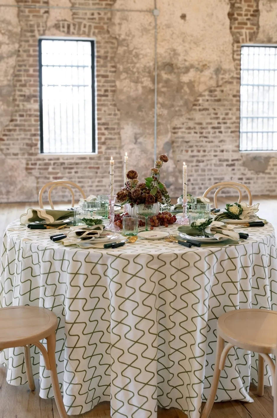
A linen plan can look successful piece by piece and still feel overwhelming once the full event comes together. A patterned tablecloth may be beautiful on its own, the napkin may work with the palette, and the runner may add texture, but when those elements are combined with florals, chargers, glassware, and other décor, the table can lose its visual clarity.
For event planners, the answer is usually not to start over. A stronger approach is to identify what should lead the design and then simplify the elements competing with it.
Thoughtful event linen design depends on hierarchy. The strongest textile choices should have room to stand out, while supporting linens help connect the overall look without demanding the same level of attention.
Recognize When the Linen Plan Is Doing Too Much
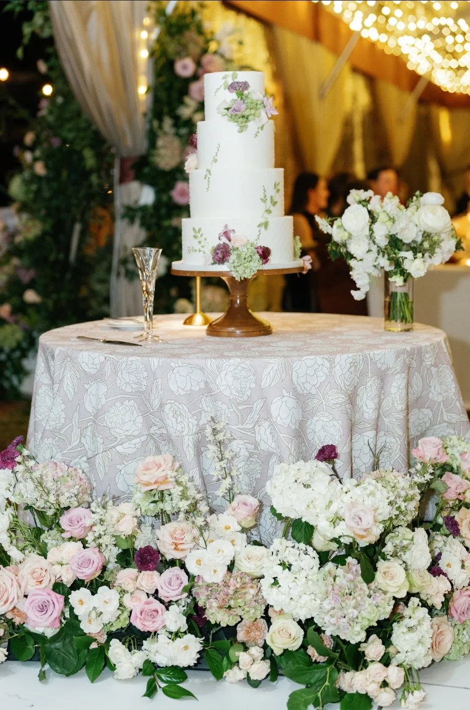
An overworked linen plan is not always obvious during the selection process. Many decisions are made separately, so the design may only begin to feel crowded once multiple fabrics, colors, and tabletop elements are viewed together.
The first step is to look at the full composition and identify where too many elements are competing for attention.
Too Many Patterns Compete at Once
Pattern creates visual movement, but several bold patterns in the same setting can make the design difficult to read.
A patterned tablecloth, printed napkin, decorative runner, and another strong textile nearby may each work independently, but together they can create too many focal points.
Look at which pattern contributes most clearly to the event’s design direction. The remaining patterns should either support it or be simplified.
Too Many Colors Lack a Clear Hierarchy
A broad palette can work when some colors clearly lead and others appear as accents.
Problems arise when every color receives the same visual weight. If several saturated shades are repeated across table linens, napkins, florals, and décor, the room may begin to feel disconnected rather than layered.
Identify the main colors first, then decide which tones should appear more selectively.
Every Table Is Trying to Be a Focal Point
Not every surface needs a statement treatment.
When guest tables, cocktail tables, bars, welcome tables, and specialty surfaces all use expressive linens, there is little visual hierarchy left in the room.
Some areas should naturally be quieter. Allowing certain tables to support rather than lead the design makes the stronger textile moments more effective.
Decide What Should Lead the Design
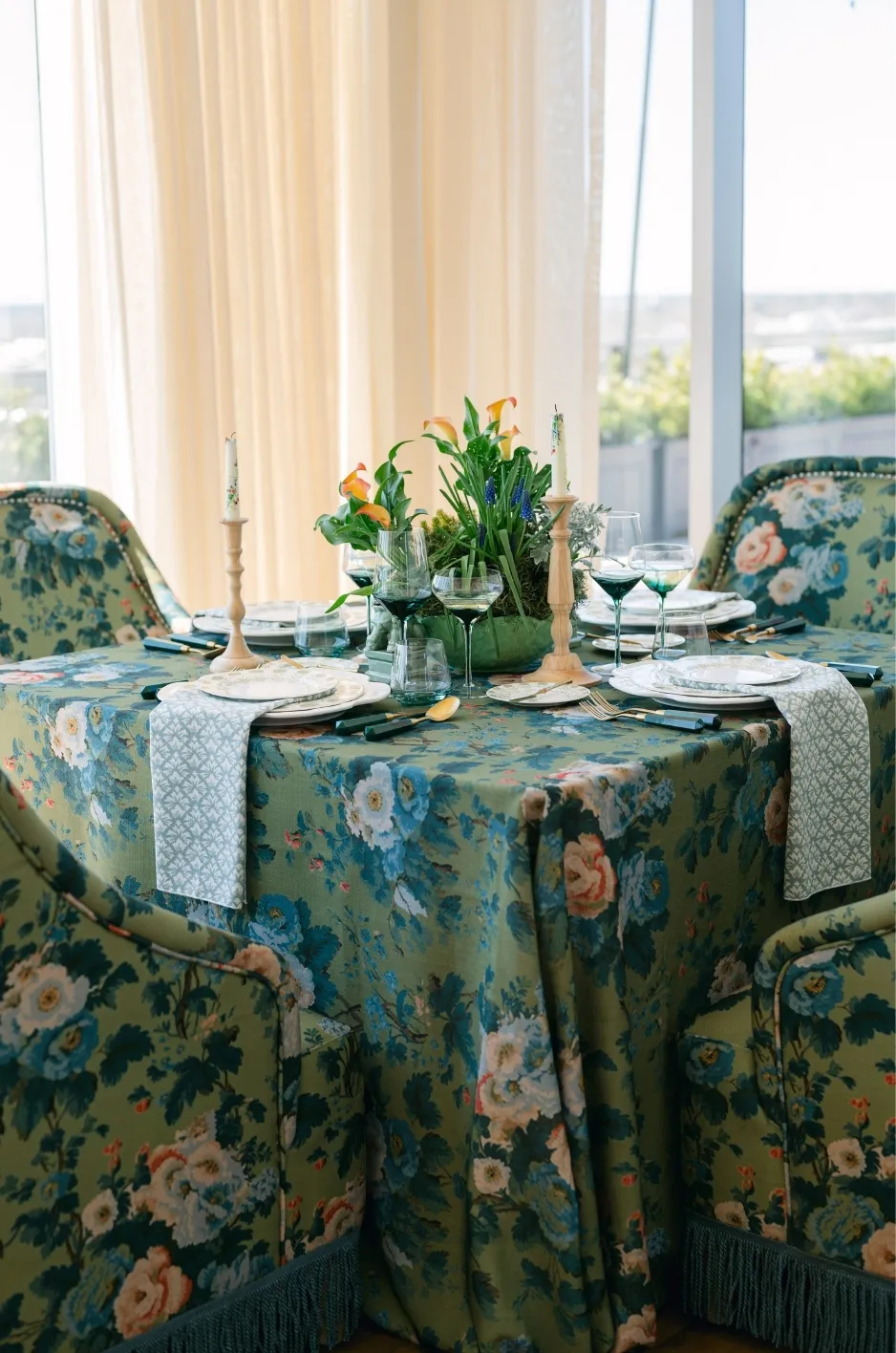
Once the linen plan feels too busy, determine which element deserves the strongest visual role.
This decision makes the editing process much easier because every other textile can then be judged by whether it supports or competes with that main idea. A useful first step is to separate the statement linen from the foundation linen before refining colors and accessories.
Identify the Most Important Linen Moment
Start with the linen or table treatment that best represents the event. It may be a distinctive patterned guest-table linen, a richly textured head table, or a particular textile that already anchors the overall palette. For more detail, see our article Sweetheart and Guest Table Linen Coordination Guide.
That selection should become the reference point for the rest of the linen plan.
Protect the Strongest Selection
Once the main linen moment is clear, avoid surrounding it with several equally strong choices.
If a patterned tablecloth is meant to be the focal textile, nearby napkins, runners, or supporting tables may work better in quieter colors or textures.
Simplifying the surrounding elements does not weaken the design. It gives the strongest selection more presence.
Let Supporting Linens Stay Supporting
A solid table linen, simple napkin, or restrained runner can still be an important design choice. Supporting textiles help establish rhythm, repeat key colors, and give the eye somewhere to rest.
They do not need to make the same statement as the event’s most expressive linens.
Reduce Pattern Without Making the Design Flat

Pattern is often the first place a linen plan becomes too busy, but removing every print can make the design feel overly restrained. The goal is to edit pattern strategically rather than eliminate it.
Keep the Pattern That Matters Most
Choose the pattern that contributes most directly to the event’s visual identity. Consider where it appears, how visible it will be, and how strongly it interacts with the rest of the room. You may also find Luxury Table Linens for Seasonal Events: What to Choose helpful.
Once that pattern is established, reduce other prints that compete with it rather than adding more variation for interest alone.
Replace Secondary Patterns With Solids
Solid linens can create useful visual rest around a stronger print. Pulling a color from the main pattern into a solid tablecloth, napkin, or runner keeps the design connected while reducing visual competition.
This is especially effective when several tables or event areas need to feel related without repeating the same patterned linen everywhere.
Use Smaller Pattern Moments Where Needed
Additional pattern can still be introduced on a smaller scale. A napkin or runner may provide enough movement without requiring another full patterned tablecloth. This allows planners to maintain personality while keeping the strongest print clearly identifiable.
Scale matters as much as the number of patterns being used.
Simplify the Color Palette
A linen plan can feel crowded even when pattern is limited. Too many equally strong colors can make the room visually fragmented, particularly when those colors also appear in florals, glassware, lighting, or other décor.
Separate Main Colors From Accent Colors
Identify the two or three colors that should define the event. Everything else should support those tones rather than compete with them.
Accent colors can still appear, but they are usually more effective when used through smaller textile details rather than across several major surfaces.
Remove Colors That Appear Only Once
An isolated color can make the design feel accidental. If a shade appears on only one table or textile and has no relationship to the rest of the event, consider removing it or repeating it intentionally elsewhere.
Every color does not need to appear in equal amounts, but it should have a reason for being part of the palette.
Use Neutrals to Create Visual Rest
Neutral linens can provide relief between stronger colors and patterns. Ivory, taupe, soft gray, black, navy, and other restrained tones can help anchor the room and make more expressive textiles feel deliberate rather than overwhelming. For more detail, see our article Popular Wedding Table Linen Colors to Elevate Your Event.
A neutral surface can be especially useful when the surrounding florals or tabletop pieces already introduce significant color. For a more systematic check, compare color, texture, and finish in one balanced linen plan before adding or removing pieces.
Edit Napkins, Runners, and Overlays Before Changing Everything

When the primary table linens are working, the smaller textile details may be creating the excess visual activity.
Before replacing the main linen, review the napkins, runners, overlays, and other secondary pieces.
Simplify the Napkin Treatment
Napkins are highly visible because they appear at every place setting. If the tablecloth already contains strong pattern or color, the napkin may work better as a simple connector rather than another statement.
A solid napkin pulled from the main palette can often create more cohesion than introducing an additional pattern.
Remove a Runner or Overlay That Adds No Clear Value
Layering should serve a purpose. A runner or overlay may add useful contrast, texture, or emphasis, but if the table already has enough visual detail, another textile layer can make the setting feel crowded.
Temporarily remove it and compare the result. If the table feels clearer without it, the extra layer may not be necessary. You may also find How to Layer Linens for Visually Striking and Dimensional Table Settings helpful.
Repeat One Small Detail Instead of Several
One recurring textile detail can be more effective than several competing accents.
A consistent napkin color, runner treatment, or subtle texture can connect different tables without requiring each one to carry multiple decorative elements. Selective repetition creates cohesion with less visual noise. You may also find Luxury Event Linen Color Ideas for Stunning Events helpful.
Check What the Rest of the Tablescape Is Adding
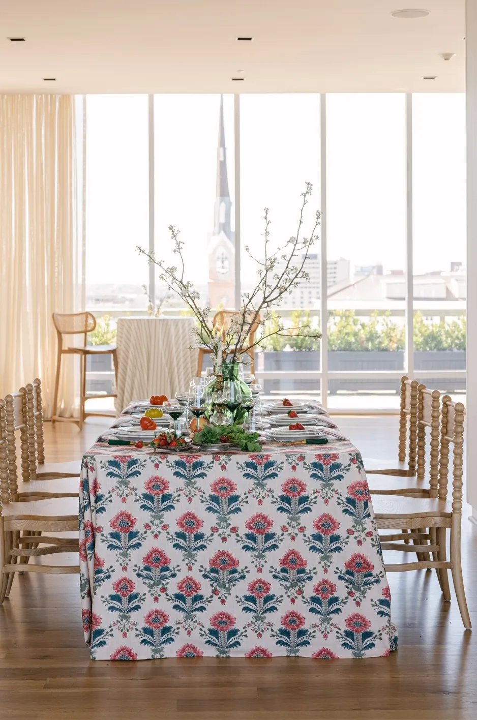
Sometimes the linen plan only feels busy because the rest of the table is already highly detailed.
Florals, chargers, china, glassware, candles, and other tabletop pieces can add enough color, pattern, texture, and shine that the linens need to become quieter.
Review the Linen With the Full Tabletop
Do not judge the linen in isolation. Place it alongside the confirmed china, chargers, flatware, glassware, and other tabletop elements whenever possible.
A textile that feels understated on its own may become much stronger once the complete place setting is added.
Account for Strong Florals and Centerpieces
Large florals, saturated colors, or highly textural centerpieces naturally attract attention. When those elements already carry significant visual weight, a quieter linen can help the table feel balanced.
If the floral design is restrained, there may be more room for pattern or stronger color in the textile.
Watch for Repeated Shine, Pattern, and Saturated Color
Visual overload often comes from several different types of intensity appearing together.
A patterned tablecloth, metallic charger, colored glassware, bold floral arrangement, and high-contrast napkin can create more competition than intended.
Consider whether each element needs to be expressive or whether one can become more supportive. Where contrast is the issue, use color contrast in formal fall event linens to refine the light/dark relationship.
Create More Visual Rest Across the Room
Even if individual tables look balanced, the full room can still feel crowded when strong treatments are repeated too closely together. Visual rest gives the eye space between more expressive linen moments.
Alternate Expressive and Restrained Areas
A patterned table may feel stronger when surrounded by quieter surfaces.
Related solid linens can help break up repeated pattern while keeping the palette consistent.
This creates a more deliberate rhythm across the event rather than making every table equally active.
Avoid Concentrating Every Strong Element in One Sightline
Review the room from the entrance, stage, dance floor, and other important viewpoints. If several patterned or deeply saturated tables are visible together, the room may feel heavier than expected.
Redistributing or simplifying some treatments can create better balance across the space.
Let Some Surfaces Remain Simple
Not every cocktail table, bar, welcome table, or specialty surface needs its own pattern or accent.
A simple linen can still feel intentional when it supports the surrounding design. Allowing some areas to remain restrained helps the event’s strongest textile moments feel more important.
Review the Design From Near and Far
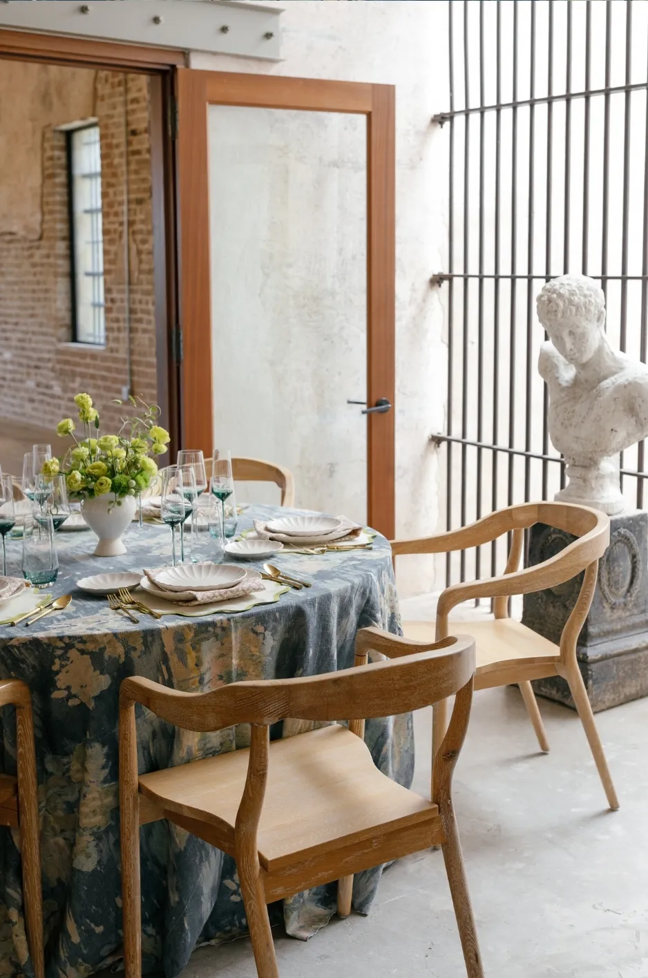
A successful linen plan should work both at the individual table and across the full room. What feels balanced in a small sample may become much stronger once repeated dozens of times.
Start With the Individual Table
Look at how the linen, napkin, florals, tabletop, and other details interact. Ask which element attracts attention first and whether that reflects the intended hierarchy.
If several elements compete immediately, simplify one before adding anything else.
Step Back and Look Across Multiple Tables
Repetition changes visual impact. A color that seems subtle on one napkin may become prominent across hundreds of place settings. A patterned linen that feels controlled on one table may dominate when repeated throughout the room.
Review the design at scale before making final decisions.
Remove One Element at a Time
Editing is easier when changes are made gradually. Temporarily remove one pattern, runner, napkin treatment, or accent and compare the result.
If the design becomes clearer without it, that element may not be contributing enough to justify its place.
Know When the Linen Plan Is Finished
Editing should create clarity without removing the personality that made the original concept interesting.
The goal is not minimalism. It is a design in which every textile has a clear purpose.
Check That the Main Idea Is Easy to See
The strongest color, pattern, or textile direction should be recognizable without explanation. If the main idea is difficult to identify, too many supporting elements may still be competing with it.
A clear focal direction helps the rest of the room feel more intentional.
Make Sure Variation Still Has a Purpose
Different linen treatments can add dimension when each one serves a specific role. Variation may distinguish focal tables, create rhythm across the room, or introduce a secondary color.
If two treatments accomplish the same thing, one may be unnecessary.
Stop Adding Once the Design Feels Balanced
More detail does not automatically make a linen plan stronger. Once the main textile direction is clear, the supporting colors feel connected, and the room has enough visual rest, additional elements may only add complexity. A balanced design should feel complete without needing every possible accent.
Frequently Asked Questions
How Many Linen Patterns Are Too Many?
There is no fixed number. If several strong patterns are visible together and compete for attention, simplify the mix.
Should Every Table Use the Same Linen?
No. Different linens can work together as long as they share a clear color or design relationship.
What Should I Simplify First?
Start with smaller elements such as napkins, runners, overlays, or secondary patterns before changing the main linen.
Can I Mix Patterned and Solid Linens?
Yes. Solid linens can balance stronger patterns and create useful visual rest across the room.
How Do I Know When the Design Is Balanced?
The main textile or design feature should be easy to identify, while the supporting elements add interest without competing with it.
Edit the Linen Plan Without Losing Its Personality
A busy linen plan does not necessarily need to be rebuilt. In many cases, the strongest design is already there; it needs only more room to be seen.
By identifying the main textile moment, reducing competing patterns and colors, simplifying secondary details, and creating visual rest across the room, planners can preserve the original character of the event while making the full design feel more polished.
Curated Linen Collection offers patterned and solid table linens, napkins, runners, specialty overlays, and coordinating textile options that give planners flexibility to refine an event linen design without losing the creative direction that made it distinctive in the first place. For inspiration from real events, browse our linen gallery.